一、背景与边框
1.background-clip: border-box|padding-box|content-box; background-clip 属性规定背景被裁剪到指定位置。
border: 10px solid hsla(0,0%,100%,.5);
background: white;
background-clip: padding-box; //制作透明边框效果
2.border-width,border-color,border-style顺序可以改变
3.outline (轮廓)是绘制于元素周围的一条线,位于边框边缘的外围,可起到突出元素的作用。
outline-color,outline-style,outline-width;
outline-offset: length; outline-offset 属性对轮廓进行偏移,并在边框边缘进行绘制。正值在边框外部偏移,负值在边框内部偏移;
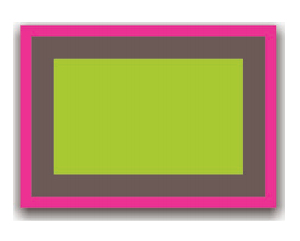
4.box-shadow: h-shadow v-shadow blur spread color inset;
绘制多层边框可用box-shadow,但是box-shadow只可以绘制实现边框
background: yellowgreen;
box-shadow: 0 0 0 10px #655,
0 0 0 15px deeppink,
0 2px 5px 15px rgba(0,0,0,.6);
outline可实现绘制虚线边框,但是只能绘制两层
background: yellowgreen;
border: 10px solid #655;
outline: 5px solid deeppink;

5.background-position
css2以前background-position只能指定距离左上角的偏移量,css3中background-position 属性已经得到扩展,它允许我们指定背景图片距离任意角的偏移量,只要我们在偏移量前面指定关键字
background-position: right 20px bottom 10px;
background-origin: content-box | padding-box | border-box; 默认值padding-box; 规定 background-position 属性相对于什么位置来定位。
6.calc()属性需要在 calc() 函数内部的 - 和 + 运算符的两侧各加一个空白符,否则会产生解析错误!
7.linear-gradient/repeating-linear-gradient 重复线性渐变百分比不懂
二、形状
1.椭圆
border-radius: 50%; 宽高一致时为圆,宽高不一致时为椭圆
border-radius: 50%; /*椭圆*/
border-radius: 50% / 100% 100% 0 0; /*上 沿x轴的半椭圆*/
border-radius: 0 100% 100% 0 / 50%; /*右 沿x轴的半椭圆*/
border-radius: 50% / 0 0 100% 100%; /*下 沿x轴的半椭圆*/
border-radius: 100% 0 0 100% /50%; /*左 沿x轴的半椭圆*/
2.平行四边形
嵌套元素方案
<a href="#yolo" class="button">
<div>Click me</div>
</a>
.button { transform: skewX(-45deg); }
.button > div { transform: skewX(45deg); }
伪元素方案
.button {
position: relative;
/* 其他的文字颜色、内边距等样式…… */
}
.button::before {
content: ''; /* 用伪元素来生成一个矩形 */
position: absolute;
top: 0; right: 0; bottom: 0; left: 0;
z-index: -1;
background: #58a;
transform: skew(45deg);
}
3.菱形
<div class="picture">
<img src="adam-catlace.jpg" alt="..." />
</div>
.picture {
400px;
transform: rotate(45deg);
overflow: hidden;
}
.picture > img {
max- 100%;
transform: rotate(-45deg) scale(1.42);
}
/************************************css规范****************************/
1.选择器 与 { 之间必须包含空格
.selector {
}
2.列表型属性值 书写在单行时,, 后必须跟一个空格。
font-family: Arial, sans-serif;
3.当一个 rule 包含多个 selector 时,每个选择器声明必须独占一行。
.post,
.page,
.comment {
line-height: 1.5; }
4.>、+、~选择器的两边各保留一个空格。
main > nav {
    padding: 10px;
}

label + input {
    margin-left: 5px;
}

input:checked ~ button {
    background-color: #69C;
}
5.属性选择器中的值必须用双引号包围。不允许使用单引号,不允许不使用引号。

6.[强制] 属性定义必须另起一行。
.selector {
    margin: 0;
    padding: 0;
}
7.属性书写顺序:同一 rule set 下的属性在书写时,应按功能进行分组,并以 Formatting Model(布局方式、位置) > Box Model(尺寸) > Typographic(文本相关) > Visual(视觉效果) 的顺序书写,以提高代码的可读性。
减少浏览器reflow(回流),提升浏览器渲染dom的性能
解释:
-
(1)定位属性:position display float left top right bottom overflow clear z-index
(2)自身属性:width height padding border margin background
(3)文字样式:font-family font-size font-style font-weight font-varient color
(4)文本属性:text-align vertical-align text-wrap text-transform text-indent text-decoration letter-spacing word-spacing white-space text-overflow
(5)css3中新增属性:content box-shadow border-radius transform……
.sidebar {
/* formatting model: positioning schemes / offsets / z-indexes / display / ... */
position: absolute;
top: 50px;
left: 0;
overflow-x: hidden;
/* box model: sizes / margins / paddings / borders / ... */
200px;
padding: 5px;
border: 1px solid #ddd;
/* typographic: font / aligns / text styles / ... */
font-size: 14px;
line-height: 20px;
/* visual: colors / shadows / gradients / ... */
background: #f5f5f5;
color: #333;
-webkit-transition: color 1s;
-moz-transition: color 1s;
transition: color 1s;
}
8.当数值为 0 - 1 之间的小数时,省略整数部分的 0。
9.url() 函数中的路径不加引号容易遭到xss攻击,加引号老版本ie浏览器不兼容
10.2D 位置:必须同时给出水平和垂直方向的位置。2D 位置初始值为 0% 0%,但在只有一个方向的值时,另一个方向的值会被解析为 center。