---恢复内容开始---
简介
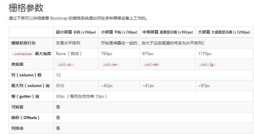
栅格系统用于通过一系列的行(row)与列(column)的组合来创建页面布局,你的内容就可以放入这些创建好的布局中。下面就介绍一下 Bootstrap 栅格系统的工作原理:
- “行(row)”必须包含在
.container(固定宽度)或.container-fluid(100% 宽度)中,以便为其赋予合适的排列(aligment)和内补(padding)。 - 通过“行(row)”在水平方向创建一组“列(column)”。
- 你的内容应当放置于“列(column)”内,并且,只有“列(column)”可以作为行(row)”的直接子元素。
- 类似
.row和.col-xs-4这种预定义的类,可以用来快速创建栅格布局。Bootstrap 源码中定义的 mixin 也可以用来创建语义化的布局。 - 通过为“列(column)”设置
padding属性,从而创建列与列之间的间隔(gutter)。通过为.row元素设置负值margin从而抵消掉为.container元素设置的padding,也就间接为“行(row)”所包含的“列(column)”抵消掉了padding。 - 负值的 margin就是下面的示例为什么是向外突出的原因。在栅格列中的内容排成一行。
- 栅格系统中的列是通过指定1到12的值来表示其跨越的范围。例如,三个等宽的列可以使用三个
.col-xs-4来创建。 - 如果一“行(row)”中包含了的“列(column)”大于 12,多余的“列(column)”所在的元素将被作为一个整体另起一行排列。
- 栅格类适用于与屏幕宽度大于或等于分界点大小的设备 , 并且针对小屏幕设备覆盖栅格类。 因此,在元素上应用任何
.col-md-*栅格类适用于与屏幕宽度大于或等于分界点大小的设备 , 并且针对小屏幕设备覆盖栅格类。 因此,在元素上应用任何.col-lg-*不存在, 也影响大屏幕设备。
通过研究后面的实例,可以将这些原理应用到你的代码中。
媒体查询
实例:流式布局容器
将最外面的布局元素 .container 修改为 .container-fluid,就可以将固定宽度的栅格布局转换为 100% 宽度的布局。
<div class="container-fluid">
  <div class="row">
    ...
  </div>
</div>
实例:手机、平板、桌面
在上面案例的基础上,通过使用针对平板设备的 .col-sm-* 类,我们来创建更加动态和强大的布局吧。
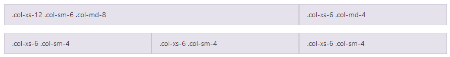
<div class="row">
  <div class="col-xs-12 col-sm-6 col-md-8">.col-xs-12 .col-sm-6 .col-md-8</div>
//可以给每一个column来设置对于不同设备的显示效果,
  <div class="col-xs-6 col-md-4">.col-xs-6 .col-md-4</div>
</div>
<div class="row">
  <div class="col-xs-6 col-sm-4">.col-xs-6 .col-sm-4</div>
  <div class="col-xs-6 col-sm-4">.col-xs-6 .col-sm-4</div>
  <!-- Optional: clear the XS cols if their content doesn't match in height -->
  <div class="clearfix visible-xs-block"></div>
  <div class="col-xs-6 col-sm-4">.col-xs-6 .col-sm-4</div>
</div>
除了列在分界点清除响应, 您可能需要 重置偏移, 后推或前拉某个列。请看此栅格实例。
<div class="row">
  <div class="col-sm-5 col-md-6">.col-sm-5 .col-md-6</div>
  <div class="col-sm-5 col-sm-offset-2 col-md-6 col-md-offset-5">.col-sm-5 .col-sm-offset-2 .col-md-6 .col-md-offset-0</div>
</div>
//当是sm的显示器时,向右推2个栅格位  当是md 时,向右推5个栅格

<div class="row">
  <div class="col-sm-6 col-md-5 col-lg-6">.col-sm-6 .col-md-5 .col-lg-6</div>
  <div class="col-sm-6 col-md-5 col-md-offset-2 col-lg-6 col-lg-offset-0">.col-sm-6 .col-md-5 .col-md-offset-2 .col-lg-6 .col-lg-offset-0</div>
</div>
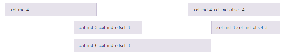
列偏移
使用 .col-md-offset-* 类可以将列向右侧偏移。这些类实际是通过使用 * 选择器为当前元素增加了左侧的边距(margin)。例如,.col-md-offset-4 类将 .col-md-4 元素向右侧偏移了4个列(column)的宽度。
嵌套列
为了使用内置的栅格系统将内容再次嵌套,可以通过添加一个新的 .row 元素和一系列 .col-sm-* 元素到已经存在的 .col-sm-* 元素内。被嵌套的行(row)所包含的列(column)的个数不能超过12(其实,没有要求你必须占满12列)。
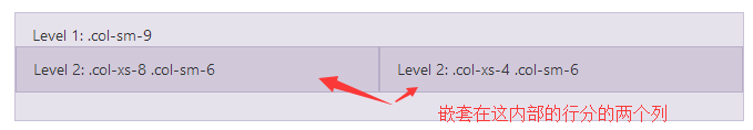
<div class="row">
  <div class="col-sm-9">
    Level 1: .col-sm-9
    <div class="row">
      <div class="col-xs-8 col-sm-6">
        Level 2: .col-xs-8 .col-sm-6
      </div>
      <div class="col-xs-4 col-sm-6">
        Level 2: .col-xs-4 .col-sm-6
      </div>
    </div>
  </div>
</div>
列排序
通过使用 .col-md-push-* 和 .col-md-pull-* 类就可以很容易的改变列(column)的顺序。

<div class="row">
  <div class="col-md-9 col-md-push-3">.col-md-9 .col-md-push-3</div>
//push 推
  <div class="col-md-3 col-md-pull-9">.col-md-3 .col-md-pull-9</div>
// pull 拉
</div>
排版
标题
表格
表单
基本实例
单独的表单控件会被自动赋予一些全局样式。所有设置了 .form-control 类的 <input>、<textarea> 和 <select> 元素都将被默认设置宽度属性为 100%;。 将 label 元素和前面提到的控件包裹在 .form-group 中可以获得最好的排列。
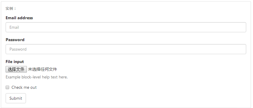
重要表单代码
<form>
  <div class="form-group">
    //将表单内容包裹在 form-group中 里边所有的
    <label for="exampleInputEmail1">Email address</label>
    <input type="email" class="form-control" id="exampleInputEmail1" placeholder="Email">
  </div>
  <div class="form-group">
    <label for="exampleInputPassword1">Password</label>
    <input type="password" class="form-control" id="exampleInputPassword1" placeholder="Password">
  </div>
  <div class="form-group">
    <label for="exampleInputFile">File input</label>
    <input type="file" id="exampleInputFile">
    <p class="help-block">Example block-level help text here.</p>
  </div>
  <div class="checkbox">
    <label>
      <input type="checkbox"> Check me out
    </label>
  </div>
  <button type="submit" class="btn btn-default">Submit</button>
</form>
内联表单
为 <form> 元素添加 .form-inline 类可使其内容左对齐并且表现为 inline-block 级别的控件。只适用于视口(viewport)至少在 768px 宽度时(视口宽度再小的话就会使表单折叠)。
可能需要手动设置宽度
在 Bootstrap 中,输入框和单选/多选框控件默认被设置为 100%; 宽度。在内联表单,我们将这些元素的宽度设置为 auto;,因此,多个控件可以排列在同一行。根据你的布局需求,可能需要一些额外的定制化组件。
一定要添加 label 标签
如果你没有为每个输入控件设置 label 标签,如果没有屏幕阅读器将无法正确识别。对于这些内联表单,你可以通过为 label 设置 .sr-only 类将其隐藏。还有一些辅助技术提供label标签的替代方案,比如 aria-label、aria-labelledby 或 title 属性。如果这些都不存在,屏幕阅读器可能会采取使用 placeholder 属性,如果存在的话,使用占位符来替代其他的标记,但要注意,这种方法是不妥当的。
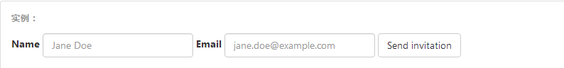
<form class="form-inline">
  <div class="form-group">
    <label for="exampleInputName2">Name</label>
    <input type="text" class="form-control" id="exampleInputName2" placeholder="Jane Doe">
  </div>
  <div class="form-group">
    <label for="exampleInputEmail2">Email</label>
    <input type="email" class="form-control" id="exampleInputEmail2" placeholder="jane.doe@example.com">
  </div>
  <button type="submit" class="btn btn-default">Send invitation</button>
</form>

<!DOCTYPE html>
<html lang="en">
<head>
    <meta charset="UTF-8">
    <meta http-equiv="X-UA-Compatible" content="IE=edge">
    <meta name="viewport" content="width=device-width, initial-scale=1">
    <title>Title</title>
    <link rel="stylesheet" href="bootstrap-3.3.7-dist/css/bootstrap.min.css">
</head>
<body>
<div class="container">
    <form class="form-inline">
        <div class="form-group">
            <label for="pasw">密码</label>
            <input type="password" id="pasw" class="form-control" placeholder="password">
        </div>
        <div class="form-group">
            <label for="exampleinputemail">邮箱地址</label>
            <input type="email" id="exampleinputemail" class="form-control" placeholder="email">
        </div>

    <div class="form-group">
            <label ></label>
            <!--checkbox不用跟label绑定,-->
            <input type="checkbox"  class="form-control" >我已阅读
        </div>
    <button  type="submit" style="background-color: #2459a2;" >提交</button>
    </form>

</div>
</body>
</html>
默认外观(堆叠在一起) 单选和多选框的写法
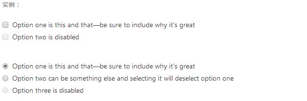
注意:写法也是用label 来包裹,与text password 不太相同 如下
<div class="checkbox"> <label> <input type="checkbox" value=""> Option one is this and that—be sure to include why it's great </label> </div> <div class="checkbox disabled"> <label> <input type="checkbox" value="" disabled> Option two is disabled </label> </div> <div class="radio"> <label> <input type="radio" name="optionsRadios" id="optionsRadios1" value="option1" checked> Option one is this and that—be sure to include why it's great </label> </div> <div class="radio"> <label> <input type="radio" name="optionsRadios" id="optionsRadios2" value="option2"> Option two can be something else and selecting it will deselect option one </label> </div> <div class="radio disabled"> <label> <input type="radio" name="optionsRadios" id="optionsRadios3" value="option3" disabled> Option three is disabled </label> </div>
内联单选和多选框
通过将 .checkbox-inline 或 .radio-inline 类应用到一系列的多选框(checkbox)或单选框(radio)控件上,可以使这些控件排列在一行。
---恢复内容结束---