Flex布局


1.上顶,下顶
flex-wrap: wrap; align-content: flex-start;

 https://www.runoob.com/try/playit.php?f=playcss_align-content&preval=flex-start

 https://www.runoob.com/cssref/css3-pr-align-items.html


两个盒子,100%,统一置顶

display: flex;
flex-direction: column;
justify-content: flex-start;


1.实现左右居中,上下居中:(规定盒子)

display: flex;
justify-content: center;    
align-items: center;
 
--------------------------------------
display: flex;
align-content: space-between;  【靠着外边】:向上/向下-互斥
 -------------------------------------
/* 换行 */
flex-wrap: wrap;
------------------------------------
/* 右 */
justify-content: flex-end
========================
控制x轴的:横向
1.  justify-content: flex-end  (默认居左,end为右)

=================================================================== 
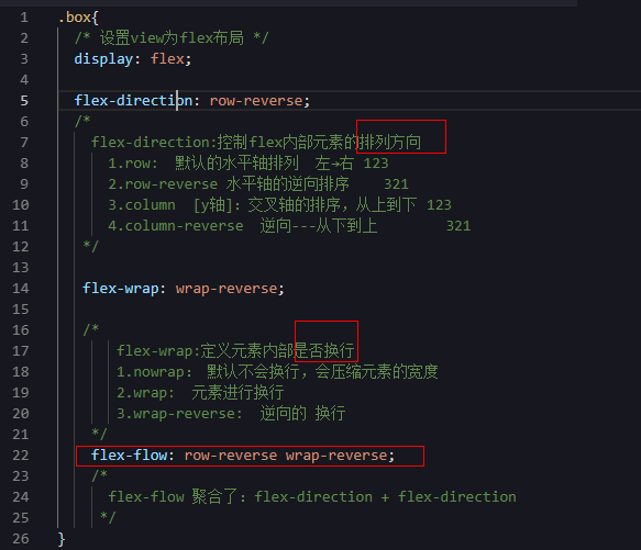
 

Flex容器的属性

 
flex布局  弹性盒子布局模型【自适应】6
容器可以控制内部元素高度和宽度
flex direction  布局方向

---------------------------------------

原始样式:

=================================================


justify-content: space-around;
/*
  设置容器内部元素的对齐方式 默认:flex-start
  1.flex-start 默认 左对齐
  2.flex-end 右对齐
  3.center 居中对齐
  4.space-between 设置容器内元素直接的等量间隙
  5.justify-content: space-around; 设置元素之间的间隙
*/
----------------------------------------------------------------------
justify-content: center;


------------------------------------------------------

justify-content: flex-end;    【右对齐】

 -------------------------------------------

justify-content: space-between;

------------------------------------------------------

justify-content: space-around;
 

 -------------------------------------------------------

 align-items:  每个元素再交叉轴上的对齐方式
 
1.flex-start,flex-end
2.conter
3.baseline,stretch

 ===================================

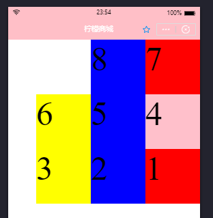
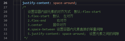
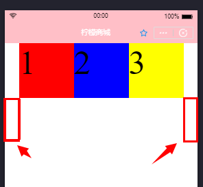
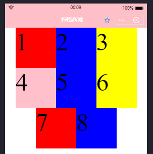
align-content:多轴线的对齐方式(把每个轴线视为元素,至少要有两个轴线)

1.flex-start:  向上(左)对齐

2.flex-end:  向下(右)对齐

3.conter:  居中对齐

4.stretch:  默认,当元素本身没有设置高度,则拉伸到整个容器

5.space-between:  设置多轴线之间的等量间隙

5.space-around:  设置多轴线之间的间隙,以及两边的间隙

-------------------------------------------------------------

原文地址:https://www.cnblogs.com/vip-deng-vip/p/10493456.html