今天看到一篇文章,说到margin的塌陷的问题,并提供了好几个例子。
自己之前还没怎么遇到过这个问题,正好来研究一下。
<div class="box1"></div>
<div class="box2"></div>
<div class="box3"></div>
<div class="box4"></div>
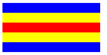
css样式一,使用margin塌陷:
.box1, .box2, .box3 {
  width: 200px;
  }
.box1{
  margin-bottom: -80px;
  height:100px;
  background: blue;
  }
.box2 {
  margin-bottom:-40px;
  height:60px;
  background: #ffff00;
}
.box3{
  height:20px;
  background: #ff0000;
}
效果:
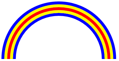
css样式二,也是使用的margin塌陷,不过做出来的是弧形的彩虹:
.box1{
            width: 400px;
            height: 200px;
            overflow: hidden;
        }
        .box1::before{
            float: left;
            display: block;
            height: 400px;
            width:400px;
            border-radius: 100%;
            border: solid 10px blue;
            box-sizing: border-box;
            content: "";
        }
        .box1::after{
            margin-top: 10px;
            margin-left: 10px;
            display: block;
            width: 380px;
            height: 380px;
            border: solid #ffff00 10px;
            border-radius: 100%;
            box-sizing: border-box;
            content: "";
        }
        .box2{
            float: left;
            margin-top: -180px;
            margin-left: 20px;
            width: 360px;
            height: 180px;
            overflow: hidden;
        }
        .box2::before{
            float: left;
            display: block;
            margin: 0;
            width: 360px;
            height: 360px;
            border-radius: 100%;
            border: solid 10px #ff0000;
            box-sizing: border-box;
            content: "";
        }
        .box2::after{
            display: block;
            margin-top: 10px;
            margin-left: 10px;
            width: 340px;
            height: 340px;
            border-radius: 100%;
            border: solid 10px #ffff00;
            box-sizing: border-box;
            content: "";
        }
        .box3{
            margin-top: -160px;
            margin-left: 40px;
            width: 340px;
            height: 160px;
            overflow: hidden;
        }
        .box3::before{
            float: left;
            display: block;
            width: 320px;
            height: 320px;
            border: solid 10px blue;
            border-radius: 100%;
            box-sizing: border-box;
            content: "";
        }
效果:
css样式三,使用的是box-shadow:
.box4{
            width: 200px;
            height: 200px;
            box-shadow: 0 10px 0 red,0 20px 0 yellow, 0 30px 0 green,0 40px 0 blue,0 50px 0 purple;
        }
效果:

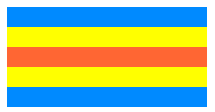
CSS样式四,使用position:absolute来实现,感觉这种是最常见的了
.box1{
            position: absolute;
            width: 200px;
            height: 100px;
            background: #008aff;
        }
        .box2{
            position: absolute;
            margin-top: 20px;
            width: 200px;
            height: 60px;
            background: #ffff00;
        }
        .box3{
            position: absolute;
            margin-top: 40px;
            width: 200px;
            height: 20px;
            background: #ff6633;
        }
效果:
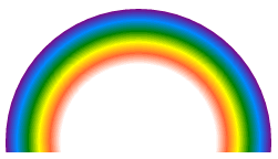
CSS样式五,使用radial-gradient:
 .box4{
            width: 260px;
            height: 130px;
            overflow: hidden;
        }
        .box5{
            width: 260px;
            height: 260px;
            border-radius: 100%;
            background: radial-gradient(#ffffff 70px,#ff6633 80px,#ffff00 90px,green 100px,#008aff 110px,purple 120px);
            background: -moz-radial-gradient(#ffffff 70px,#ff6633 80px,#ffff00 90px,green 100px,#008aff 110px,purple 120px);
            background: -webkit-radial-gradient(#ffffff 70px,#ff6633 80px,#ffff00 90px,green 100px,#008aff 110px,purple 120px);
        }
另外附上关于css负边距的文章链接:https://segmentfault.com/a/1190000005856540