一、新建demo工程
vue init webpack-simple demo
添加src/mixins/emitter.js文件(见前几篇博文)
安装font-awesome字体库:
cnpm install font-awesome --save
配置webpack.config.js,引入字体文件:
{
  test: /.(otf|eot|ttf|woff|woff2)$/,
  loader: 'file-loader'
}
在src/main.js中引入font-awesome:
import '../node_modules/font-awesome/css/font-awesome.min.css'
二、组件设计
新建src/components/mySelect.vue和myOption.vue文件
1) 先来设计选项组件,这个比较简单
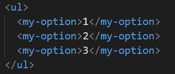
先来考虑一下使用场景,一般的下拉菜单都是由无序列表组成,而选项则是一个个列表项:
但是直接slot标签很可能会出现重名,所以需要分别prop一个label和value,其中value是必须的,如果没有slot标签则显示label,所以myOption的基本结构为:
<template>
  <li class="my-option">
    <span v-if="!$slots.default">{{ label }}</span>
    <slot></slot>
  </li>
</template>

<script>
import emitter from "../mixins/emitter";

export default {
  name: "myOption",
  mixins: [emitter],
  props: {
    label: {
      type: String,
      default: "empty-label"
    },
    value: {
      type: String,
      required: true
    }
  }
};
</script>
然后来考虑一下myOption可能会存在的状态,选项有选择和取消两种事件,对应的状态就是是否已经被选择,而且选择的状态需要高亮显示:
先来加一个状态:
data() {
  return {
    selected: true
  }
}
然后在最外层的li添加一个selected类名和一个右浮的check图标(可以用v-show="selected"来控制显示,我这里用css与文字颜色一起控制):
<template> <li :class="['my-option', { selected: selected }]"> <span v-if="!$slots.default">{{ label ? label : value }}</span> <slot></slot> <i class="fa fa-check pull-right"> </i> </li> </template>
css代码:
<style lang="scss" scoped>
.my-option {
  > .fa-check {
    display: none;
  }
  &.selected {
    color: blue;
    > .fa-check {
      display: inline;
    }
  }
}
</style>
由于父组件select需要接收label的值,而prop不能改变,只好再定义一个myLabel标签,然后通过事件发送给父级:
myLabel: this.label || this.value
先后添加点击事件和监听的选择/取消事件:
methods: {
  handleClick() {
    this.dispatch(
      "mySelect",
      "option-click",
      this.selected,
      this.myLabel,
      this.value
    );
  }
},
created() {
  this.$on("select", value => {
    if (this.value === value) {
      this.selected = true;
    }
  });
  this.$on("cancel", value => {
    if (this.value === value) {
      this.selected = false;
    }
  });
}
然后,不带样式的选项组件基本就完成了,完整代码如下:
<template> <li :class="['my-option', { selected: selected }]"> <span v-if="!$slots.default">{{ myLabel }}</span> <slot></slot> <i class="fa fa-check pull-right"> </i> </li> </template> <script> import emitter from "../mixins/emitter"; export default { name: "myOption", mixins: [emitter], props: { label: { type: String, default: "" }, value: { type: String, required: true } }, data() { return { selected: false, myLabel: this.label || this.value }; }, methods: { handleClick() { this.dispatch( "mySelect", "option-click", this.selected, this.myLabel, this.value ); } }, created() { this.$on("select", value => { if (this.value === value) { this.selected = true; } }); this.$on("cancel", value => { if (this.value === value) { this.selected = false; } }); } }; </script> <style lang="scss" scoped> .my-option { > .fa-check { display: none; } &.selected { color: blue; > .fa-check { display: inline; } } } </style>