filter:定义了元素的可视效果
具体函数:
hue-rotate() 色相旋转
blur() 高斯模糊效果
brightness() 图片变亮
contrast() 图像的对比度
grayscale() 灰度
invert()反转
opacity() 透明度
saturate() 饱和度

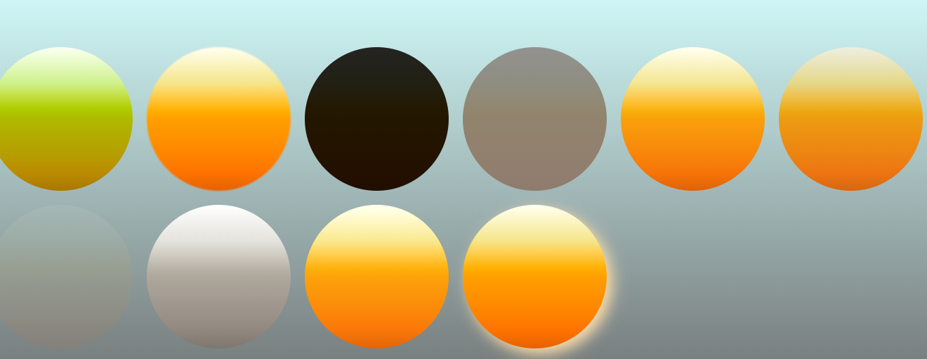
<!DOCTYPE html>
<html lang="en">
<head>
    <meta charset="UTF-8">
    <title>CSS3 filter</title>
</head>
<style type="text/css">
    body,html{
        display: flex;
        align-items:center;
        justify-content:center;
         100%;
        height: 100%;
        background: linear-gradient(#E0FFFF 0,     #696969 100%);
        margin:0;
    }
    .wrap{
        display: flex;
        flex-wrap: wrap;
    }
    .wrap div{
         15vw;
        height:15vw;
        margin:10px;
        border-radius: 50%;
        background: linear-gradient(#FFFFF0 0,    #F0E68C 25%, #FFA500 50%,#FF8C00 75%,     #D2691E 100%);
        -webkit-animation: sun 10s ease-in-out infinite 5s;
                  animation: sun 10s ease-in-out infinite 5s;
    }
    .wrap div:nth-child(2){
        -webkit-animation: sun1 10s ease-in-out infinite 5s;
                  animation: sun1 10s ease-in-out infinite 5s;
    }
    .wrap div:nth-child(3){
        -webkit-animation: sun2 10s ease-in-out infinite 5s;
                  animation: sun2 10s ease-in-out infinite 5s;
    }
    .wrap div:nth-child(4){
        -webkit-animation: sun3 10s ease-in-out infinite 5s;
                  animation: sun3 10s ease-in-out infinite 5s;
    }
    .wrap div:nth-child(5){
        -webkit-animation: sun4 10s ease-in-out infinite 5s;
                  animation: sun4 10s ease-in-out infinite 5s;
    }
    .wrap div:nth-child(6){
        -webkit-animation: sun5 10s ease-in-out infinite 5s;
                  animation: sun5 10s ease-in-out infinite 5s;
    }
    .wrap div:nth-child(7){
        -webkit-animation: sun6 10s ease-in-out infinite 5s;
                  animation: sun6 10s ease-in-out infinite 5s;
    }
    .wrap div:nth-child(8){
        -webkit-animation: sun7 10s ease-in-out infinite 5s;
                  animation: sun7 10s ease-in-out infinite 5s;
    }
    .wrap div:nth-child(9){
        -webkit-animation: sun8 10s ease-in-out infinite 5s;
                  animation: sun8 10s ease-in-out infinite 5s;
    }
    .wrap div:nth-child(10){
        -webkit-animation: sun9 10s ease-in-out infinite 5s;
                  animation: sun9 10s ease-in-out infinite 5s;
    }
    @keyframes sun {
      0% {
        -webkit-filter: hue-rotate(360deg);
                filter: hue-rotate(360deg);
      }
      100% {
        -webkit-filter: hue-rotate(0deg);
                filter: hue-rotate(0deg);
      }
    }
    @keyframes sun1 {
      0% {
        -webkit-filter: blur(15px);
                filter: blur(15px);
      }
      100% {
        -webkit-filter: blur(0px);;
                filter: blur(0px);;
      }
    }
    @keyframes sun2 {
      0% {
        -webkit-filter: brightness(200%);
                filter: brightness(200%);
      }
      100% {
        -webkit-filter: brightness(0%);
                filter: brightness(0%);
      }
    }
    @keyframes sun3 {
      0% {
        -webkit-filter: contrast(200%);
                filter: contrast(200%);
      }
      100% {
        -webkit-filter: contrast(0%);
                filter: contrast(0%);
      }
    }
    @keyframes sun4 {
      0% {
        -webkit-filter: grayscale(100%);
                filter: grayscale(100%);
      }
      100% {
        -webkit-filter: grayscale(0%);
                filter: grayscale(0%);
      }
    }
    @keyframes sun5 {
      0% {
        -webkit-filter: invert(100%);
                filter: invert(100%);
      }
      100% {
        -webkit-filter: invert(0%);
                filter: invert(0%);
      }
    }
    @keyframes sun6 {
      0% {
        -webkit-filter: opacity(100%);
                filter: opacity(100%);
      }
      100% {
        -webkit-filter: opacity(0%);
                filter: opacity(0%);
      }
    }
    @keyframes sun7 {
      0% {
        -webkit-filter: saturate(100%);
                filter: saturate(100%);
      }
      100% {
        -webkit-filter: saturate(0%);
                filter: saturate(0%);
      }
    }
    @keyframes sun8 {
      0% {
        -webkit-filter: sepia(100%);
                filter: sepia(100%);
      }
      100% {
        -webkit-filter: sepia(0%);
                filter: sepia(0%);
      }
    }
    @keyframes sun9 {
      0% {
        -webkit-filter: drop-shadow(8px 8px 10px #F0E68C);;
                filter: drop-shadow(8px 8px 10px #F0E68C);;
      }
      100% {
        -webkit-filter: drop-shadow(8px 8px 10px #FFDEAD);;
                filter: drop-shadow(8px 8px 10px #FFDEAD);;
      }
    }
</style>
<body>
    <div class="wrap">
        <div></div>
        <div></div>
        <div></div>
        <div></div>
        <div></div>
        <div></div>

        <div></div>
        <div></div>
        <div></div>
        <div></div>
    </div>
</body>
</html>