废话不多说,直接上代码,希望能帮到有需要的小伙伴
①:遮罩
   position: fixed;
    background: rgba(0, 0, 0, .4);
    top: 0;
    left: 0;
    right: 0;
    bottom: 0;
    z-index: 99;
     100%;
    height: 100%;
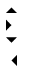
②:三角(下面三角的代码按照下图上右下左的顺序排列)
   display: inline-block;
    0;
    height: 0;
    border- 8px;
    border-style: solid;
    border-color: transparent transparent #000 transparent;
  display: inline-block;
   0;
   height: 0;
   border- 8px;
   border-style: solid;
   border-color: #000 transparent transparent transparent;
  display: inline-block;
   0;
   height: 0;
   border- 8px;
   border-style: solid;
   border-color: transparent #000 transparent transparent;
  display: inline-block;
   0;
   height: 0;
   border- 8px;
   border-style: solid;
   border-color: transparent #000 transparent transparent;
③:圆形

   display: inline-block;
    10px;
   height: 10px;
   border-radius: 50%;
   background-color: #f6ad03;
注:设置 border-radius 的值为宽高的一半,或者直接设置50%的百分比来制作圆形
④:图标

   24px;
   box-shadow: 0 10px 0 2px #999, 0 20px 0 2px #999, 0 30px 0 2px #999;
⑤:文字超出隐藏
   180px;
  overflow: hidden;
  text-overflow: ellipsis;
  white-space: nowrap;
⑥:垂直居中
  position: fixed;
   top: 0;
   right: 0;
   bottom: 0;
   left: 0;
   margin: auto;
注:针对元素有固定宽高的情况
   position: fixed;
    top: 50%;
    left: 50%;
    z-index: 999;
    transform: translate(-50%,-50%);
注:针对元素无固定宽高的情况
⑦:巧妙运用伪类::after,给元素添加边框,如下图

    content: '';
    position: absolute;
    right: 0;
    bottom: 0;
    left: 15px;
    height: 1px;
    background-color: #c8c7cc;
注:不要忘记上面截图中的a标签要设置相对定位position:relative; 因为用伪类添加的边框是相对父元素a标签定位的
⑧:用CSS3的animation属性制作loading动画效果
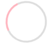
       .loading {
                margin: 0 auto;
                width: 200px;
                height: 200px;
                border-radius: 50%;
                border: 10px solid #ddd;
                border-left-color: #FFB5BF;
                animation: loading-animation 1s linear infinite;
            }
            @keyframes loading-animation{
                0% {
                    transform: rotate(0deg);
                }
                100% {
                    transform: rotate(360deg);
                }
            }
⑨:气泡效果

    <div class="bubble">
            <div class="triangle common"></div>
            <div class="cover common"></div>
            <!-- 用来覆盖的倒三角 -->
        </div>
      .bubble {
                width: 200px;
                height: 40px;
                border: 5px solid #FFB5BF;
                position: relative;
            }

            .common {
                width: 0;
                height: 0;
                position: absolute;
                /* 使用绝对定位 */
                left: 50%;
                transform: translate(-50%, 0);
                /* 水平居中 */
            }

            .triangle {
                bottom: -20px;
                border-top: 20px solid #FFB5BF;
                border-right: 20px solid transparent;
                border-left: 20px solid transparent;
            }

            .cover {
                bottom: -13px;
                border-top: 20px solid #94E8FF;
                border-right: 20px solid transparent;
                border-left: 20px solid transparent;
            }

            .cover {
                border-top: 20px solid #fff;
            }