我阅读了google官方的关于抽屉导航的设计准则,这可以给我带来什么帮助?最起码,我可以知道,抽屉导航适用在什么场景中,使用它时要注意什么事项。App的设计是有规则可以依据的,比如,使用抽屉导航时,是有明确的规则和场景的。
The navigation drawer(导航抽屉) is a panel that transitions in from the left edge of the screen and displays the app’s main navigation options.
Displaying the navigation drawer
The user can bring the navigation drawer onto the screen by swiping from the left edge of the screen or by touching the application icon on the action bar.
As the navigation drawer expands, it overlays the content but not the action bar. When the drawer is fully extended, the action bar adjusts its content by replacing the current action bar title with the app name and removing all actions that are contextual to the view underneath (在什么下面)the navigation drawer. The overflow menu with the standard action items for Settings and Help remains visible.
The user can open the drawer panel by touching the navigation drawer indicator.
Dismissing the navigation drawer
When the navigation drawer is expanded, the user can dismiss it in one of four ways:
- Touching the content outside the navigation drawer
- Swiping to the left anywhere on the screen (including edge swipe from right)
- Touching the app icon/title in the action bar
- Pressing Back
When to Use the Navigation Drawer
The navigation drawer is not a general replacement for top-level navigation via spinners or tabs. The structure of your app should guide your choice of which pattern to use for top-level switching. For more information on top-level switching mechanisms, see the Application Structure design pattern.
导航抽屉结构,并不是作为同是顶层导航结构的下拉框(spinners)和tab的替代。选择什么样的模式作为你的顶层导航,这个要根据你app的结构来定的。要了解顶层导航的更多信息,可以阅读应用结构设计准则一文。
下文的场景是最适合使用导航抽屉作为顶层结构的
Here are some examples of where navigation drawers work best:
More than 3 top-level views
Navigation drawers are great for displaying a large number of navigation targets concurrently. Use the navigation drawer if you have more than 3 unique top-level views. If not, use fixed tabs for top-level organization to ease discovery and interaction.
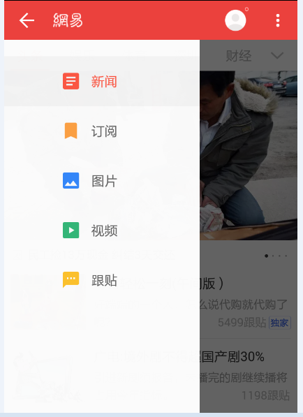
顶层进入模块超过3个
当app有多个顶层模块要同时展现的时候,使用导航抽屉结构来实现时最好的。如果,你的app的顶层模块是少于3个的,那么,还是使用tab的方式来组织你的顶层模块。
比如,网易新闻的一级进入模块有:新闻,订阅,图片,视频,跟帖。为了同时展示这些一级进入口,可以使用抽屉导航来组织它们。
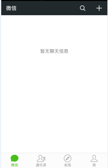
比如,微信,只有四个一级入口,为了方便用户使用,方便用户发现和交互,微信使用了tab来组织它们。
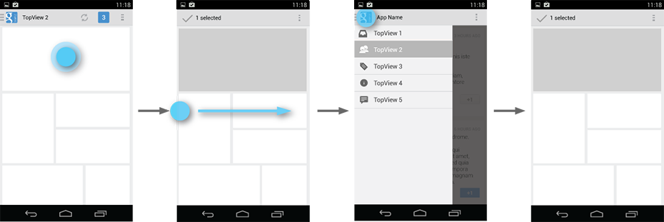
Cross-navigation from lower levels
If your app requires cross-navigating between lower-level screens, consider using the navigation drawer. Because it is accessible from anywhere in the app, the drawer enables efficient navigation from lower-level screens to other important places in your app.
在低层次模块中发生的交叉导航
在这种情况下,也可使用抽屉导航。这个时候使用抽屉导航,它的好处是,用户在低层次的模块中时,可以快速跳转到高层次的模块中。当你需要在低层次的模块中,快速跳转到某个重要的高层次模块去,那么,可以使用抽屉导航来组织。
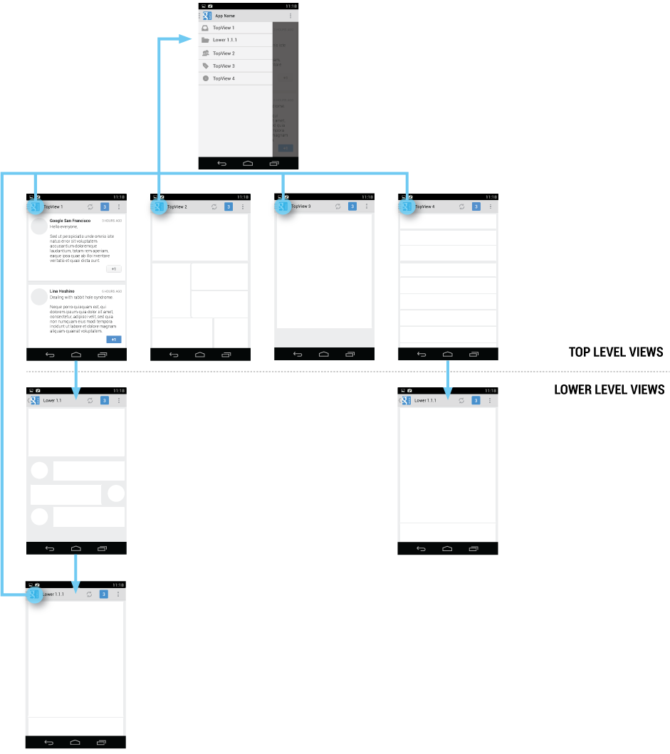
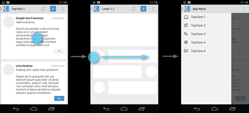
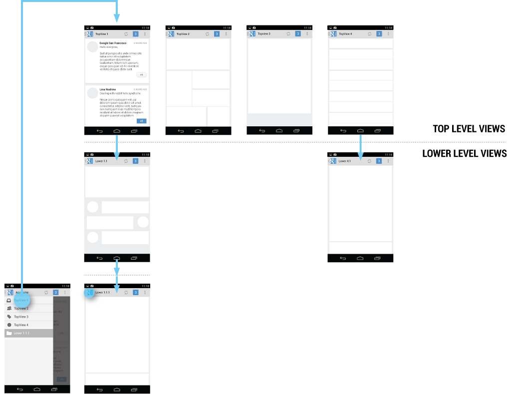
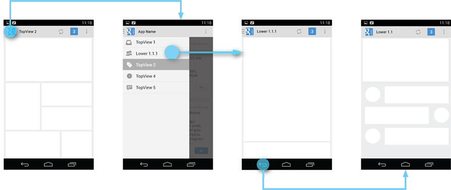
比如下图的例子,在每个界面中,都有actionBar,都有抽屉导航。
到达Lower 4.1界面,有两个路径。
一个路径是,TopView4---->Lower 4.1。这是从顶层模块进入的。
一个路径是,TopView1--->Lower 1.1--->Lower 1.1.1,在当前界面,使用抽屉导航,直接进入Lower 4.1。这是从低层次模块Lower1.1.1进入的。
The navigation drawer makes cross-navigation at lower levels possible.
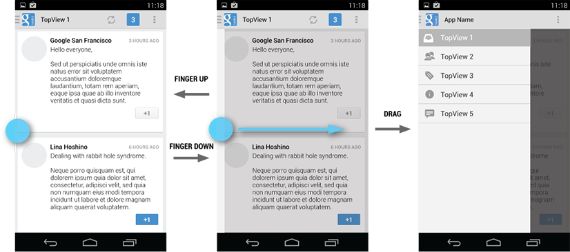
Deep navigation branches
If you have particularly deep branches, navigating to the top-level of your app can become repetitive and cumbersome with Up and Back alone. Since navigation drawers are accessible from anywhere in the app, navigation up to the top level is faster and more efficient.
过深的导航分支
如果你的app有特别深的导航分支,那么,从底层的导航分支到顶层的界面,将会是一个重复和愚笨的行为,你只可以通过不断重复按下【返回上一级】或者【后退】来实现。既然抽屉导航可以在任何层次的界面中出现,那么,我就可以在某个低层次的界面中直接通过抽屉导航到达某个顶层界面,这是一个快速和高效的行为。
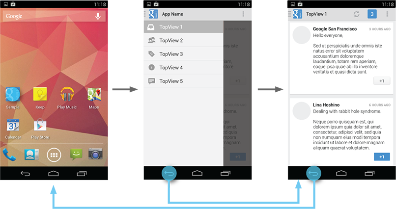
比如下图,到达Lower1.1.1界面后,想要回到TopView1,有两个路径可以实现:
路径1:不断按下返回键,这样最后可以返回到TopView1.
路径2:在Lower1.1.1界面,往右滑动,弹出抽屉导航,然后,点击TopView1,就可以快速到达TopView1.
The navigation drawer allows for quick jumps to the top-level of your app, removing the need for repetitive Back or Up sequences.
Navigation Hubs
The navigation drawer is a reflection of your app’s structure and displays its major navigation hubs. Think of navigation hubs as those places in your app that a user will want to visit frequently or use as a jumping-off point to other parts of the app. At a minimum, the navigation hubs are the top-level views, since they correspond to your app’s major functional areas.
导航枢纽
抽屉导航的内容,是你app架构的反映,它展示了app中主要的枢纽。想象一下,导航枢纽就是在你的app中,用户会经常访问的界面,或者,这是一个入口点,用户通过访问该入口点进入到app的某个模块。至少,抽屉导航中的导航枢纽对应的顶层界面组件,这些顶层界面组件与app的主要功能区相关联,顶层界面就是app主要功能的入口界面。
If your app’s structure is deep, you can add screens from lower levels that your users will likely visit often and make those navigation hubs as well.
如果你app的架构层次过深,你可以在抽屉导航中添加低层次界面中会经常访问的顶层界面,并且也可以把把添加的Item作为导航枢纽。
The navigation drawer contains all of your app's navigation hubs. Include your top level screens as well as important lower-level screens.
抽屉导航包含了你app的所有导航枢纽。除了包含到底顶层界面的Item,也包含可以到底重要底层界面的Item
To facilitate access to the navigation drawer on navigation hubs, all screens that correspond to an entry in your navigation drawer should show the navigation drawer indicator next to the application icon in the action bar. Touching the app icon causes the navigation drawer to slide in from the left.
All other lower-level screens show the traditional Up indicator next to the application icon. The drawer is still accessible with an edge-swipe, but is not featured in the action bar.
App icon with navigation drawer indicator. 此时是位于顶级界面,在当前界面中,应用图标的旁边是一个表示抽屉导航的标识。
所有与抽屉导航中某个Item相关的界面,在展示该界面时,在actionBar的应用图标旁边要展示表示当前界面的标识。点击应用的图标,会导致抽屉导航往左边隐藏。比如,点击抽屉导航中的TopView1,则会进入TopView1界面,此时,在应用图标的旁边要有“TopView 1”的字样,表示当前界面时TopView 1.
而对于低层次界面,不是某个模块的入口界面,则在应用的图标显示一个传统的返回上一级的图标。在低层次界面时,抽屉导航是依然可用的,你通过在屏幕左边往右滑动,可以展示抽屉导航,但是,此时你不能通过actionBar中的应用按钮唤出抽屉导航。
比如:
订阅界面是顶级界面入口,它是点击抽屉导航中的【订阅】后进入的。 这是低层次界面,在ActionBar中展示的是传统的返回上一级的标识。
在ActionBar中显示的是抽屉导航的标识。
Content of the Navigation Drawer
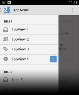
Keep the content of the navigation drawer focused on app navigation. Expose the navigation hubs of your app as list items inside the navigation drawer - one item per row.
抽屉导航中的内容
抽屉导航中的内容,就是app的导航。在展示的时候,抽屉导航中的每个枢纽展示为List中的每个Item。每个Item占据一行。
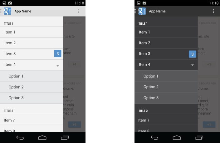
Titles, icons, and counters
You can structure navigation targets by adding titles. The titles are not interactive, but just organize navigation targets into functional topics. If you have many navigation targets, use titles to orient the user within the drawer.
Navigation targets can have optional leading icons as well as trailing counters. Use the counters to inform users about a changed state of data in the corresponding view.
抬头,图标,数字
如果有多个导航,你可以使用title来组织多个导航。这些title是不会响应你的点击的,它们可以用来组织某个主题功能下的所有导航。如果你有很多导航item,使用多个title来组织你的所有导航。
每个具体的导航Item,可以包含一个icon和一个表示页面状态信息的数字。
Use titles and icons to organize your drawer.
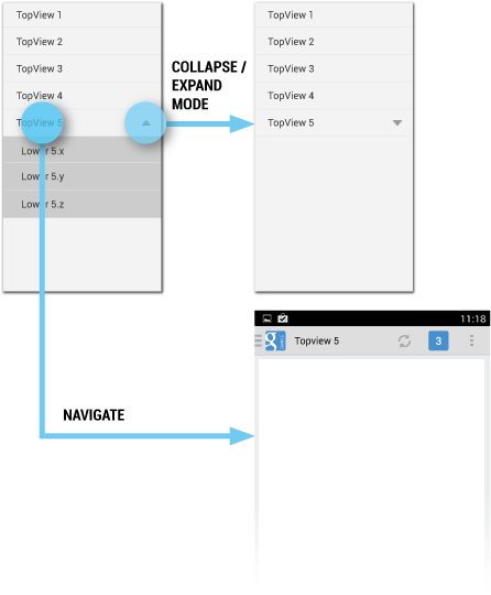
Collapsible navigation items
If you have many views with some subordinate to others, consider collapsing them into one expandable item to conserve space. The parent in the navigation drawer then turns into a split item. The left side allows navigation to the parent item’s view, and the right side collapses or expands the list of child items.
如果在抽屉导航中,你的某个Item包含了多个子项,那么,可以考虑将它们折叠到某个可以扩展的Item下,通过这个方式来节省空间。
At launch, the initial state of the collapsible items is up to you. As a rule, all top-level view entries of the navigation drawer should be visible. If you have many collapsible items, consider collapsing all items to allow the user to see the top-level views in their entirety.
抽屉导航的可以折叠Item的状态由你自己来定。通常,抽屉导航中的所有顶层Item必须是可见的。如果你有很多的可折叠的子Item,考虑将这些Item折叠了,这样用户就可以完全看到顶层的Item。
When the user opens the drawer from a lower-level screen, expand the associated branch of the top-level view to give a stronger sense of place and highlight navigation opportunities close to the user’s current location in the app.
当用户在底层的界面打开抽屉导航时,这时,要在抽屉导航中展开对应的顶层Item,给用户一个直观的体验:当前的底层界面是从属于哪个顶层Item的。
Collapsible navigation items are split. Use the left side for navigation and the right to collapse and expand items.
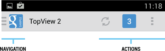
Navigation Drawers and Action Bars
When the user expands the navigation drawer, the task focus switches to selecting an item from the drawer. Because the drawer does not overlay the action bar, users may not realize that the items in the action bar do not pertain to the navigation drawer.
当用户展开抽屉导航时,当前的任务就切换为从当前的抽屉导航中选择一个Item。因为,抽屉导航没有覆盖掉actionBar,用户有可能没有意识到在actionBar中的Item是并不属于抽屉导航的(即是用户会觉得actionBar的Item是属于抽屉导航的)。
To reduce confusion, adjust the content of the action bar to the following, once the drawer is fully expanded:
- App icon
- App name
- Remove actions from the action bar that are contextual to the underlying view (such as Create new, Refresh). You may retain actions with global scope, such as “Search”.
- Overflow menu with expected navigation targets, such as Settings and Help.
为了消除用户产生的困惑,当抽屉导航完全展开时,将actionBar的内容进行调整:
.App图标
.App名称
.将表示左边View内容的ACTION Item名称移除。你可以保留全局的action Item名称,比如“搜索”
.将Overflow menu中的Item,修改为Settings,Help。
具体如下图:
Clean up the action bar when the drawer is fully expanded. Remove actions that are not needed and display your app's name in the title area.
Actions
Keep actions on the right side of the action bar and in the overflow
Don’t place actions in the navigation drawer. Actions belong in the action bar, and the user expects to see them there. Keep in mind that not all applications use the navigation drawer pattern. It may be tempting to expose all your app’s capabilities in a single place, but keep the bigger picture in mind. Place your actions where all apps display them.
别把Action Item也放在抽屉导航中。Action Item是属于ActionBar的,用户期望在ActionBar中看到它们。然后,注意,并不是所有应用都使用抽屉导航模式。虽然,应用的所有功能入口放在一个地方(抽屉导航)是一个诱人的做法,但是,你要从整体来考虑,把Action Item放在所有App都放的地方(即是ActionBar)。
Keep Help and Settings in the overflow.
This also applies to common navigation targets, such as access to Help or the app’s Settings. As per style guide convention Help and Settings are always located in the action overflow.
同样,对于其它通用的导航Item,比如App的Help和Settings的入口Item,它们要放在ActionBar的OverFlow menu中,不要将它们都放在抽屉导航中。
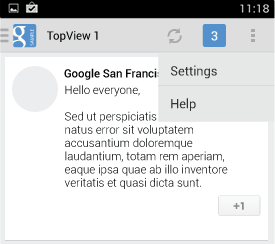
Contextual action bars
Sometimes the user will be in a state where a contextual action bar (CAB) appears instead of the app’s action bar. This typically happens when the user selects text or selects multiple items after a press-and-hold gesture. While the CAB is visible, you should still allow the user to open the navigation drawer using an edge swipe. However, replace the CAB with the standard action bar while the navigation drawer is open. When the user dismisses the drawer, re-display the CAB.
有时候,ActionBar上显示的是当前界面状态的数据,这时显示的是具有上下文信息的ActionBar(CAB)。比如下图,TopView2的界面的某个区域被选中时,ActionBar就显示为CAB,左边有勾选图标和表示勾选的文字信息。
这种场景通常发生在用户选中界面的某个文字或者选中界面的几个Item,然后松开,这时头部的ActionBar就变换为CAB。
当CAB是可见的时候,这时,你要允许用户通过左侧的滑动来打开抽屉导航(虽然这时你不能让用户通过点击ActionBar的左边图标来唤出抽屉导航)。当抽屉导航打开的时候,使用标准的ActionBar来替换掉CAB,而当用户关闭抽屉导航的时候,重新打开CAB。
Hide contextual action bars while the drawer is visible.
If the user navigates away from a view with selected content, deselect the content before navigating to the new view.
Interaction Details
Introduce the user to the drawer at first use
Upon first launch of your app, introduce the user to the navigation drawer by automatically opening it. This ensures that users know about the navigation drawer and prompts them to learn about the structure of your app by exploring its content. Continue showing the drawer upon subsequent launches until the user actively expands the navigation drawer manually. Once you know that the user understands how to open the drawer, launch the app with the navigation drawer closed.
在首次启动你的app的时,将你的抽屉导航打开,通过这个方式让用户知道你的app有抽屉导航。这可以保证,用户知道抽屉导航的存在,并且可以鼓励用户浏览抽屉导航的内容,从而让用户知道你的app架构和内容。
在app接下来的几次启动中,持续打开抽屉导航,直到用户自己手动打开抽屉导航(这说明用户知道怎么打开抽屉导航了)。一旦用户知道如何打开抽屉导航了,那么,下次启动app的时候,就不用打开抽屉导航。
At first use, show the navigation drawer automatically to help the user learn the functionality and structure of your app.
Give the user a quick peek
If the user touches the very left edge of the screen (within 20 dp from the left), have the drawer peek out as soon as the finger makes contact with the display. This promotes accidental discovery and provides richer feedback.
当用户触摸屏幕左边时,触摸位置距离屏幕左边20dp,这时让抽屉导航往右边移动一点。这会鼓励用户进行更多的尝试,并且可以提供更好的体验。
The navigation drawer peeks out when the user touches the very left edge of the screen.
Highlights
When you open the navigation drawer from a screen that is represented inside the drawer, highlight its entry in the drawer. Vice versa, if you open the drawer from a screen that is not listed in the drawer, none of the items of the drawer should be highlighted.
高亮
当你打开抽屉导航时,所在的界面对应抽屉导航中的某个Item,那么就要高亮该对应的Item。与之相反,如果所在的界面并没有对应抽屉导航中的某个Item,那么,抽屉导航中就应该没有Item会被高亮。
Impact of Drawer on Overall App Navigation
The navigation drawer is an alternative to other top-level navigation patterns. To make apps with navigation drawers work consistently with apps that use a tab or spinner pattern, remember that all navigation requirements for system Back and Up apply.
抽屉导航是其它顶层导航模式的替代。要让app中,抽屉导航模式和tab或者下拉导航模式良好的配合,共存,你要记住的是,在所有的导航中都要处理好系统的Back和Up。
Pay special attention to the following situations:
对以下几种情况要注意:
System Back at the top level of the app
Touching System Back at the app’s top level never opens the navigation drawer. Instead, System Back behaves according to the navigation rules for the top level, such as navigating to the previous app within the task or navigating to the Home screen.
如下图,在顶层页面,按下系统的返回键,不会打开抽屉导航。
相反,在顶层页面,按下系统的返回键时,根据导航的规则,它会返回到上一个页面或者直接返回到Home页面。
System Back does not show the drawer, but behaves according to the navigation rules for the top level.
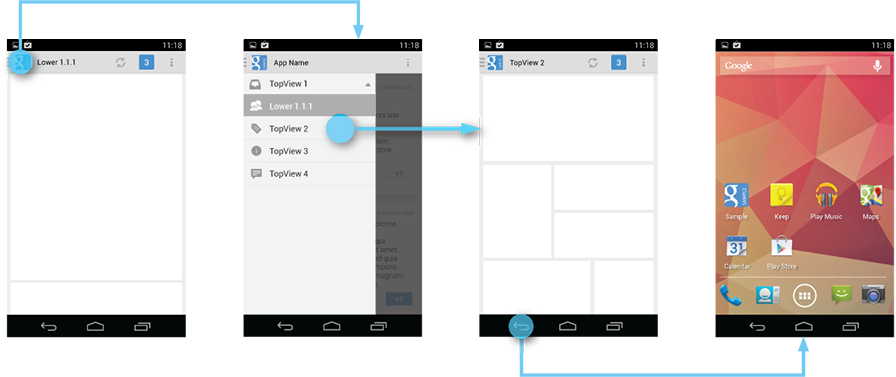
System Back after cross navigation to lower hierarchy levels
If the user navigates to a lower hierarchy screen from the navigation drawer and the screen has a direct parent, then the Back stack is reset and Back points to the target screen’s parent. This Back behavior is the same as when a user navigates into an app from a notification.
如果用户从抽屉导航中直接进入某个页面,该页面存在上一级,那么,按下系统返回键时,要返回到该页面的上一级。
比如下图,在抽屉导航中点击Lower1.1.1,进入Lower1.1.1页面;按下返回键,返回到界面Lower1.1.
Reset the Back stack if your lower-level navigation target has direct parents.
Style
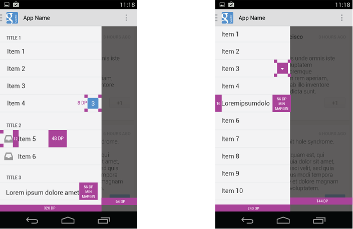
The width of the navigation drawer depends on the content you want to display, but should be between a minimum of 240 dp and a maximum of 320 dp. The height of the individual line items should not fall below 48 dp. See the layout guideline below for recommendations on padding and spacing.
抽屉导航的内容宽度(240dp 到320dp);每行Item的高度不能低于48dp。间隔的大小参照下图。
Layout guidelines for the navigation drawer.
Pick the drawer background to best match your app’s theme. See the following examples for a Holo light and a Holo dark themed drawer.
要为你的抽屉导航选择与你应用主题相适配的背景,比如下图。
Navigation drawers in Holo light and Holo dark themed apps.
Navigation Drawer Checklist
Even if you already support a similar navigation drawer, update your drawer to this pattern to make sure that:
- The action bar remains in place and adjusts its content.
- Your navigation drawer overlays the content.
- Any view represented in the drawer has a navigation drawer indicator in its action bar that allows the drawer to be opened by touching the app icon.
- You take advantage of the new visual drawer transition.
- Any view not represented in the drawer maintains the traditional Up indicator in its action bar.
- You stay in sync with the general navigation patterns for Up and Back.
使用抽屉导航时要支持的内容
可能你的应用已经使用了一个抽屉导航,确保你使用的抽屉导航模式,达到以下要求:
1.action bar要在它该在的地方,并且要根据情况调整action bar的内容。
2.抽屉导航打开时覆盖在内容区域上方。
3.在action bar 中有一个抽屉导航标识图标,点击这个图标,会触发抽屉导航打开。
4.You take advantage of the new visual drawer transition
5.当内容区域的内容,不与抽屉导航中的某个Item相关,那么,此时在Action bar中要有返回的标识。
6.在使用抽屉导航的时候,你要同时兼顾系统的Up和Back。