
import numpy as np # linear algebra
import pandas as pd # data processing, CSV file I/O (e.g. pd.read_csv)

# plotly
import chart_studio.plotly as py
from plotly.offline import init_notebook_mode, iplot
init_notebook_mode(connected=True)
import plotly.graph_objs as go
import seaborn as sns
# word cloud library
from wordcloud import WordCloud

# matplotlib
import matplotlib.pyplot as plt
# Input data files are available in the "../input/" directory.
# For example, running this (by clicking run or pressing Shift+Enter) will list the files in the input directory
dataframe = pd.read_csv("F:\kaggleDataSet\healthcare-data\test_2v.csv")
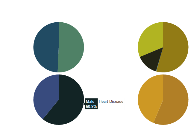
import chart_studio.plotly as py
from plotly.graph_objs import *

df_heart_disease = dataframe[dataframe.heart_disease== 1]
labels = df_heart_disease.gender
pie1_list=df_heart_disease.heart_disease

df_hypertension= dataframe[dataframe.hypertension == 1]
labels1 = df_hypertension.gender
pie1_list1=df_hypertension.hypertension


labels2 = dataframe.Residence_type
pie1_list2 = dataframe.heart_disease

labels3 = dataframe.work_type
pie1_list3 = dataframe.heart_disease


fig = {
    'data': [
        {
            'labels': labels,
            'values': pie1_list,
            'type': 'pie',
            'name': 'Heart Disease',
            'marker': {'colors': ['rgb(56, 75, 126)',
                                  'rgb(18, 36, 37)',
                                  'rgb(34, 53, 101)',
                                  'rgb(36, 55, 57)',
                                  'rgb(6, 4, 4)']},
            'domain': {'x': [0, .48],
                       'y': [0, .49]},
            'hoverinfo':'label+percent+name',
            'textinfo':'none'
        },
        {
            'labels': labels1,
            'values': pie1_list1,
            'marker': {'colors': ['rgb(177, 127, 38)',
                                  'rgb(205, 152, 36)',
                                  'rgb(99, 79, 37)',
                                  'rgb(129, 180, 179)',
                                  'rgb(124, 103, 37)']},
            'type': 'pie',
            'name': 'Hypertension',
            'domain': {'x': [.52, 1],
                       'y': [0, .49]},
            'hoverinfo':'label+percent+name',
            'textinfo':'none'

        },
        {
            'labels': labels2,
            'values': pie1_list2,
            'marker': {'colors': ['rgb(33, 75, 99)',
                                  'rgb(79, 129, 102)',
                                  'rgb(151, 179, 100)',
                                  'rgb(175, 49, 35)',
                                  'rgb(36, 73, 147)']},
            'type': 'pie',
            'name': 'Residence Type',
            'domain': {'x': [0, .48],
                       'y': [.51, 1]},
            'hoverinfo':'label+percent+name',
            'textinfo':'none'
        },
        {
            'labels': labels3,
            'values': pie1_list3,
            'marker': {'colors': ['rgb(146, 123, 21)',
                                  'rgb(177, 180, 34)',
                                  'rgb(206, 206, 40)',
                                  'rgb(175, 51, 21)',
                                  'rgb(35, 36, 21)']},
            'type': 'pie',
            'name':'Work Type',
            'domain': {'x': [.52, 1],
                       'y': [.51, 1]},
            'hoverinfo':'label+percent+name',
            'textinfo':'none'
        }

    ],
    'layout': {'title': '',
               'showlegend': False}
}

iplot(fig)
import chart_studio.plotly as py
import plotly.graph_objs as go

# Create random data with numpy
import numpy as np

df_250 = dataframe.iloc[:250,:]


random_x = df_250.index
random_y0 =  df_250.avg_glucose_level
random_y1 =  df_250.bmi
random_y2 =  df_250.age

# Create traces
trace0 = go.Scatter(
    x = random_x,
    y = random_y0,
    mode = 'markers',
    name = 'Avg. Glucose Level'
)
trace1 = go.Scatter(
    x = random_x,
    y = random_y1,
    mode = 'lines+markers',
    name = 'BMI'
)
trace2 = go.Scatter(
    x = random_x,
    y = random_y2,
    mode = 'lines',
    name = 'Age'
)

data = [trace0, trace1, trace2]
iplot(data, filename='scatter-mode')

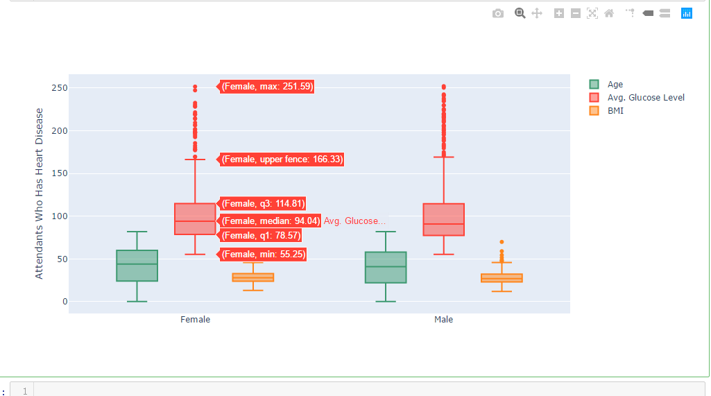
import chart_studio.plotly as py
import plotly.graph_objs as go
df_heart_disease = dataframe[dataframe.heart_disease==1]
labels = df_heart_disease.gender
x = labels

trace0 = go.Box(
    y=dataframe.age,
    x=x,
    name='Age',
    marker=dict(
        color='#3D9970'
    )
)
trace1 = go.Box(
    y=dataframe.avg_glucose_level,
    x=x,
    name='Avg. Glucose Level',
    marker=dict(
        color='#FF4136'
    )
)
trace2 = go.Box(
    y=dataframe.bmi,
    x=x,
    name='BMI',
    marker=dict(
        color='#FF851B'
    )
)
data = [trace0, trace1, trace2]
layout = go.Layout(
    yaxis=dict(
        title='Attendants Who Has Heart Disease',
        zeroline=False
    ),
    boxmode='group'
)
fig = go.Figure(data=data, layout=layout)
iplot(fig)
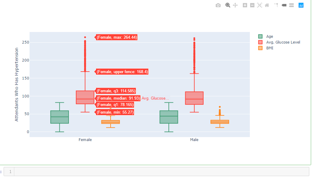
import chart_studio.plotly as py
import plotly.graph_objs as go
df_hypertension= dataframe[dataframe.hypertension == 1]
labels1 = df_hypertension.gender
x = labels1

trace0 = go.Box(
    y=dataframe.age,
    x=x,
    name='Age',
    marker=dict(
        color='#3D9970'
    )
)
trace1 = go.Box(
    y=dataframe.avg_glucose_level,
    x=x,
    name='Avg. Glucose Level',
    marker=dict(
        color='#FF4136'
    )
)
trace2 = go.Box(
    y=dataframe.bmi,
    x=x,
    name='BMI',
    marker=dict(
        color='#FF851B'
    )
)
data = [trace0, trace1, trace2]
layout = go.Layout(
    yaxis=dict(
        title='Attendants Who Has Hypertension',
        zeroline=False
    ),
    boxmode='group'
)
fig = go.Figure(data=data, layout=layout)
iplot(fig)
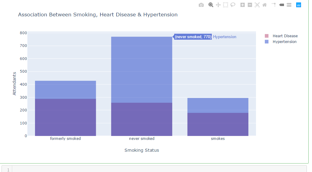
df_heart_disease_1 = dataframe.smoking_status [dataframe.heart_disease == 1  ]
df_hypertension_1  = dataframe.smoking_status [dataframe.hypertension  == 1   ]
trace1 = go.Histogram(
    x=df_heart_disease_1,
    opacity=0.75,
    name = "Heart Disease",
    marker=dict(color='rgba(171, 50, 96, 0.6)'))
trace2 = go.Histogram(
    x=df_hypertension_1,
    opacity=0.75,
    name = "Hypertension",
    marker=dict(color='rgba(12, 50, 196, 0.6)'))


data = [trace1, trace2]
layout = go.Layout(barmode='overlay',
                   title=' Association Between Smoking, Heart Disease & Hypertension',
                   xaxis=dict(title='Smoking Status'),
                   yaxis=dict( title='Attendants'),
)
fig = go.Figure(data=data, layout=layout)
iplot(fig)
df_heart_disease_1 = dataframe.work_type [dataframe.heart_disease    == 1  ]
df_hypertension_1 = dataframe.work_type [dataframe.hypertension    == 1   ]

trace1 = go.Histogram(
    x=df_heart_disease_1,
    opacity=0.75,
    name = "Heart Disease",
    marker=dict(color='rgba(171, 50, 96, 0.6)'))
trace2 = go.Histogram(
    x=df_hypertension_1,
    opacity=0.75,
    name = "Hypertension",
    marker=dict(color='rgba(12, 50, 196, 0.6)'))

data = [trace1, trace2]
layout = go.Layout(barmode='overlay',
                   title=' Association Between Work Type, Heart Disease & Hypertension',
                   xaxis=dict(title=''),
                   yaxis=dict( title='Attendants'),
)
fig = go.Figure(data=data, layout=layout)
iplot(fig)
