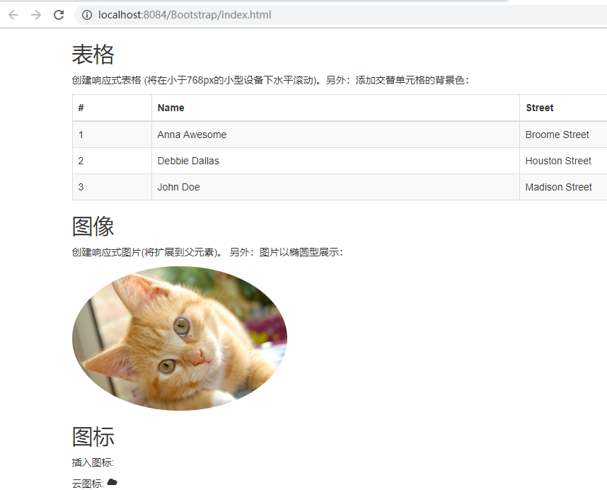
<!DOCTYPE html>
<html>
  <head>
    <meta charset="utf-8">
    <title>Bootstrap 实例</title>
    <!-- 包含头部信息用于适应不同设备 -->
    <meta name="viewport" content="width=device-width, initial-scale=1">
    <!-- 包含 bootstrap 样式表 -->
    <link rel="stylesheet" href="https://apps.bdimg.com/libs/bootstrap/3.2.0/css/bootstrap.min.css">
  </head>

  <body>
    <div class="container">
      <h2>表格</h2>
      <p>创建响应式表格 (将在小于768px的小型设备下水平滚动)。另外:添加交替单元格的背景色:</p>
      <div class="table-responsive">
       <table class="table table-striped table-bordered">
         <thead>
           <tr>
             <th>#</th>
             <th>Name</th>
             <th>Street</th>
           </tr>
         </thead>
         <tbody>
           <tr>
             <td>1</td>
             <td>Anna Awesome</td>
             <td>Broome Street</td>
           </tr>
           <tr>
             <td>2</td>
             <td>Debbie Dallas</td>
             <td>Houston Street</td>
           </tr>
           <tr>
             <td>3</td>
             <td>John Doe</td>
             <td>Madison Street</td>
           </tr>
         </tbody>
       </table>
      </div>

      <h2>图像</h2>
      <p>创建响应式图片(将扩展到父元素)。 另外:图片以椭圆型展示:</p>
      <img src="tu/cat.jpg" class="img-responsive img-circle" alt="Cinque Terre" width="304" height="236">

      <h2>图标</h2>
      <p>插入图标:</p>
      <p>云图标: <span class="glyphicon glyphicon-cloud"></span></p>
      <p>信件图标: <span class="glyphicon glyphicon-envelope"></span></p>
      <p>搜索图标: <span class="glyphicon glyphicon-search"></span></p>
      <p>打印图标: <span class="glyphicon glyphicon-print"></span></p>
      <p>下载图标:<span class="glyphicon glyphicon-download"></span></p>
    </div>

    <!-- JavaScript 放置在文档最后面可以使页面加载速度更快 -->
    <!-- 可选: 包含 jQuery 库 -->
    <script src="https://cdn.staticfile.org/jquery/2.1.1/jquery.min.js"></script>
    <!-- 可选: 合并了 Bootstrap JavaScript 插件 -->
    <script src="https://apps.bdimg.com/libs/bootstrap/3.2.0/js/bootstrap.min.js"></script>
  </body>

</html>
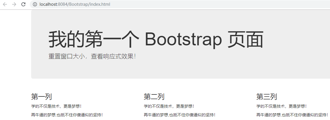
<!DOCTYPE html>
<html>
<head>
  <title>Bootstrap 实例</title>
  <meta charset="utf-8">
  <meta name="viewport" content="width=device-width, initial-scale=1">
  <link rel="stylesheet" href="https://cdn.staticfile.org/twitter-bootstrap/3.3.7/css/bootstrap.min.css">
  <script src="https://cdn.staticfile.org/jquery/2.1.1/jquery.min.js"></script>
  <script src="https://cdn.staticfile.org/twitter-bootstrap/3.3.7/js/bootstrap.min.js"></script>
</head>
<body>

<div class="container">
  <div class="jumbotron">
    <h1>我的第一个 Bootstrap 页面</h1>
    <p>重置窗口大小,查看响应式效果!</p>
  </div>
  <div class="row">
    <div class="col-sm-4">
      <h3>第一列</h3>
      <p>学的不仅是技术,更是梦想!</p>
      <p>再牛逼的梦想,也抵不住你傻逼似的坚持!</p>
    </div>
    <div class="col-sm-4">
      <h3>第二列</h3>
      <p>学的不仅是技术,更是梦想!</p>
      <p>再牛逼的梦想,也抵不住你傻逼似的坚持!</p>
    </div>
    <div class="col-sm-4">
      <h3>第三列</h3>
      <p>学的不仅是技术,更是梦想!</p>
      <p>再牛逼的梦想,也抵不住你傻逼似的坚持!</p>
    </div>
  </div>
</div>

</body>
</html>