# 饼图的绘制
# 导入第三方模块
import matplotlib
import matplotlib.pyplot as plt
plt.rcParams['font.sans-serif']=['Simhei']
plt.rcParams['axes.unicode_minus']=False
ziti = matplotlib.font_manager.FontProperties(fname='C:WindowsFontssimsun.ttc')
# 构造数据
edu = [0.2515,0.3724,0.3336,0.0368,0.0057]
labels = ['中专','大专','本科','硕士','其他']
# 绘制饼图
plt.pie(x = edu, # 绘图数据
labels=labels, # 添加教育水平标签
autopct='%.1f%%' # 设置百分比的格式,这里保留一位小数
)
# 添加图标题
plt.title('失信用户的教育水平分布')
# 显示图形
plt.show()
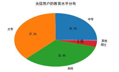
# 构造数据
edu = [0.2515,0.3724,0.3336,0.0368,0.0057]
labels = ['中专','大专','本科','硕士','其他']
# 添加修饰的饼图
explode = [0,0.1,0,0,0] # 生成数据,用于突出显示大专学历人群
colors=['#9999ff','#ff9999','#7777aa','#2442aa','#dd5555'] # 自定义颜色
# 中文乱码和坐标轴负号的处理
plt.rcParams['font.sans-serif'] = ['Microsoft YaHei']
plt.rcParams['axes.unicode_minus'] = False
# 将横、纵坐标轴标准化处理,确保饼图是一个正圆,否则为椭圆
plt.axes(aspect='equal')
# 绘制饼图
plt.pie(x = edu, # 绘图数据
explode=explode, # 突出显示大专人群
labels=labels, # 添加教育水平标签
colors=colors, # 设置饼图的自定义填充色
autopct='%.1f%%', # 设置百分比的格式,这里保留一位小数
pctdistance=0.8, # 设置百分比标签与圆心的距离
labeldistance = 1.1, # 设置教育水平标签与圆心的距离
startangle = 180, # 设置饼图的初始角度
radius = 1.2, # 设置饼图的半径
counterclock = False, # 是否逆时针,这里设置为顺时针方向
wedgeprops = {'linewidth': 1.5, 'edgecolor':'green'},# 设置饼图内外边界的属性值
textprops = {'fontsize':10, 'color':'black'}, # 设置文本标签的属性值
)
# 添加图标题
plt.title('失信用户的受教育水平分布')
# 显示图形
plt.show()
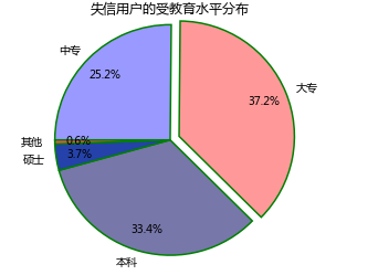
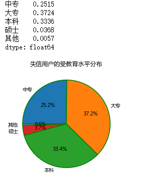
# 导入第三方模块
import pandas as pd
import matplotlib.pyplot as plt
# 构建序列
data1 = pd.Series({'中专':0.2515,'大专':0.3724,'本科':0.3336,'硕士':0.0368,'其他':0.0057})
print(data1)
data1.name = ''
# 控制饼图为正圆
plt.axes(aspect = 'equal')
# plot方法对序列进行绘图
data1.plot(kind = 'pie', # 选择图形类型
autopct='%.1f%%', # 饼图中添加数值标签
radius = 1, # 设置饼图的半径
startangle = 180, # 设置饼图的初始角度
counterclock = False, # 将饼图的顺序设置为顺时针方向
title = '失信用户的受教育水平分布', # 为饼图添加标题
wedgeprops = {'linewidth': 1.5, 'edgecolor':'green'}, # 设置饼图内外边界的属性值
textprops = {'fontsize':10, 'color':'black'} # 设置文本标签的属性值
)
# 显示图形
plt.show()
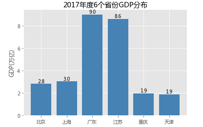
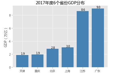
# 条形图的绘制--垂直条形图
# 读入数据
GDP = pd.read_excel(r'F:\python_Data_analysis_and_mining\06\Province GDP 2017.xlsx')
# 设置绘图风格(不妨使用R语言中的ggplot2风格)
plt.style.use('ggplot')
# 绘制条形图
plt.bar(left = range(GDP.shape[0]), # 指定条形图x轴的刻度值
height = GDP.GDP, # 指定条形图y轴的数值
tick_label = GDP.Province, # 指定条形图x轴的刻度标签
color = 'steelblue', # 指定条形图的填充色
)
# 添加y轴的标签
plt.ylabel('GDP(万亿)')
# 添加条形图的标题
plt.title('2017年度6个省份GDP分布')
# 为每个条形图添加数值标签
for x,y in enumerate(GDP.GDP):
plt.text(x,y+0.1,'%s' %round(y,1),ha='center')
# 显示图形
plt.show()
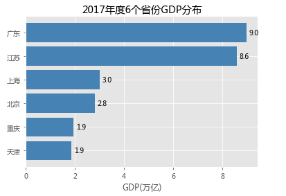
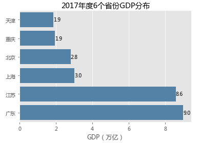
# 条形图的绘制--水平条形图
# 对读入的数据作升序排序
GDP.sort_values(by = 'GDP', inplace = True)
# 绘制条形图
plt.barh(bottom = range(GDP.shape[0]), # 指定条形图y轴的刻度值
width = GDP.GDP, # 指定条形图x轴的数值
tick_label = GDP.Province, # 指定条形图y轴的刻度标签
color = 'steelblue', # 指定条形图的填充色
)
# 添加x轴的标签
plt.xlabel('GDP(万亿)')
# 添加条形图的标题
plt.title('2017年度6个省份GDP分布')
# 为每个条形图添加数值标签
for y,x in enumerate(GDP.GDP):
plt.text(x+0.1,y,'%s' %round(x,1),va='center')
# 显示图形
plt.show()
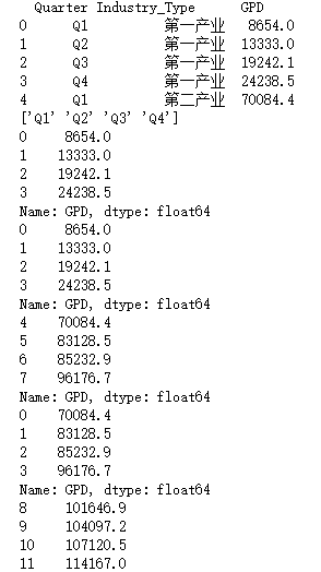
# 条形图的绘制--堆叠条形图
# 读入数据
Industry_GDP = pd.read_excel(r'F:\python_Data_analysis_and_mining\06\Industry_GDP.xlsx')
print(Industry_GDP.head())
# 取出四个不同的季度标签,用作堆叠条形图x轴的刻度标签
Quarters = Industry_GDP.Quarter.unique()
print(Quarters)
# 取出第一产业的四季度值
Industry1 = Industry_GDP.GPD[Industry_GDP.Industry_Type == '第一产业']
print(Industry1)
# 重新设置行索引
Industry1.index = range(len(Quarters))
print(Industry1)
# 取出第二产业的四季度值
Industry2 = Industry_GDP.GPD[Industry_GDP.Industry_Type == '第二产业']
print(Industry2)
# 重新设置行索引
Industry2.index = range(len(Quarters))
print(Industry2)
# 取出第三产业的四季度值
Industry3 = Industry_GDP.GPD[Industry_GDP.Industry_Type == '第三产业']
print(Industry3)
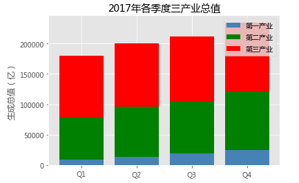
# 绘制堆叠条形图
# 各季度下第一产业的条形图
plt.bar(left = range(len(Quarters)), height=Industry1, color = 'steelblue', label = '第一产业', tick_label = Quarters)
# 各季度下第二产业的条形图
plt.bar(left = range(len(Quarters)), height=Industry2, bottom = Industry1, color = 'green', label = '第二产业')
# 各季度下第三产业的条形图
plt.bar(left = range(len(Quarters)), height=Industry3, bottom = Industry1 + Industry2, color = 'red', label = '第三产业')
# 添加y轴标签
plt.ylabel('生成总值(亿)')
# 添加图形标题
plt.title('2017年各季度三产业总值')
# 显示各产业的图例
plt.legend()
# 显示图形
plt.show()
# Pandas模块之垂直或水平条形图
# 绘图(此时的数据集在前文已经按各省GDP做过升序处理)
GDP.GDP.plot(kind = 'bar', width = 0.8, rot = 0, color = 'steelblue', title = '2017年度6个省份GDP分布')
# 添加y轴标签
plt.ylabel('GDP(万亿)')
# 添加x轴刻度标签
plt.xticks(range(len(GDP.Province)), #指定刻度标签的位置
GDP.Province # 指出具体的刻度标签值
)
# 为每个条形图添加数值标签
for x,y in enumerate(GDP.GDP):
plt.text(x-0.1,y+0.2,'%s' %round(y,1),va='center')
# 显示图形
plt.show()
# 条形图的绘制--水平交错条形图
# 导入第三方模块
import numpy as np
# 读入数据
HuRun = pd.read_excel(r'F:\python_Data_analysis_and_mining\06\HuRun.xlsx')
# 取出城市名称
Cities = HuRun.City.unique()
# 取出2016年各城市亿万资产家庭数
Counts2016 = HuRun.Counts[HuRun.Year == 2016]
# 取出2017年各城市亿万资产家庭数
Counts2017 = HuRun.Counts[HuRun.Year == 2017]
# 绘制水平交错条形图
bar_width = 0.4
plt.bar(left = np.arange(len(Cities)), height = Counts2016, label = '2016', color = 'steelblue', width = bar_width)
plt.bar(left = np.arange(len(Cities))+bar_width, height = Counts2017, label = '2017', color = 'indianred', width = bar_width)
# 添加刻度标签(向右偏移0.225)
plt.xticks(np.arange(5)+0.2, Cities)
# 添加y轴标签
plt.ylabel('亿万资产家庭数')
# 添加图形标题
plt.title('近两年5个城市亿万资产家庭数比较')
# 添加图例
plt.legend()
# 显示图形
plt.show()
# Pandas模块之水平交错条形图
HuRun_reshape = HuRun.pivot_table(index = 'City', columns='Year', values='Counts').reset_index()
# 对数据集降序排序
HuRun_reshape.sort_values(by = 2016, ascending = False, inplace = True)
HuRun_reshape.plot(x = 'City', y = [2016,2017], kind = 'bar', color = ['steelblue', 'indianred'],
rot = 0, # 用于旋转x轴刻度标签的角度,0表示水平显示刻度标签
width = 0.8, title = '近两年5个城市亿万资产家庭数比较')
# 添加y轴标签
plt.ylabel('亿万资产家庭数')
plt.xlabel('')
plt.show()
# seaborn模块之垂直或水平条形图
# 导入第三方模块
import seaborn as sns
sns.barplot(y = 'Province', # 指定条形图x轴的数据
x = 'GDP', # 指定条形图y轴的数据
data = GDP, # 指定需要绘图的数据集
color = 'steelblue', # 指定条形图的填充色
orient = 'horizontal' # 将条形图水平显示
)
# 重新设置x轴和y轴的标签
plt.xlabel('GDP(万亿)')
plt.ylabel('')
# 添加图形的标题
plt.title('2017年度6个省份GDP分布')
# 为每个条形图添加数值标签
for y,x in enumerate(GDP.GDP):
plt.text(x,y,'%s' %round(x,1),va='center')
# 显示图形
plt.show()
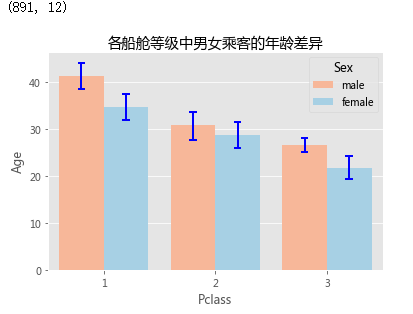
# 读入数据
Titanic = pd.read_csv(r'F:\python_Data_analysis_and_mining\06\titanic_train.csv')
print(Titanic.shape)
# 绘制水平交错条形图
sns.barplot(x = 'Pclass', # 指定x轴数据
y = 'Age', # 指定y轴数据
hue = 'Sex', # 指定分组数据
data = Titanic, # 指定绘图数据集
palette = 'RdBu', # 指定男女性别的不同颜色
errcolor = 'blue', # 指定误差棒的颜色
errwidth=2, # 指定误差棒的线宽
saturation = 1, # 指定颜色的透明度,这里设置为无透明度
capsize = 0.05 # 指定误差棒两端线条的宽度
)
# 添加图形标题
plt.title('各船舱等级中男女乘客的年龄差异')
# 显示图形
plt.show()
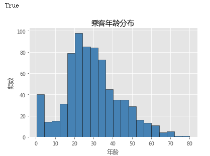
# 读入数据
Titanic = pd.read_csv(r'F:\python_Data_analysis_and_mining\06\titanic_train.csv')
# matplotlib模块绘制直方图
# 检查年龄是否有缺失
print(any(Titanic.Age.isnull()))
# 不妨删除含有缺失年龄的观察
Titanic.dropna(subset=['Age'], inplace=True)
# 绘制直方图
plt.hist(x = Titanic.Age, # 指定绘图数据
bins = 20, # 指定直方图中条块的个数
color = 'steelblue', # 指定直方图的填充色
edgecolor = 'black' # 指定直方图的边框色
)
# 添加x轴和y轴标签
plt.xlabel('年龄')
plt.ylabel('频数')
# 添加标题
plt.title('乘客年龄分布')
# 显示图形
plt.show()
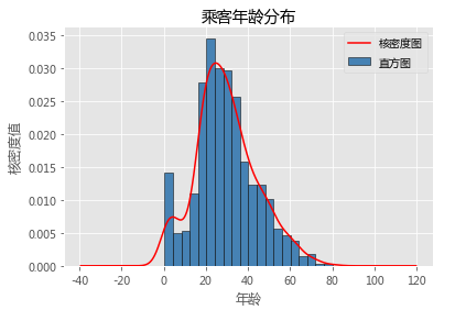
# Pandas模块绘制直方图和核密度图
# 绘制直方图
Titanic.Age.plot(kind = 'hist', bins = 20, color = 'steelblue', edgecolor = 'black', normed = True, label = '直方图')
# 绘制核密度图
Titanic.Age.plot(kind = 'kde', color = 'red', label = '核密度图')
# 添加x轴和y轴标签
plt.xlabel('年龄')
plt.ylabel('核密度值')
# 添加标题
plt.title('乘客年龄分布')
# 显示图例
plt.legend()
# 显示图形
plt.show()
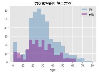
# seaborn模块绘制分组的直方图和核密度图
# 取出男性年龄
Age_Male = Titanic.Age[Titanic.Sex == 'male']
# 取出女性年龄
Age_Female = Titanic.Age[Titanic.Sex == 'female']
# 绘制男女乘客年龄的直方图
sns.distplot(Age_Male, bins = 20, kde = False, hist_kws = {'color':'steelblue'}, label = '男性')
# 绘制女性年龄的直方图
sns.distplot(Age_Female, bins = 20, kde = False, hist_kws = {'color':'purple'}, label = '女性')
plt.title('男女乘客的年龄直方图')
# 显示图例
plt.legend()
# 显示图形
plt.show()
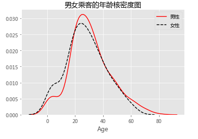
# 绘制男女乘客年龄的核密度图
sns.distplot(Age_Male, hist = False, kde_kws = {'color':'red', 'linestyle':'-'},
norm_hist = True, label = '男性')
# 绘制女性年龄的核密度图
sns.distplot(Age_Female, hist = False, kde_kws = {'color':'black', 'linestyle':'--'},
norm_hist = True, label = '女性')
plt.title('男女乘客的年龄核密度图')
# 显示图例
plt.legend()
# 显示图形
plt.show()
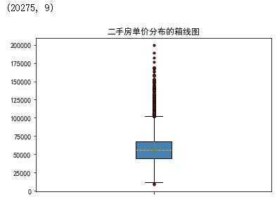
import pandas as pd
import matplotlib.pyplot as plt
# 读取数据
Sec_Buildings = pd.read_excel(r'F:\python_Data_analysis_and_mining\06\sec_buildings.xlsx')
print(Sec_Buildings.shape)
# 绘制箱线图
plt.boxplot(x = Sec_Buildings.price_unit, # 指定绘图数据
patch_artist=True, # 要求用自定义颜色填充盒形图,默认白色填充
showmeans=True, # 以点的形式显示均值
boxprops = {'color':'black','facecolor':'steelblue'}, # 设置箱体属性,如边框色和填充色
# 设置异常点属性,如点的形状、填充色和点的大小
flierprops = {'marker':'o','markerfacecolor':'red', 'markersize':3},
# 设置均值点的属性,如点的形状、填充色和点的大小
meanprops = {'marker':'D','markerfacecolor':'indianred', 'markersize':4},
# 设置中位数线的属性,如线的类型和颜色
medianprops = {'linestyle':'--','color':'orange'},
labels = [''] # 删除x轴的刻度标签,否则图形显示刻度标签为1
)
# 添加图形标题
plt.title('二手房单价分布的箱线图')
# 显示图形
plt.show()
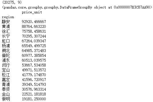
import numpy as np
import pandas as pd
import matplotlib.pyplot as plt
# 读取数据
Sec_Buildings = pd.read_excel(r'F:\python_Data_analysis_and_mining\06\sec_buildings.xlsx')
print(Sec_Buildings.shape)
# 二手房在各行政区域的平均单价
group_region = Sec_Buildings.groupby('region')
print(group_region)
avg_price = group_region.aggregate({'price_unit':np.mean}).sort_values('price_unit', ascending = False)
print(avg_price)
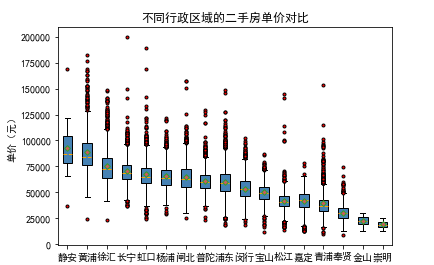
# 通过循环,将不同行政区域的二手房存储到列表中
region_price = []
for region in avg_price.index:
region_price.append(Sec_Buildings.price_unit[Sec_Buildings.region == region])
# print(region_price)
# 绘制分组箱线图
plt.boxplot(x = region_price,
patch_artist=True,
labels = avg_price.index, # 添加x轴的刻度标签
showmeans=True,
boxprops = {'color':'black', 'facecolor':'steelblue'},
flierprops = {'marker':'o','markerfacecolor':'red', 'markersize':3},
meanprops = {'marker':'D','markerfacecolor':'indianred', 'markersize':4},
medianprops = {'linestyle':'--','color':'orange'}
)
# 添加y轴标签
plt.ylabel('单价(元)')
# 添加标题
plt.title('不同行政区域的二手房单价对比')
# 显示图形
plt.show()
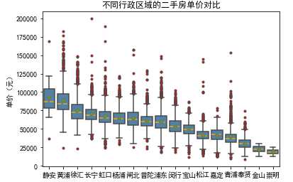
import seaborn as sns
# 绘制分组箱线图
sns.boxplot(x = 'region', y = 'price_unit', data = Sec_Buildings,
order = avg_price.index, showmeans=True,color = 'steelblue',
flierprops = {'marker':'o','markerfacecolor':'red', 'markersize':3},
meanprops = {'marker':'D','markerfacecolor':'indianred', 'markersize':4},
medianprops = {'linestyle':'--','color':'orange'}
)
# 更改x轴和y轴标签
plt.xlabel('')
plt.ylabel('单价(元)')
# 添加标题
plt.title('不同行政区域的二手房单价对比')
# 显示图形
plt.show()
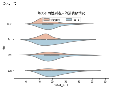
# 读取数据
tips = pd.read_csv(r'F:\python_Data_analysis_and_mining\06\tips.csv')
print(tips.shape)
# 绘制分组小提琴图
sns.violinplot(x = "total_bill", # 指定x轴的数据
y = "day", # 指定y轴的数据
hue = "sex", # 指定分组变量
data = tips, # 指定绘图的数据集
order = ['Thur','Fri','Sat','Sun'], # 指定x轴刻度标签的顺序
scale = 'count', # 以男女客户数调节小提琴图左右的宽度
split = True, # 将小提琴图从中间割裂开,形成不同的密度曲线;
palette = 'RdBu' # 指定不同性别对应的颜色(因为hue参数为设置为性别变量)
)
# 添加图形标题
plt.title('每天不同性别客户的消费额情况')
# 设置图例
plt.legend(loc = 'upper center', ncol = 2)
# 显示图形
plt.show()
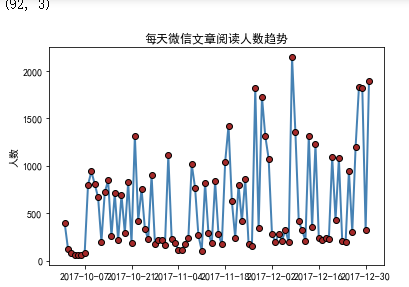
# 数据读取
wechat = pd.read_excel(r'F:\python_Data_analysis_and_mining\06\wechat.xlsx')
print(wechat.shape)
# 绘制单条折线图
plt.plot(wechat.Date, # x轴数据
wechat.Counts, # y轴数据
linestyle = '-', # 折线类型
linewidth = 2, # 折线宽度
color = 'steelblue', # 折线颜色
marker = 'o', # 折线图中添加圆点
markersize = 6, # 点的大小
markeredgecolor='black', # 点的边框色
markerfacecolor='brown') # 点的填充色
# 添加y轴标签
plt.ylabel('人数')
# 添加图形标题
plt.title('每天微信文章阅读人数趋势')
# 显示图形
plt.show()
# 绘制两条折线图
# 导入模块,用于日期刻度的修改
import matplotlib as mpl
# 绘制阅读人数折线图
plt.plot(wechat.Date, # x轴数据
wechat.Counts, # y轴数据
linestyle = '-', # 折线类型,实心线
color = 'steelblue', # 折线颜色
label = '阅读人数'
)
# 绘制阅读人次折线图
plt.plot(wechat.Date, # x轴数据
wechat.Times, # y轴数据
linestyle = '--', # 折线类型,虚线
color = 'indianred', # 折线颜色
label = '阅读人次'
)
plt.show()
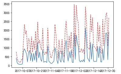
import matplotlib as mpl
# 获取图的坐标信息
ax = plt.gca()
# 设置日期的显示格式
date_format = mpl.dates.DateFormatter("%m-%d")
ax.xaxis.set_major_formatter(date_format)
# 设置x轴显示多少个日期刻度
# xlocator = mpl.ticker.LinearLocator(10)
# 设置x轴每个刻度的间隔天数
xlocator = mpl.ticker.MultipleLocator(7)
ax.xaxis.set_major_locator(xlocator)
# 为了避免x轴刻度标签的紧凑,将刻度标签旋转45度
plt.xticks(rotation=45)
# 添加y轴标签
plt.ylabel('人数')
# 添加图形标题
plt.title('每天微信文章阅读人数与人次趋势')
# 添加图例
plt.legend()
# 显示图形
plt.show()
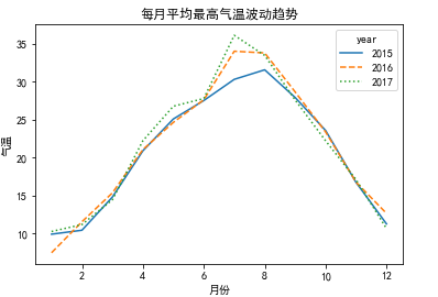
# 读取天气数据
weather = pd.read_excel(r'F:\python_Data_analysis_and_mining\06\weather.xlsx')
# 统计每月的平均最高气温
data = weather.pivot_table(index = 'month', columns='year', values='high')
# 绘制折线图
data.plot(kind = 'line',
style = ['-','--',':'] # 设置折线图的线条类型
)
# 修改x轴和y轴标签
plt.xlabel('月份')
plt.ylabel('气温')
# 添加图形标题
plt.title('每月平均最高气温波动趋势')
# 显示图形
plt.show()
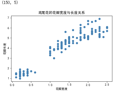
# 读入数据
iris = pd.read_csv(r'F:\python_Data_analysis_and_mining\06\iris.csv')
print(iris.shape)
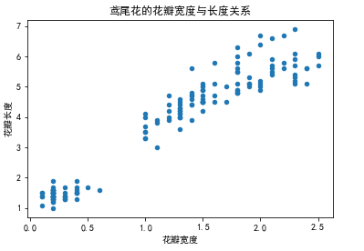
# 绘制散点图
plt.scatter(x = iris.Petal_Width, # 指定散点图的x轴数据
y = iris.Petal_Length, # 指定散点图的y轴数据
color = 'steelblue' # 指定散点图中点的颜色
)
# 添加x轴和y轴标签
plt.xlabel('花瓣宽度')
plt.ylabel('花瓣长度')
# 添加标题
plt.title('鸢尾花的花瓣宽度与长度关系')
# 显示图形
plt.show()
# Pandas模块绘制散点图
# 绘制散点图
iris.plot(x = 'Petal_Width', y = 'Petal_Length', kind = 'scatter', title = '鸢尾花的花瓣宽度与长度关系')
# 修改x轴和y轴标签
plt.xlabel('花瓣宽度')
plt.ylabel('花瓣长度')
# 显示图形
plt.show()
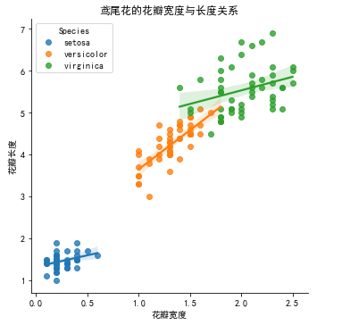
# seaborn模块绘制分组散点图
sns.lmplot(x = 'Petal_Width', # 指定x轴变量
y = 'Petal_Length', # 指定y轴变量
hue = 'Species', # 指定分组变量
data = iris, # 指定绘图数据集
legend_out = False, # 将图例呈现在图框内
truncate=True # 根据实际的数据范围,对拟合线作截断操作
)
# 修改x轴和y轴标签
plt.xlabel('花瓣宽度')
plt.ylabel('花瓣长度')
# 添加标题
plt.title('鸢尾花的花瓣宽度与长度关系')
# 显示图形
plt.show()
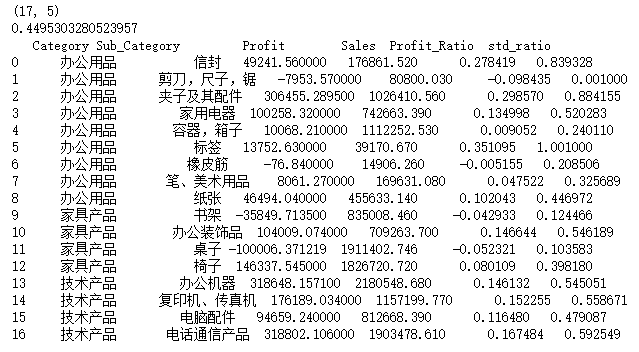
# 读取数据
Prod_Category = pd.read_excel(r'F:\python_Data_analysis_and_mining\06\SuperMarket.xlsx')
print(Prod_Category.shape)
# 将利润率标准化到[0,1]之间(因为利润率中有负数),然后加上微小的数值0.001
range_diff = Prod_Category.Profit_Ratio.max()-Prod_Category.Profit_Ratio.min()
print(range_diff)
Prod_Category['std_ratio'] = (Prod_Category.Profit_Ratio-Prod_Category.Profit_Ratio.min())/range_diff + 0.001
print(Prod_Category)
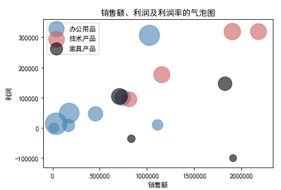
# 绘制办公用品的气泡图
plt.scatter(x = Prod_Category.Sales[Prod_Category.Category == '办公用品'],
y = Prod_Category.Profit[Prod_Category.Category == '办公用品'],
s = Prod_Category.std_ratio[Prod_Category.Category == '办公用品']*1000,
color = 'steelblue', label = '办公用品', alpha = 0.6
)
# 绘制技术产品的气泡图
plt.scatter(x = Prod_Category.Sales[Prod_Category.Category == '技术产品'],
y = Prod_Category.Profit[Prod_Category.Category == '技术产品'],
s = Prod_Category.std_ratio[Prod_Category.Category == '技术产品']*1000,
color = 'indianred' , label = '技术产品', alpha = 0.6
)
# 绘制家具产品的气泡图
plt.scatter(x = Prod_Category.Sales[Prod_Category.Category == '家具产品'],
y = Prod_Category.Profit[Prod_Category.Category == '家具产品'],
s = Prod_Category.std_ratio[Prod_Category.Category == '家具产品']*1000,
color = 'black' , label = '家具产品', alpha = 0.6
)
# 添加x轴和y轴标签
plt.xlabel('销售额')
plt.ylabel('利润')
# 添加标题
plt.title('销售额、利润及利润率的气泡图')
# 添加图例
plt.legend()
# 显示图形
plt.show()
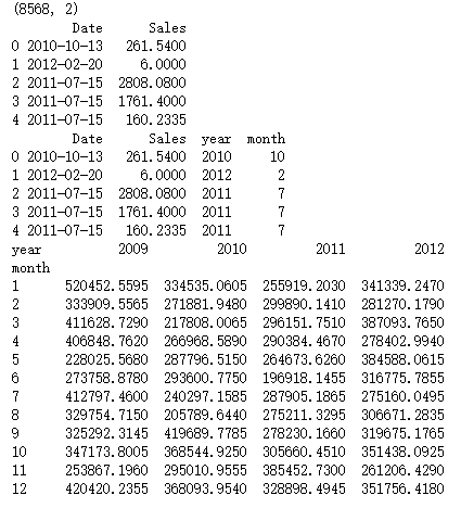
# 读取数据
Sales = pd.read_excel(r'F:\python_Data_analysis_and_mining\06\Sales.xlsx')
print(Sales.shape)
print(Sales.head())
# 根据交易日期,衍生出年份和月份字段
Sales['year'] = Sales.Date.dt.year
Sales['month'] = Sales.Date.dt.month
print(Sales.head())
# 统计每年各月份的销售总额
Summary = Sales.pivot_table(index = 'month', columns = 'year', values = 'Sales', aggfunc = np.sum)
print(Summary)
# 绘制热力图
sns.heatmap(data = Summary, # 指定绘图数据
cmap = 'PuBuGn', # 指定填充色
linewidths = .1, # 设置每个单元格边框的宽度
annot = True, # 显示数值
fmt = '.1e' # 以科学计算法显示数据
)
#添加标题
plt.title('每年各月份销售总额热力图')
# 显示图形
plt.show()

# 读取数据
Prod_Trade = pd.read_excel(r'F:\python_Data_analysis_and_mining\06\Prod_Trade.xlsx')
print(Prod_Trade.shape)
print(Prod_Trade.head())
# 衍生出交易年份和月份字段
Prod_Trade['year'] = Prod_Trade.Date.dt.year
Prod_Trade['month'] = Prod_Trade.Date.dt.month
print(Prod_Trade.head())
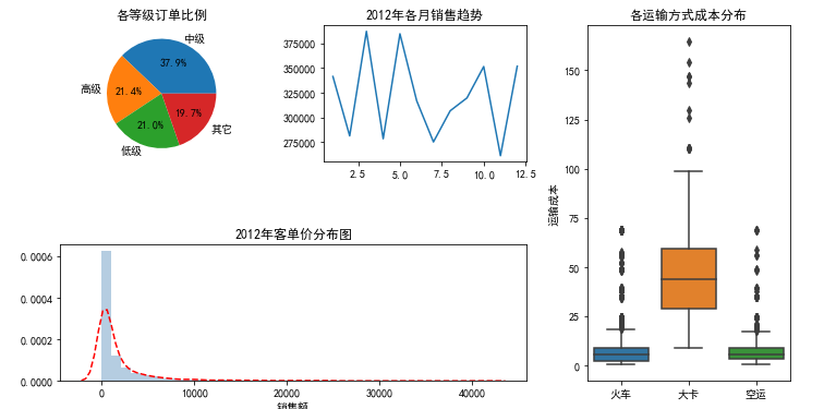
# 设置大图框的长和高
plt.figure(figsize = (12,6))
# 设置第一个子图的布局
ax1 = plt.subplot2grid(shape = (2,3), loc = (0,0))
# 统计2012年各订单等级的数量
Class_Counts = Prod_Trade.Order_Class[Prod_Trade.year == 2012].value_counts()
Class_Percent = Class_Counts/Class_Counts.sum()
# 将饼图设置为圆形(否则有点像椭圆)
ax1.set_aspect(aspect = 'equal')
# 绘制订单等级饼图
ax1.pie(x = Class_Percent.values, labels = Class_Percent.index, autopct = '%.1f%%')
# 添加标题
ax1.set_title('各等级订单比例')
# 设置第二个子图的布局
ax2 = plt.subplot2grid(shape = (2,3), loc = (0,1))
# 统计2012年每月销售额
Month_Sales = Prod_Trade[Prod_Trade.year == 2012].groupby(by = 'month').aggregate({'Sales':np.sum})
# 绘制销售额趋势图
Month_Sales.plot(title = '2012年各月销售趋势', ax = ax2, legend = False)
# 删除x轴标签
ax2.set_xlabel('')
# 设置第三个子图的布局
ax3 = plt.subplot2grid(shape = (2,3), loc = (0,2), rowspan = 2)
# 绘制各运输方式的成本箱线图
sns.boxplot(x = 'Transport', y = 'Trans_Cost', data = Prod_Trade, ax = ax3)
# 添加标题
ax3.set_title('各运输方式成本分布')
# 删除x轴标签
ax3.set_xlabel('')
# 修改y轴标签
ax3.set_ylabel('运输成本')
# 设置第四个子图的布局
ax4 = plt.subplot2grid(shape = (2,3), loc = (1,0), colspan = 2)
# 2012年客单价分布直方图
sns.distplot(Prod_Trade.Sales[Prod_Trade.year == 2012], bins = 40, norm_hist = True, ax = ax4, hist_kws = {'color':'steelblue'}, kde_kws=({'linestyle':'--', 'color':'red'}))
# 添加标题
ax4.set_title('2012年客单价分布图')
# 修改x轴标签
ax4.set_xlabel('销售额')
# 调整子图之间的水平间距和高度间距
plt.subplots_adjust(hspace=0.6, wspace=0.3)
# 图形显示
plt.show()