div css 伪类 不固定图片大小 居中
<style>
.pic_box{300px; height:300px; background-color:#beceeb; font-size:0; *font-size:200px; text-align:center;}
.pic_box img{vertical-align:middle;}
.pic_box::after{
content:'center';
display:inline-block;
0;
height:100%;
vertical-align:middle;
overflow:hidden;
}

</style>

<div class="pic_box">
  <img src="http://i.santelvxing.com/upload/2016/ouc8qxay7-uystiw75ku-125148768.jpg" />
</div>
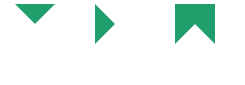
css div 实现三角形
<style>
    .left{
        float: left;
    }
    .mlr-20{
        margin-left:20px;
        margin-right:20px;
    }
    .triangle{
         0;
        height: 0;
        border: 20px solid #fff;
    }
    .triangle-down{
        border-color: #209E6B  transparent transparent transparent;
    }
    .triangle-right{
        border-color: transparent transparent transparent #209E6B;
    }
    .triangle-special{
        border-color: #209E6B #209E6B transparent #209E6B;
    }
</style>

<body>
    <div class="triangle triangle-down  left mlr-20">

    </div>
    <div class="triangle  triangle-right left mlr-20">

    </div>
    <div class="triangle triangle-special left mlr-20">

    </div>
</body>
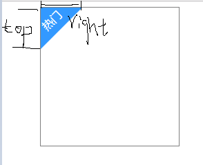
CSS 伪类实现左上角标签
<style type="text/css">
	.ui-cover-tip{
	  position: relative;
	   200px;
	  height: 200px;
	  margin:0 auto;
	  border: solid 1px grey;
	}
	.ui-cover-tip:before{
	  content:'';
	  position: absolute;
	  display:block;
	   0;
	  height: 0;
	  border-top: 60px solid #3399FF;
	  border-right: 60px solid transparent;
	  z-index: 2;
	}
	.ui-cover-tip:after{
	  content:'热门';
	  position: absolute;
	  top: 0px;
	  left: 0px;
	   50px;
	  height: 30px;
	  transform: rotate(-45deg);
	  display: inline-block;
	  color:#fff;
	  z-index: 3
	}
</style>

<body>
	 <div class="ui-cover-tip"><div>
</body>