手机页面制作3
利用上节说的box-sizing解决流式布局的一个问题
一个流式布局的代码 左右的width+border>100% 所以盒子会掉下去
<!DOCTYPE html>
<html lang="en">
<head>
    <meta charset="UTF-8">
    <title>Document</title>
    <style>
    #box{
        width:100%;
        height:300px;
        background: #fec;
    }
    #left{
        width:50%;
        height:200px;
        float:left;
        border:1px solid #f00;
        background: orange;
    }
    #right{
        width:50%;
        height:200px;
        float:left;
        border: 1px solid #f00;
        background: blue;
    }
    </style>
</head>
<body>
    <div id="box">
        <div id="left"></div>
        <div id="right"></div>
    </div>
</body>
</html>
效果图

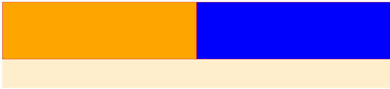
使用box-sizing 后
 1 <!DOCTYPE html>
 2 <html lang="en">
 3 <head>
 4     <meta charset="UTF-8">
 5     <title>Document</title>
 6     <style>
 7     #box{
 8         width:100%;
 9         height:300px;
10         background: #fec;
11     }
12     #left{
13         width:50%;
14         height:200px;
15         float:left;
16         border:1px solid #f00;
17         background: orange;
18         -webkit-box-sizing: border-box;
19            -moz-box-sizing: border-box;
20                 box-sizing: border-box;
21     }
22     #right{
23         width:50%;
24         height:200px;
25         float:left;
26         border: 1px solid #f00;
27         background: blue;
28                 -webkit-box-sizing: border-box;
29            -moz-box-sizing: border-box;
30                 box-sizing: border-box;
31
32     }
33     </style>
34 </head>
35 <body>
36     <div id="box">
37         <div id="left"></div>
38         <div id="right"></div>
39     </div>
40 </body>
41 </html>
显示效果图 发现对齐了。