知识点:
- border-radius:圆角设置,主要作用是设置匹配标签圆角。
它是CSS3新增的样式,其属性值写法有两种:百分比,属性值单位可以是px像素单位。
<head>
<meta charset="UTF-8">
<meta name="viewport" content="width=device-width, initial-scale=1.0">
<title>Document</title>
<style>
*{
margin: 0;
padding: 0;
}
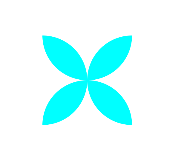
div.box{
150px;
height: 150px;
background-color: pink;
border-radius: 50%;
}
.box1{
position: relative;
200px;
height: 200px;
border:1px solid black;
margin: 100px auto;
}
.box1>p:nth-child(1){
position: absolute;
100px;
height: 100px;
background-color: cyan;
border-radius: 0px 100px 0 100px;
}
.box1>p:nth-child(2){
position: absolute;
100px;
height: 100px;
left: 100px;
background-color: cyan;
border-radius: 100px 0px 100px 0px;
}
.box1>p:nth-child(3){
position: absolute;
100px;
height: 100px;
top:100px;
background-color: cyan;
border-radius: 100px 0px 100px 0px;
}
.box1>p:nth-child(4){
position: absolute;
100px;
height: 100px;
left: 100px;
top: 100px;
background-color: cyan;
border-radius: 0px 100px 0 100px;
}
</style>
</head>
<body>
<div class=box></div>
<div class=box1>
<p></p>
<p></p>
<p></p>
<p></p>
</div>
</body>
</body>
</html>