WPF在动画和3D上的优势主要有:
- XAML语言针对的是界面美化问题,可以让设计师直接加入开发团队、降低沟通成本。
- XAML的图形绘制功能非常强大,可以轻易绘制出复杂的图标、图画。
- WPF支持“滤镜”功能,可以像Photoshop那样为对象添加各种效果。
- WPF原生支持动面开发,设计师、程序员都能够使用XAML或C#轻松开发制作出炫丽的动画效果。
- WWF原生支持3D效果,甚至可以将其他3D建模工具创建的模型导入进来使用。
- Blend作为专门的设计工具让WPF如虎添翼,既能帮助不了解编程的设计师快速上手,又能帮助资深开发者快速建立图形或动画的原型。
WPF绘图
XAML绘图本身就是矢量的,支持各式各样的填充和效果,还可以添加滤镜。
XAML矢量图是借助Microsoft Expression Studio中的Design和Blend两个工具画出来的。Blend可以直接绘制XAML图形;Design可以像Photoshop或者Fireworks那样绘制图形,再由设计者决定导出为PNG或XAML格式。
这些图片都是由有限的几个基本图形组成的,WPF的基本图形包括以下几个(它们都是Shape类的派生类):
- Line:直线段,可以设置其笔触(Stroke)。
- Rectangle:矩形,既有笔触,又有填充(Fill)。
- Ellipse:椭圆,长、宽相等的椭圆即为正圆,既有笔触又有填充。
- Polygon:多边形,由多条直线段围成的闭合区域,既有笔触又有填充。
- Polyline:折线(不闭合),由多条首尾相接的直线段组成。
- Path:路径(闭合区域),基本图形中功能最强大的一个,可由若干直线、圆弧、贝塞尔曲线组成。
直线(Line)
直线是最简单的图形,使用X1、Y1两个属性可以设置它的起点坐标,X2、Y2两个属性则用来设置其终点坐标,控制起点/终点坐标就可以实现平行、交错等效果,一些属性还能控制画出虚线以及控制线段终点的形状。
Stroke(笔触)属性的数据类型是Brush(画刷),凡是Brush的派生类均可用于给这个属性赋值。
WPF提供了多种渐变色画刷,画直线也可以画出渐变效果,下面的例子综合了这些属性:
<Window x:Class="WpfApp.MainWindow"
        xmlns="http://schemas.microsoft.com/winfx/2006/xaml/presentation"
        xmlns:x="http://schemas.microsoft.com/winfx/2006/xaml"
        Title="MainWindow" Height="258.651" Width="296.482">
    <Grid>
        <Line X1="10" Y1="20" X2="260" Y2="20" Stroke="Red" StrokeThickness="10"/>
        <Line X1="10" Y1="40" X2="260" Y2="40" Stroke="Orange" StrokeThickness="6"/>
        <Line X1="10" Y1="60" X2="260" Y2="60" Stroke="Green" StrokeThickness="3"/>
        <Line X1="10" Y1="80" X2="260" Y2="80" Stroke="Purple" StrokeThickness="2"/>
        <Line X1="10" Y1="100" X2="260" Y2="100" Stroke="Black" StrokeThickness="1"/>
        <Line X1="10" Y1="120" X2="260" Y2="120" StrokeDashArray="3" Stroke="Black" StrokeThickness="1"/>
        <Line X1="10" Y1="140" X2="260" Y2="140" StrokeDashArray="5" Stroke="Black" StrokeThickness="1"/>
        <Line X1="10" Y1="160" X2="260" Y2="160" Stroke="Black" StrokeEndLineCap="Flat" StrokeThickness="6"/>
        <Line X1="10" Y1="180" X2="260" Y2="180" Stroke="Black" StrokeEndLineCap="Triangle" StrokeThickness="8"/>
        <Line X1="10" Y1="200" X2="260" Y2="200" StrokeEndLineCap="Round" StrokeThickness="10">
            <Line.Stroke>
                <LinearGradientBrush EndPoint="0,0.5" StartPoint="1,0.5">
                    <GradientStop Color="Blue"/>
                    <GradientStop Offset="1"/>
                </LinearGradientBrush>
            </Line.Stroke>
        </Line>
    </Grid>
</Window>
效果如下:

注:绘图可以在任何一种布局控件中完成,WPF会自动根据容器的不同计算图形的坐标,常用的绘图容器是Canvas和Grid。
矩形(Rectangle)
矩形由笔触(Stroke,即边线)和填充(Fill)构成。Stroke属性的设置与Line一样,Fill属性的数据类型是Brush。
Brush是个抽象类,只能用Brush派生类的实例为Fill属性赋值,常用的Brush类型有:
- SolidColorBrush:实心画刷,在XAML中可以使用颜色名称字符串(如Red、Blue)直接赋值。
- LinearGradientBrush:线性渐变画刷,色彩沿设定的直线方向、按设定的变化点进行渐变。
- RadialGradientBrush:径向渐变画刷,色彩沿半径的方向、按设定的变化点进行渐变,形成圆形填充。
- ImageBrush:使用图片(Image)作为填充内容。
- DrawingBrush:使用矢量图(Vector)和位图(Bitmap)作为填充内容。
- VisualBrush:每个控件的可视化形象可以通过Visual类的方法获得(Visual->FrameworkElement),获得可视化的形象后可以用VisualBrush这个形象进行填充,如拖拽控件时鼠标松开前的控件“幻影”。
下面是使用各种画刷填充矩形的综合实例:
<Window x:Class="WpfApp.MainWindow"
        xmlns="http://schemas.microsoft.com/winfx/2006/xaml/presentation"
        xmlns:x="http://schemas.microsoft.com/winfx/2006/xaml"
        Title="MainWindow" Height="394.452" Width="597.761">
    <Grid Margin="10">
        <Grid.RowDefinitions>
            <RowDefinition Height="160"/>
            <RowDefinition Height="10"/>
            <RowDefinition Height="160"/>
        </Grid.RowDefinitions>
        <Grid.ColumnDefinitions>
            <ColumnDefinition Width="180"/>
            <ColumnDefinition Width="10"/>
            <ColumnDefinition Width="180"/>
            <ColumnDefinition Width="10"/>
            <ColumnDefinition Width="180"/>
        </Grid.ColumnDefinitions>
        <!--实心填充-->
        <Rectangle Grid.Column="0" Grid.Row="0" Stroke="Black" Fill="LightBlue"/>
        <!--线性渐变-->
        <Rectangle Grid.Column="2" Grid.Row="0">
            <Rectangle.Fill>
                <LinearGradientBrush StartPoint="0,0" EndPoint="1,1">
                    <GradientStop Color="#FFB6F8F1" Offset="0"/>
                    <GradientStop Color="#FF0082BD" Offset="0.25"/>
                    <GradientStop Color="#FF95DEFF" Offset="0.6"/>
                    <GradientStop Color="#FF004F72" Offset="1"/>
                </LinearGradientBrush>
            </Rectangle.Fill>
        </Rectangle>
        <!--径向渐变-->
        <Rectangle Grid.Column="4" Grid.Row="0">
            <Rectangle.Fill>
                <RadialGradientBrush>
                    <GradientStop Color="#FFB6F8F1" Offset="0"/>
                    <GradientStop Color="#FF0082BD" Offset="0.25"/>
                    <GradientStop Color="#FF95DEFF" Offset="0.75"/>
                    <GradientStop Color="#FF004F72" Offset="1.5"/>
                </RadialGradientBrush>
            </Rectangle.Fill>
        </Rectangle>
        <!--图片填充-->
        <Rectangle Grid.Column="0" Grid.Row="2">
            <Rectangle.Fill>
                <ImageBrush ImageSource="ResourceLogosLamborghini.png" Viewport="0,0,0.3,0.15" TileMode="Tile"/>
            </Rectangle.Fill>
        </Rectangle>
        <!--矢量图填充-->
        <Rectangle Grid.Column="2" Grid.Row="2">
            <Rectangle.Fill>
                <DrawingBrush Viewport="0,0,0.2,0.2" TileMode="Tile">
                    <DrawingBrush.Drawing>
                        <GeometryDrawing Brush="LightBlue">
                            <GeometryDrawing.Geometry>
                                <EllipseGeometry RadiusX="10" RadiusY="10"/>
                            </GeometryDrawing.Geometry>
                        </GeometryDrawing>
                    </DrawingBrush.Drawing>
                </DrawingBrush>
            </Rectangle.Fill>
        </Rectangle>
        <!--无填充,用线性渐变填充边线-->
        <Rectangle Grid.Column="4" Grid.Row="2" StrokeThickness="10">
            <Rectangle.Stroke>
                <LinearGradientBrush StartPoint="0,0" EndPoint="1,1">
                    <GradientStop Color="White" Offset="0.3"/>
                    <GradientStop Color="Blue" Offset="1"/>
                </LinearGradientBrush>
            </Rectangle.Stroke>
        </Rectangle>
    </Grid>
</Window>
效果如下:

在使用画刷的时候,建议先在Blend里绘制出大致效果然后再在Visual Studio里进行微调。
接下来看一个VisualBrush的例子,目标控件是一个Button,程序的XAML代码如下:
<Window x:Class="WpfApp.MainWindow"
        xmlns="http://schemas.microsoft.com/winfx/2006/xaml/presentation"
        xmlns:x="http://schemas.microsoft.com/winfx/2006/xaml"
        Title="MainWindow" Height="394.452" Width="597.761">
    <Grid Margin="10">
        <Grid.ColumnDefinitions>
            <ColumnDefinition Width="160"/>
            <ColumnDefinition Width="*"/>
            <ColumnDefinition Width="160"/>
        </Grid.ColumnDefinitions>
        <StackPanel x:Name="stackPanelLeft" Background="White"/>
        <Button x:Name="realButton" Content="OK" Height="40"/>
        <Button Content=">>>" Grid.Column="1" Margin="5,0" Click="CloneVisual"/>
        <StackPanel x:Name="stackPanelRight" Background="White" Grid.Column="2"/>
    </Grid>
</Window>
中间Button的Click事件处理器代码如下:
double o = 1.0;//不透明度计数器
private void CloneVisual(object sender, RoutedEventArgs e)
{
    VisualBrush vBrush = new VisualBrush(this.realButton);
    Rectangle rect = new Rectangle();
    rect.Width = realButton.ActualWidth;
    rect.Height = realButton.ActualHeight;
    rect.Fill = vBrush;
    rect.Opacity = o;
    o -= 0.2;

    this.stackPanelRight.Children.Add(rect);
}
效果如下:

椭圆(Ellipse)
椭圆也是一种常用的几何图形,使用方法与矩形没有什么区别。
绘制一个球体,球体的轮廓是正圆(Circle),Width与Height相等的椭圆即是正圆;球体的光影效果使用径向渐变实现。XAML代码如下:
<Window x:Class="WpfApp.MainWindow"
        xmlns="http://schemas.microsoft.com/winfx/2006/xaml/presentation"
        xmlns:x="http://schemas.microsoft.com/winfx/2006/xaml"
        Title="MainWindow" Height="394.452" Width="597.761">
    <Grid>
        <Ellipse Stroke="Gray"  Width="140" Height="140" Cursor="Hand" ToolTip="A Ball">
            <Ellipse.Fill>
                <RadialGradientBrush GradientOrigin="0.2,0.8" RadiusX="0.75" RadiusY="0.75">
                    <RadialGradientBrush.RelativeTransform>
                        <TransformGroup>
                            <RotateTransform Angle="90" CenterX="0.5" CenterY="0.5"/>
                            <TranslateTransform/>
                        </TransformGroup>
                    </RadialGradientBrush.RelativeTransform>
                    <GradientStop Color="#FFFFFFFF" Offset="0"/>
                    <GradientStop Color="#FF444444" Offset="0.66"/>
                    <GradientStop Color="#FF999999" Offset="1"/>
                </RadialGradientBrush>
            </Ellipse.Fill>
         </Ellipse>
    </Grid>
</Window>
效果如下:

椭圆的绘制和色彩填充都是在Blend里完成的,在Visual Studio里又进行了一些调整(包括规整数值、调整顺序和去掉无用代码)。
路径(Path)
路径(Path)完全可以替代其他几种图形,可以将直线、圆弧、贝塞尔曲线等基本元素结合进来,形成更复杂的图形。
路径最重要的一个属性是Data,Data的数据类型是Geometry(几何图形),使用这个属性将一些基本的线段拼接起来、形成复杂的图形,赋值的语法有两种:
- 标签式的标准语法
- 专门用于绘制几何图形的“路径标记语法”
本小节借助标准语法认识各种基本线段,下一小节将学习绘制几何图形的路径标记语法。
Path的Data属性是Geometry类(抽象类,不可直接使用),可以使用的是Geometry的子类,Geometry的子类包括:
- LineGeometry:直线几何图形。
- RectangleGeometry:矩形几何图形。
- EllipseGeometry:椭圆几何图形。
- PathGeometry:路径几何图形。
- StreamGeometry:PathGeometry的轻量级替代品,不支持Binding、动画等功能。
- CombinedGeometry:由多个基本几何图形联合在一起,形成的单一几何图形。
- GeometryGroup:由多个基本几何图形组合在一起,形成的几何图形组。
区别在于前面介绍的Line、Rectangle、Ellipse类都是可以独立存在的对象,这些*Geometry类只能用于结合成其他几何图形、不能独立存在。
当在Blend里选中一组独立的几何图形并在菜单里执行组合路径的命令时,本质上就是把原来独立的Line、Rectangle、Ellipse对象转换成*Geometry对象并结合成一个新的复杂几何图形。
下面例子是简要展示各个几何图形:
<Window x:Class="WpfApp.MainWindow"
        xmlns="http://schemas.microsoft.com/winfx/2006/xaml/presentation"
        xmlns:x="http://schemas.microsoft.com/winfx/2006/xaml"
        Title="MainWindow" Height="350" Width="340">
    <Grid>
        <Grid.ColumnDefinitions>
            <ColumnDefinition Width="160"/>
            <ColumnDefinition Width="160"/>
        </Grid.ColumnDefinitions>
        <Grid.RowDefinitions>
            <RowDefinition Height="160"/>
            <RowDefinition Height="160"/>
        </Grid.RowDefinitions>
        <!--直线-->
        <Path Stroke="Blue" StrokeThickness="2" Grid.Column="0" Grid.Row="0">
            <Path.Data>
                <LineGeometry StartPoint="20,20" EndPoint="140,140"/>
            </Path.Data>
        </Path>
        <!--矩形路径-->
        <Path Stroke="Orange" Fill="Yellow" Grid.Column="1" Grid.Row="0">
            <Path.Data>
                <RectangleGeometry Rect="20,20,120,120" RadiusX="10" RadiusY="10"/>
            </Path.Data>
        </Path>
        <!--椭圆路径-->
        <Path Stroke="Green" Fill="LawnGreen" Grid.Column="0" Grid.Row="1">
            <Path.Data>
                <EllipseGeometry Center="80,80" RadiusX="60" RadiusY="40"/>
            </Path.Data>
        </Path>
        <!--自定义路径(最为重要)-->
        <Path Stroke="Yellow" Fill="Orange" Grid.Column="1" Grid.Row="1">
            <Path.Data>
                    <PathGeometry>
                        <PathGeometry.Figures>
                            <PathFigure StartPoint="25,140" IsClosed="True">
                                <PathFigure.Segments>
                                <LineSegment Point="20,40"/>
                                <LineSegment Point="40,110"/>
                                <LineSegment Point="50,20"/>
                                <LineSegment Point="80,110"/>
                                <LineSegment Point="110,20"/>
                                <LineSegment Point="120,110"/>
                                <LineSegment Point="140,40"/>
                                <LineSegment Point="135,140"/>
                            </PathFigure.Segments>
                        </PathFigure>
                    </PathGeometry.Figures>
                </PathGeometry>
            </Path.Data>
        </Path>
    </Grid>
</Window>
效果如下:

WPF绘图的重点在于Path,Path的重点在于PathGeometry。PathGeometry的Figures属性可以容纳PathFigure对象,而PathFigure的Segments属性又可以容纳各种线段用于结合成复杂图形,XAML代码结构如下:
<Path>
    <Path.Data>
        <PathGeometry>
            <PathGeometry.Figures>
                <PathFigure>
                    <PathFigure.Segments>
                        <!--各种线段-->
                    </PathFigure.Segments>
                </PathFigure>
            </PathGeometry.Figures>
        </PathGeometry>
    </Path.Data>
</Path>
Figures是PathGeometry的默认内容属性、Segments是PathFigure的默认内容属性,常简化为这样:
<Path>
    <Path.Data>
        <PathGeometry>
            <PathFigure>
                <!--各种线段-->
            </PathFigure>
        </PathGeometry>
    </Path.Data>
</Path>
上面格式中的各种线段是:
- LineSegment:直线段。
- ArcSegment:圆弧线段。
- BezierSegment:三次方贝塞尔曲线段(默认贝塞尔曲线就是指三次曲线,所以Cubic一词被省略)。
- QuadraticBezierSegment:二次方贝塞尔曲线段。
- PolyLineSegment:多直线段。
- PolyBezierSegment:多三次方贝塞尔曲线段。
- PolyQuadraticBezierSegment:多二次方贝塞尔曲线。
注:所有这些线段都没有起点(StartPoint),起点就是前一个线段的终点,而第一个线段的起点则是PathFigure的StartPoint。
LineSegment最为简单,只需要控制它的Point(终点)即可,XAML代码如下:
<Window x:Class="WpfApp.MainWindow"
        xmlns="http://schemas.microsoft.com/winfx/2006/xaml/presentation"
        xmlns:x="http://schemas.microsoft.com/winfx/2006/xaml"
        Title="MainWindow" Height="350" Width="340">
    <Grid VerticalAlignment="Center" HorizontalAlignment="Center">
        <Path Stroke="Green" Fill="LawnGreen" StrokeThickness="2">
            <Path.Data>
                <PathGeometry>
                    <PathFigure IsClosed="True" StartPoint="0,0">
                        <LineSegment Point="150,0"/>
                        <LineSegment Point="150,30"/>
                        <LineSegment Point="90,30"/>
                        <LineSegment Point="90,150"/>
                        <LineSegment Point="60,150"/>
                        <LineSegment Point="60,30"/>
                        <LineSegment Point="0,30"/>
                    </PathFigure>
                </PathGeometry>
            </Path.Data>
        </Path>
    </Grid>
</Window>
效果如下:

ArcSegment用来绘制圆弧:
- Point属性用来指明圆弧连接的终点;
- Size属性是完整椭圆的横轴半径和纵轴半径(圆弧截取自椭圆);
- SweepDirection属性指明圆弧是顺时针方向还是逆时针方向;
- IsLargeArc属性用于指明是否使用大弧去连接(如果椭圆上的两点位置不对称,那么这两点间的圆弧就会分为大弧和小弧);
- RotationAngle属性用来指明圆弧母椭圆的旋转角度。
几个属性的变化如下所示:

BezierSegment(三次方贝塞尔曲线)由4个点决定:
- 起点:即前一个线段的终点或PathFigure的StartPoint。
- 终点:Point3属性,即曲线的终点位置。
- 两个控制点:Point1和Point2属性。
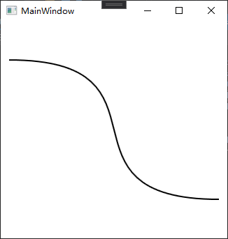
三次方贝塞尔曲线就是由起点出发走向Pointl的方向,再走向Point2的方向,最后到达终点的平滑曲线,如下为XAML代码表示的三次方贝塞尔曲线:
<Window x:Class="WpfApp.MainWindow"
        xmlns="http://schemas.microsoft.com/winfx/2006/xaml/presentation"
        xmlns:x="http://schemas.microsoft.com/winfx/2006/xaml"
        Title="MainWindow" Height="350" Width="340">
    <Grid VerticalAlignment="Center" HorizontalAlignment="Center">
        <Path Stroke="Black" StrokeThickness="2">
            <Path.Data>
                <PathGeometry>
                    <PathFigure StartPoint="0,0">
                        <BezierSegment Point1="250,0" Point2="50,200" Point3="300,200"/>
                    </PathFigure>
                </PathGeometry>
            </Path.Data>
        </Path>
    </Grid>
</Window>
效果如下:
想绘制出复杂的图画来,要做的仅仅是在PathFigure把Segment一段一段加上去。
GeometryGroup也是Geometry的一个派生类,它最大的特点是可以将一组PathGeometry组合在一起,如下面的例子所示:
<Window x:Class="WpfApp.MainWindow"
        xmlns="http://schemas.microsoft.com/winfx/2006/xaml/presentation"
        xmlns:x="http://schemas.microsoft.com/winfx/2006/xaml"
        Title="MainWindow" Height="350" Width="340">
    <Grid VerticalAlignment="Center" HorizontalAlignment="Center">
        <Path Stroke="Black" Fill="LightBlue" StrokeThickness="1">
            <Path.Data>
                <GeometryGroup>
                    <PathGeometry>
                        <PathFigure StartPoint="0,0">
                            <BezierSegment Point1="250,0" Point2="50,200" Point3="300,200"/>
                        </PathFigure>
                    </PathGeometry>
                    <PathGeometry>
                        <PathFigure StartPoint="0,0">
                            <BezierSegment Point1="230,0" Point2="50,200" Point3="300,200"/>
                        </PathFigure>
                    </PathGeometry>
                    <PathGeometry>
                        <PathFigure StartPoint="0,0">
                            <BezierSegment Point1="210,0" Point2="50,200" Point3="300,200"/>
                        </PathFigure>
                    </PathGeometry>
                    <PathGeometry>
                        <PathFigure StartPoint="0,0">
                            <BezierSegment Point1="190,0" Point2="50,200" Point3="300,200"/>
                        </PathFigure>
                    </PathGeometry>
                    <PathGeometry>
                        <PathFigure StartPoint="0,0">
                            <BezierSegment Point1="170,0" Point2="50,200" Point3="300,200"/>
                        </PathFigure>
                    </PathGeometry>
                    <PathGeometry>
                        <PathFigure StartPoint="0,0">
                            <BezierSegment Point1="150,0" Point2="50,200" Point3="300,200"/>
                        </PathFigure>
                    </PathGeometry>
                    <PathGeometry>
                        <PathFigure StartPoint="0,0">
                            <BezierSegment Point1="130,0" Point2="50,200" Point3="300,200"/>
                        </PathFigure>
                    </PathGeometry>
                </GeometryGroup>
            </Path.Data>
        </Path>
    </Grid>
</Window>
效果如下:

路径标记语法
Path的一大缺点是其标签式语法的烦琐,复杂图形(Path)都是由数十条线段连接而成,按照标签式语法,每条线段(Segment)是一个标签、每个标签占据一行,一个图形就要占去几十行代码。
借助专供WPF绘图使用的路径标记语法(Path Markup Syntax)可以极大地简化Path的描述,路径标记语法实际上就是各种线段的简记法(
使用路径标记语法绘图时一般分三步:移动至起点一绘图→闭合图形,这三步使用的命令稍有差别:
- 移动到起点使用的是“移动命令”M;
- 绘图使用的是绘图命令,包括L、H、V、A、C、Q等;
- 如果图形是闭合的,需要使用“闭合命令”Z,这样最后一条线段的终点与第一条线段的起点间会连接上一条直线段。
路径标记语法不区分大小写(A与a、H与h等价),使用两个double类型数值来表示一个点,第一个值表示横坐标(常记为x),第二个值表示纵坐标(常记为y),两个数值既可以使用逗号分隔(x,y)又可以使用空格分隔(x y)。
注:由于路径标记法语中使用空格作为两个点之间的分隔,为了避免混淆,建议使用逗号作为点横纵坐标的分隔符。
常用路径标记语法的总结如下所示:
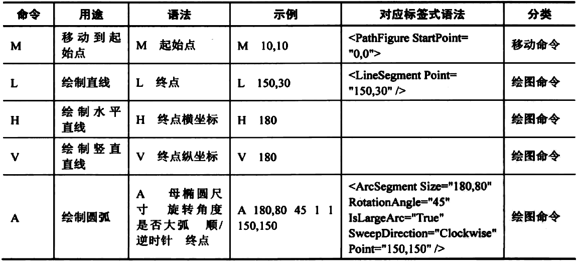

在上述命令中,S和T两个命令比较特殊:
- S用于绘制平滑三次方贝塞尔曲线,只需要给出一个控制点(相当于普通三次方贝塞尔曲线的第二个控制点),平滑三次方贝塞尔曲线会把前一条三次方贝塞尔曲线的第二控制点以起点为对称中心的对称点当作自己的第一控制点(如果前面的线段不是三次方贝塞尔曲线,则第一控制点与起点相同)。
下面两条曲线等价:
<Path Stroke="Red" Data="M 0,0 C30,0 70,100 100,100 S 170,0 200,0"/>
<Path Stroke="Black" Data="M 0,0 C30,0 70,100 100,100 C 130,100 170,0 200,0"/>
- T命令用于绘制平滑二次方贝塞尔曲线,绘制的时候如果前面的线段也是一段二次方贝塞尔曲线的话,T命令会把前面这段曲线的控制点以起点为对称中心的对称点当作自己的控制点(如果前面的线段不是二次方贝塞尔曲线则控制点与起点相同)。
下面两条曲线等价:
<Path Stroke="Red" Data="M 0,200 Q 100,0 200,200 T 400,200"/>
<Path Stroke="Black" Data="M 0,200 Q 100,0 200,200 Q 300,400 400,200"/>
使用方法是把这些命令串起来、形成一个字符串,然后赋值给Path的Data属性。使用Blend绘图时,Blend会自动使用路径标记语法来记录数据而不是使用代码量巨大的标签式语法。
使用Path剪裁界面元素
遇到制作不规则窗体或控件的需求,仅需使用窗体或控件的Clip属性就可以轻松做到。Clip属性被定义在UIElement类中,WPF窗体和所有控件、图形都具有这个属性。
Clip属性的数据类型是Geometry(与Path的Data属性一致),只要按需求制作好特殊形状的Path并把Path的Data属性值赋给目标窗体、控件或其他图形,对目标的剪切就完成了。
请看下面这个不规则窗体的例子(数据经过优化):
<Window x:Class="WpfApp.MainWindow"
        xmlns="http://schemas.microsoft.com/winfx/2006/xaml/presentation"
        xmlns:x="http://schemas.microsoft.com/winfx/2006/xaml"
        Title="MainWindow" Height="350" Width="340" AllowsTransparency="True" WindowStyle="None">
    <Grid VerticalAlignment="Center" HorizontalAlignment="Center">
        <Path Visibility="Hidden" x:Name="clipPath" Data="M 55,100 A 50,50 0 1 1 100,60 A 110,95 0 0 1 200,60 A 50,50 0 1 1 250,100 A 110,95 0 1 1 55,100 Z"/>
        <Button VerticalAlignment="Center" HorizontalAlignment="Center" Width="80" Height="25" Name="butonClip" Click="buttonClip_Click">Clip</Button>
    </Grid>
</Window>
注:想让一个窗体能够被剪切,其AllowsTransparency必须设为True,WindowStyle属性必须设为None。
窗体中Buton的Click事件处理器如下:
private void buttonClip_Click(object sender, RoutedEventArgs e)
{
    this.Clip = this.clipPath.Data;
}
效果如下:

图形的效果与滤镜
在UIElement类的成员中可以找到BitmapEffect和Effect这两个属性,这两个属性都能用来为UI元素增加效果。BitmapEffect属性(已过时)使用CPU的运算能力为UI元素添加效果,Effect属性使用GPU的运算能力为UI元素添加效果。
简单易用的BitmapEffect
BitmapEffect属性定义在UIEemet类中,它的数据类型是BitmapEffect类(抽象类),只能用BitmapEffect类的派生类实例为UIElement的BitmapEffect属性赋值。
BitmapEffect类的派生类包括如下几个:
- BevelBitmapEffect:斜角效果。
- BitmapEffectGroup:复合效果(可以把多个BitmapEffect组合在一起)。
- BlurBitmapEffect:模糊效果。
- DropShadowBitmapEffec:投影效果。
- EmbossBitmapEffect:浮雕效果。
- OuterGlowBitmapEffect:外发光效果。
每个效果都有自己的一系列属性可以调整,下面是一个DropShadowBitmapEffect的简单例子:
<Grid>
    <Button Content="Click Me" Grid.Column="0" Grid.Row="0" Margin="20">
        <Button.BitmapEffect>
            <DropShadowBitmapEffect Direction="-45" Opacity="0.75" ShadowDepth="7"/>
        </Button.BitmapEffect>
    </Button>
</Grid>
效果如下:

丰富多彩的Effect
在绘图软件Photoshop中,使用滤镜插件能获得如下好处:
- 提高工作效率。
- 得到更专业的效果。
- 对使用者的技术水平要求相对较低。
WPF引进了这种“滤镜插件”的思想——UIElement类的Effect属性,Effect属性的数据类型是Effect类(抽象类),可以接收Effect类的任何一个派生类的派生类实例作为它的值。
Effect类位于System.Windows.Media.Effects名称空间中,它的派生类有3个,分别是:
- BlurEffect:模糊效果。
- DropShadowEffect:投影效果。
- ShaderEffect:着色器效果(抽象类)。
模糊和投影效果在编程中用的最多,.NET Framework内建了这两个效果,使用起来非常方便(用GPU进行渲染)。ShaderEffect(抽象类)是留给滤镜插件开发人员的接口,只要是派生自ShaderEffec的效果类就可以直接拿来用。
开发着色器效果需要使用Pixel Shader 语言(简写与Photoshop一样,也是PS)和一些DirectX的知识。大多数WPF开发人员需要的是现成的效果滤镜,可以使用官方的滤镜包,参考一些WPF中的滤镜特效——Effect Library
图形的变形
WPF中的“变形”一词含义很广,尺寸、位置、坐标系比例、旋转角度等的变化都算是变形。
WPF中的变形与UI元素是分开的,如设计一个“向左旋转45度”的变形赋值给不同UI元素的变形控制属性,这些UI元素就都向左旋转45度了。
控制变形的属性有两个,分别是:
- RenderTransform:呈现变形,定义在UIElement类中。
- LayoutTransform:布局变形,定义在FrameworkElement类中。
FrameworkElement派生自UIElement,而控件的基类Control类又派生自FrameworkElement,所以在控件级别两个属性都能看到。
这两个属性都是依赖属性,它们的数据类型都是Transform抽象类,Transform类的派生类实均可用来为这两个属性赋值。
Transform抽象类的派生类有如下一些:
- MatrixTransform:矩阵变形,把容纳被变形UI元素的矩形顶点看作一个矩阵进行变形。
- Rotate Transform:旋转变形,以给定的点为旋转中心,以角度为单位进行旋转变形。
- ScaleTransform:坐标系变形,调整被变形元素的坐标系,可产生缩放效果。
- SkewTransform:拉伸变形,可在横向和纵向上对被变形元素进行拉伸。
- TranslateTransform:偏移变形,使被变形元素在横向或纵向上偏移一个给定的值。
- TransformGroup:变形组,可以把多个独立变形合成为一个变形组、产生复合变形效果。
呈现变形
WPF的RenderTransform属性就是起到“呈现变形(Render Transform)”作用,让UI元素呈现出来的属性与它本来的属性不一样。
一个按钮本来处在Canvas或者Grid的左上角,可以使用RenderTransform属性让其呈现在右下角并且向右旋转45°,XAML代码如下:
<Window x:Class="WpfApp.MainWindow"
        xmlns="http://schemas.microsoft.com/winfx/2006/xaml/presentation"
        xmlns:x="http://schemas.microsoft.com/winfx/2006/xaml"
        Title="MainWindow" Height="351" Width="420">
    <Grid>
        <Grid.ColumnDefinitions>
            <ColumnDefinition Width="Auto"/>
            <ColumnDefinition Width="*"/>
        </Grid.ColumnDefinitions>
        <Grid.RowDefinitions>
            <RowDefinition Height="Auto"/>
            <RowDefinition Height="*"/>
        </Grid.RowDefinitions>
        <Button Width="80" HorizontalAlignment="Left" VerticalAlignment="Top" Height="80" Content="Hello">
            <Button.RenderTransform>
                <!--复合变形-->
                <TransformGroup>
                    <RotateTransform CenterX="40" CenterY="40" Angle="45"/>
                    <TranslateTransform X="300" Y="200"/>
                </TransformGroup>
            </Button.RenderTransform>
        </Button>
    </Grid>
</Window>
Grid的第一行的行高、第一列的列宽都由Button来决定,在窗体设计器里可以清晰地看到Button本身的位置并没有改变(第一行和第一列没有变化),但Button却出现在了右下(300,200)的位置,并向右旋转了45°。
效果如下:

用户并不能察觉到究竟是控件本身的位置、角度发生了改变,还是呈现的位置与角度发生了改变。
在窗体上移动UI元素本身会导致窗体布局的改变,而窗体布局的每一个(哪怕是细微的)变化都将导致所有窗体元素的尺寸测算函数、位置测算函数、呈现函数等的调用,造成系统资源占用激增、程序性能陡降。
使用呈现变形则不会遇到这样的问题,呈现变形只改变元素“出现在哪里”,不牵扯布局的改变、只涉及窗体的重绘,制作动画时切记要使用RenderTransform。
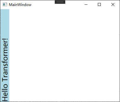
布局变形
与呈现变形不同,布局变形会影响窗体的布局、导致窗体布局的重新测算。因为窗体布局的重新测算和绘制会影响程序的性能,所以布局变形一般只用在静态变形上,而不用于制作动画。
考虑这样一个需求:制作一个文字纵向排列的浅蓝色标题栏。如果我们使用呈现变形,代码如下:
<Window x:Class="WpfApp.MainWindow"
        xmlns="http://schemas.microsoft.com/winfx/2006/xaml/presentation"
        xmlns:x="http://schemas.microsoft.com/winfx/2006/xaml"
        Title="MainWindow" Height="351" Width="420">
    <Grid>
        <!--Layout-->
        <Grid.ColumnDefinitions>
            <ColumnDefinition Width="Auto"/>
            <ColumnDefinition Width="*"/>
        </Grid.ColumnDefinitions>
        <!--Content-->
        <Grid x:Name="titleBar" Background="LightBlue">
            <TextBlock Text="Hello Transformer!" FontSize="24" HorizontalAlignment="Left" VerticalAlignment="Bottom">
                <TextBlock.RenderTransform>
                    <RotateTransform Angle="-90"/>
                </TextBlock.RenderTransform>
            </TextBlock>
        </Grid>
    </Grid>
</Window>
效果如下:

TextBox本身并没有改变,改变的只是它的显示,它的真实宽度仍然把宽度设为Auto的第一列撑得很宽。
分析需求,实际上需要的是静态改变TextBox的布局,因此应该使用LayoutTransform,对上面的代码做一处改动:
<TextBlock.LayoutTransform>
    <RotateTransform Angle="-90"/>
</TextBlock.LayoutTransform>
效果如下:
动画
动画本质就是在一个时间段内对象位置、角度、颜色、透明度等属性值的连续变化,有些是对象自身的属性,有些则是图形变形的属性。
注:WPF规定——可以用来制作动画的属性必须是依赖属性。
变化即是运动,WPF的动画也是一种运动:
- 运动的主体就是各种UI元素。
- 运动本身就是施加在UI元素上的一些Timeline派生类的实例。
在实际工作中,往往就是先设计好一个动画构思、用一个Timeline派生类的实例加以表达,最后让某个UI元素来执行这个动画、完成动画与动画主体的结合。
简单的动画由一个元素来完成就可以了,WPF把简单动画称为AnimationTimeline。
复杂的(即并行的、复合的)动画就需要UI上的多个元素协同完成,包括有哪些UI元素参与动画、每个元素的动画行为是什么、动画何时开始何时结束等,WPF把一组协同的动画也称为Storyboard。
Timeline、AnimationTimeline和Storyboard的关系如下所示:

简单独立动画
动画就是“会动的画”,“会动”指的就是能够让UI元素或元素变形的某个属性值产生连续变化。
任何一个属性都有自己的数据类型(如UIElement的Width和Height属性为Double类型),几乎针对每个可能的数据类型,WPF的动画子系统都为其准备了相应的动画类(均派生自AnimationTimeline)。它们包括:
- BooleanAnimationBase
- ByteAnimationBase
- CharAnimationBase
- ColorAnimationBase
- DecimalAnimationBase
- DoubleAnimationBase
- Int16AnimationBase
- Int32AnimationBase
- Int64AnimationBase
- MatrixAnimationBase
- ObjectAnimationBase
- Point3DAnimationBase
- PointAnimationBase
- QuaternionAnimationBase
- RectAnimationBase
- Rotation3DAnimationBase
- SingleAnimationBase
- SizeAnimationBase
- StringAnimationBase
- ThicknessAnimationBase
- Vector3DAnimationBase
- VectorAnimationBase
上面列出的这些类都是抽象基类(带有Base后缀)。完整的情况下,这些抽象基类又能派生出3种具体动画,即简单动画、关键帧动画、沿路径运动的动画。
如DoubleAnimationBase完整地派生出了3个具体动画,如下所示:

注:针对于int类型属性的Imt32AnimationBase只派生出Int32Animation和Int32AnimationUsingKeyFrames两个具体动画类。BooleanAnimationBase和CharAnimationBase的派生类则更少——只有关键帧动画类。
在WPF动画系统中Double类型的属性用得最多,而且DoubleAnimationBase的派生类也最完整,下面只讲述DoubleAnimationBase的派生类。
用户界面上只包含一个Button,这个Button的RenderTransform属性值是一个名为tt的TranslateTransform对象,改变这个对象的X和Y值就会让Buton的显示位置(而不是真实位置)变化,XAML代码如下:
<Grid>
    <Button Content="Move!" HorizontalAlignment="Left" VerticalAlignment="Top" Width="60" Height="60" Click="Button_Click">
        <Button.RenderTransform>
            <TranslateTransform x:Name="tt" X="0" Y="0"/>
        </Button.RenderTransform>
    </Button>
</Grid>

简单线性动画
“简单线性动画”是指仅由变化起点、变化终点、变化幅度、变化时间4个要素构成的动画:
- 变化时间(Duration属性):必须指定,数据类型为Duration。
- 变化终点(To属性):如果没有指定变化终点,程序将采用上一次动画的终点或默认值。
- 变化幅度(By属性):如果同时指定了变化终点,变化幅度将被忽略。
- 变化起点(From属性):如果没有指定变化起点则以变化目标属性的当前值为起点。
每次单击按钮,按钮都会从起始位置(窗体的左上角)向窗体右下长宽不超出300像素的矩形内的某点运动,完成运动的时长是300毫秒,Button的Click事件处理器代码如下:
private void Button_Click(object sender, RoutedEventArgs e)
{
    //TranslateTransform的X、Y属性均为Double类型,选用DoubleAnimation来使之产生变化
    //声明dax和daY两个DoubleAnimation变量并分别为之创建引用实例
    DoubleAnimation daX = new DoubleAnimation();
    DoubleAnimation daY = new DoubleAnimation();

    //指定起点
    daX.From = 0D;
    daY.From = 0D;

    //指定终点
    Random r = new Random();
    daX.To = r.NextDouble() * 300;
    daY.To = r.NextDouble() * 300;

    //指定时长
    Duration duration = new Duration(TimeSpan.FromMilliseconds(300));
    daX.Duration = duration;
    daY.Duration = duration;

    // 动画的主体是TranslateTransform 变形,而非Button
    //调用BeginAnimation方法,让daX、daY分别作用在TranslateTransform的XProperty、YProperty依赖属性上
    this.tt.BeginAnimation(TranslateTransform.XProperty, daX);
    this.tt.BeginAnimation(TranslateTransform.YProperty, daY);
}
以下几处值得注意:
- 想让按钮从当前位置开始下一次动画,只需要把“daX.From=0D;”和“daY.From=0D;”两句代码移除即可。
- 尽管表现出来的是Button在移动,但DoubleAnimation的作用目标并不是Button而是TranslateTransform实例。
- 用来制作动画的属性必须是依赖属性,TranslateTransform的XProperty和YProperty就是两个依赖属性。
- UIElement和Animatable两个类都定义有BeginAnimation方法,方法的调用者就是动画要作用的目标对象,两个参数分别指明被作用的依赖属性和设计好的动画。
每次单击按扭,按钮都向窗体的右下角移动,则把事件处理器的代码改变成这样:
private void Button_Click(object sender, RoutedEventArgs e)
{
    DoubleAnimation daX = new DoubleAnimation();
    DoubleAnimation daY = new DoubleAnimation();

    //指定幅度
    daX.By = 100D;
    daY.By = 100D;

    //指定时长
    Duration duration = new Duration(TimeSpan.FromMilliseconds(300));
    daX.Duration = duration;
    daY.Duration = duration;

    // 动画的主体是TranslateTransform 变形,而非Button
    this.tt.BeginAnimation(TranslateTransform.XProperty, daX);
    this.tt.BeginAnimation(TranslateTransform.YProperty, daY);
}
高级动画控制
使用From、To、By、Duration几个属性进行组合就已经可以制作很多不同效果的动画了,如果想制作更加复杂或逼真的动画,还需要使用以下一些效果:


在这些属性中,EasingFunction是一个扩展性非常强的属性,取值是IEasingFunction接口类型,自带的派生类有十多种。
比如BounceEase可以产生乒乓球弹跳式的效果,把前面例子的代码改成这样:
private void Button_Click(object sender, RoutedEventArgs e)
{
    DoubleAnimation daX = new DoubleAnimation();
    DoubleAnimation daY = new DoubleAnimation();

    //设置反弹
    BounceEase be = new BounceEase();
    be.Bounces = 3; // 弹跳3次
    be.Bounciness = 3; //弹性程度,值越大反弹越低
    daY.EasingFunction = be;

    //指定终点
    daX.To = 300;
    daY.To = 300;

    //指定时长
    Duration duration = new Duration(TimeSpan.FromMilliseconds(2000));
    daX.Duration = duration;
    daY.Duration = duration;

    // 动画的主体是TranslateTransform 变形,而非Button
    this.tt.BeginAnimation(TranslateTransform.XProperty, daX);
    this.tt.BeginAnimation(TranslateTransform.YProperty, daY);
}
关键帧动画
动画是UI元素属性连续改变所产生的视觉效果。属性每次细微的变化都会产生一个新的画面,每个新画面就称为一“帧”,帧的连续播放就产生动画效果。单位时间内播放的帧数越多,动画的效果就越细致。
简单动画只设置了起点和终点,之间的动画帧都是由程序计算出来并绘制的,程序员无法进行控制。
关键帧动画则允许程序员为一段动画设置几个“里程碑”,动画执行到里程碑所在的时间点时,被动画所控制的属性值也必须达到设定的值,这些时间线上的“里程碑”就是关键帧。
让Button在单击后用900毫秒的时长从左上角移动到右下角,但移动路线不是直接移动而是走“Z”字形,Button的Click事件处理器代码如下:
private void Button_Click(object sender, RoutedEventArgs e)
{
    //创建两个DoubleAnimationUsingKeyFrames实例
    //一个控制TranslateTransform的X属性,另一个控制Translate Transform的Y属性
    //每个DoubleAnimationUsingKeyFrames各拥有三个关键帧用于指明X或Y在三个时间点(两个拐点和终点)应该达到什么样的值
    DoubleAnimationUsingKeyFrames dakX = new DoubleAnimationUsingKeyFrames();
    DoubleAnimationUsingKeyFrames dakY = new DoubleAnimationUsingKeyFrames();

    // 设置动画总时长
    dakX.Duration = new Duration(TimeSpan.FromMilliseconds(900));
    dakY.Duration = new Duration(TimeSpan.FromMilliseconds(900));

    //创建、添加关键帧
    LinearDoubleKeyFrame x_kf_1 = new LinearDoubleKeyFrame();
    LinearDoubleKeyFrame x_kf_2 = new LinearDoubleKeyFrame();
    LinearDoubleKeyFrame x_kf_3 = new LinearDoubleKeyFrame();
    x_kf_1.KeyTime = KeyTime.FromTimeSpan(TimeSpan.FromMilliseconds(300));
    x_kf_1.Value = 200;
    x_kf_2.KeyTime = KeyTime.FromTimeSpan(TimeSpan.FromMilliseconds(600));
    x_kf_2.Value = 0;
    x_kf_3.KeyTime = KeyTime.FromTimeSpan(TimeSpan.FromMilliseconds(900));
    x_kf_3.Value = 200;

    dakX.KeyFrames.Add(x_kf_1);
    dakX.KeyFrames.Add(x_kf_2);
    dakX.KeyFrames.Add(x_kf_3);

    LinearDoubleKeyFrame y_kf_1 = new LinearDoubleKeyFrame();
    LinearDoubleKeyFrame y_kf_2 = new LinearDoubleKeyFrame();
    LinearDoubleKeyFrame y_kf_3 = new LinearDoubleKeyFrame();
    y_kf_1.KeyTime = KeyTime.FromTimeSpan(TimeSpan.FromMilliseconds(300));
    y_kf_1.Value = 0;
    y_kf_2.KeyTime = KeyTime.FromTimeSpan(TimeSpan.FromMilliseconds(600));
    y_kf_2.Value = 180;
    y_kf_3.KeyTime = KeyTime.FromTimeSpan(TimeSpan.FromMilliseconds(900));
    y_kf_3.Value = 180;

    dakY.KeyFrames.Add(y_kf_1);
    dakY.KeyFrames.Add(y_kf_2);
    dakY.KeyFrames.Add(y_kf_3);

    //执行动画
    this.tt.BeginAnimation(TranslateTransform.XProperty, dakX);
    this.tt.BeginAnimation(TranslateTransform.YProperty, dakY);
}
在这组关键帧动画中,使用的是最简单的关键帧LinearDoubleKeyFrame,这种关键帧的特点就是只需你给定时间点(KeyTime属性)和到达时间点时目标属性的值(Value属性)动画就会让目标属性值在两个关键帧之间匀速变化。
上面的代码中,为关键帧的KeyTime属性使用了KeyTime.FromTimeSpan静态方法,这样可以得到一个绝对时间点。使用KeyTime.FromPercent静态方法则可以获得以百分比计算的相对时间点,程序将整个关键帧动画的时长(Duration)视为100%。
无论把dakX的Duration改为多少,三个关键帧都会将整个动画分割为均等的三段,代码改动如下:
//...
x_kf_1.KeyTime = KeyTime.FromPercent(0.33);
x_kf_1.Value = 200;
x_kf_2.KeyTime = KeyTime.FromPercent(0.66);
x_kf_2.Value = 0;
x_kf_3.KeyTime = KeyTime.FromPercent(1);
x_kf_3.Value = 200;
//...
特殊的关键帧
DoubleAnimationUsingKeyFrames的KeyFrames属性的数据类型是DoubleKeyFrameCollection,此集合类可接收的元素类型为DoubleKeyFrame。
DoubleKeyFrame是一个抽象类,前面使用的LinearDoubleKeyFrame就是它的派生类之一。DoubleKeyFrame的所有派生类如下:
- LinearDoubleKeyFrame:线性变化关键帧,目标属性值的变化是直线性的、均匀的,即变化速率不变。
- DiscreteDoubleKeyFrame:不连续变化关键帧,目标属性值的变化是跳跃性的、跃迁的。
- SplineDoubleKeyFrame:样条函数式变化关键帧,目标属性值的变化速率是一条贝塞尔曲线。
- EasingDoubleKeyFrame:缓冲式变化关键帧,目标属性值以某种缓冲形式变化。
4个派生类中最常用的是SplineDoubleKeyFrame(SplineDoubleKeyFrame可以替代LinearDoubleKeyFrame)。使用SplineDoubleKeyFrame可以非常方便地制作非匀速动画,因为它使用一条贝塞尔曲线来控制目标属性值的变化速率。
这条用于控制变化速率的贝塞尔曲线的起点是(0,0)和(1,1),分别映射着目标属性的变化起点和变化终点,意思是目标属性值由0%变化到100%。
这条贝塞尔曲线有两个控制点ControlPointl和ControlPoint2,意思是贝塞尔曲线从起点出发先向ControlPoint1的方向前进、再向ControlPoint2的方向前进、最后到达终点,形成一条平滑的曲线。
如果设置ControlPoint1和ControlPoint2的横纵坐标值相等,比如(0,0)、(0.5,0.5)、(1,1),则贝塞尔曲线成为一条直线,这时候SplineDoubleKeyFrame与LinearDoubleKeyFrame是等价的。
关键帧动画控制Button的位置变形、让Button横向移动,整个动画只有一个关键帧(使用的是SplineDoubleKeyFrame),变化速率控制曲线的两个控制点分别是(0,1)和(1,0),目标属性值会以“快一慢一快”的形式变化,Button的Click事件处理器代码如下:
private void Button_Click(object sender, RoutedEventArgs e)
{
    //创建动画
    DoubleAnimationUsingKeyFrames dakX = new DoubleAnimationUsingKeyFrames();
    dakX.Duration = new Duration(TimeSpan.FromMilliseconds(1000));

    // 创建、添加关键帧
    SplineDoubleKeyFrame kf = new SplineDoubleKeyFrame();
    kf.KeyTime = KeyTime.FromPercent(1);
    kf.Value = 400;
    KeySpline ks = new KeySpline();
    ks.ControlPoint1 = new Point(0, 1);
    ks.ControlPoint2 = new Point(1, 0);
    kf.KeySpline = ks;
    dakX.KeyFrames.Add(kf);

    //执行动画
    this.tt.BeginAnimation(TranslateTransform.XProperty, dakX);
}
路径动画
使用DoubleAnimationUsingPath类,可以让目标对象沿着一条给定的路径移动。
DoubleAnimationUsingPath需要一个PathGeometry来指明移动路径,PathGeometry的数据信息可以用XAML的Path语法书写。
PathGeometry的另一个重要属性是Source,Source属性的数据类型是PathAnimationSource枚举,枚举值可取X、Y或Angle:
- 取值是PathAnimationSource.X,意味着这个动画关注的是曲线上每一点横坐标的变化;
- 取值是PathAnimationSource.Y,意味着这个动画关注的是曲线上每一点纵坐标的变化;
- 取值是PathAnimationSource.Angle,意味着这个动画关注的是曲线上每一点处切线方向的变化。
让Button沿着一条贝塞尔曲线做波浪形运动,程序的XAML代码如下:
<Grid x:Name="LayoutRoot">
    <Grid.Resources>
        <!--移动路径-->
        <PathGeometry x:Key="movingPath" Figures="M 0,150 C 300,-100 300,400 600,120"/>
    </Grid.Resources>
    <Button Content="Move!" HorizontalAlignment="Left" VerticalAlignment="Top" Width="60" Height="60" Click="Button_Click">
        <Button.RenderTransform>
            <TranslateTransform x:Name="tt" X="0" Y="0"/>
        </Button.RenderTransform>
    </Button>
</Grid>
Button的Click事件处理器代码如下(添加自动返回和循环控制):
private void Button_Click(object sender, RoutedEventArgs e)
{
    //从XAML代码中获取移动路径数据
    PathGeometry pg = this.LayoutRoot.FindResource("movingPath") as PathGeometry;
    Duration duration = new Duration(TimeSpan.FromMilliseconds(600));

    //创建动画
    DoubleAnimationUsingPath dapX = new DoubleAnimationUsingPath();
    dapX.PathGeometry = pg;
    dapX.Source = PathAnimationSource.X;
    dapX.Duration = duration;
    DoubleAnimationUsingPath dapY = new DoubleAnimationUsingPath();
    dapY.PathGeometry = pg;
    dapY.Source = PathAnimationSource.Y;
    dapY.Duration = duration;

    //自动返回、永远循环
    dapX.AutoReverse = true;
    dapX.RepeatBehavior = RepeatBehavior.Forever;
    dapY.AutoReverse = true;
    dapY.RepeatBehavior = RepeatBehavior.Forever;

    // 执行动画
    this.tt.BeginAnimation(TranslateTransform.XProperty, dapX);
    this.tt.BeginAnimation(TranslateTransform.YProperty, dapY);
}
场景
场景(Storyboard)就是并行执行的一组动画(前面讲述的关键帧动画则是串行执行的一组动画)。
设计WPF的场景时,可按以下步骤进行:
- 把一组独立的动画组织在一个Storyboard元素中、安排好它们的协作关系。
- 指定哪个动画由哪个UI元素、哪个属性负责完成。
- 为Storyboard选择一个恰当的触发时机,比如按钮按下时或下载开始时。
一旦触发条件被满足,动画场景就会开始执行,用户就会看到动画效果。
下面是一个Storyboard的例子,单击按钮后三个小球分别在不同的时间开始向右以不同的速度移动,程序的XAML代码如下:
<Grid Margin="6">
    <!--布局控制-->
    <Grid.RowDefinitions>
        <RowDefinition Height="38"/>
        <RowDefinition Height="38"/>
        <RowDefinition Height="38"/>
    </Grid.RowDefinitions>
    <Grid.ColumnDefinitions>
        <ColumnDefinition/>
        <ColumnDefinition Width="60"/>
    </Grid.ColumnDefinitions>
    <!--跑道(红)-->
    <Border BorderBrush="Gray" BorderThickness="1" Grid.Row="0">
        <Ellipse x:Name="ballR" Height="36" Width="36" Fill="Red" HorizontalAlignment="Left">
            <Ellipse.RenderTransform>
                <TranslateTransform x:Name="ttR"/>
            </Ellipse.RenderTransform>
        </Ellipse>
    </Border>
    <!--跑道(绿)-->
    <Border BorderBrush="Gray" BorderThickness="1,0,1,1" Grid.Row="1">
        <Ellipse x:Name="ballG" Height="36" Width="36" Fill="LawnGreen" HorizontalAlignment="Left">
            <Ellipse.RenderTransform>
                <TranslateTransform x:Name="ttG"/>
            </Ellipse.RenderTransform>
        </Ellipse>
    </Border>
    <!--跑道(蓝)-->
    <Border BorderBrush="Gray" BorderThickness="1,0,1,1" Grid.Row="2">
        <Ellipse x:Name="ballB" Height="36" Width="36" Fill="Blue" HorizontalAlignment="Left">
            <Ellipse.RenderTransform>
                <TranslateTransform x:Name="ttB"/>
            </Ellipse.RenderTransform>
         </Ellipse>
    </Border>
    <!--按钮-->
    <Button Content="Go!" Grid.Column="1" Grid.RowSpan="3" Click="Button_Click"/>
</Grid>
Button的Click事件处理器代码如下:
private void Button_Click(object sender, RoutedEventArgs e)
{
    Duration duration = new Duration(TimeSpan.FromMilliseconds(600));

    // 红色小球匀速移动
    DoubleAnimation daRx = new DoubleAnimation();
    daRx.Duration = duration;
    daRx.To = 400;

    //绿色小球变速运动
    DoubleAnimationUsingKeyFrames dakGx = new DoubleAnimationUsingKeyFrames();
    dakGx.Duration = duration;
    SplineDoubleKeyFrame kfG = new SplineDoubleKeyFrame(400, KeyTime.FromPercent(1.0));
    kfG.KeySpline = new KeySpline(1, 0, 0, 1);
    dakGx.KeyFrames.Add(kfG);

    //蓝色小球变速运动
    DoubleAnimationUsingKeyFrames dakBx = new DoubleAnimationUsingKeyFrames();
    dakBx.Duration = duration;
    SplineDoubleKeyFrame kfB = new SplineDoubleKeyFrame(400, KeyTime.FromPercent(1.0));
    kfB.KeySpline = new KeySpline(0, 1, 1, 0);
    dakBx.KeyFrames.Add(kfB);

    //创建场景
    Storyboard storyboard = new Storyboard();
    Storyboard.SetTargetName(daRx, "ttR");
    Storyboard.SetTargetProperty(daRx, new PropertyPath(TranslateTransform.XProperty));
    Storyboard.SetTargetName(dakGx, "ttG");
    Storyboard.SetTargetProperty(dakGx, new PropertyPath(TranslateTransform.XProperty));
    Storyboard.SetTargetName(dakBx, "ttB");
    Storyboard.SetTargetProperty(dakBx, new PropertyPath(TranslateTransform.XProperty));
    storyboard.Duration = duration;
    storyboard.Children.Add(daRx);
    storyboard.Children.Add(dakGx);
    storyboard.Children.Add(dakBx);
    storyboard.Completed += (a, b) => { MessageBox.Show(ttR.X.ToString()); };
    storyboard.Begin(this);
}
使用C#代码实现Storyboard非常复杂,除了拿来做研究或遇到非得使用C#动态创建Storyboard的情况,不然都是用XAML代码创建Storyboard。
Storyboard一般都放在UI元素的Trigger里,Trigger在触发时会执行
为Buton添加Trigger并去掉对Click事件的订阅,XAML代码其他的部分不做任何改动,代码如下:
<Button Content="Go!" Grid.Column="1" Grid.RowSpan="3">
    <Button.Triggers>
        <EventTrigger RoutedEvent="Button.Click">
            <BeginStoryboard>
                <Storyboard Duration="0:0:0.6">
                    <!--红色小球动画-->
                    <DoubleAnimation Duration="0:0:0.6" To="400" Storyboard.TargetName="ttR" Storyboard.TargetProperty="X"/>
                    <!--绿色小球动画-->
                    <DoubleAnimationUsingKeyFrames Duration="0:0:0.6" Storyboard.TargetName="ttG" Storyboard.TargetProperty="X">
                        <SplineDoubleKeyFrame KeyTime="0:0:0.6" Value="400" KeySpline="1,0,0,1"/>
                    </DoubleAnimationUsingKeyFrames>
                    <!--红蓝小球动画-->
                    <DoubleAnimationUsingKeyFrames Duration="0:0:0.6" Storyboard.TargetName="ttB" Storyboard.TargetProperty="X">
                        <SplineDoubleKeyFrame KeyTime="0:0:0.6" Value="400" KeySpline="0,1,1,0"/>
                    </DoubleAnimationUsingKeyFrames>
                </Storyboard>
            </BeginStoryboard>
        </EventTrigger>
    </Button.Triggers>
</Button>