盒子背景
盒子背景:content padding 特殊的 boder 背景
背景绘制 从 padding 开始绘制

- 背景裁剪 background-clip(默认值 border-box)
特殊: 在指定文字背景时 -webkit-background-clip: text;
- 可选值:
- border-box 默认值,从 padding 左上角开始绘制,border 单独绘制
-
- padding-box 不绘制 border,从 padding 左上角开始绘制
-
- content-box 不绘制 border,padding,从 content 左上角开始绘制
- 背景原始其实位置 background-origin(默认值 padding-box)
- 可选值:
- padding-box 默认值,从 padding 左上角开始绘制,border 单独绘制
-
- border-box 从 border 左上角开始绘制
-
- content-box 从 content 左上角开始绘制
- 与 background-position 的联系: background-origin 指定了 background-position(0,0)起始位置
- background-origin: padding-box 时,background-position 的(0, 0)点为 padding
-
- background-origin: border-box 时,background-position 的(0, 0)点为 border
-
- background-origin: content-box 时,background-position 的(0, 0)点为 content
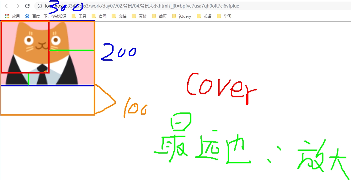
- 设置背景图片的大小 background-size: px / % / cover / contain;
- background-size: px;
-
#box {
    width: 300px;
    height: 300px;
    bakground-image: url(./img/a.jpg);

                  /* width  height     如果只写一个值,第二个值根据宽高比自动计算*/
    background-size: 100px  100px;
}
-
- background-size: %;
-
#box {
    width: 300px;
    height: 300px;
    bakground-image: url(./img/a.jpg);

  /* 参照于盒子自身的 width  height     如果只写一个值,第二个值根据宽高比自动计算*/
    background-size: 100%  100%;
    background-size: 20%;
}
-
- background-size: cover; 将图片以容器最远边进行缩放
-
#box {
    width: 300px;
    height: 200px;
    bakground-image: url(./img/a.jpg);

  /* 拉伸效果: 根据最远边进行伸缩调节 */
    background-size: cover;
}
-
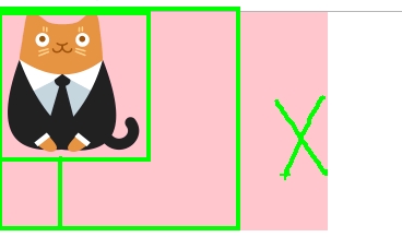
- background-size: contain;
-
#box {
    width: 300px;
    height: 200px;
    bakground-image: url(./img/a.jpg);

  /* 拉伸效果: 根据最近边进行伸缩调节 */
    background-size: contain;
}
-
- 多重背景 background-image: url(./img/a.png), url(./img/b.png), url(./img/c.png)... ...
- 需要使用 png 带透明的背景图
- 前面的图片会 覆盖后面的图片
-
#box {
    width: 300px;
    height: 200px;

    background-repeat: no-repeat;

    background-image: url("img/niu.png") , url("img/cao_bg.png") ;

}
- 模糊背景 (CSS3 过滤器: filter)
-
#bg {
    width:
    height: 480px;

    overflow: hidden;    /* 隐藏模糊溢出 */
}

#bg img {
    width: 320px;
    height: 480px

    filter: blur(5px);
}

#content {
    position: absolute;
    top: 0px;
    left: 0px;
    width: 320px;
    height: 480px;
}