1.CSS
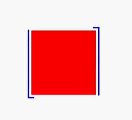
.fixed {
    position: fixed;
    width: 90px;
    height: 90px;
    background: red;
    border: 0px solid blue;
    left: 100px;
    top: 100px;
}

    .fixed:before {
        position: absolute;
        width: 100px;
        height: 100px;
        margin: -5px;
        content: '';
        box-shadow: inset 0px 0px 0px 2px blue;
        animation: animateOne linear 4s infinite;
    }

    .fixed:after {
        position: absolute;
        width: 100px;
        height: 100px;
        margin: -5px;
        content: '';
        box-shadow: inset 0px 0px 0px 2px blue;
        animation: animateOne linear 4s infinite;
        animation-delay: -2s; /*此处设置负值,提前进入指定状态*/
    }
@keyframes animateOne {
    0%,100% {
        clip: rect(0px,100px,5px,0px);
    }

    25% {
        clip: rect(0px,5px,100px,0px);
    }

    50% {
        clip: rect(95px,100px,100px,0px);
    }

    75% {
        clip: rect(0px,100px,100px,95px);
    }
}
注:
animation-delay 单独使用时注意两点:
1.需要放在animation属性后面
2.可以设置负数,调整动画开始的状态
显示结果:
更多: