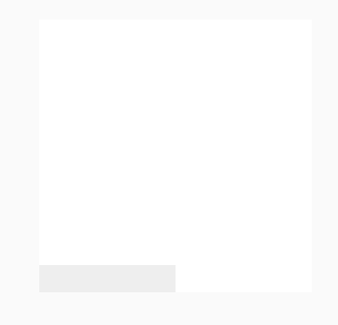
一、Css3图片阴影效果_Css3相册阴影效果
html代码:
<!DOCTYPE html>
<html lang="en">

<head>
    <meta charset="UTF-8">
    <meta http-equiv="X-UA-Compatible" content="IE=edge">
    <meta name="viewport" content="width=device-width, initial-scale=1.0">
    <title>Document</title>
    <style>
        body {
            background-color: #fafafa;
        }

        .img {
            width: 200px;
            height: 200px;
            background: white;
            position: relative;
            left: 100px;
            top: 100px;

        }

        .img:hover::before,
        .img:hover::after {
            box-shadow: 0px 15px 10px rgba(0, 0, 0, 0.3);
        }

        .img::before {
            content: '';
            width: 50%;
            height: 20px;
            background: #eee;
            position: absolute;
            z-index: -1;
            bottom: 10px;
            left: 5px;
            transform: skewY(-6deg);
            box-shadow: 0px 15px 10px rgba(0, 0, 0, 0.1);
            transition: all ease 0.8s;
        }

        .img::after {
            content: '';
            width: 50%;
            height: 20px;
            background: #eee;
            position: absolute;
            z-index: -1;
            bottom: 10px;
            right: 5px;
            transform: skewY(6deg);
            box-shadow: 0px 15px 10px rgba(0, 0, 0, 0.1);
            transition: all ease 0.8s;
        }
    </style>
</head>

<body>
    <!-- Css3图片阴影效果 -->
    <div class="img"></div>
</body>

</html>
二、效果变换过程

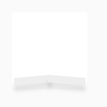
鼠标滑过:
更多: