Css 左右循环动画_左右循环运动效果案例
方案1 animation+定时器、简单css定义动画,js错开运行时间
css定义
      body {
            padding: 100px;
        }

        .block {
            background-color: aquamarine;
            width: 500px;
            height: 200px;
            padding: 10px;
            position: relative;
            overflow: hidden;
        }

        .item {
            display: inline-block;
            white-space: nowrap;
            padding: 10px 30px;
            border-radius: 20px;
            background: blueviolet;
            color: white;
            position: absolute;
            left: 100%;
        }

        @keyframes runOne {
            from {
                left: 100%;
            }

            to {
                left: -20%;
            }
        }

        .item.active {
            animation: runOne 5s linear infinite;
        }
html
    <div class="block">
        <div class="item">张三丰</div>
        <div class="item">李四</div>
        <div class="item">王五</div>
        <div class="item">赵六</div>
        <div class="item">aaaaa</div>
    </div>
js
        //循环运动展示处理
        //方式1 使用 animation 动画处理
        //总时间/总个数 =每个项运动的间隔

        //举例子 5秒钟 5个项 循环运动
        //处理运动
        var index = 0;
        var itemList = $('.item');
        setInterval(() => {
            itemList.eq(index).addClass('active');
            index++;
            if (index == itemList.length)
                index = 0;
        }, 1000);
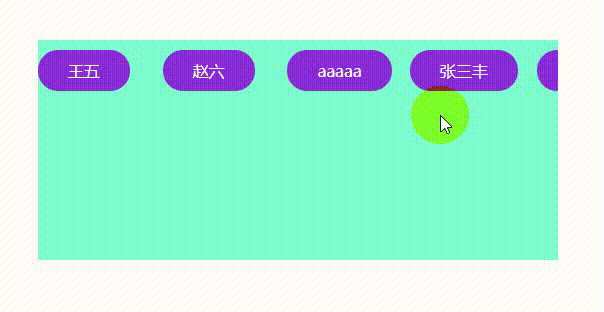
展示效果:
方案2:
待完善
更多: