from matplotlib import pyplot as plt
#调节图形大小,宽,高
plt.figure(figsize=(6,9))
#定义饼状图的标签,标签是列表
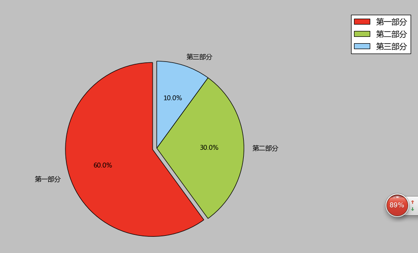
labels = [u'第一部分',u'第二部分',u'第三部分']
#每个标签占多大,会自动去算百分比
sizes = [60,30,10]
colors = ['red','yellowgreen','lightskyblue']
#将某部分爆炸出来, 使用括号,将第一块分割出来,数值的大小是分割出来的与其他两块的间隙
explode = (0.05,0,0)
patches,l_text,p_text = plt.pie(sizes,explode=explode,labels=labels,colors=colors,
labeldistance = 1.1,autopct = '%3.1f%%',shadow = False,
startangle = 90,pctdistance = 0.6)
#labeldistance,文本的位置离远点有多远,1.1指1.1倍半径的位置
#autopct,圆里面的文本格式,%3.1f%%表示小数有三位,整数有一位的浮点数
#shadow,饼是否有阴影
#startangle,起始角度,0,表示从0开始逆时针转,为第一块。一般选择从90度开始比较好看
#pctdistance,百分比的text离圆心的距离
#patches, l_texts, p_texts,为了得到饼图的返回值,p_texts饼图内部文本的,l_texts饼图外label的文本
#改变文本的大小
#方法是把每一个text遍历。调用set_size方法设置它的属性
for t in l_text:
t.set_size=(30)
for t in p_text:
t.set_size=(20)
# 设置x,y轴刻度一致,这样饼图才能是圆的
plt.axis('equal')
plt.legend()
plt.show()
作者:Kedi
链接:http://www.jianshu.com/p/0a76c94e9db7
來源:简书
著作权归作者所有。商业转载请联系作者获得授权,非商业转载请注明出处。
python 画图--饼图
这是python画图系列第三篇--饼图
画饼图用到的方法为:
matplotlib.pyplot.pie()
参数为:
- pie(x, explode=None, labels=None,
- colors=('b', 'g', 'r', 'c', 'm', 'y', 'k', 'w'),
- autopct=None, pctdistance=0.6, shadow=False,
- labeldistance=1.1, startangle=None, radius=None,
- counterclock=True, wedgeprops=None, textprops=None,
- center = (0, 0), frame = False )
参数说明:
返回值:
如果没有设置autopct,返回(patches, texts)
如果设置autopct,返回(patches, texts, autotexts)
patches -- list --matplotlib.patches.Wedge对象
texts autotexts -- matplotlib.text.Text对象
下面是一个简单的示例:
- # -*- coding: utf-8 -*-
- import numpy as np
- import matplotlib.mlab as mlab
- import matplotlib.pyplot as plt
- labels=['China','Swiss','USA','UK','Laos','Spain']
- X=[222,42,455,664,454,334]
- fig = plt.figure()
- plt.pie(X,labels=labels,autopct='%1.2f%%') #画饼图(数据,数据对应的标签,百分数保留两位小数点)
- plt.title("Pie chart")
- plt.show()
- plt.savefig("PieChart.jpg")
下面是结果:

下面是另一个示例:
- # -*- coding: utf-8 -*-
- import numpy as np
- import matplotlib.pyplot as plt
- import matplotlib as mpl
- def draw_pie(labels,quants):
- # make a square figure
- plt.figure(1, figsize=(6,6))
- # For China, make the piece explode a bit
- expl = [0,0.1,0,0,0,0,0,0,0,0] #第二块即China离开圆心0.1
- # Colors used. Recycle if not enough.
- colors = ["blue","red","coral","green","yellow","orange"] #设置颜色(循环显示)
- # Pie Plot
- # autopct: format of "percent" string;百分数格式
- plt.pie(quants, explode=expl, colors=colors, labels=labels, autopct='%1.1f%%',pctdistance=0.8, shadow=True)
- plt.title('Top 10 GDP Countries', bbox={'facecolor':'0.8', 'pad':5})
- plt.show()
- plt.savefig("pie.jpg")
- plt.close()
- # quants: GDP
- # labels: country name
- labels = ['USA', 'China', 'India', 'Japan', 'Germany', 'Russia', 'Brazil', 'UK', 'France', 'Italy']
- quants = [15094025.0, 11299967.0, 4457784.0, 4440376.0, 3099080.0, 2383402.0, 2293954.0, 2260803.0, 2217900.0, 1846950.0]
- draw_pie(labels,quants)

官方文档:
链接:http://matplotlib.org/api/pyplot_api.html
matplotlib.pyplot.pie(x, explode=None, labels=None, colors=None, autopct=None, pctdistance=0.6, shadow=False, labeldistance=1.1, startangle=None,radius=None, counterclock=True, wedgeprops=None, textprops=None, center=(0, 0), frame=False, hold=None, data=None)
Plot a pie chart.
Call signature:
pie(x, explode=None, labels=None,
    colors=('b', 'g', 'r', 'c', 'm', 'y', 'k', 'w'),
    autopct=None, pctdistance=0.6, shadow=False,
    labeldistance=1.1, startangle=None, radius=None,
    counterclock=True, wedgeprops=None, textprops=None,
    center = (0, 0), frame = False )
Make a pie chart of array x. The fractional area of each wedge is given by x/sum(x). If sum(x) <= 1, then the values of x give the fractional area directly and the array will not be normalized. The wedges are plotted counterclockwise, by default starting from the x-axis.
Keyword arguments:
- explode: [ None | len(x) sequence ]
- If not None, is a
len(x)array which specifies the fraction of the radius with which to offset each wedge.- colors: [ None | color sequence ]
- A sequence of matplotlib color args through which the pie chart will cycle.
- labels: [ None | len(x) sequence of strings ]
- A sequence of strings providing the labels for each wedge
- autopct: [ None | format string | format function ]
- If not None, is a string or function used to label the wedges with their numeric value. The label will be placed inside the wedge. If it is a format string, the label will be
fmt%pct. If it is a function, it will be called.- pctdistance: scalar
- The ratio between the center of each pie slice and the start of the text generated by autopct. Ignored if autopct is None; default is 0.6.
- labeldistance: scalar
- The radial distance at which the pie labels are drawn
- shadow: [ False | True ]
- Draw a shadow beneath the pie.
- startangle: [ None | Offset angle ]
- If not None, rotates the start of the pie chart by angle degrees counterclockwise from the x-axis.
radius: [ None | scalar ] The radius of the pie, if radius is None it will be set to 1.
- counterclock: [ False | True ]
- Specify fractions direction, clockwise or counterclockwise.
- wedgeprops: [ None | dict of key value pairs ]
- Dict of arguments passed to the wedge objects making the pie. For example, you can pass in wedgeprops = { ‘linewidth’ : 3 } to set the width of the wedge border lines equal to 3. For more details, look at the doc/arguments of the wedge object. By default
clip_on=False.- textprops: [ None | dict of key value pairs ]
- Dict of arguments to pass to the text objects.
center: [ (0,0) | sequence of 2 scalars ] Center position of the chart.
- frame: [ False | True ]
- Plot axes frame with the chart.
The pie chart will probably look best if the figure and axes are square, or the Axes aspect is equal. e.g.:
figure(figsize=(8,8))
ax = axes([0.1, 0.1, 0.8, 0.8])
or:
axes(aspect=1)
- Return value:
-
If autopct is None, return the tuple (patches, texts):
- patches is a sequence of
matplotlib.patches.Wedgeinstances - texts is a list of the label
matplotlib.text.Textinstances.
If autopct is not None, return the tuple (patches, texts, autotexts), where patches and texts are as above, and autotexts is a list of
Textinstances for the numeric labels. - patches is a sequence of
Notes
In addition to the above described arguments, this function can take a data keyword argument. If such a data argument is given, the following arguments are replaced by data[<arg>]:
- All arguments with the following names: ‘colors’, ‘x’, ‘explode’, ‘labels’.
Additional kwargs: hold = [True|False] overrides default hold state