移动端css里面写了1px, 实际看起来比1px粗,因为css中的1px并不等于移动设备的1px,这些由于不同的手机有不同的像素密度
在window对象中有一个devicePixelRatio属性,他可以反应css中的像素与设备的像素比
 //devicePixelRatio的官方的定义为:设备物理像素和设备独立像素的比例,也就是
 //devicePixelRatio = 物理像素 / 独立像素。
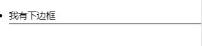
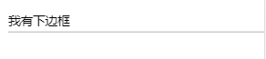
很明显图一要比图二更粗,这就是所谓的1px区别
实现方案:
1、伪类 + transform
原理是把原先元素的 border 去掉,然后利用 :before 或者 :after 重做 border ,并 transform 的 scale 缩小一半,原先的元素相对定位,新做的 border 绝对定位
li{position: relative;}
li:after{
  position: absolute;
  bottom:0;
  left:0;
  content: '';
  width:100%;
  height:1px;
  border-top:1px solid black;
  transform: scaleY(0.5);}
2、viewport + rem(ios)
viewport结合rem解决像素比问题
通过设置对应viewport的rem基准值,这种方式就可以像以前一样轻松愉快的写1px了
在devicePixelRatio = 2 时,输出viewport
<meta name="viewport" content="initial-scale=0.5, maximum-scale=0.5, minimum-scale=0.5, user-scalable=no">
在devicePixelRatio = 3 时,输出viewport:
<meta name="viewport" content="initial-scale=0.3333333333333333, maximum-scale=0.3333333333333333, minimum-scale=0.3333333333333333, user-scalable=no">
3、使用box-shadow模拟边框
利用css 对阴影处理的方式实现0.5px的效果
.box-1px {
  box-shadow: inset 0px -1px 1px -1px black;
}
4、background-img渐变
设置1px的渐变背景,50%有颜色,50%透明
.border {
    background:
    linear-gradient(180deg, black, black 50%, transparent 50%) top    left  / 100% 1px no-repeat,
    linear-gradient(90deg,  black, black 50%, transparent 50%) top    right / 1px 100% no-repeat,
    linear-gradient(0,      black, black 50%, transparent 50%) bottom right / 100% 1px no-repeat,
    linear-gradient(-90deg, black, black 50%, transparent 50%) bottom left  / 1px 100% no-repeat;

}