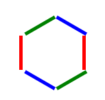
需求:为数字加上正六边形边框
分解一:正六边形,可视为三个同样的长方形,经过不同角度旋转后叠加形成
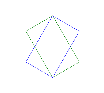
分解二:根据数学公式可以算出,一个长方形旋转60度,一个长方形旋转120度,重叠形成
分解三:根据数学公式可以算出,长方形长宽比为√3:1
<html>
    <head>
    <style>
            #dec {
                width: 173px;
                height: 100px;
                border-left:1px solid red;
                border-right:1px solid red;
                position: relative;
            }
            #dec:before {
                content: "";
                position: absolute;
                top: 0;
                left: -1px;
                width: 173px;
                height: 100px;
                border-left:1px solid green;
                border-right:1px solid green;
                transform: rotate(60deg);
            }
            #dec:after {
                content: "";
                position: absolute;
                top: 0;
                left: -1px;
                width: 173px;
                height: 100px;
                border-left:1px solid blue;
                border-right:1px solid blue;
                transform: rotate(120deg);
            }
    </style>
  </head>
  <body>
        <div id="dec"></div>
  </body>
</html>
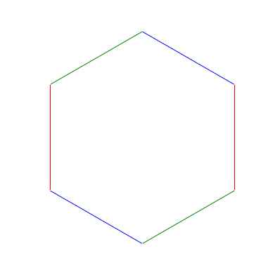
分解四:为什么要给旋转图形加上left: -1px呢?是因为图形越小时,border造成的视觉偏移效果越明显,具体偏移不用计算,一般不会出现特别小的存在,建议边框多大直接偏移多大