业务中需要分析一批离散的统计数据相似性,用于将同种类别的数据识别出来。
整理的资料是三大统计学的相似性计算方法,与数据之间距离的度量。
首先简单介绍一下数据的使用:
| 三大相关性系数 | 适用范围 | scipy库的调用 |
| 皮尔森相关系数 pearson | 数据呈正太分布 | from scipy.stats import pearsonr |
| 肯德尔相关系数 kendall | 非正态分布且数据无序 | from scipy.stats import kendalltau |
| 斯皮尔曼相关系数 spearman | 非正态分布且数据有序 | from scipy.stats import spearman |
from scipy.stats import normaltest 先用该函数检测比较数据的正太分布。后根据结果决定使用具体的方法
在处理相似性的过程中,除了统计学的相似性,还需要结合如距离(欧式,马氏等)
from scipy.spatial.distance import pdist 其中 pdist函数涵盖了各种距离度量的方法
最后还要结合极差来度量。
这里给出一个seaborn调用肯德尔系数的绘图。
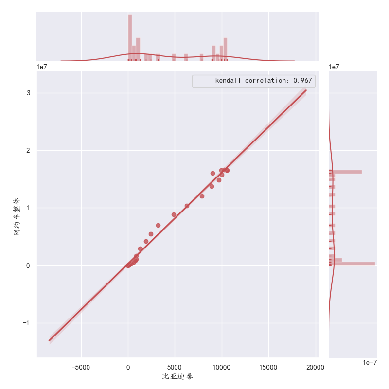
代码如下:
首先定义肯德尔系数,
然后处理中文字体显示问题。
随后把要求的两个数据按照dataframe的格式建立起来
核心是joinplot后面的.
.annotate调用之前定义的肯德尔系数函数 template是要显示的具体文字和 保存的肯德尔系数小数点位数
from scipy.stats import pearsonr,kendalltau,spearmanr,kstest,normaltest
def kendall(x,y):
   return kendalltau(x,y)

# 绘图设置-解决中文报错
plt.rcParams['axes.unicode_minus'] = False
plt.rcParams['font.sans-serif']=['KaiTi'] #用来正常显示中文标签
sns.set(font='KaiTi')  # 解决Seaborn中文显示问题
# 整周数据相似性绘图
df=pd.DataFrame(columns=['网约车周末','网约车工作日'],data={'网约车周末':df_weekday['All'],'网约车工作日':df_weekend['All']})
plt.figure()
sns.jointplot('网约车周末','网约车工作日',
        df,kind='reg',size=8,
        marginal_kws=dict(bins=25, rug=True),
        color='r').annotate(kendall,template='kendall correlation: {val:.3f}')#,stat_func=pearsonr,space=1,color='r') #
p: {p:.6f}
pandas中dataframe亦可直接调用 列与列之间的相似性系数:
对于dataframe df
调用:
df.corr('kendall')