公司让做一个报表页面,搜索了下发现highcharts比较符合业务需求,下面就说一下使用心得。
 $('#container').highcharts({
                title: {
                    text: '部门统计图'
                },
                credits: {
                enabled: false   //不显示版权信息
                },
                xAxis: {
                    //type: 'category',   //x轴类型
                    categories: <%=departmentData %>, //x轴数据
                    labels: {
						    rotation: -45,  //x轴字体倾斜角度,由于数据量大,倾斜更好看
						    //align: 'right',
                            style: {
                                fontSize: '12px',
                                fontFamily: '微软雅黑'//'Verdana, sans-serif'
                            },
                            x:10,
                            y:20
					}
                },
                yAxis:[{
			            min: 0,
			            title: {
				            text: '工作量(人天)'
			            },
			            stackLabels: {
				            enabled: true,
				            style: {
					            fontWeight: 'bold',
					            color: (Highcharts.theme && Highcharts.theme.textColor) || 'gray'
				            }
			            }
		            },
		            {
			            min: 0,
			            title: {
				            text: '任务数量'
			            },
			            stackLabels: {
				            enabled: true,
				            style: {
					            fontWeight: 'bold',
					            color: (Highcharts.theme && Highcharts.theme.textColor) || 'gray'
				            }
			            },
			            opposite:true  //y轴共用,是否显示右边y轴的值
		            }
		            ],
		         tooltip: {
			            shared:true,
			            pointFormat:'<span style="color:{series.color}"></span> {series.name}: <b>{point.y}</b><br/>'   //如果页面不是utf-8,
会乱码,重写pointFormat方法,把圆圈图标去掉就可以了
		            },
		         plotOptions: {
			        column: {
				        stacking: null,  //是否堆叠,上线显示
				        dataLabels: {
					        enabled: false  //是否在柱状图上显示值
					        //color: (Highcharts.theme && Highcharts.theme.dataLabelsColor) || 'red'
				        }
			        }
		        },
                series: [{
                        name:'提交工作量',
                        color:'#C0504D',
                        type: 'column',   //柱状图
                        tooltip: {
			                   valueSuffix:'人天'
		                },
                        data: <%=submitWork %>
                     },
                        {
                        name:'审批通过工作量',
                        color:'#9BBB59',
                        type: 'column',
                         tooltip: {
			                  valueSuffix:'人天'
		                },
                        data: <%=approveWork %>
                     },
                        {
                        name:'任务数量',
                        color:'#4F81BD',
                        type:'line',  //线性图
                        marker:{
                              enabled:true  //是否显示点
                        },
                        yAxis:1,
                        tooltip: {
			                valueSuffix:'个'
		                },
                        data: <%=task_num %>
                     }
                        ]
                    });
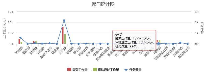
效果图如下: