小球碰到一面壁之后一般都会反弹,反射角=入射角;
其实用css3来实现这个效果也非常简单。
首先,分解一下小球的运动:水平运动和垂直运动。
当小球往右下方向运动时,如果碰到了下面的壁,那么由于碰撞,小球受到了垂直于墙壁的力(即向上的力),这样的话水平运动是不会受到影响的,只有垂直运动受到了影响。所以在与上下壁碰撞时只需改变上下运动的方向,左右运动不变;以此类推,当小球与左右壁相碰撞时,只需改变水平运动的方向,垂直方向无需改动。
有了这个思路,就可以开始用css3动画来实现这个小球碰撞时反弹了。
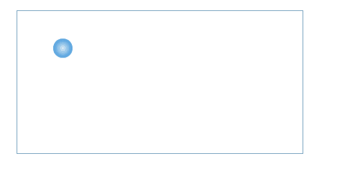
1.html:
1 <div id="box">
2       <div id="ball-box">
3            <div id="ball"></div>
4       </div>
5 </div>
2.css:


 1 #box {
 2     width: 300px;
 3     height: 150px;
 4     border: 1px solid #7aa4c0;
 5 }
 6 #ball-box {
 7     width: 20px;
 8     height: 20px;
 9     border-radius: 10px;
10     animation: bouncey linear 3s infinite;
11     -webkit-animation: bouncey linear 3s infinite;
12 }
13 #ball {
14     width: 20px;
15     height: 20px;
16     border-radius: 10px;
17     background: -webkit-radial-gradient(circle, #ddecee, #0377db);
18     background: -o-radial-gradient(circle, #ddecee, #0377db);
19     background: -moz-radial-gradient(circle, #ddecee, #0377db);
20     background: radial-gradient(circle, #ddecee, #0377db);
21     animation: bouncex linear 5s infinite;
22     -webkit-animation: bouncex linear 3s infinite;
23 }
24 @keyframes bouncey
25 {
26     0%,100% {
27         transform:translateY(0px);
28         -webkit-transform:translateY(0px);
29         }
30     50% {
31         transform:translateY(130px);
32         -webkit-transform:translateY(130px);
33         }
34 }
35 @keyframes bouncex
36 {
37     0%,100% {
38         transform:translateX(0px);
39         -webkit-transform:translateX(0px);
40         }
41     50% {
42         transform:translateX(280px);
43         -webkit-transform:translateX(280px);
44         }
45 }
小球的颜色利用css3里面的径向渐变,使小球看起来更加具有立体视觉感受。
好啦,大功告成= =