写几个简单的加载中动画吧。
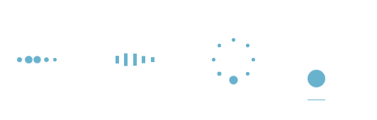
像前面三种都是相当于几个不同的点轮流来播放同一动画:变大变小。css3里面有一个用于尺度变换的方法:scale(x,y):定义 2D 缩放转换,改变元素的宽度和高度。
第四种就是一个小球从上往下跌落,再弹回去,在上面的时候速度最小,下面的时候速度最大。由于该小球只进行了上下的移动,所以我们可以运用:translateY(n):定义 2D 转换,沿着 Y 轴移动元素,从而实现小球沿Y方向来回移动。
废话不多说了,上代码。
首先,第一个加载中的动画:


1 <div id="loading1">
2         <div class="demo1"></div>
3         <div class="demo1"></div>
4         <div class="demo1"></div>
5         <div class="demo1"></div>
6         <div class="demo1"></div>
7 </div>
 1 .demo1 {
 2     width: 4px;
 3     height: 4px;
 4     border-radius: 2px;
 5     background: #68b2ce;
 6     float: left;
 7     margin: 0 3px;
 8     animation: demo1 linear 1s infinite;
 9     -webkit-animation: demo1 linear 1s infinite;
10 }
11 .demo1:nth-child(1){
12     animation-delay:0s;
13 }
14 .demo1:nth-child(2){
15     animation-delay:0.15s;
16 }
17 .demo1:nth-child(3){
18     animation-delay:0.3s;
19 }
20 .demo1:nth-child(4){
21     animation-delay:0.45s;
22 }
23 .demo1:nth-child(5){
24     animation-delay:0.6s;
25 }
26 @keyframes demo1
27 {
28     0%,60%,100% {transform: scale(1);}
29     30% {transform: scale(2.5);}
30 }
31 @-webkit-keyframes demo1
32 {
33     0%,60%,100% {transform: scale(1);}
34     30% {transform: scale(2.5);}
35 }
第二个动画和第一个动画大同小异,第一个动画是将小球整体变大变小,第二动画则是将小方块的高度变大变小,而宽度不变:
1 <div id="loading2">
2     <div class="demo2"></div>
3     <div class="demo2"></div>
4     <div class="demo2"></div>
5     <div class="demo2"></div>
6     <div class="demo2"></div>
7 </div>
 1 .demo2 {
 2     width: 4px;
 3     height: 6px;
 4     background: #68b2ce;
 5     float: left;
 6     margin: 0 3px;
 7     animation: demo2 linear 1s infinite;
 8     -webkit-animation: demo2 linear 1s infinite;
 9 }
10 .demo2:nth-child(1){
11     animation-delay:0s;
12 }
13 .demo2:nth-child(2){
14     animation-delay:0.15s;
15 }
16 .demo2:nth-child(3){
17     animation-delay:0.3s;
18 }
19 .demo2:nth-child(4){
20     animation-delay:0.45s;
21 }
22 .demo2:nth-child(5){
23     animation-delay:0.6s;
24 }
25 @keyframes demo2
26 {
27     0%,60%,100% {transform: scale(1);}
28     30% {transform: scaleY(3);}
29 }
30 @-webkit-keyframes demo2
31 {
32     0%,60%,100% {transform: scale(1);}
33     30% {transform: scaleY(3);}
34 }
第三个动画就需要将小球的位置定位一下,让几个小球整体上看起来围成一个圆,然后就像第一个一样使小球变大变小:
 1 <div id="loading3">
 2      <div class="demo3"></div>
 3      <div class="demo3"></div>
 4      <div class="demo3"></div>
 5      <div class="demo3"></div>
 6      <div class="demo3"></div>
 7      <div class="demo3"></div>
 8      <div class="demo3"></div>
 9      <div class="demo3"></div>
10 </div>
 1 #loading3 {
 2     position: relative;
 3     width: 50px;
 4     height: 50px;
 5 }
 6 .demo3 {
 7     width: 4px;
 8     height: 4px;
 9     border-radius: 2px;
10     background: #68b2ce;
11     position: absolute;
12     animation: demo3 linear 0.8s infinite;
13     -webkit-animation: demo3 linear 0.8s infinite;
14 }
15 .demo3:nth-child(1){
16     left: 24px;
17     top: 2px;
18     animation-delay:0s;
19 }
20 .demo3:nth-child(2){
21     left: 40px;
22     top: 8px;
23     animation-delay:0.1s;
24 }
25 .demo3:nth-child(3){
26     left: 47px;
27     top: 24px;
28     animation-delay:0.1s;
29 }
30 .demo3:nth-child(4){
31     left: 40px;
32     top: 40px;
33     animation-delay:0.2s;
34 }
35 .demo3:nth-child(5){
36     left: 24px;
37     top: 47px;
38     animation-delay:0.4s;
39 }
40 .demo3:nth-child(6){
41     left: 8px;
42     top: 40px;
43     animation-delay:0.5s;
44 }
45 .demo3:nth-child(7){
46     left: 2px;
47     top: 24px;
48     animation-delay:0.6s;
49 }
50 .demo3:nth-child(8){
51     left: 8px;
52     top: 8px;
53     animation-delay:0.7s;
54 }
55
56 @keyframes demo3
57 {
58     0%,40%,100% {transform: scale(1);}
59     20% {transform: scale(3);}
60 }
61 @-webkit-keyframes demo3
62 {
63     0%,40%,100% {transform: scale(1);}
64     20% {transform: scale(3);}
65 }
接下来是第四个动画:
1 <div id="loading5">
2      <div class="demo5"></div>
3 </div>
 1 #loading5 {
 2     width: 20px;
 3     height: 100px;
 4     border-bottom: 1px solid #68b2ce;
 5 }
 6 .demo5 {
 7     width: 20px;
 8     height: 20px;
 9     border-radius: 10px;
10     background: #68b2ce;
11     animation: demo5 cubic-bezier(0.5,0.01,0.9,1) 0.6s infinite alternate;
12     -webkit-animation: demo5 cubic-bezier(0.5,0.01,0.9,1) 0.6s infinite alternate;
13 }
14 @keyframes demo5
15 {
16     0%{
17         transform:translateY(0px);
18         -webkit-transform:translateY(0px);
19     }
20     100% {
21         transform:translateY(80px);
22         -webkit-transform:translateY(80px);
23     }
24 }
25 @-webkit-keyframes demo5
26 {
27     0%{
28         transform:translateY(0px);
29         -webkit-transform:translateY(0px);
30     }
31     100% {
32         transform:translateY(80px);
33         -webkit-transform:translateY(80px);
34     }
35 }
以上就是这几个简单的加载中小动画的内容了。