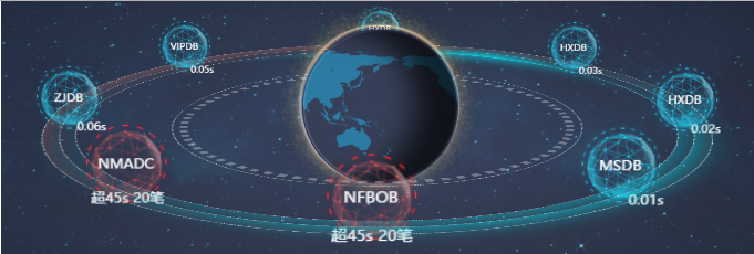
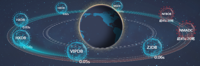
截图效果:实际效果是动态的:地球自西向东自转,行星绕着地球公转,轨道也会转动
HTML页面代码:
<!DOCTYPE html>
<html lang="en">
<head>
<meta charset="UTF-8">
<title>CSS3星系轨道3D</title>
<link rel="stylesheet" type="text/css" href="css/css.css">
</head>
<body>
<!--<div class="earth"></div>-->
<div id="center_earth">
<div class="ui_base u_p3d">
<div class="ball_base u_p3d ball_c_1">
<div class="ball_huo"></div>
</div>
<div class="ball_base u_p3d"> <!-- ball_c_1-->
<div class="earth"></div> <!--ball_c -->
</div>
<div class="base u_p3d">
<div class="ball_c_panx"></div>
<div class="ball_c_pan"></div>
<div class="pan"></div>
<div class="pan1"></div>
<div class="pan2"></div>
<div class="guang1"></div>
<div class="guang2"></div>
<div class="guangx"></div>
<!--<div class="guangin"></div>
<div class="guangout"></div>-->
<div class="ball_base u_p3d ball_1">
<div class="ball">MSDB<span style="position: absolute;left: 60%;top:40%;">0.01s</span></div>
</div>
<div class="ball_base u_p3d ball_2">
<div class="ball">HXDB<span style="position: absolute;left: 60%;top:40%;">0.02s</span></div>
</div>
<div class="ball_base u_p3d ball_3">
<div class="ball">HXDB<span style="position: absolute;left: 60%;top:40%;">0.03s</span></div>
</div>
<div class="ball_base u_p3d ball_4">
<div class="ball">HXDB<span style="position: absolute;left: 60%;top:40%;">0.04s</span></div>
</div>
<div class="ball_base u_p3d ball_5">
<div class="ball">VIPDB<span style="position: absolute;left: 60%;top:40%;">0.05s</span></div>
</div>
<div class="ball_base u_p3d ball_6">
<div class="ball">ZJDB<span style="position: absolute;left: 60%;top:40%;">0.06s</span></div>
</div>
<div class="ball_base u_p3d ball_7">
<div class="ball" style="background-image: url(images/red.png);">NMADC<span style="position: absolute;left: 10%;top:40%;">超45s 20笔</span></div>
</div>
<div class="ball_base u_p3d ball_8">
<div class="ball" style="background-image: url(images/red.png);">NFBOB<span style="position: absolute;left: 10%;top:40%;">超45s 20笔</span></div>
</div>
</div>
</div>
</div>
<script type="text/javascript" src="js/jquery-1.11.0.min.js" ></script>
<script type="text/javascript" src="js/index.js" ></script>
</body>
</html>
js代码:
var i = 5;
var opacLoop = setInterval(function() {
if(i<10) {
i+=0.5;
}else{
i = 5;
}
$('.ball_huo').css("opacity", i/10);
},250);
//clearInterval(opacLoop);
CSS代码:
*{
margin: 0px;
padding: 0px;
border: 0px;
}
body,html{
2725px;
height: 923px;
font-family:microsoft yahei;
}
#center_earth{
100%;
height: 100%;
margin-left: 20px;
background: url(../images/BG.png) no-repeat;
}
@keyframes cir1 {
0% {transform:rotateY(0deg) scale(0.9,0.9);}
25% {transform:rotateY(-90deg) scale(1,1);}
50% {transform:rotateY(-180deg) scale(0.9,0.9);}
75% {transform:rotateY(-270deg) scale(0.7,0.7);}
100% {transform:rotateY(-360deg) scale(0.9,0.9);}
}
@keyframes cir2 {
0% {transform: rotateY(-45deg) scale(0.95,0.95);}
12.5% {transform: rotateY(-90deg) scale(1,1);}
25% {transform:rotateY(-135deg) scale(0.95,0.95);}
37.5% {transform:rotateY(-180deg) scale(0.9,0.9);}
50% {transform:rotateY(-225deg) scale(0.8,0.8);}
62.5% {transform:rotateY(-270deg) scale(0.7,0.7);}
75% {transform:rotateY(-315deg) scale(0.8,0.8);}
87.2% {transform:rotateY(-360deg) scale(0.9,0.9);}
100% {transform: rotateY(-405deg) scale(0.95,0.95);}
}
@keyframes cir3 {
0% {transform: rotateY(-90deg) scale(1,1);}
25% {transform:rotateY(-180deg) scale(0.9,0.9);}
50% {transform:rotateY(-270deg) scale(0.7,0.7);}
75% {transform:rotateY(-360deg) scale(0.9,0.9);}
100% {transform: rotateY(-450deg) scale(1,1);}
}
@keyframes cir4 {
0% {transform: rotateY(-135deg) scale(0.95,0.95);}
12.5% {transform: rotateY(-180deg) scale(0.9,0.9);}
25% {transform:rotateY(-225deg) scale(0.8,0.8);}
37.5%{ transform:rotateY(-270deg) scale(0.7,0.7);}
50% {transform:rotateY(-315deg) scale(0.8,0.8);}
62.5%{transform:rotateY(-360deg) scale(0.9,0.9);}
75% {transform:rotateY(-405deg) scale(0.95,0.95);}
87.5%{transform:rotateY(-450deg) scale(1,1); }
100% {transform: rotateY(-495deg) scale(0.95,0.95);}
}
@keyframes cir5 {
0% {transform: rotateY(-180deg) scale(0.9,0.9);}
25% {transform:rotateY(-270deg) scale(0.7,0.7);}
50% {transform:rotateY(-360deg) scale(0.9,0.9);}
75% {transform:rotateY(-450deg) scale(1,1);}
100% {transform: rotateY(-540deg) scale(0.9,0.9);}
}
@keyframes cir6 {
0% {transform: rotateY(-225deg) scale(0.8,0.8);}
12.5%{transform: rotateY(-270deg) scale(0.7,0.7);}
25%{transform: rotateY(-315deg) scale(0.8,0.8);}
37.5%{transform: rotateY(-360deg) scale(0.9,0.9);}
50%{transform: rotateY(-405deg) scale(0.95,0.95);}
62.5%{transform: rotateY(-450deg) scale(1,1);}
75%{transform: rotateY(-495deg) scale(0.95,0.95);}
87.5%{transform: rotateY(-540deg) scale(0.9,0.9);}
100% {transform: rotateY(-585deg) scale(0.8,0.8);}
}
@keyframes cir7 {
0% {transform: rotateY(-270deg) scale(0.7,0.7);}
25%{transform: rotateY(-360deg) scale(0.9,0.9);}
50%{transform: rotateY(-450deg) scale(1,1);}
75%{transform: rotateY(-540deg) scale(0.9,0.9);}
100% {transform: rotateY(-630deg) scale(0.7,0.7);}
}
@keyframes cir8 {
0% {transform: rotateY(-315deg) scale(0.8,0.8);}
12.5%{transform: rotateY(-360deg) scale(0.9,0.9)}
25%{transform: rotateY(-405deg) scale(0.95,0.95);}
37.5%{transform: rotateY(-450deg) scale(1,1);}
50%{transform: rotateY(-495deg) scale(0.95,0.95);}
62.5%{transform: rotateY(-540deg) scale(0.9,0.9);}
75%{transform: rotateY(-585deg) scale(0.8,0.8);}
87.5%{ transform: rotateY(-630deg) scale(0.7,0.7);}
100% {transform: rotateY(-675deg) scale(0.8,0.8);}
}
@keyframes cir {
0% {transform: rotateX(80deg) rotateY(0deg) rotateZ(0deg);}
100% {transform: rotateX(80deg) rotateY(0deg) rotateZ(-360deg);}
}
@keyframes cir_c_px {
0% {transform: rotateZ(0deg) ;}
100% {transform: rotateZ(-360deg) ;}
}
@keyframes cir_c_p {
0% {transform: rotateZ(0deg) ;}
100% {transform: rotateZ(-360deg) ;}
}
@keyframes cir_p {
0% {transform: rotateZ(0deg) ;}
100% {transform: rotateZ(-360deg) ;}
}
@keyframes cir_p1 {
0% {transform: rotateZ(0deg) ;}
100% {transform: rotateZ(-360deg) ;}
}
@keyframes cir_p2 {
0% {transform: rotateZ(0deg) ;}
100% {transform: rotateZ(-360deg) ;}
}
@keyframes cir_g1 {
0% {transform: rotateZ(0deg) ;}
100% {transform: rotateZ(-360deg) ;}
}
@keyframes cir_g2 {
0% {transform: rotateZ(0deg) ;}
100% {transform: rotateZ(-360deg) ;}
}
@keyframes cir_gx {
0% {transform: rotateZ(0deg) ;}
100% {transform: rotateZ(-360deg) ;}
}
.u_p3d{transform-style: preserve-3d !important;}
.ui_base {
position: relative;
1400px;
height: 0px;
left: 24%;
top:-28%;
perspective: 6500px;
perspective-origin: 50% 0%;
}
.base{
transform: rotateX(80deg) rotateY(-10deg);
position: relative;
1400px;
height: 1400px;
backface-visibility: hidden;
animation: cir 10s linear 0s infinite;
}
.ball_base {
transform-origin: 1260px 0px;
position: absolute;
top: 700px;
left: -560px;
1260px;
height: 300px;
}
.ball{
transition:all 2s ease-out 0ms;
transform-origin: 50% 50%;
position: absolute;
300px;
height: 300px;
line-height: 300px;
text-align: center;
background-image: url(../images/blue.png);
background-size: 100% 100%;
left: 0px;
top: 0px;
color: rgba(255, 255, 255, 0);
font-size: 12px;
opacity: 1;
overflow: hidden;
}
.ball_c {
z-index: 1;
transform-origin: 50% 50%;
position: absolute;
640px;
height: 640px;
line-height: 640px;
text-align: center;
background-image: url(../images/diqiu.png);
background-size: 100% 100%;
left: 986px;
top: 966px;
color: #fff;
font-size: 34px;
}
.ball_huo {
border-radius: 50%;
transform-origin: 50% 50%;
position: absolute;
830px;
height: 830px;
line-height: 830px;
text-align: center;
background-image: url(../images/huo.png);
background-size: 100% 100%;
left: 878px;
top:771px;
color: #fff;
font-size: 34px;
}
.ball_c_pan {
border: 1px dotted white;
border-radius: 50%;
position: absolute;
105%;
height: 105%;
left: -35px;
top: -35px;
animation: cir_c_p 40s linear 0s infinite;
}
.ball_c_panx{
border: 30px dotted rgba(255,255,255,0.3);
border-radius: 50%;
position: absolute;
97%;
height: 97%;
left: -8px;
top: -8px;
animation: cir_c_px 40s linear 0s infinite;
}
.pan {
border: 1px dotted white;
border-radius: 50%;
position: absolute;
153%;
height: 153%;
left: -372px;
top: -372px;
animation: cir_p 40s linear 0s infinite;
}
.pan1 {
box-shadow: -50px 50px 300px -100px #09daea;
border: 1px dotted white;
border-radius: 50%;
position: absolute;
161%;
height: 161%;
left: -428px;
top: -428px;
animation: cir_p1 40s linear 0s infinite;
}
.pan2 {
box-shadow: -50px 50px 300px -100px #c76e62 inset;
border: 1px dotted white;
border-radius: 50%;
position: absolute;
170%;
height: 170%;
left: -491px;
top: -491px;
animation: cir_p2 40s linear 0s infinite;
}
.guang1 {
box-shadow: -600px -50px 250px -600px #09daea inset;
border-radius: 50%;
position: absolute;
153%;
height: 153%;
left: -372px;
top: -372px;
animation: cir_g1 40s linear 0s infinite;
}
.guang2 {
box-shadow: -50px 50px 300px -100px #09daea;
border-radius: 50%;
position: absolute;
153%;
height: 153%;
left: -372px;
top: -372px;
animation: cir_g2 40s linear 0s infinite;
}
.guangx {
box-shadow: 540px 100px 150px -500px #09daea;
border-radius: 50%;
position: absolute;
153%;
height: 153%;
left: -372px;
top: -372px;
animation: cir_gx 40s linear 0s infinite;
}
.ball {
color: #fff;
opacity: 1;
}
.ball_1 .ball {
transform: rotateY(10deg) rotateZ(10deg);
animation: cir1 10s linear 0s infinite;
transition-delay: 1100ms !important;
}
.ball_2 .ball {
animation: cir2 10s linear 0s infinite;
transition-delay: 900ms !important;
}
.ball_3 .ball {
animation: cir3 10s linear 0s infinite;
transition-delay: 700ms !important;
}
.ball_4 .ball {
animation: cir4 10s linear 0s infinite;
transition-delay: 500ms !important;
}
.ball_5 .ball {
animation: cir5 10s linear 0s infinite;
transition-delay: 300ms !important;
}
.ball_6 .ball {
animation: cir6 10s linear 0s infinite;
transition-delay: 100ms !important;
}
.ball_7 .ball{
animation: cir7 10s linear 0s infinite;
transition-delay: 1300ms !important;
}
.ball_8 .ball{
animation: cir8 10s linear 0s infinite;
transition-delay: 1500ms !important;
}
.ball_c_1 .ball_c{
animation: circ 40s linear 0s infinite;
transition-delay: 200ms !important;
}
.ball_c_1 .ball_huo{
animation: circ 40s linear 0s infinite;
transition-delay: 200ms !important;
}
.ball_1 {
transform: rotateX(-90deg) rotateY(0deg) translateY(-240px);
}
.ball_2 {
transform: rotateX(-90deg) rotateY(45deg) translateY(-240px);
}
.ball_3 {
transform: rotateX(-90deg) rotateY(90deg) translateY(-240px);
}
.ball_4 {
transform: rotateX(-90deg) rotateY(135deg) translateY(-240px);
}
.ball_5 {
transform: rotateX(-90deg) rotateY(180deg) translateY(-240px);
}
.ball_6 {
transform: rotateX(-90deg) rotateY(225deg) translateY(-240px);
}
.ball_7 {
transform: rotateX(-90deg) rotateY(270deg) translateY(-240px);
}
.ball_8 {
transform: rotateX(-90deg) rotateY(315deg) translateY(-240px);
}
.ball_c_1{
transform: rotateX(-90deg) rotateY(300deg) translateY(-240px);
}
.ball_c ,.ball_huo{
color: #fff;
opacity: 1;
}
@-webkit-keyframes loop {
0% { background-position: 0 0; }
100%{ background-position: -1112px 0;}
}
.earth{
z-index: 1;
background: url(../images/diqiuG.png) repeat-x 0 0; /*背景图片在水平方向复制*/
border: 1px solid rgba(26,18,101,0.3); /*形成圆边效果,视觉效果更好,不用也行*/
border-radius: 50%; /*使地球形成圆形效果*/
box-shadow: -8px 0 25px rgba(256,256,256,0.3), -1px -2px 14px rgba(256,256,256,0.5) inset; /*形成圆形外面的模糊月晕效果*/
/*下面的属性可使地球位于浏览器窗口垂直水平居中国*/
height: 150px;
left: 68%;
margin: -225px 0 0 -225px;
position: absolute;
top: -118px;
left: 1218px;
height: 556px;
556px;
-webkit-animation: loop 20s linear infinite;
}
.earth:before{
content: "";
border-radius: 50%;
box-shadow: -150px -6px 150px rgba(0,0,0,0.7) inset;/*形成弧形阴影*/
left: 0;
position:absolute;
top: 0;
height: 556px;
556px;
}