所用数据可从这里下载(提取码1fl1),数据说明可参考此文件(提取码7tvm),目标是分析建筑物的节能之星评分(ENERGY STAR Score)与哪些因素有关,并对之进行预测。
一个完整的机器学习项目主要有以下几个步骤组成:
- 探索性数据分析(EDA)
- 特征工程和选择(Feature Engineering and Selection)
- 机器学习模型比较(Model Comparison)
- 超参数调优(Hyperparameters Tuning)
- 模型评估和解释(Model Evaluation and Interpretation)
1. 探索性数据分析
- Read data and Confirm data type
 View Code
import pandas as pd
import numpy as np
import seaborn as sns
import matplotlib.pyplot as plt
from IPython.core.pylabtools import figsize
from sklearn.model_selection import train_test_split
from sklearn.preprocessing import Imputer, FunctionTransformer, MinMaxScaler, LabelBinarizer
from sklearn_pandas import DataFrameMapper, CategoricalImputer
from sklearn.pipeline import Pipeline
data = pd.read_csv('Energy_and_Water_Data_Disclosure_for_Local_Law_84_2017__Data_for_Calendar_Year_2016.csv')
data = data.replace({'Not Available': np.nan})
numeric_units = ['ft²','kBtu','Metric Tons CO2e','kWh','therms','gal','Score']
for col in list(data.columns):
    for unit in numeric_units:
        # Select columns that should be numeric
        if unit in col:
            # Convert the data type to float
            data[col] = data[col].astype(float)
- Check missing value
View Code
def missing_values_table(df):
    # Total missing values
    mis_val = df.isnull().sum()
    # Percentage of missing values
    mis_val_percent = 100 * df.isnull().sum() / len(df)
    # Make a table with the results
    mis_val_table = pd.concat([mis_val, mis_val_percent], axis=1)
    # Rename the columns
    mis_val_table = mis_val_table.rename(columns = {0 : 'Missing Values', 1 : '% of Total Values'})
    # Sort the table by percentage of missing descending
    mis_val_table = mis_val_table[mis_val_table.iloc[:,1] != 0].sort_values('% of Total Values', ascending=False).round(1)
    # Return the dataframe with missing information
    return mis_val_table
missing_df = missing_values_table(data)
### drop the columns that have >50% missing values
missing_columns = list(missing_df[missing_df['% of Total Values'] > 50].index)
print('We will remove %d columns.' % len(missing_columns))
data = data.drop(columns = missing_columns)
- Remove Outliers
View Code
# Calculate first and third quartile
first_quartile = data['Site EUI (kBtu/ft²)'].describe()['25%']
third_quartile = data['Site EUI (kBtu/ft²)'].describe()['75%']
iqr = third_quartile - first_quartile  #Interquartile range
data = data[(data['Site EUI (kBtu/ft²)'] > (first_quartile - 3 * iqr)) &
            (data['Site EUI (kBtu/ft²)'] < (third_quartile + 3 * iqr))]
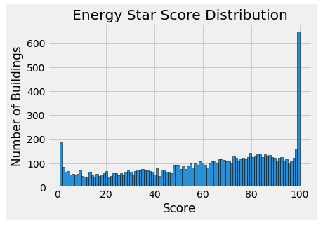
- Histogram of the target
View Code
### Histogram of the Energy Star Score(the target)
data = data.rename(columns = {'ENERGY STAR Score': 'score'})
plt.style.use('fivethirtyeight')
plt.hist(data['score'].dropna(), bins = 100, edgecolor = 'k')
plt.xlabel('Score'); plt.ylabel('Number of Buildings')
plt.title('Energy Star Score Distribution')
- Correlations between the target and numerical variables
View Code
# Find all correlations and sort
correlations_data = data.corr()['score'].sort_values()
# Print the most negative correlations
print(correlations_data.head(15), '
')
# Print the most positive correlations
print(correlations_data.tail(15))
- Plot distributions of the target for a categorical variable
View Code
# Create a list of building types with more than 100 observations
types = data.dropna(subset=['score'])
types = types['Largest Property Use Type'].value_counts()
types = list(types[types.values > 100].index)
# Plot each building
sns.set(font_scale = 1)
figsize(6, 5)
for b_type in types:
    # Select the building type
    subset = data[data['Largest Property Use Type'] == b_type]
    # Density plot of Energy Star scores
    sns.kdeplot(subset['score'].dropna(), label = b_type, shade = False, alpha = 0.8)
# label the plot
plt.xlabel('Energy Star Score', size = 10)
plt.ylabel('Density', size = 10)
plt.title('Density Plot of Energy Star Scores by Building Type', size = 14)

- Visualization of the target vs a numerical variable and a categorical variable
View Code
temp = data.dropna(subset=['score'])
# Limit to building types with more than 100 observations
temp = temp[temp['Largest Property Use Type'].isin(types)]
# Visualization
figsize(9, 7.5)
sns.set(font_scale = 2)
sns.lmplot('Site EUI (kBtu/ft²)', 'score', hue = 'Largest Property Use Type', data = temp,
           scatter_kws = {'alpha': 0.8, 's': 60}, fit_reg = False, size = 12, aspect = 1.2)
# Plot labeling
plt.xlabel("Site EUI", size = 28)
plt.ylabel('Energy Star Score', size = 28)
plt.title('Energy Star Score vs Site EUI', size = 36)

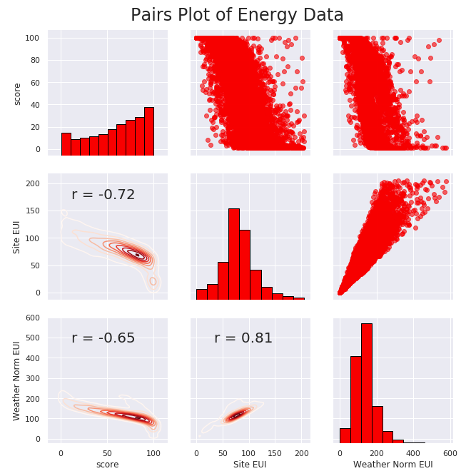
- Pair Plot
View Code
# Extract the columns to  plot
plot_data = data[['score', 'Site EUI (kBtu/ft²)', 'Weather Normalized Source EUI (kBtu/ft²)']]
# Replace the inf with nan
plot_data = plot_data.replace({np.inf: np.nan, -np.inf: np.nan})
# Rename columns
plot_data = plot_data.rename(columns = {'Site EUI (kBtu/ft²)': 'Site EUI',
                                        'Weather Normalized Source EUI (kBtu/ft²)': 'Weather Norm EUI'})
# Drop na values
plot_data = plot_data.dropna()
# Function to calculate correlation coefficient between two columns
def corr_func(x, y, **kwargs):
    r = np.corrcoef(x, y)[0][1]
    ax = plt.gca()
    ax.annotate("r = {:.2f}".format(r), xy=(.2, .8), xycoords=ax.transAxes, size = 20)
# Create the pairgrid object
figsize(9,7.5)
sns.set(font_scale = 1)
grid = sns.PairGrid(data = plot_data, height = 3)
# Upper is a scatter plot
grid.map_upper(plt.scatter, color = 'red', alpha = 0.6)
# Diagonal is a histogram
grid.map_diag(plt.hist, color = 'red', edgecolor = 'black')
# Bottom is correlation and density plot
grid.map_lower(corr_func);
grid.map_lower(sns.kdeplot, cmap = plt.cm.Reds)
# Title for entire plot
plt.suptitle('Pairs Plot of Energy Data', size = 24, y = 1.02)

2. 特征工程和选择
- 特征工程
View Code
### Extract the buildings with no score and the buildings with a score
numeric_cols = data.columns[data.dtypes!=object].tolist()
categorical_cols = ['Borough', 'Largest Property Use Type']
no_score = data[numeric_cols+categorical_cols][data['score'].isna()] #for prediction
score = data[numeric_cols+categorical_cols][data['score'].notnull()]
### Separate out the features and targets
features = score.drop(columns='score')
targets = pd.DataFrame(score['score'])
numeric_cols.remove('score')
### Split into 70% training and 30% testing set
X, X_test, y, y_test = train_test_split(features, targets, test_size = 0.3, random_state = 42)
### Create columns with log of numeric columns
def add_log(df):
    temp = df.copy()
    for col in numeric_cols:
        temp['log_' + col] = np.sign(df[col])*np.log(np.abs(df[col])+1)
    return temp
### Apply numeric imputer and min-max transform
cols = numeric_cols+['log_'+col for col in numeric_cols]
numeric_imputer = [([feature], [Imputer(strategy="median"),MinMaxScaler(feature_range=(0, 1))])
                   for feature in cols]
### Apply categorical imputer and one-hot encode
category_imputer = [(feature, [CategoricalImputer(strategy='constant', fill_value='Missing'),LabelBinarizer()])
                    for feature in categorical_cols]
### union mapper
mapper = DataFrameMapper(numeric_imputer+category_imputer, input_df=True, df_out=True)
### feature engineer pipeline
fea_engine = Pipeline([("add_log", FunctionTransformer(add_log, validate=False)),
                       ("num_cat_mapper", mapper)])
X_engine = fea_engine.fit_transform(X)
X_test_engine = fea_engine.transform(X_test)
- 特征选择
View Code
### Remove collinear features in a dataframe with a correlation coefficient greater than the threshold.
### Removing collinear features can help a model to generalize and improves the interpretability of the model.
### pakage feature_selector: https://github.com/WillKoehrsen/feature-selector
from feature_selector import FeatureSelector
cols = numeric_cols+['log_'+col for col in numeric_cols]
fs = FeatureSelector(data = X_engine[cols], labels = y)
fs.identify_collinear(correlation_threshold=0.8)
correlated_features = fs.ops['collinear']
print(fs.record_collinear) #打印相关系数的详细信息
X_select = X_engine.drop(columns = correlated_features)
X_test_select = X_test_engine.drop(columns = correlated_features)
### Write to files for next modeling
no_score.to_csv('data/no_score.csv', index = False)
X_select.to_csv('data/training_features.csv', index = False)
X_test_select.to_csv('data/testing_features.csv', index = False)
y.to_csv('data/training_labels.csv', index = False)
y_test.to_csv('data/testing_labels.csv', index = False)
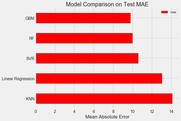
3. 机器学习模型比较
from sklearn.linear_model import LinearRegression
from sklearn.ensemble import RandomForestRegressor, GradientBoostingRegressor
from sklearn.svm import SVR
from sklearn.neighbors import KNeighborsRegressor
### Read data
train_features = pd.read_csv('data/training_features.csv')
test_features = pd.read_csv('data/testing_features.csv')
train_labels = pd.read_csv('data/training_labels.csv')
test_labels = pd.read_csv('data/testing_labels.csv')
### Function to calculate mean absolute error
def mae(y_true, y_pred):
    return np.mean(abs(y_true - y_pred))
### Create a baseline
baseline_guess = np.median(train_labels)
print('The baseline guess is a score of %0.2f' % baseline_guess)
print("Baseline Performance on the test set: MAE = %0.4f" % mae(test_labels, baseline_guess))
### Model Comparison
def fit_and_evaluate(model):
    model.fit(train_features, train_labels.values.reshape((-1,))) #train the model
    model_pred = model.predict(test_features) #predict the model
    model_mae = mae(test_labels.values.reshape((-1,)), model_pred) #compute the metric
    return model_mae
lr = LinearRegression() #Linear Regression
lr_mae = fit_and_evaluate(lr)
print('Linear Regression Performance on the test set: MAE = %0.4f' % lr_mae)
svm = SVR(C = 1000, gamma = 0.1)
svm_mae = fit_and_evaluate(svm) #SVR
print('Support Vector Machine Regression Performance on the test set: MAE = %0.4f' % svm_mae)
random_forest = RandomForestRegressor(random_state=60) #Random Forest
random_forest_mae = fit_and_evaluate(random_forest)
print('Random Forest Regression Performance on the test set: MAE = %0.4f' % random_forest_mae)
gradient_boosted = GradientBoostingRegressor(random_state=60) #GBM
gradient_boosted_mae = fit_and_evaluate(gradient_boosted)
print('Gradient Boosted Regression Performance on the test set: MAE = %0.4f' % gradient_boosted_mae)
knn = KNeighborsRegressor(n_neighbors=10) #KNN
knn_mae = fit_and_evaluate(knn)
print('K-Nearest Neighbors Regression Performance on the test set: MAE = %0.4f' % knn_mae)
### Visualization
plt.style.use('fivethirtyeight')
figsize(8, 6)
model_comparison = pd.DataFrame({'model': ['Linear Regression', 'SVR', 'RF', 'GBM', 'KNN'],
                                 'mae': [lr_mae, svm_mae, random_forest_mae, gradient_boosted_mae, knn_mae]}) # Dataframe to hold the results
model_comparison.sort_values('mae', ascending = False).plot(x = 'model', y = 'mae',
                                                            kind = 'barh', color = 'red', edgecolor = 'black') # Horizontal bar chart of test mae
plt.ylabel(''); plt.yticks(size = 14); plt.xlabel('Mean Absolute Error'); plt.xticks(size = 14)
plt.title('Model Comparison on Test MAE', size = 20)
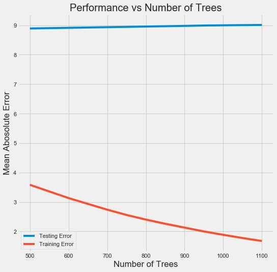
4. 超参数调优
from sklearn.model_selection import RandomizedSearchCV, GridSearchCV
### Create the model to use for hyperparameter tuning
model = GradientBoostingRegressor(random_state=60)
### Set tuned hyperparameters
loss = ['ls', 'lad', 'huber']
n_estimators = [100, 500, 900, 1100, 1500]
max_depth = [2, 3, 5, 10, 15]
min_samples_leaf = [1, 2, 4, 6, 8]
min_samples_split = [2, 4, 6, 10]
max_features = ['sqrt', 'log2', None]
hyperparameter_grid = {'loss': loss, 'n_estimators': n_estimators, 'max_depth': max_depth,
                       'min_samples_leaf': min_samples_leaf, 'min_samples_split': min_samples_split,
                       'max_features': max_features}
### Set up the random search with 4-fold cross validation
random_cv = RandomizedSearchCV(estimator=model, param_distributions=hyperparameter_grid,
                               cv=4, n_iter=25, scoring='neg_mean_absolute_error', n_jobs=-1,
                               verbose=1, random_state=60)
random_cv.fit(train_features, train_labels.values.reshape((-1,)))
print(random_cv.best_estimator_)
### Further grid search for the model
model = random_cv.best_estimator_
trees_grid = {'n_estimators': [500, 600, 700, 750, 800, 850, 900, 950, 1000, 1050, 1100]}
grid_search = GridSearchCV(estimator=model, param_grid=trees_grid, cv=4, verbose=1,
                           scoring='neg_mean_absolute_error', n_jobs=-1)
grid_search.fit(train_features, train_labels.values.reshape((-1,)))
### Plot the training and testing error vs number of trees
results = pd.DataFrame(grid_search.cv_results_)
figsize(8, 8)
plt.style.use('fivethirtyeight')
plt.plot(results['param_n_estimators'], -1 * results['mean_test_score'], label = 'Testing Error')
plt.plot(results['param_n_estimators'], -1 * results['mean_train_score'], label = 'Training Error')
plt.xlabel('Number of Trees'); plt.ylabel('Mean Abosolute Error'); plt.legend()
plt.title('Performance vs Number of Trees') #下图
### 由下图可以看出过拟合现象,因此再进行一轮grid search,希望能够改善过拟合
of_grid = {'n_estimators': [100,200,300,400,500], 'min_samples_leaf': [1,2], 'min_samples_split': [2,4], 'max_depth': [3,5]}
grid_search_of = GridSearchCV(estimator=grid_search.best_estimator_, param_grid=of_grid, cv=4, verbose=1,
                              scoring='neg_mean_absolute_error', n_jobs=-1)
grid_search_of.fit(train_features, train_labels.values.reshape((-1,)))
### Final Model
final_model = grid_search_of.best_estimator_
print(final_model)
final_mae = fit_and_evaluate(final_model)
print('Final model performance on the test set:   MAE = %0.4f.' % final_mae) #MAE: 9.02
5. 模型评估和解释
- 预测缺失的评分
View Code
no_score = pd.read_csv('data/no_score.csv').drop(columns='score')
no_score_engine = fea_engine.transform(no_score)
no_score_select = no_score_engine.drop(columns = correlated_features)
final_model = grid_search_of.best_estimator_
final_model.fit(train_features, train_labels.values.reshape((-1,)))
score_preds = final_model.predict(no_score_select)
score_preds = np.where(score_preds>100, 100, score_preds)
score_preds = np.where(score_preds<0, 0, score_preds)
### Plot
plt.style.use('fivethirtyeight')
plt.hist(score_preds, bins = 100, edgecolor = 'k')
plt.xlabel('Predicted Score'); plt.ylabel('Number of Buildings')
plt.title('Energy Star Score Distribution')

- 特征重要性
View Code
# Extract the feature importances into a dataframe
feature_results = pd.DataFrame({'feature': list(train_features.columns), 'importance': final_model.feature_importances_})
# Show the top 10 most important
feature_results = feature_results.sort_values('importance', ascending = False).reset_index(drop=True)
print(feature_results.head(10))
- Locally Interpretable Model-agnostic Explanations(LIME)
View Code
import lime
import lime.lime_tabular
### Find the residuals
residuals = abs(final_model.predict(test_features) - test_labels.values.reshape((-1,)))
### Extract the worst prediction
wrong = test_features.values[np.argmax(residuals), :]
### Create a lime explainer object
explainer = lime.lime_tabular.LimeTabularExplainer(training_data = train_features.values,
                                                   categorical_features=list(range(25,len(train_features.columns))),
                                                   mode = 'regression',
                                                   training_labels = train_labels.values.reshape((-1,)),
                                                   feature_names = list(train_features.columns))
### Explanation for wrong prediction
print('Prediction: %0.4f' % final_model.predict(wrong.reshape(1, -1)))
print('Actual Value: %0.4f' % test_labels.values.reshape((-1,))[np.argmax(residuals)])
wrong_exp = explainer.explain_instance(data_row = wrong, predict_fn = final_model.predict)
### Plot the prediction explaination
wrong_exp.as_pyplot_figure()
plt.title('Explanation of Prediction for the Wrong Case', size = 28)
plt.xlabel('Effect on Prediction', size = 22)
关于LIME的介绍可参考这篇文章,上述代码仅分析了模型预测最不准确的那个例子。从下图可以看出在该例中模型预测值偏低的主要原因是Site EUI以及Weather Normalized Site Electricity Intensity的值较高;这两个值越高,建筑物的节能之星评分就越低,这是模型经过训练所总结出来的性质。在该例中虽然这两个值很高,但是建筑物的实际节能之星评分也很高,这就与模型经过大量数据训练所得到的经验相悖,最终造成了较大的预测误差。
