一、定宽定高:
1、margin
根据已知的宽高写死,不推荐
2、绝对定位 + margin-top + margin-left
<!DOCTYPE html>
<html lang="en">
<head>
    <meta charset="UTF-8">
    <meta name="viewport" content="width=device-width, initial-scale=1.0">
    <title>Document</title>
</head>
<body>
    <style>
        .parents{
            background:rgb(70, 68, 68);
            width:400px;
            height:400px;
            position:relative;

        }
        .child{
            background:rgb(170, 79, 79);
            width:200px;
            height:100px;
            position:absolute;
            left:50%;
            top:50%;
            margin-top:-50px;
            margin-left:-100px;

        }
    </style>
    <div class="parents">
        <div class="child">
            <ul>
                <li>我要垂直水平居中</li>
                <li>我用绝对定位+margin</li>
                <li>我是定宽定高元素</li>
            </ul>
        </div>
    </div>

</body>
</html>
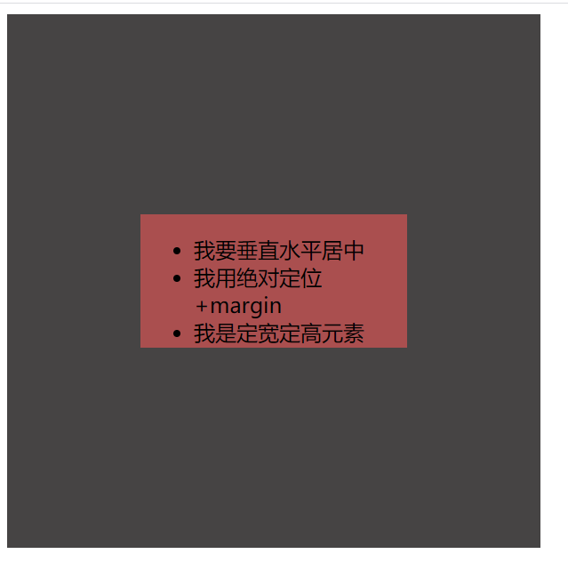
设置父元素的position为相对定位,子元素绝对定位,并在 top 和 left 方向上移动父元素50%的距离。
但这个时候,是子元素的上边框和左边框距离父元素200px,整体向右下角偏了一些,所以还需要再用 margin 调整至中心位置,数值分别是高度和宽度的一半。
3、绝对定位 + (margin:auto)
<!DOCTYPE html>
<html lang="en">
<head>
    <meta charset="UTF-8">
    <meta name="viewport" content="width=device-width, initial-scale=1.0">
    <title>Document</title>
</head>
<body>
    <style>
        .parents{
            background:rgb(70, 68, 68);
            width:300px;
            height:300px;
            position:relative;

        }
        .child{
            background:rgb(170, 79, 79);
            width:200px;
            height:100px;
            position:absolute;
            left:0;
            top:0;
            bottom:0;
            right:0;
            margin:auto;

        }
    </style>
    <div class="parents">
        <div class="child">
            <ul>
                <li>我要垂直水平居中</li>
                <li>我用绝对定位+marginauto</li>
                <li>我是定宽定高元素</li>
            </ul>
        </div>
    </div>

</body>
</html>
同样是使用绝对定位,但四个方向的偏移量全都为0,之后设置 margin:auto 分配剩余空间,令元素的均匀拖拽至父元素的中心位置。
二、未知宽高
1、transform 方案: 存在兼容问题:
<!DOCTYPE html>
<html lang="en">
<head>
    <meta charset="UTF-8">
    <meta name="viewport" content="width=device-width, initial-scale=1.0">
    <title>Document</title>
</head>
<body>
    <style>
        .parents{
            background:rgb(70, 68, 68);
            width:300px;
            height:300px;
            position:relative;


        }
        .child{
            background:rgb(170, 79, 79);
            position:absolute;
            left:50%;
            top:50%;
            transform:translate(-50%,-50%);

        }
    </style>
    <div class="parents">
        <div class="child">
            <ul>
                <li>我要垂直水平居中</li>
                <li>我用绝对定位+transform</li>
                <li>我类似于绝对定位+margintop</li>
                <li>我是定宽定高元素</li>
            </ul>
        </div>
    </div>

</body>
</html>

在子元素上设置,transform: translate(-50%, -50%); 用于平面的2D转换,后面的百分比以自身的宽高为参考,定位后将元素的左上角置于父级中央,之后再用 transform 进行偏移,相当于上面设置的 margin-top 和 margin-left。
2、flex: 兼容问题
<!DOCTYPE html>
<html lang="en">
<head>
    <meta charset="UTF-8">
    <meta name="viewport" content="width=device-width, initial-scale=1.0">
    <title>Document</title>
</head>
<body>
    <style>
        .parents{
            background:rgb(70, 68, 68);
            width:300px;
            height:300px;
            display:flex;
            align-items: center;
            justify-content: center;


        }
        .child{
            background:rgb(170, 79, 79);

        }
    </style>
    <div class="parents">
        <div class="child">
            <ul>
                <li>我要垂直水平居中</li>
                <li>我用flex</li>
                <li>我是不定宽不定高元素</li>
            </ul>
        </div>
    </div>

</body>
</html>
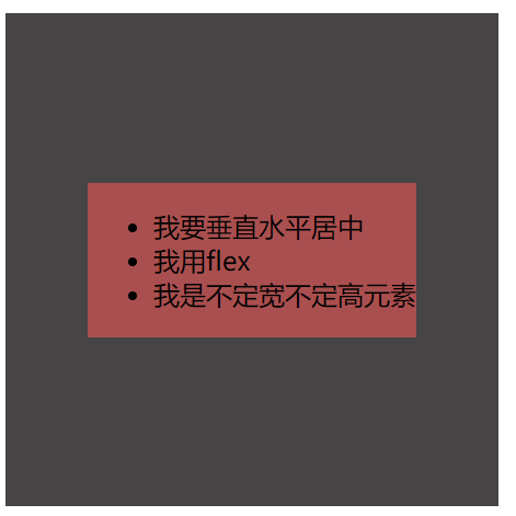
设置父元素为 flex 弹性盒模型。
3.父元素设置table-cell
<!DOCTYPE html>
<html lang="en">
<head>
    <meta charset="UTF-8">
    <meta name="viewport" content="width=device-width, initial-scale=1.0">
    <title>Document</title>
</head>
<body>
    <style>
        *{
            margin:0;
            padding:0;
        }
        .grandPa{
            display:table;
            width:300px;
            height:300px;
        }
        .parents{
            background:rgb(70, 68, 68);
            display: table-cell;
            text-align: center;
            vertical-align: middle;


        }
        .child{
            background:rgb(170, 79, 79);
        }
        li{
            list-style:none;
        }
    </style>
    <div class='grandPa'>
    <div class="parents">
        <div class="child">
            <ul>
                <li>我要垂直水平居中</li>
                <li>我用table-cell</li>
                <li>我是不定宽不定高元素</li>
            </ul>
            <!-- <p>我要垂直水平居中</p>
            <p>我用table-cell</p>
            <p>我是不定宽不定高元素</p> -->
        </div>
    </div>
</div>

</body>
</html>

只需要设置父元素即可,text-align: center; 并在竖直方向上vertical-align:middle;,早期属性,不存在兼容问题。