通过switch组件控制swiper组件的属性,实现轮播图的各种效果
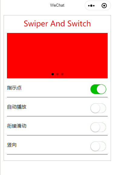
<!--index.wxml-->
<view class='box'>
  <view class='title'>Swiper And Switch</view>
  <swiper indicator-dots="{{indicatorDots}}" autoplay="{{autoplay}}" circular="{{circular}}" vertical="{{vertical}}" interval="{{interval}}" duration="{{duration}}"><!--indicator-dots是否有指示点,autoplay是否自动播放,circular是否衔接播放,vertical是否垂直播放,interval间隔,duration播放时长-->
    <block wx:for="{{background}}" wx:key="{{index}}"><!--滑块通过循环实现,{{background}}数据绑定,从js文件中获得,第一个值是bc-red-->
      <swiper-item>
        <view class="{{item}}"></view><!--样式=bc-red,用到wxss文件-->
      </swiper-item>
    </block>
  </swiper>
  <view class='waikuang'>
    <text class='myLeft'>指示点</text>
    <switch checked='{{indicatorDots}}' bindchange="changeIndicatorDots" />
  </view>
  <view class='waikuang'>
    <text class='myLeft'>自动播放</text>
    <switch checked="{{autoplay}}" bindchange="changeAutoplay" />
  </view>
  <view class='waikuang'>
    <text class='myLeft'>衔接滑动</text>
    <switch checked="{{circular}}" bindchange="changeCircular" />
  </view>
  <view class='waikuang'>
    <text class='myLeft'>竖向</text>
    <switch checked="{{vertical}}" bindchange="changeVertical" />
  </view>
</view>
/*index.wxss */

.bc-red {
  width: 100%;
  height: 150px;
  background-color: red;
}

.bc-green {
  width: 100%;
  height: 150px;
  background-color: green;
}

.bc-blue {
  width: 100%;
  height: 150px;
  background-color: blue;
}

.waikuang {
  display: flex;
  flex-direction: row;
  border-bottom: 1px solid #353535;
  margin: 10px 0px;
  padding: 10px 0px;
}

.myLeft {
  flex: 1;/*指示点文本要占据整个父组件waikuang的所在的view的全部剩余空间,最右边有一个组件,所以占用的左边所有的空间 */
}
//index.js
Page({
  data: {
    background: ['bc-red', 'bc-green', 'bc-blue'],
    indicatorDots: true,
    autoplay: false,
    circular: false,
    vertical: false,
    interval: 2000,
    duration: 500,
  },

  changeIndicatorDots: function(e) {
    this.setData({
      indicatorDots: !this.data.indicatorDots//本对象当中的data里的indicatorDots,取反
    })
  },
  changeAutoplay: function(e) {
    this.setData({
      autoplay: !this.data.autoplay
    })
  },
  changeCircular: function(e) {
    this.setData({
      circular: !this.data.circular
    })
  },
  changeVertical: function(e) {
    this.setData({
      vertical: !this.data.vertical
    })
  }
})
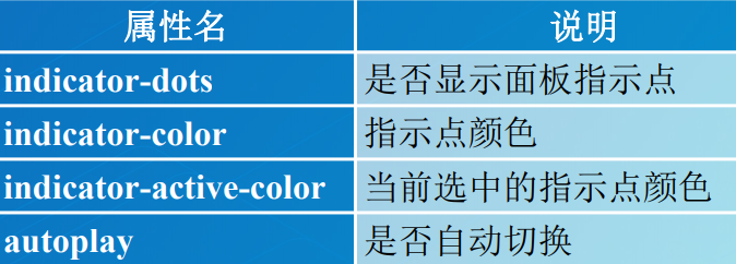
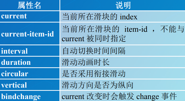
swiper组件
滑块视图容器组件,能够实现轮播图的效果,其常用属性如表所示:
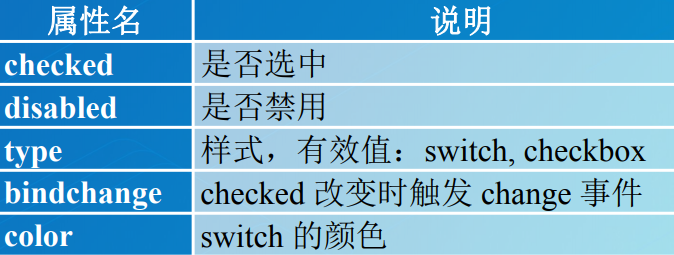
switch组件
开关选择器组件,能够实现开关效果,其 常用属性如表所示: