Design Better Forms
https://medium.com/nextux/design-better-forms-96fadca0f49c
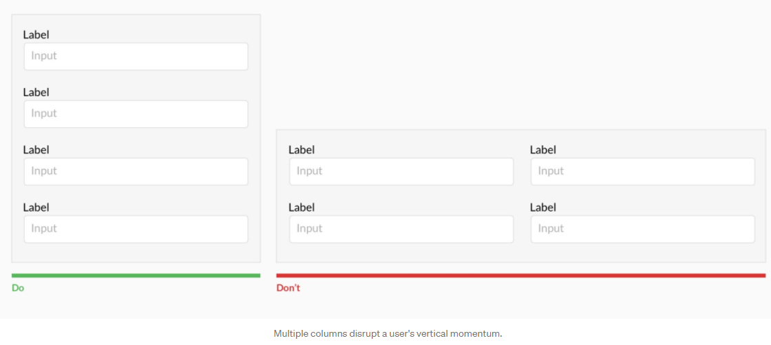
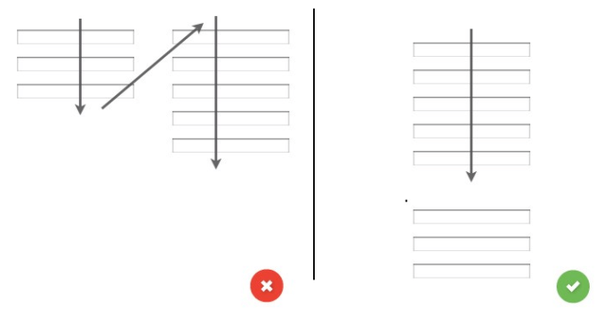
一列 input:
Forms should be one column
-
多列干扰用户的垂直动量
-
Z 或 N 字形扫描影响用户体验
Top align labels
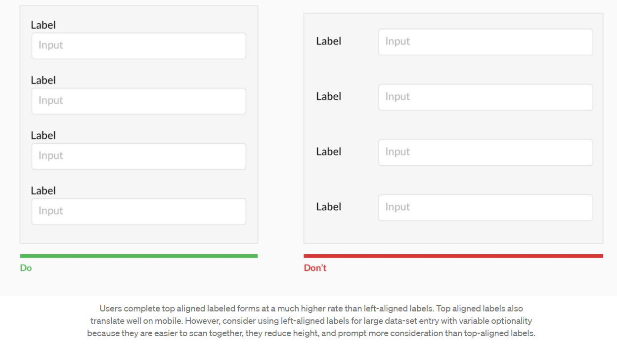
-
手机比较合适
-
大数据表格合适 left align
-
合适扫描
-
高度不需要那么多
Label 和 input 的亲密性:
Group labels with their inputs

-
#亲密性: Label and input 是非常亲密的
Avoid all caps
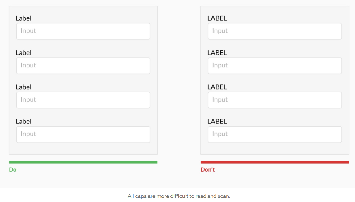
-
大写字母更难阅读和扫描
6 个以下需要显示:
Show all selection options if under 6
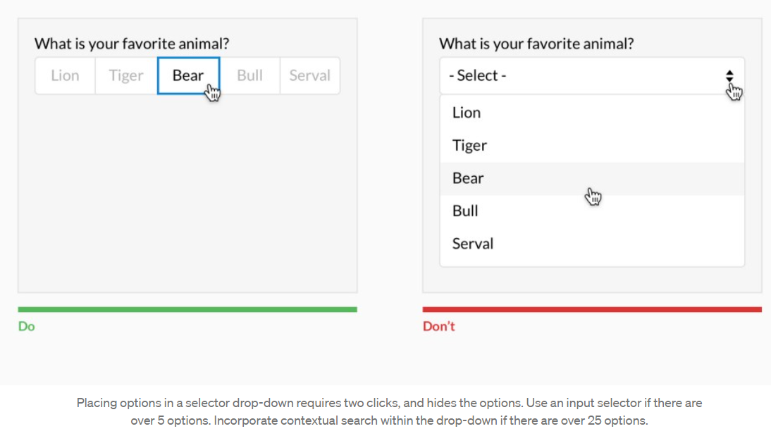
-
Selector 需要 2 次点击,选项被隐藏(这不好)
-
少过 6 个就不要用 selector
-
超过 25 个就建议搜索
-
定案:
-
不记得多少 option 才要隐藏?
不要用 placeholder as label
Resist using placeholder text as labels
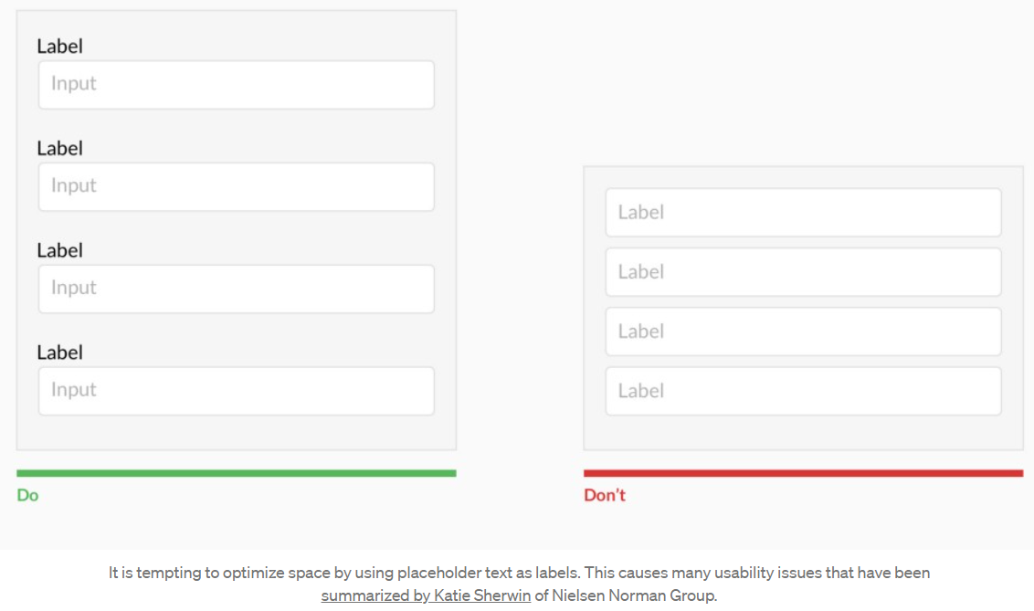
-
使用 placeholder as label 可能是为了节省空间
-
#可用性 会被影响
-
Placeholder 会被隐藏,这让用户在 input 后无法记得 label 当需要检查时
-
Placeholder 的颜色 contract 不好
往下摆列易于阅读
Place checkboxes (and radios) underneath each other for scannability

-
#可扫描性: 往下比较好扫描
Make CTAs descriptive


-
CTA 按钮文字需要带有意图
错误提示要明显
Specify errors inline

-
Error 提示要明显和提供提示
当用户在填写 input 时,不要显示错误提示
Use inline validation after the user fills out the field (unless it helps them while in the process)
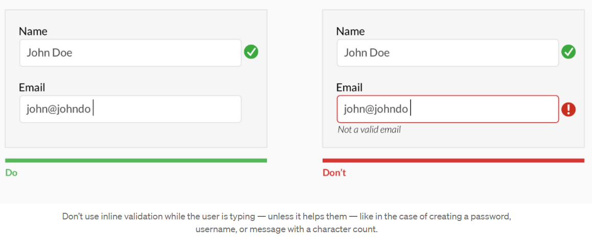
-
当用户在填写 input 时,不要显示错误提示(没有 dirty),比如在填写 input email 时
-
可以在填写 input 时,直接显示错误提示,比如 username
-
定案:
-
通常都是 unblur 给出提示,因为我们会假设在没有填完整之前,所输入的都可能是对的
-
在 unblur 后又 focus 回去之前的 input 同时 input change,立马显示错误,因为用户很可能是要马上得到 feedback 来判断自己的 value
Don’t hide basic helper text
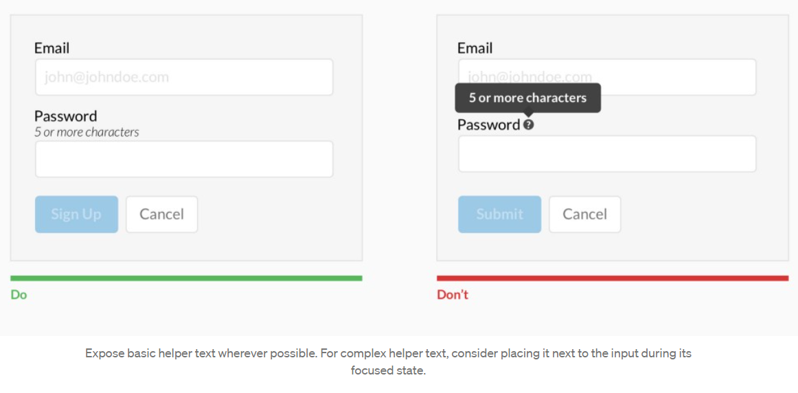
-
Hint = Help text
-
定案:分为几类
-
Label hint
-
Show
-
Hide
-
Label hint hint
-
Show
-
Hide
-
Input hint
-
Value hint
主要次要要区分
Differentiate primary from secondary actions
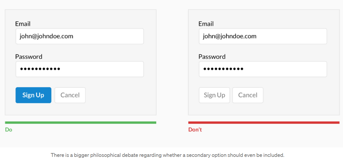
-
主要和次要需要区分(按钮)
Input 宽度
Use field length as an affordance
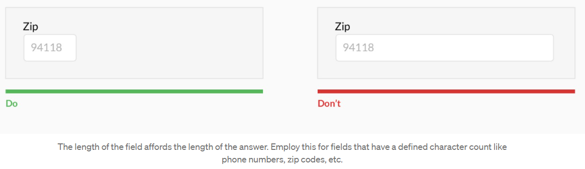
-
Input width 会引导用户认为字数需要很多
星星和 optional
Ditch the * and denote optional fields
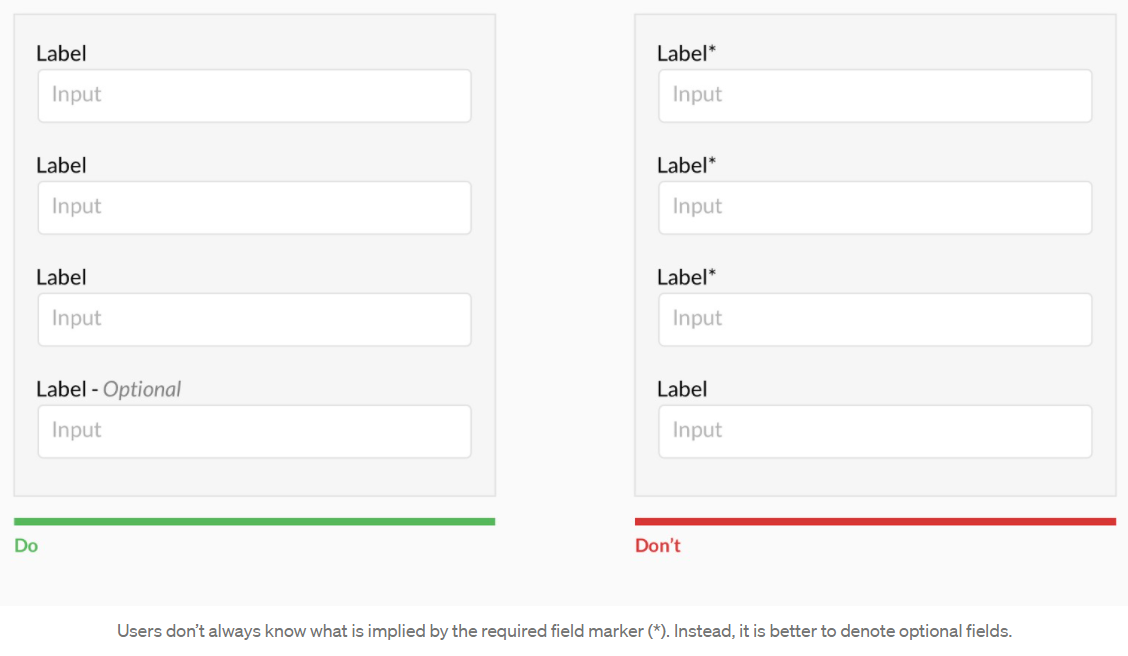
-
大部分是 required,就放 optional,同样 optional 是大部分,就放 required
Group related information
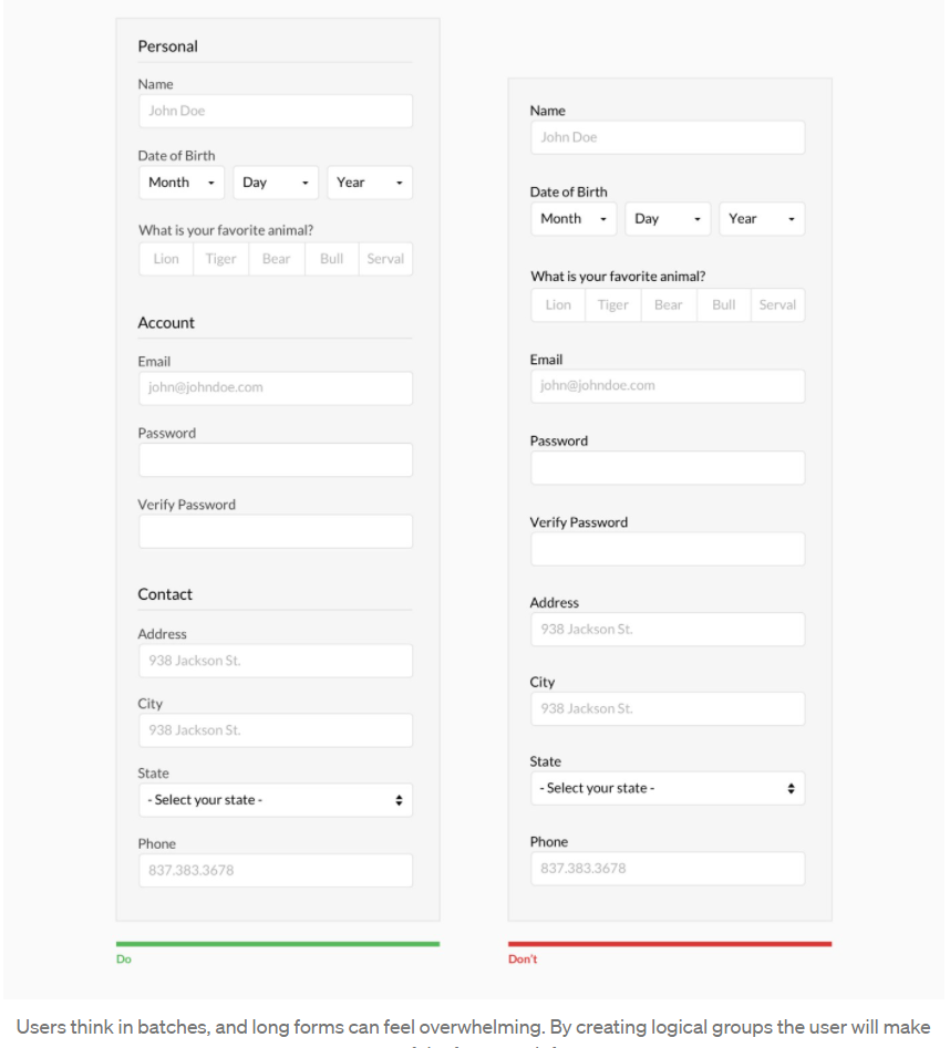
-
同样类型需要 group 起来,这样用户好理解
-
定案:
-
超过 6 个 inputs,需要 group 起来