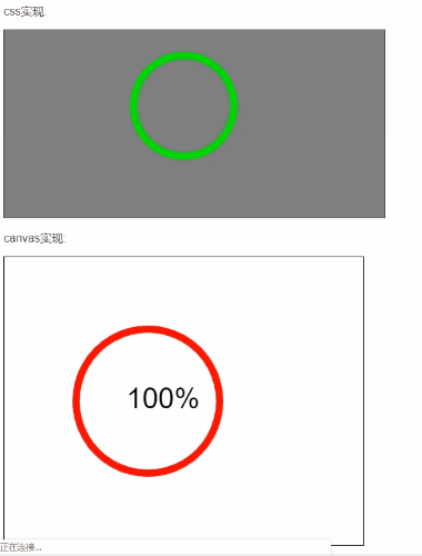
进度条效果:
话不多说,上代码
使用css动画实现,看到一篇博客的启发,稍微修改了下,
css实现的原理是用两个半圆一开始隐藏,再分别旋转180度,最后成为一个整圆
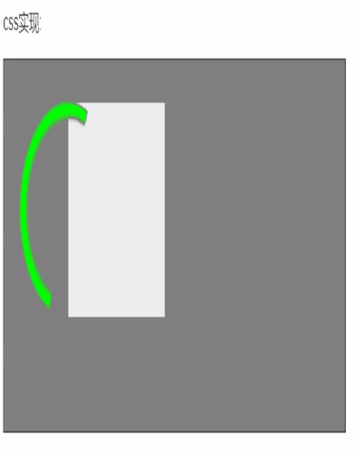
半圆效果,一开始右边的半圆在盒子左边
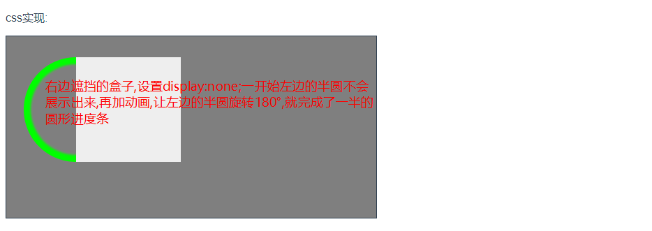
加上动画,实现右边进度条效果
代码:
<div class="container">
<!-- 右边圆形 -->
<div class="rigth_content">
<div class="rotate_box right_rotate"></div>
</div>
</div>
<style>

.container {
padding: 30px;
padding-left: 100px;
 400px;
height: 200px;
border: 1px solid #2c3e50;

}
<!-- 旋转动画 -->
@-webkit-keyframes rotateright {
0% {
transform: rotate(0deg);
}
50%,100% {
transform: rotate(180deg);
}
}

.rigth_content {
 150px;
height: 150px;
/* overflow: hidden; */
position: relative;
background-color: #eee;
}

.rotate_box {
 150px;
height: 150px;
position: absolute;
<!-- 这里我用的是内阴影效果,也可以直接用border边框 -->
box-shadow: 0 0 3px 10px #00ff00 inset;
border-radius: 50%;
top: 0px;
}

.right_rotate {
<!-- 定位到盒子的外部,一开始被遮挡 -->
left: -75px;
<!-- clip属性:截取指定区域的内容,顺序为上,右,下,左,这里不需要右边的阴影,第二个参数取一半 -->
clip: rect(0px, 75px, auto, 0);
animation: rotateright 8s linear normal;
animation-fill-mode: forwards;
}
</style>
右边的圆形绘成后,用同样的方法画出左边的圆形
完整代码:
<p>css实现:</p>
<div class="container">
  <!-- 左边圆形 -->
  <div class="left_content">
    <div class="rotate_box left_rotate"></div>
  </div>
  <!-- 右边圆形 -->
  <div class="rigth_content">
    <div class="rotate_box right_rotate"></div>
  </div>
</div>
<style>
.container {
  padding: 30px;
  padding-left: 100px;
   400px;
  height: 200px;
  border: 1px solid #2c3e50;
  background-color: rgba(0, 0, 0, .5);
}
@-webkit-keyframes rotateright {
  0% {
    transform: rotate(0deg);
  }
  50%,100% {
    transform: rotate(180deg);
  }
}
@-webkit-keyframes rotateleft {
  0%,50% {
    transform: rotate(0deg);
  }
  100% {
    transform: rotate(180deg);
  }
}
.rigth_content {
   150px;
  height: 150px;
  overflow: hidden;
  position: relative;
}
.left_content {
   150px;
  height: 150px;
  overflow: hidden;
  position: relative;
  float: left;
}
.rotate_box {
   150px;
  height: 150px;
  position: absolute;
  box-shadow: 0 0 3px 10px #00ff00 inset;
  border-radius: 50%;
  top: 0px;
}
.left_rotate {
  left: 75px;
  clip: rect(0px, auto, auto, 75px);
  animation: rotateleft 8s linear normal;
  animation-fill-mode: forwards;
}
.right_rotate {
  left: -75px;
  clip: rect(0px, 75px, auto, 0);
  animation: rotateright 8s linear normal;
  animation-fill-mode: forwards;
}

</style>
第二种实现方法,使用canvas绘图,这种方法效果会更好一些,扩展性更好
我是写在vue项目中的,绘制方法写在mounted中
<p>canvas实现:</p>
<canvas width="500px" height="400px" style="border: 1px solid #000;" ref="myCanvas"></canvas>

mounted() {
    this.$nextTick(() => {
      const brush = this.$refs.myCanvas
      const ctx = brush.getContext("2d")
      ctx.strokeStyle = 'red'
      ctx.lineCap='round'
      ctx.lineWidth = 10
      // 初始角度,默认是在右边3点钟方向,旋转90度到12点方位
      let startangle = -90*Math.PI/180
      // 初始绘制结束角度
      let end = -80
      let endangle = end*Math.PI/180
      // 进度文字百分比
      let text = 0
      console.log(new Date())
      // 时间需要自己换算,这里我总用时是10秒,需要算的是计时器的时间间隔,总共360°,每秒旋转36°
      // 1s是1000毫秒,为了动画过渡效果顺畅,一般需要在1s内绘制几次,这里的时间拆分为36/n 1000/n.例: 若n为3次,则36/3,每次增加12°;1000/3,每333毫秒执行一次
      // 圆形进度条
      var timer = setInterval(() => {
        // 绘制完360度就停止
        if (startangle > 270*Math.PI/180) {
          console.log(new Date())
          clearInterval(timer)
        }
        ctx.beginPath()
        ctx.arc(200,200,100,startangle, endangle)
        ctx.stroke()
        startangle = endangle
        end += 12
        endangle = `${end}`*Math.PI/180
      }, 333)

      // 百分比进度
      // 这里的时间计算: 百分比从0-99 执行100次,总用时10S,每秒10次,1000/10,每100毫秒执行一次
      var textTimer = setInterval(() => {
        // 到100%时停止
        if (text > 99) {
          console.log(new Date())
          clearInterval(textTimer)
        }
        // 清除上一次绘制的百分比,这里只清除了文字区域,外围的进度条区域没有清除
        // 你也可以把进度条和百分比的计时器合为一个,每次绘制全部清除,不过进度条结束角度和每次增加的角度需要改变
        ctx.clearRect(150,150,100,100)
        ctx.font = "40px Arial"
        ctx.fillText(`${text}%`, 170, 210)
        text++
      }, 100)
    })
}
OK~~~完成