vue提供了<transition></transition>和<transition-group></transition-group>实现元素状态的过渡.加入过渡效果可以使元素的展示和隐藏更自然.
如果在vue中使用了<transition></transition>标签,vue会检测是否有应用CSS过渡动画或JavaScript钩子函数,并在适当的阶段添加添加/删除类名和调用函数执行过渡动画
在进入/离开的过渡中,会有 6 个 class 切换。
v-enter:定义进入过渡的开始状态。在元素被插入之前生效,在元素被插入之后的下一帧移除。
v-enter-active:定义进入过渡生效时的状态。在整个进入过渡的阶段中应用,在元素被插入之前生效,在过渡/动画完成之后移除。这个类可以被用来定义进入过渡的过程时间,延迟和曲线函数。
v-enter-to: 2.1.8版及以上 定义进入过渡的结束状态。在元素被插入之后下一帧生效 (与此同时 v-enter 被移除),在过渡/动画完成之后移除。
v-leave: 定义离开过渡的开始状态。在离开过渡被触发时立刻生效,下一帧被移除。
v-leave-active:定义离开过渡生效时的状态。在整个离开过渡的阶段中应用,在离开过渡被触发时立刻生效,在过渡/动画完成之后移除。这个类可以被用来定义离开过渡的过程时间,延迟和曲线函数。
v-leave-to: 2.1.8版及以上 定义离开过渡的结束状态。在离开过渡被触发之后下一帧生效 (与此同时 v-leave 被删除),在过渡/动画完成之后移除。
其他的概念性文字不赘述了,大家可以去官网查看
自己写了几个小例子,效果图如下,这次的图片转换工具不行,GIF动图没弄好,大家勉强看看效果
下面贴代码
./tansitionTest.vue
文字淡入淡出效果
<template>
  <div class="transition_test">
    <button @click="show = !show">click</button>
    // 页面有多个transition时可以加name区分,如果没有加name,默认CSS类名为v-开头
    <transition name="slide-fade">
      <div v-if="show" class="circle"></div>
    </transition>
    <div>
  </div>
</template>

export default {
    name: 'myTransition',
    components: {

    },
    data() {
      return {
        show: false
      }
    },
}

<style scoped>
  .transition_test {
    text-align: left;
    padding-bottom: 300px;
  }
  .circle {
     100px;
    height: 100px;
    border-radius: 50%;
    background-color: aquamarine;
  }

  .slide-fade-enter-active, .slide-fade-leave-active {
    transition: all .5s ease-out;
  }
  .slide-fade-enter, .slide-fade-leave-to {
    /* transform: translateX(500px); */
    opacity: 0;
  }
</style>
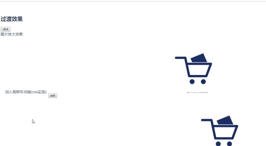
加入购物车效果
场景:点击添加按钮,商品图片展示,并移入到购物车位置,到购物车位置时隐藏商品图片
<template>
  <div class="shop_cart">
    加入购物车动画(css实现):
    <div class="add">
      <button @click="addShopCart">add</button>
      <transition name="shop_cart">
        <img class="add_img" v-if="addShow" src="../assets/voucher.png" alt="">
      </transition>
    </div>
    <div class="cart">
      <img src="../assets/cart.jpg" alt="">
    </div>
  </div>
</template>

export default {
    name: 'myTransition',
    components: {

    },
    data() {
      return {
        addShow: false
      }
    },
    methods: {
      addShopCart () {
        this.addShow = true
        // 添加类名的方法没有动画结束的时机,这里我直接写了一个定时器,时机和动画时间一致,在图片移动到购物车位置时隐藏
        setTimeout(() => {
          this.addShow = false
        }, 1000)
      }
    }
}

<style scoped>
  .transition_test {
    text-align: left;
    padding-bottom: 300px;
  }
  .shop_cart {
    padding: 20px;
  }
  .shop_cart .add {
    position: relative;
    margin-top: 100px;
     500px;
    display: inline-block;
  }
  .shop_cart .add button {
    position: absolute;
    z-index: 99;
  }
  .shop_cart .cart{
     300px;
    display: inline-block;
  }
  .shop_cart .cart img {
     100%;
  }
  // 一开始调整好商品图片在购物车的位置,移入效果最后显示是在一开始定义好的位置
  .shop_cart .add_img {
     100px;
    position: absolute;
    left: 600px;
    top: -160px;
  }
  // 可以有两种方式实现飞入动画,用动画的效果感觉会更好一点
  /* 动画效果实现 */
  /* @keyframes bounce-in {
    0% {
      transform: scale(1);
      transform: translate(-610px, 100px);
    }
    100% {
      transform: scale(.5);
      transform: translate(0px, 0px);
    }
  }
  .shop_cart-enter-active {
    animation: bounce-in 1s;
  } */

  /* CSS类名实现 */
  .shop_cart-enter-active {
    transition: all 1s ease-out;
  }
  .shop_cart-enter {
    opacity: 0;
    transform: scale(.5);
    transform: translate(-610px, 100px);
  }
</style>
其他效果不单独放了,代码放在一起,可以直接在vue项目中新建一个component,把代码复制过去就可以使用了
<template>
  <div class="transition_test">
    <h2>   过渡效果</h2>

    <button @click="show = !show">click</button>
    <!-- <transition name="slide-fade">
      <div v-if="show" class="circle"></div>
    </transition> -->
    <div>
      图片放大效果:
      <transition name="img-fade">
        <img class="bigimg" v-if="show" src="../assets/voucher.png" alt="">
      </transition>
    </div>
    <div class="shop_cart">
      加入购物车动画(css实现):
      <div class="add">
        <button @click="addShopCart">add</button>
        <transition name="shop_cart">
          <img class="add_img" v-if="addShow" src="../assets/voucher.png" alt="">
        </transition>
      </div>
      <div class="cart">
        <img src="../assets/cart.jpg" alt="">
      </div>
    </div>

    <div class="shop_cart">
      加入购物车动画(JavaScript钩子函数实现):
      <div class="add">
        <button @click="addShopCart1">add</button>
        <transition v-on:before-enter="beforeEnter" v-on:enter="enter" v-on:after-enter="afterEnter">
          <img class="add_img_js" v-if="addShow1" src="../assets/voucher.png" alt="">
        </transition>
      </div>
      <div class="cart">
        <img src="../assets/cart.jpg" alt="">
      </div>
    </div>
    <!-- 动画数组效果 -->
    <ul class="group_list">
      <button @click="addItem">addItem</button>
      <button @click="removeItem">removeItem</button>
      <transition-group name="list">
        <li class="group_item" v-for="item in list" :key="item">{{item}}</li>
      </transition-group>
    </ul>
  </div>
</template>
<script>
  export default {
    name: 'myTransition',
    components: {

    },
    data() {
      return {
        show: false,
        addShow: false,
        addShow1: false,
        list: [1, 2, 3]
      }
    },
    created() {

    },

    methods: {
      addShopCart () {
        this.addShow = true
        setTimeout(() => {
          this.addShow = false
        }, 1000)
      },
      addShopCart1 () {
        this.addShow1 = true
      },

      // 动画钩子函数
      // 进入前状态
      beforeEnter (el) {
        el.style.left = '-20px'
        el.style.top = '-15px'
        el.style.transform = 'scale(1)'
      },
      // 进入中
      enter (el, done) {
        // 需要调用元素的offset操作,才有过渡的效果,否则会马上实现过渡
        el.offsetWidth
        el.style.left = '600px'
        el.style.top = '-160px'
        el.style.transform = 'scale(.5)'
        done()
      },
      // 进入后
      afterEnter () {
        this.addShow1 = false
      },

      // 新增
      addItem () {
        this.list.push(this.list.length + 1)
      },
      // 删除
      removeItem () {
        if (this.list.length > 1) {
          this.list.pop()
        }
      }
    }

  }
</script>
<style scoped>
  .transition_test {
    text-align: left;
    padding-bottom: 300px;
  }
  .circle {
     100px;
    height: 100px;
    border-radius: 50%;
    background-color: aquamarine;
  }
  .slide-fade-enter-active, .slide-fade-leave-active {
    transition: all .5s ease-out;
  }
  .slide-fade-enter, .slide-fade-leave-to {
    /* transform: translateX(500px); */
    opacity: 0;
  }
  .bigimg {
     300px;
  }

  .img-fade-enter-active {
    transition: all 1s ease-out;
  }
  .img-fade-enter {
    transform: scale(.5);
    /*  50px; */
  }

  .shop_cart {
    padding: 20px;
  }
  .shop_cart .add {
    position: relative;
    margin-top: 100px;
     500px;
    display: inline-block;
  }
  .shop_cart .add button {
    position: absolute;
    z-index: 99;
  }
  .shop_cart .cart{
     300px;
    display: inline-block;
  }
  .shop_cart .cart img {
     100%;
  }
  .shop_cart .add_img {
     100px;
    position: absolute;
    left: 600px;
    top: -160px;
  }
  /* 动画效果实现 */
  /* @keyframes bounce-in {
    0% {
      transform: scale(1);
      transform: translate(-610px, 100px);
    }
    100% {
      transform: scale(.5);
      transform: translate(0px, 0px);
    }
  }
  .shop_cart-enter-active {
    animation: bounce-in 1s;
  } */

  /* CSS类名实现 */
  .shop_cart-enter-active {
    transition: all 1s ease-out;
  }
  .shop_cart-enter {
    opacity: 0;
    transform: scale(.5);
    transform: translate(-610px, 100px);
  }
// JavaScript函数
  .shop_cart .add_img_js {
     100px;
    position: absolute;
    left: 600px;
    top: -160px;
    transition: all 1s;
  }
// 动态列表
  .group_list {
    padding: 30px;
  }
  .group_list .group_item {
     200px;
    height: 100px;
    border: 1px solid orangered;
    margin: 10px;
  }
  .list-enter-active, .list-leave-active {
    transition: all .8s;
  }
  .list-enter, .list-leave-to {
    opacity: 0;
    transform: translateX(40px);
  }
</style>