经典的Material UI卡片式布局,设计出来的UI很有质感。
/**
 * 卡片布局,相当于Android中的CardView
 * const Card({
    Key key,
    this.color,//背景色
    this.elevation,//阴影大小
    this.shape,//设置边,可以设置圆角
    this.margin = const EdgeInsets.all(4.0),
    this.clipBehavior = Clip.none,
    this.child,
    this.semanticContainer = true,
    })
 */
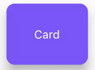
import 'package:flutter/material.dart';

class FlutterCardWidget extends StatelessWidget {
  @override
  Widget build(BuildContext context) {
    return Card(
      color: Colors.blueAccent,
      //z轴的高度,设置card的阴影
      elevation: 20.0,
      //设置shape,这里设置成了R角
      shape: RoundedRectangleBorder(
          borderRadius: BorderRadius.all(Radius.circular(20.0)),),
      //对Widget截取的行为,比如这里 Clip.antiAlias 指抗锯齿
      clipBehavior: Clip.antiAlias,
      semanticContainer: false,
      child: getChild(),
    );
  }

  getChild() {
    return Container(
      color: Colors.deepPurpleAccent,
       200,
      height: 150,
      alignment: Alignment.center,
      child: Text(
        "Card",
        style: TextStyle(fontSize: 28, color: Colors.white),
      ),
    );
  }
}

borderRadius: BorderRadius.only(
            topLeft: Radius.circular(20.0),
            topRight: Radius.zero,
            bottomLeft: Radius.zero,
            bottomRight: Radius.circular(20.0)),
      )