效果属性
box-shadow/text-shadow/border-radius/background/clip-path
box-shadow
图形阴影


<style type="text/css">
  .container{
    width: 50px;
    height:50px;
    background: red;
    box-shadow: 5px 5px 10px rgba(0,0,0,0.5)
  }
</style>
<body>
  <div class="container"></div>
</body>
内阴影
<style type="text/css">
  .container{
    width: 50px;
    height:50px;
    background: red;
    box-shadow: inset 5px 5px 10px rgba(0,0,0,0.5)
  }
</style>
<body>
  <div class="container"></div>
</body>
制作无宽度的border
<style type="text/css">
  .container{
    width: 50px;
    height:50px;
    background: red;
    box-shadow:  0px 0px 0px 5px blue;
  }
</style>
<body>
  <div class="container"></div>
</body>
复制元素
<style type="text/css">
  .container{
    width: 10px;
    height:10px;
    border-radius: 5px;
    margin-left: 20px;
    background: red;
    box-shadow:  15px 0px 0px 0px blue,-15px 0px 0px 0px green;
  }
</style>
<body>
  <div class="container"></div>
</body>
作用
营造层次感
充当没有宽度的边框
复制元素可以实现一个div制作特殊效果
text-shadow
作用 文字立体感
border-radius
圆角矩形
圆角
半圈/扇形
一个奇怪的角
圆角矩形/圆角
<style type="text/css">
  .container{
    width: 50px;
    height:50px;
    border-radius: 10px;
    margin-left: 20px;
    background: red;
  }
</style>
<body>
  <div class="container"></div>
</body>
半圆/扇形
<style type="text/css">
  .container{
    width: 50px;
    height:50px;
    margin-left: 20px;
    background: red;
    border-radius: 0;
    border-top-left-radius: 50px;
  }
</style>
<body>
  <div class="container"></div>
</body>
一些奇怪的东西
<style type="text/css">
  .container{
    width: 50px;
    height:50px;
    margin-left: 20px;
    background: #fff;
    border-bottom: 1px solid #000;
    border-radius: 0;
    border-bottom-left-radius: 10px;
    border-bottom-right-radius: 10px;
  }
</style>
<body>
  <div class="container"></div>
</body>
background
纹理、图案
渐变
linear-gradient
radial-gradient
雪碧图动画
background-position
背景图尺寸适应
background-size:cover/contain
纹理
<style type="text/css">
  .container{
    width: 400px;
    height:50px;
    background: linear-gradient(45deg, transparent 0, transparent 49.5%, rgb(0, 0, 0) 49.5%, rgb(0, 0, 0) 50.5%, transparent 50.5%, transparent 100%),
      linear-gradient(135deg, transparent 0, transparent 49.5%, rgb(0, 0, 0) 49.5%, rgb(0, 0, 0) 50.5%, transparent 50.5%, transparent 100%);
    background-size: 30px 30px;
  }
</style>
<body>
  <div class="container"></div>
</body>
纹理2
<style type="text/css">
  .container{
    width: 400px;
    height:50px;
    background: linear-gradient(135deg, #000 0%, #000 12.5%, transparent 12.5%, transparent 37.5%, #000 37.5%, #000 62.5%, transparent 62.5%,transparent 87.5%, #000 87.5%,#000 100%);
    background-size: 50px 50px;
  }
</style>
<body>
  <div class="container"></div>
</body>
雪碧图动画
<style>
    .container{
        width: 20px;
        height: 20px;
        background: url('') no-repeat;
        background-size: 20px 40px;
        transition: background-position .4s;
    }
    .container:hover{
        background-position: 0 -20px;
    }
</style>
<body>
    <div class="container">
    </div>
</body>

clip-path
对容器进行裁剪
常见的几何图形
自定义路径
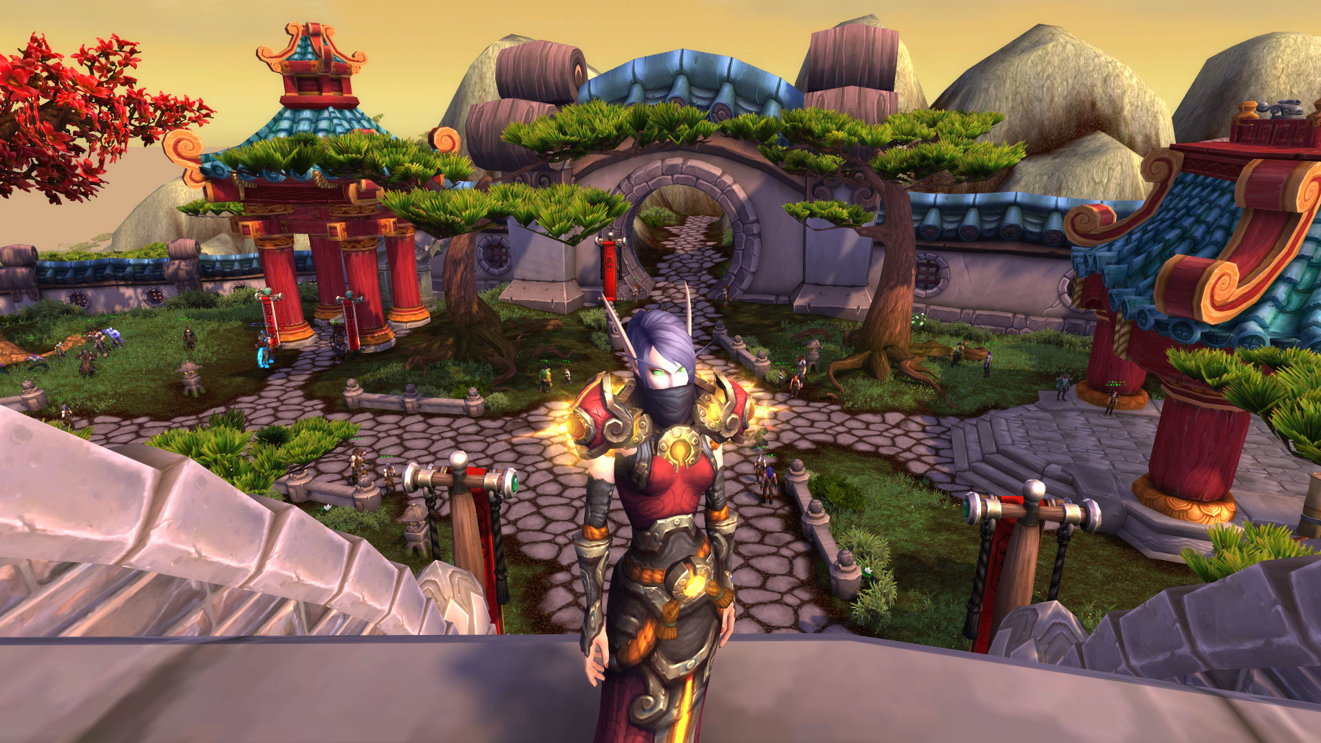
<style type="text/css">
  .container{
    width: 400px;
    height:224px;
    float: left;
    overflow: auto;
    background-image: url(./wow.jpg);
    background-repeat: no-repeat;
    background-size: contain;
  }
  .clip-path{
    clip-path: polygon(50% 0%, 80% 10%, 100% 35%, 100% 70%, 80% 90%, 50% 100%, 20% 90%, 0% 70%, 0% 35%, 20% 10%);
  }
</style>
<body>
  <div class="container"></div>
  <div class="container clip-path"></div>
</body>
http://bennettfeely.com/clippy/
3D变换
transform
translate/scale/skew/rotate
transform-style: preserve-3d 3D旋转效果
perspective 元素获得透视效果, 3D立体感
perspective-origin 观察视角
<style type="text/css">
  .container{
    width: 200px;
    height: 200px;
    border: 1px solid red;
    position: relative;
    transform-style: preserve-3d;
    transform: translateZ(-100px);
    text-align: center;
    perspective: 500px;
  }
  .container div{
    position: absolute;
    width: 200px;
    height: 200px;
    background-color: #000;
    color:#fff;
    transition: transform .4s;
    transform-origin: left center;
    transform: translateZ(-100px);
  }
  .container .page2{
    background-color: green;
  }
  .container:hover .page2{
    transform: translateZ(-100px) rotateY(-135deg);
  }

</style>
<div class="container">
  <div class="page1">
    preserve-3d/perspective
  </div>
  <div class="page2">
    学习3D变换
  </div>
</div>
preserve-3d/perspective
学习3D变换
3D轮播
<style type="text/css">
.wrapper{
  width: 600px;
  height: 337px;
  overflow: hidden;
  font-size: 0;
}
.container{
  position: relative;
  width: 600px;
  height: 337px;
  background-size: contain;
  perspective: 500px;
  transform-style: preserve-3d;
}
.container .col{
  position: absolute;
  height: 337px;
  width: 100px;
  transform-style: preserve-3d;
  transform-origin: 50% 50% 0;
  transition: transform 1s;
  transform: translateZ(-290px);
}
.container:hover .col{
  transform: translateZ(-290px) rotateX(60deg);
}
.container .col .row{
  width: 100%;
  height: 337px;
  position: absolute;
  top: 0;
  background-repeat: no-repeat;
  background-size: cover;
}
.row1{
  transform: rotateX(0deg) translateZ(290px);
}
.row2{
  transform: rotateX(-60deg) translateZ(290px);
}
.row3{
  transform: rotateX(-120deg) translateZ(290px);
}
.row4{
  transform: rotateX(-180deg) translateZ(290px);
}
.row5{
  transform: rotateX(-240deg) translateZ(290px);
}
.row6{
  transform: rotateX(-300deg) translateZ(290px);
}
.col0{
  left: 0;
}
.col1{
  left:100px;
}
.col2{
  left: 200px;
}
.col3{
  left: 300px;
}
.col4{
  left: 400px;
}
.col5{
  left: 500px;
}
.dot-wrapper{
  width: 600px;
  text-align: center;
}
.dot-wrapper .dot{
  display: inline-block;
  background-color: rgba(0,0,0,.5);
  width: 20px;
  height: 20px;
  border-radius: 50%;
  margin: 0 5px;
}
.dot-wrapper .dot.active{
  background-color: rgba(0,0,0,1);
}
</style>
<body>
<div class="wrapper">
  <div class="container">
    <div class="col col0" style="transition-delay: 0s;">
      <div class="row row1" style="background-image: url(1.jpg);background-position: 0 0;"></div>
      <div class="row row2" style="background-image: url(2.jpg);background-position: 0 0;"></div>
      <div class="row row3" style="background-image: url(3.jpg);background-position: 0 0;"></div>
      <div class="row row4" style="background-image: url(4.jpg);background-position: 0 0;"></div>
      <div class="row row5" style="background-image: url(5.jpg);background-position: 0 0;"></div>
      <div class="row row6" style="background-image: url(6.jpg);background-position: 0 0;"></div>
    </div>
    <div class="col col1" style="transition-delay: 0.2s;">
      <div class="row row1" style="background-image: url(1.jpg);background-position: -100px 0;"></div>
      <div class="row row2" style="background-image: url(2.jpg);background-position: -100px 0;"></div>
      <div class="row row3" style="background-image: url(3.jpg);background-position: -100px 0;"></div>
      <div class="row row4" style="background-image: url(4.jpg);background-position: -100px 0;"></div>
      <div class="row row5" style="background-image: url(5.jpg);background-position: -100px 0;"></div>
      <div class="row row6" style="background-image: url(6.jpg);background-position: -100px 0;"></div>
    </div>
    <div class="col col2" style="transition-delay: 0.4s;">
      <div class="row row1" style="background-image: url(1.jpg);background-position: -200px 0;"></div>
      <div class="row row2" style="background-image: url(2.jpg);background-position: -200px 0;"></div>
      <div class="row row3" style="background-image: url(3.jpg);background-position: -200px 0;"></div>
      <div class="row row4" style="background-image: url(4.jpg);background-position: -200px 0;"></div>
      <div class="row row5" style="background-image: url(5.jpg);background-position: -200px 0;"></div>
      <div class="row row6" style="background-image: url(6.jpg);background-position: -200px 0;"></div>
    </div>
    <div class="col col3" style="transition-delay: 0.6s;">
      <div class="row row1" style="background-image: url(1.jpg);background-position: -300px 0;"></div>
      <div class="row row2" style="background-image: url(2.jpg);background-position: -300px 0;"></div>
      <div class="row row3" style="background-image: url(3.jpg);background-position: -300px 0;"></div>
      <div class="row row4" style="background-image: url(4.jpg);background-position: -300px 0;"></div>
      <div class="row row5" style="background-image: url(5.jpg);background-position: -300px 0;"></div>
      <div class="row row6" style="background-image: url(6.jpg);background-position: -300px 0;"></div>
    </div>
    <div class="col col4" style="transition-delay: 0.8s;">
      <div class="row row1" style="background-image: url(1.jpg);background-position: -400px 0;"></div>
      <div class="row row2" style="background-image: url(2.jpg);background-position: -400px 0;"></div>
      <div class="row row3" style="background-image: url(3.jpg);background-position: -400px 0;"></div>
      <div class="row row4" style="background-image: url(4.jpg);background-position: -400px 0;"></div>
      <div class="row row5" style="background-image: url(5.jpg);background-position: -400px 0;"></div>
      <div class="row row6" style="background-image: url(6.jpg);background-position: -400px 0;"></div>
    </div>
    <div class="col col5" style="transition-delay: 1.0s;">
      <div class="row row1" style="background-image: url(1.jpg);background-position: -500px 0;"></div>
      <div class="row row2" style="background-image: url(2.jpg);background-position: -500px 0;"></div>
      <div class="row row3" style="background-image: url(3.jpg);background-position: -500px 0;"></div>
      <div class="row row4" style="background-image: url(4.jpg);background-position: -500px 0;"></div>
      <div class="row row5" style="background-image: url(5.jpg);background-position: -500px 0;"></div>
      <div class="row row6" style="background-image: url(6.jpg);background-position: -500px 0;"></div>
    </div>
  </div>
</div>
<div id="dots" class="dot-wrapper">
  <span class="dot active"></span>
  <span class="dot"></span>
  <span class="dot"></span>
  <span class="dot"></span>
  <span class="dot"></span>
  <span class="dot"></span>
</div>
<script type="text/javascript">
  document.querySelector('#dots').addEventListener('click', function(e){
    var obj = e.target
    var dots = document.querySelectorAll('.dot')
    if (obj.tagName.toUpperCase() === 'SPAN') {
      for (var i = 0; i < dots.length; i++) {
        dots[i].className = 'dot'
        if (obj === dots[i]) {
          var cols = document.querySelectorAll('.col')
          for (var j = 0; j < cols.length; j++) {
            cols[j].style = 'transition-delay: ' + (j * 0.2) + 's;transform:translateZ(-290px) rotateX('+60*i+'deg)';
          }
        }
      }
      obj.className='dot active'
    }
  })
</script>
</body>

1
2
3
4
5
6
1
2
3
4
5
6
1
2
3
4
5
6
1
2
3
4
5
6
1
2
3
4
5
6
1
2
3
4
5
6