前端之HTML,CSS(七)
CSS
CSS布局的核心就是盒子的摆放,即CSS定位。而CSS中定位机制分为:普通流(nomal flow)、浮动(float)、定位(position)。
普通流
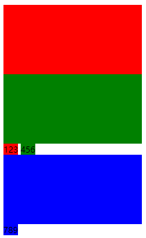
普通流又被称为文档流或者标准流,普通流是指网页内标签元素正常情况下会按照自上而下,自左向右按顺序排列。即块级元素独占一行,多个块级元素存在会自上而下顺序排列,多个行内元素会共占一行,自左向右排列。


 1 <!DOCTYPE html>
 2 <html>
 3 <head>
 4     <meta charset="utf-8">
 5     <title>普通流-测试</title>
 6     <style type="text/css">
 7         .div_one {
 8             width: 200px;
 9             height: 100px;
10             background-color: red;
11         }
12         .div_two {
13             width: 200px;
14             height: 100px;
15             background-color: green;
16         }
17         .div_three {
18             width: 200px;
19             height: 100px;
20             background-color: blue;
21         }
22         .span_one {
23             background-color: red;
24         }
25         .span_two {
26             background-color: green;
27         }
28         .span_three {
29             background-color: blue;
30         }
31     </style>
32 </head>
33 <body>
34     <div class="div_one"></div>
35     <div class="div_two"></div>
36     <span class="span_one">123</span>
37     <span class="span_two">456</span>
38     <div class="div_three"></div>
39     <span class="span_three">789</span>
40 </body>
41 </html>
效果展示:
浮动
浮动是指网页内的标签元素脱离标准流的布局方式,如果认为标准流标签元素是在网页平面沿x,y轴布局,则浮动就是增加一维,在z轴上实现布局。可以想象标准流布局标签元素坐标为(x,y,0),而浮动布局标签元素坐标为(x,y,z),当x,y相同时,浮动元素会覆盖标准流元素。
浮动的基本语法:选择器 {float:属性值},属性值有:left(元素向左浮动)、right(元素向右浮动)、none(元素不浮动),缺省默认为none。
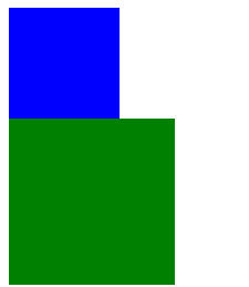
标准流布局到浮动布局
 1 <!DOCTYPE html>
 2 <html>
 3 <head>
 4     <meta charset="utf-8">
 5     <title>普通流-测试</title>
 6     <style type="text/css">
 7         .div_one {
 8             width: 100px;
 9             height: 100px;
10             background-color: blue;  /*未设置浮动*/
11         }
12         .div_two {
13             width: 150px;
14             height: 150px;
15             background-color: green;  /*未设置浮动*/
16         }
17     </style>
18 </head>
19 <body>
20     <div class="div_one"></div>
21     <div class="div_two"></div>
22 </body>
23 </html>
效果:
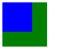
 1 <!DOCTYPE html>
 2 <html>
 3 <head>
 4     <meta charset="utf-8">
 5     <title>浮动-测试</title>
 6     <style type="text/css">
 7         .div_one {
 8             width: 100px;
 9             height: 100px;
10             background-color: blue;  /*设置浮动*/
11             float: left;
12         }
13         .div_two {
14             width: 150px;
15             height: 150px;
16             background-color: green;  /*未设置浮动*/
17         }
18     </style>
19 </head>
20 <body>
21     <div class="div_one"></div>
22     <div class="div_two"></div>
23 </body>
24 </html>
效果:
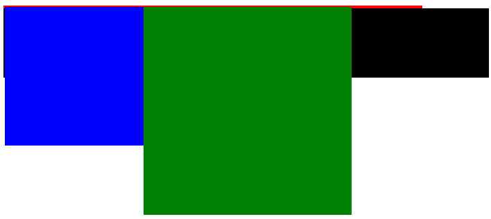
 1 <!DOCTYPE html>
 2 <html>
 3 <head>
 4     <meta charset="utf-8">
 5     <title>浮动-测试</title>
 6     <style type="text/css">
 7         .div_one {
 8             width: 100px;
 9             height: 100px;
10             background-color: blue;  /*设置浮动*/
11             float: left;
12         }
13         .div_two {
14             width: 150px;
15             height: 150px;
16             background-color: green;  /*设置浮动*/
17             float: left;
18         }
19     </style>
20 </head>
21 <body>
22     <div class="div_one"></div>
23     <div class="div_two"></div>
24 </body>
25 </html>
效果:
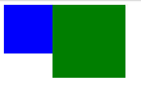
上述三个过程可以看出从标准流到浮动的整个过程,第一步中,蓝色和绿色方块都没有设置浮动,按照标准流布局,两个块级元素各自独占一行,自上而下布局。第二步中,为蓝色方块设置浮动,蓝色方块向z轴浮起,不占据x,y平面位置,绿色方块自上而下布局。第三步为绿色方块设置浮动,可以看到块元素完全改变标准流布局块元素不独占一行。因为两个块元素设置均为左浮动,故自左向右排序。
浮动的主要应用:多个块元素于一行显示。使用display:inline-block的缺点:盒子之间会出现间隙,无法控制;盒子在一行内位置无法调整,如:让盒子自右向左排列。定义浮动的元素隐含着自动转换为行内块元素的特性
 1 <!DOCTYPE html>
 2 <html>
 3 <head>
 4     <meta charset="utf-8">
 5     <title>浮动-测试</title>
 6     <style type="text/css">
 7         .div_one {
 8             width: 100px;
 9             height: 100px;
10             background-color: red;  /*设置浮动*/
11             float: left;
12         }
13         .div_two {
14             width: 100px;
15             height: 100px;
16             background-color: green;  /*设置浮动*/
17             float: left;
18         }
19         .div_three {
20             width: 100px;
21             height: 100px;
22             background-color: blue;  /*设置浮动*/
23             float: left;
24         }
25         .div_four {
26             width: 100px;
27             height: 100px;
28             background-color: pink;  /*设置浮动*/
29             float: right;
30         }
31     </style>
32 </head>
33 <body>
34     <div class="div_one"></div>
35     <div class="div_two"></div>
36     <div class="div_three"></div>
37     <div class="div_four"></div>
38 </body>
39 </html>
浮动会影响标准流的位置变化,因此浮动元素通常结合父元素一起布局,而且浮动元素左右浮动不会占据父元素盒子的内边距。另外浮动元素只会影响在同一盒子中后续元素位置,不会影响之前元素的位置。
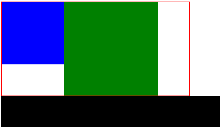
清除浮动:盒子嵌套时,因为子盒子内容不确定不宜为父盒子设定高度,而父盒子不设定高度时,当子盒子设定浮动时,子盒子不占位置,所以父盒子高度又会变成0,影响后续盒子位置变化。因此,清除浮动的本质是:为了解决父级元素因为子级元素浮动引起内部高度为0的问题。
父盒子不设定高度,标准流情况下,子盒子会撑开父盒子
 1 <!DOCTYPE html>
 2 <html>
 3 <head>
 4     <meta charset="utf-8">
 5     <title>清除浮动-测试</title>
 6     <style type="text/css">
 7         .up {
 8             width: 600px;
 9             border: 2px solid red;  /*父盒子不设定高度*/
10         }
11         .le {
12             width: 200px;
13             height: 200px;
14             background-color: blue;
15         }
16         .ri {
17             width: 300px;
18             height: 300px;
19             background-color: green;
20         }
21         .down {
22             width: 700px;
23             height: 100px;
24             background-color: black;
25         }
26     </style>
27 </head>
28 <body>
29     <div class="up">
30         <div class="le"></div>
31         <div class="ri"></div>
32     </div>
33     <div class="down"></div>
34 </body>
35 </html>

父盒子不设定高度,浮动情况下,子盒子不占位置,父盒子高度会变成0。
 1 <!DOCTYPE html>
 2 <html>
 3 <head>
 4     <meta charset="utf-8">
 5     <title>清除浮动-测试</title>
 6     <style type="text/css">
 7         .up {
 8             width: 600px;
 9             border: 2px solid red;  /*父盒子不设定高度*/
10         }
11         .le {
12             width: 200px;
13             height: 200px;
14             background-color: blue;
15             float: left;  /*设定浮动*/
16         }
17         .ri {
18             width: 300px;
19             height: 300px;
20             background-color: green;
21             float: left;  /*设定浮动*/
22         }
23         .down {
24             width: 700px;
25             height: 100px;
26             background-color: black;
27         }
28     </style>
29 </head>
30 <body>
31     <div class="up">
32         <div class="le"></div>
33         <div class="ri"></div>
34     </div>
35     <div class="down"></div>
36 </body>
37 </html>
基本语法:选择器 { clear:属性值;},其中属性值有:left(清除左浮动影响)、right(清除右浮动影响)、both(清除左右浮动影响)。
清楚浮动的方法:
1.额外标签法:在最后一个浮动元素后添加一个空元素,为空元素设定清除浮动影响。
 1 <!DOCTYPE html>
 2 <html>
 3 <head>
 4     <meta charset="utf-8">
 5     <title>清除浮动-测试</title>
 6     <style type="text/css">
 7         .up {
 8             width: 600px;
 9             border: 2px solid red;  /*父盒子不设定高度*/
10         }
11         .le {
12             width: 200px;
13             height: 200px;
14             background-color: blue;
15             float: left;  /*设定浮动*/
16         }
17         .ri {
18             width: 300px;
19             height: 300px;
20             background-color: green;
21             float: left;  /*设定浮动*/
22         }
23         .down {
24             width: 700px;
25             height: 100px;
26             background-color: black;
27         }
28         .clear {
29             clear: both;  /*设定清除浮动影响*/
30         }
31     </style>
32 </head>
33 <body>
34     <div class="up">
35         <div class="le"></div>
36         <div class="ri"></div>  <!-- 最后一个浮动元素 -->
37         <div class="clear"></div>  <!-- 添加空元素 -->
38     </div>
39     <div class="down"></div>
40 </body>
41 </html>
2.父级元素添加overflo属性方法:为父级元素添加overflow:属性值;其中属性值可以为hidden,auto,scroll中的一个,通过触发BFC方式清除浮动。
 1 <!DOCTYPE html>
 2 <html>
 3 <head>
 4     <meta charset="utf-8">
 5     <title>清除浮动-测试</title>
 6     <style type="text/css">
 7         .up {
 8             width: 600px;
 9             border: 2px solid red;  /*父盒子不设定高度*/
10             overflow: hidden;  /*为父级元素添加overflow属性*/
11         }
12         .le {
13             width: 200px;
14             height: 200px;
15             background-color: blue;
16             float: left;  /*设定浮动*/
17         }
18         .ri {
19             width: 300px;
20             height: 300px;
21             background-color: green;
22             float: left;  /*设定浮动*/
23         }
24         .down {
25             width: 700px;
26             height: 100px;
27             background-color: black;
28         }
29     </style>
30 </head>
31 <body>
32     <div class="up">
33         <div class="le"></div>
34         <div class="ri"></div>
35     </div>
36     <div class="down"></div>
37 </body>
38 </html>
3.使用after伪元素清除浮动方法:
在CSS中添加
 1 .clearfix:after {  /*添加after伪元素*/
 2             content: "";
 3             display: block;
 4             height: 0;
 5             clear: both;
 6             visibility: hidden;
 7 }
 8 .clearfix {
 9         *zoom: 1;  /*IE6、IE7专有*/
10 }
添加后在父元素中调用
 1 <!DOCTYPE html>
 2 <html>
 3 <head>
 4     <meta charset="utf-8">
 5     <title>清除浮动-测试</title>
 6     <style type="text/css">
 7         .clearfix:after {  /*添加after伪元素*/
 8             content: "";
 9             height: 0;
10             display: block;
11             visibility: hidden;
12             clear: both;
13         }
14         .clearfix {  /*IE6、IE7专有*/
15             *zoom: 1;
16         }
17         .up {
18             width: 600px;
19             border: 2px solid red;  /*父盒子不设定高度*/
20         }
21         .le {
22             width: 200px;
23             height: 200px;
24             background-color: blue;
25             float: left;  /*设定浮动*/
26         }
27         .ri {
28             width: 300px;
29             height: 300px;
30             background-color: green;
31             float: left;  /*设定浮动*/
32         }
33         .down {
34             width: 700px;
35             height: 100px;
36             background-color: black;
37         }
38     </style>
39 </head>
40 <body>
41     <div class="up clearfix">  <!-- 父元素中调用 -->
42         <div class="le"></div>
43         <div class="ri"></div>
44     </div>
45     <div class="down"></div>
46 </body>
47 </html>
4.使用before和after双伪元素清除浮动方法:
在CSS中添加
 1 .clearfix:before,.clearfix:after {
 2             content: "";
 3             display: table;
 4 }
 5 .clearfix:after {
 6     clear: both;
 7 }
 8 .clearfix {
 9     *zoom: 1;
10 }
添加后在父元素中调用
 1 <!DOCTYPE html>
 2 <html>
 3 <head>
 4     <meta charset="utf-8">
 5     <title>清除浮动-测试</title>
 6     <style type="text/css">
 7         .clearfix:before,.clearfix:after {  /*添加before和after双伪元素*/
 8             content: "";
 9             display: table;  /*触发BFC清除浮动*/
10         }
11         .clearfix:after {
12             clear: both;
13         }
14         .clearfix {
15             *zoom: 1;  /*ie6、ie7专有*/
16         }
17         .up {
18             width: 600px;
19             border: 2px solid red;  /*父盒子不设定高度*/
20         }
21         .le {
22             width: 200px;
23             height: 200px;
24             background-color: blue;
25             float: left;  /*设定浮动*/
26         }
27         .ri {
28             width: 300px;
29             height: 300px;
30             background-color: green;
31             float: left;  /*设定浮动*/
32         }
33         .down {
34             width: 700px;
35             height: 100px;
36             background-color: black;
37         }
38     </style>
39 </head>
40 <body>
41     <div class="up clearfix">
42         <div class="le"></div>
43         <div class="ri"></div>
44     </div>
45     <div class="down"></div>
46 </body>
47 </html>
清除浮动影响效果展示
布局流程
1.确定页面的可视区。可视区是指网页主体内容的所在区域,一般在浏览器窗口水平居中显示。通栏网页可视区为liu'la。
2.分析页面中的行模块,以及每个行模块中的列模块
3.设计HTML结构
4.CSS初始化,运用盒子模型的原理通过CSS+DIV布局控制每个模块的分布和样式。
常见网页结构布局
一列,固定宽度且居中型
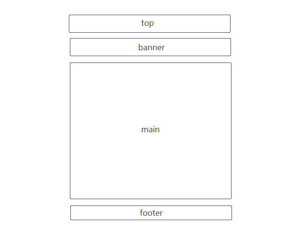
 1 <!DOCTYPE html>
 2 <html>
 3 <head>
 4     <meta charset="utf-8">
 5     <title>常见网页布局结构-一列,固定宽度且居中型</title>
 6     <style type="text/css">
 7         .top,
 8         .banner,
 9         .main,
10         .footer {
11             width: 900px;
12             border: 1px dotted #ccc;
13             background-color: #eee;
14         }
15         .top {
16             height: 80px;
17             margin: 0 auto 5px;
18         }
19         .banner {
20             height: 100px;
21             margin: 0 auto 5px;
22         }
23         .main {
24             height: 400px;
25             margin: 0 auto 5px;
26         }
27         .footer {
28             height: 80px;
29             margin: auto;
30         }
31     </style>
32 </head>
33 <body>
34     <div class="top">top</div>
35     <div class="banner">banner</div>
36     <div class="main">main</div>
37     <div class="footer">footer</div>
38 </body>
39 </html>
两列左右型

 1 <!DOCTYPE html>
 2 <html>
 3 <head>
 4     <meta charset="utf-8">
 5     <title>常见网页布局结构-两列左右型</title>
 6     <style type="text/css">
 7         .top,
 8         .banner,
 9         .footer {
10             width: 900px;
11             border: 1px dashed #ccc;
12             background-color: #eee;
13         }
14         .left,
15         .right {
16             height: 400px;
17             border: 1px dashed #ccc;
18             background-color: #eee;
19         }
20         .top {
21             height: 80px;
22             margin: auto;
23         }
24         .banner {
25             height: 100px;
26             margin: auto;
27             margin: 10px auto;
28         }
29         .main {
30             width: 900px;
31             height: 400px;
32             margin: auto;
33         }
34         .left {
35             width: 300px;
36             float: left;
37         }
38         .right {
39             width: 590px;
40             float: right;
41         }
42         .footer {
43             height: 80px;
44             margin: auto;
45             margin-top: 10px;
46         }
47     </style>
48 </head>
49 <body>
50     <div class="top">top</div>
51     <div class="banner">banner</div>
52     <div class="main">
53         <div class="left">left</div>
54         <div class="right">right</div>
55     </div>
56     <div class="footer">footer</div>
57 </body>
58 </html>
通栏平均分布型
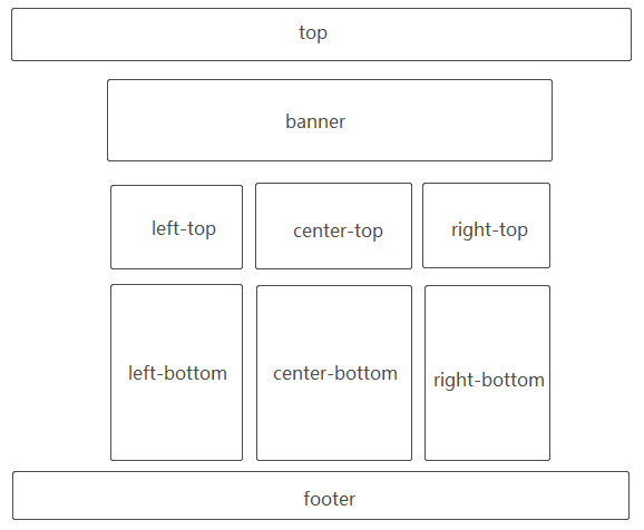
  1 <!DOCTYPE html>
  2 <html>
  3 <head>
  4     <meta charset="utf-8">
  5     <title>常见网页布局结构-通栏型</title>
  6     <style type="text/css">
  7         .top {
  8             height: 80px;
  9             background-color: #ccc;
 10         }
 11         .top-inner {
 12             width: 900px;
 13             height: 80px;
 14             margin: auto;
 15         }
 16         .banner {
 17             width: 900px;
 18             height: 100px;
 19             background-color: #ccc;
 20             border: 1px dashed #eee;
 21             margin: 5px auto;
 22         }
 23         .up {
 24             width: 900px;
 25             height: 400px;
 26             margin: auto;
 27         }
 28         .left-top {
 29             width: 250px;
 30             height: 400px;
 31             background-color: #ccc;
 32             border: 1px dashed #eee;  /*252PX*/
 33             float: left;
 34         }
 35         .center-top {
 36             width: 384px;  /*1+250+1+5+1+384+1+5+1+250+1=900*/
 37             height: 400px;
 38             background-color: #ccc;
 39             border: 1px dashed #eee;
 40             float: left;
 41             margin: 0 5px;  /*左右margin 10px*/
 42         }
 43         .right-top {
 44             width: 250px;
 45             height: 400px;
 46             background-color: #ccc;
 47             border: 1px dashed #eee;  /*252PX*/
 48             float: left;
 49         }
 50         .down {
 51             width: 900px;
 52             height: 600px;
 53             margin: 5px auto;
 54         }
 55         .left-bottom {
 56             width: 250px;
 57             height: 600px;
 58             background-color: #ccc;
 59             border: 1px dashed #eee;  /*252PX*/
 60             float: left;
 61         }
 62         .center-bottom {
 63             width: 384px;  /*1+250+1+5+1+384+1+5+1+250+1=900*/
 64             height: 600px;
 65             background-color: #ccc;
 66             border: 1px dashed #eee;
 67             float: left;
 68             margin: 0 5px;  /*左右margin 10px*/
 69         }
 70         .right-bottom {
 71             width: 250px;
 72             height: 600px;
 73             background-color: #ccc;
 74             border: 1px dashed #eee;  /*252PX*/
 75             float: left;
 76         }
 77         .footer {
 78             height: 80px;
 79             background-color: #ccc;
 80         }
 81         .footer-inner {
 82             width: 900px;
 83             height: 80px;
 84             margin: auto;
 85         }
 86     </style>
 87 </head>
 88 <body>
 89     <div class="top">
 90         <div class="top-inner">top</div>
 91     </div>
 92     <div class="banner">banner</div>
 93     <div class="up">
 94         <div class="left-top">left-top</div>
 95         <div class="center-top">center-top</div>
 96         <div class="right-top">right-top</div>
 97     </div>
 98     <div class="down">
 99         <div class="left-bottom">left-bottom</div>
100         <div class="center-bottom">center-bottom</div>
101         <div class="right-bottom">right-bottom</div>
102     </div>
103     <div class="footer">
104         <div class="footer-inner">footer</div>
105     </div>
106 </body>
107 </html>
定位
定位同浮动一样是脱离标准流的布局方式,定位顾名思义就是按照盒子的位置随意确定盒子的位置,不像标准流和浮动一般有位置上的规则,完全由设计者确定。此外,通过定位可以实现盒子的覆盖,但是又不影响被覆盖盒子的位置关系。
元素定位属性主要包括定位模式和边偏移两个部分。
边偏移
| 属性 | 属性值 | 描述 |
| top | 像素值 | 定义元素相对于父元素上边线的距离 |
| bottom | 像素值 | 定义元素相对于父元素下边线的距离 |
| left | 像素值 | 定义元素相对于父元素左边线的距离 |
| right | 像素值 | 定义元素相对于父元素右边线的距离 |
定位模式
CSS中position属性用于定义元素的定位模式,基本语法:选择器 {position:属性值;},其中position属性值有:
| 属性值 | 描述 |
| static | 静态定位,遵循标准流定位,默认定位方式。 |
| relative | 相对定位,相对于标准流的位置定位 |
| absolute | 绝对定位,相对于上一个定位的父元素定位 |
| fixed | 固定定位,相对于浏览器窗口定位 |
标准流
 1 <!DOCTYPE html>
 2 <html>
 3 <head>
 4     <meta charset="utf-8">
 5     <title>定位-测试</title>
 6     <style type="text/css">
 7         .father {
 8             width: 400px;
 9             height: 400px;
10             border: 1px solid #000;
11         }
12         .normal {
13             width: 300px;
14             height: 300px;
15             background-color: red;
16         }
17     </style>
18 </head>
19 <body>
20     <div class="father">
21         <div class="normal">标准流</div>
22     </div>
23 </body>
24 </html>
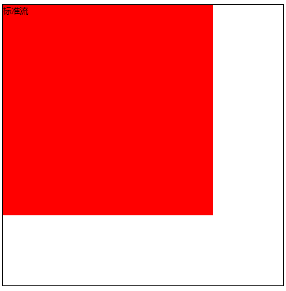
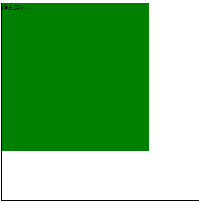
静态定位(static):所有元素默认的定位方式,即各个元素在标准流中的位置。静态定位状态下, 无法通过边偏移属性改变元素的位置。
 1 <!DOCTYPE html>
 2 <html>
 3 <head>
 4     <meta charset="utf-8">
 5     <title>定位-测试</title>
 6     <style type="text/css">
 7         .father {
 8             width: 400px;
 9             height: 400px;
10             border: 1px solid #000;
11         }
12         .static {
13             width: 300px;
14             height: 300px;
15             background-color: green;
16             position: static;  /*静态定位*/
17             top: 10px;  /*设置偏移上边线10px*/
18         }
19     </style>
20 </head>
21 <body>
22     <div class="father">
23         <div class="static">静态定位</div>
24
25     </div>
26 </body>
27 </html>
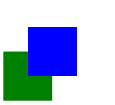
相对定位(relative):相对定位是相对于定位元素自身的原本位置,通过边偏移属性来移动位置,定位元素移动以后位置保留,后续元素的位置不会受到影响。
 1 <!DOCTYPE html>
 2 <html>
 3 <head>
 4     <meta charset="utf-8">
 5     <title>定位-测试</title>
 6     <style type="text/css">
 7         .up {
 8             width: 100px;
 9             height: 100px;
10             background-color: blue;
11             position: relative;  /*相对定位*/
12             top: 50px;  /*移动至距离原本(标准流位置)上边线50px的位置*/
13             left: 50px;  /*移动至距离(标准流位置)左边线50px的位置*/
14         }
15         .down {
16             width: 100px;
17             height: 100px;
18             background-color: green;
19         }
20     </style>
21 </head>
22 <body>
23     <div class="up"></div>
24     <div class="down"></div>
25 </body>
26 </html>
绝对定位(absolute):绝对定位是相对于浏览器当前窗口或者定位父元素的位置,通过边偏移属性来移动位置,定位元素移动以后位置不保留,后续元素的位置像浮动一样上浮。
后续元素受影响且无父元素(相对于浏览器当前窗口移动)
 1 <!DOCTYPE html>
 2 <html>
 3 <head>
 4     <meta charset="utf-8">
 5     <title>定位-测试</title>
 6     <style type="text/css">
 7         .up {
 8             width: 100px;
 9             height: 100px;
10             background-color: blue;
11             position: absolute;  /*绝对定位*/
12             top: 20px;  /*无定位父元素,相对于浏览器当前窗口*/
13             left: 20px;
14         }
15         .down {
16             width: 150px;
17             height: 150px;
18             background-color: green;
19         }
20     </style>
21 </head>
22 <body>
23     <div class="up"></div>
24     <div class="down"></div>
25 </body>
26 </html>
存在父元素,父元素无定位(相对于浏览器当前窗口移动)
 1 <!DOCTYPE html>
 2 <html>
 3 <head>
 4     <meta charset="utf-8">
 5     <title>定位-测试</title>
 6     <style type="text/css">
 7         body {
 8             height: 2000px;
 9         }
10         .father {
11             width: 200px;
12             height: 200px;
13             background-color: red;
14             margin: 50px;
15         }
16         .son {
17             width: 100px;
18             height: 100px;
19             background-color: blue;
20             position: absolute;  /*绝对定位*/
21             top: 20px;  /*无定位父元素,相对于浏览器当前窗口*/
22             left: 20px;
23         }
24         .down {
25             width: 100px;
26             height: 100px;
27             background-color: green;
28             position: absolute;
29             right: 0;
30             bottom: 0;
31         }
32     </style>
33 </head>
34 <body>
35     <div class="father">
36         <div class="son"></div>
37     </div>
38     <div class="down"></div>
39 </body>
40 </html>
 (如同存在滚动条,然而绿色元素块没有在浏览器下拉界面最下方,只是位于浏览器当前窗口)
存在“父辈”元素,“父辈”元素定位(相对于定位”父辈“元素)
 1 <!DOCTYPE html>
 2 <html>
 3 <head>
 4     <meta charset="utf-8">
 5     <title>定位-测试</title>
 6     <style type="text/css">
 7         body {
 8             height: 2000px;
 9         }
10         .father {
11             width: 200px;
12             height: 200px;
13             background-color: red;
14             margin: 50px;
15         }
16         .son {
17             width: 100px;
18             height: 100px;
19             background-color: blue;
20             position: absolute;  /*绝对定位*/
21             top: 20px;  /*无定位父元素,相对于浏览器当前窗口*/
22             left: 20px;
23         }
24         .down {
25             width: 100px;
26             height: 100px;
27             background-color: green;
28             position: absolute;
29             right: 0;
30             bottom: 0;
31         }
32     </style>
33 </head>
34 <body>
35     <div class="father">
36         <div class="son"></div>
37     </div>
38     <div class="down"></div>
39 </body>
40 </html>
“子绝父相”:子元素使用绝对定位,父元素使用相对定位(推荐)。父元素相对定位保留位置,不影响后续元素位置,子元素绝对定位,相对于父元素定位实现位置移动。
定位盒子居中对齐问题:浮动或者定位的盒子,margin:0 auto;会失效。使得定位的盒子水平居中可以使用:left:50%;margin-left:-width/2px;其中width为盒子自身的宽度;使得定位的盒子垂直居中可以使用:top:50%;margin-top:-height/2px;其中height为盒子自身的高度。
固定定位(fixed):固定定位是相对于浏览器当前窗口的位置,通过边偏移属性来移动位置,定位元素位置不保留,不随浏览器滚动条滚动。
 1 <!DOCTYPE html>
 2 <html>
 3 <head>
 4     <meta charset="utf-8">
 5     <title>定位-测试</title>
 6     <style type="text/css">
 7         body {
 8             height: 5000px;
 9         }
10         div {
11             width: 100px;
12             height: 100px;
13             background-color: red;
14             position: fixed;
15             right: 0;
16             top: 200px;
17         }
18     </style>
19 </head>
20 <body>
21     <div></div>
22 </body>
23 </html>
效果自行测试
注意:绝对定位、固定定位和浮动一样都会将定位或者浮动元素转换为行内块元素,行内块元素不指定宽度会随内容宽度显示。此外,插入图片可以撑开盒子,而背景图片不会影响盒子大小。
层叠次序
层叠即覆盖,前面提到设置盒子布局中存在覆盖的有浮动、绝对定位以及固定定位三种情况。
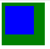
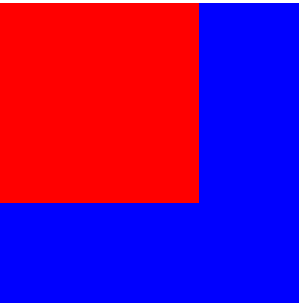
浮动:浮动存在覆盖的情形只存在前一个盒子设定浮动,不占据文档位置,后面未设定浮动盒子位置会上浮,表现为后面盒子被前面盒子覆盖的情况。
 1 <!DOCTYPE html>
 2 <html>
 3 <head>
 4     <meta charset="utf-8">
 5     <title>层叠次序-测试</title>
 6     <style type="text/css">
 7         .up {
 8             width: 200px;
 9             height: 200px;
10             background-color: red;
11             float: left;  /*前面盒子设置浮动*/
12         }
13         .down {  /*后面盒子不设置浮动*/
14             width: 300px;
15             height: 300px;
16             background-color: blue;
17         }
18     </style>
19 </head>
20 <body>
21     <div class="up"></div>
22     <div class="down"></div>
23 </body>
24 </html>
效果

浮动前后盒子都设置浮动不会存在盒子覆盖状况,而是盒子会在同一行显示。
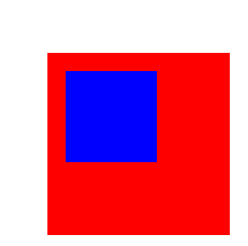
绝对定位:绝对定位存在覆盖有三种情形:前后盒子分别设定:绝对定位和绝对定位,绝对定位和浮动,绝对定位和文档流(不设置浮动或者绝对定位)。
绝对定位和文档流:这种情形只存在前一个盒子设置绝对定位,不占据文档位置,后面未设定绝对定位盒子位置上浮,表现为后面盒子被前面盒子覆盖的情况。
 1 <!DOCTYPE html>
 2 <html>
 3 <head>
 4     <meta charset="utf-8">
 5     <title>层叠次序-测试</title>
 6     <style type="text/css">
 7         .up {
 8             width: 200px;
 9             height: 200px;
10             background-color: red;
11             position: absolute;  /*前面盒子设置绝对定位*/
12         }
13         .down {  /*后面盒子不设置绝对定位*/
14             width: 300px;
15             height: 300px;
16             background-color: blue;
17         }
18     </style>
19 </head>
20 <body>
21     <div class="up"></div>
22     <div class="down"></div>
23 </body>
24 </html>
效果
绝对定位和浮动:前后两个盒子分别设定浮动和绝对定位,如:前浮后绝,前绝后浮。设置绝对定位的盒子一定会覆盖设置定位的盒子,无关前后。
前浮后绝
 1 <!DOCTYPE html>
 2 <html>
 3 <head>
 4     <meta charset="utf-8">
 5     <title>层叠次序-测试</title>
 6     <style type="text/css">
 7         .up {  /*前面盒子设置浮动*/
 8             width: 200px;
 9             height: 200px;
10             background-color: red;
11             float: left;
12         }
13         .down {  /*后面盒子设置绝对定位*/
14             width: 300px;
15             height: 300px;
16             background-color: blue;
17             position: absolute;
18         }
19     </style>
20 </head>
21 <body>
22     <div class="up"></div>
23     <div class="down"></div>
24 </body>
25 </html>
效果
前绝后浮
 1 <!DOCTYPE html>
 2 <html>
 3 <head>
 4     <meta charset="utf-8">
 5     <title>层叠次序-测试</title>
 6     <style type="text/css">
 7         .up {  /*前面盒子设置绝对定位*/
 8             width: 200px;
 9             height: 200px;
10             background-color: red;
11             position: absolute;
12         }
13         .down {  /*后面盒子设置浮动*/
14             width: 300px;
15             height: 300px;
16             background-color: blue;
17             float: left;
18         }
19     </style>
20 </head>
21 <body>
22     <div class="up"></div>
23     <div class="down"></div>
24 </body>
25 </html>
效果

绝对定位与绝对定位:前、后盒子都设置绝对定位,后面设置绝对定位的盒子会覆盖前面设置绝对定位的盒子。
 1 <!DOCTYPE html>
 2 <html>
 3 <head>
 4     <meta charset="utf-8">
 5     <title>层叠次序-测试</title>
 6     <style type="text/css">
 7         .up {  /*前面盒子设置绝对定位*/
 8             width: 200px;
 9             height: 200px;
10             background-color: red;
11             position: absolute;
12         }
13         .down {  /*后面盒子设置绝对定位*/
14             width: 300px;
15             height: 300px;
16             background-color: blue;
17             position: absolute;
18         }
19     </style>
20 </head>
21 <body>
22     <div class="up"></div>
23     <div class="down"></div>
24 </body>
25 </html>
效果

对于定位中导致的元素重叠问题,可以对定位元素应用z-index属性设置层叠顺序,属性值可以为0或者正、负整数。0为z-index属性的默认属性值,取值越大,定位元素在层叠顺序中越居上,即z-index:1;会覆盖z-index:2;的盒子。注意:z-index属性只在应用于定位元素,对于标准流(静态定位相当于标准流)、浮动元素无作用。
 1 <!DOCTYPE html>
 2 <html>
 3 <head>
 4     <meta charset="utf-8">
 5     <title>层叠次序-测试</title>
 6     <style type="text/css">
 7         .up {  /*前面盒子设置绝对定位*/
 8             width: 200px;
 9             height: 200px;
10             background-color: red;
11             position: absolute;
12             z-index: 1;   /*调高层叠等级为1*/
13         }
14         .down {  /*后面盒子设置绝对定位*/
15             width: 300px;
16             height: 300px;
17             background-color: blue;
18             position: absolute;
19         }
20     </style>
21 </head>
22 <body>
23     <div class="up"></div>
24     <div class="down"></div>
25 </body>
26 </html>
效果

固定定位:设置固定定位的元素会覆盖所有元素,但不会影响其他元素的位置。