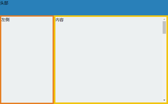
使用css3 flex实现 头部、左侧栏不变,内容区域滚动显示
<!DOCTYPE html>
<html lang="en">
<head>
    <meta charset="UTF-8">
    <meta name="viewport" content="width=device-width, initial-scale=1.0">
    <title>Document</title>
    <style>
        html, body{height: 100%;margin: 0;padding: 0;}
        .wrap{background: #a00;height: 100%;display: flex;flex-direction: column}
        .hd{background: #2980b9;flex: 0 0 60px}
        .bd{flex-grow: 1;display: flex;overflow: auto;}
        .left{background: #ecf0f1;border: solid 5px #e67e22;width: 200px;}
        .content{background: #ecf0f1;border: solid 6px #f1c40f;flex-grow: 1;overflow: auto;}
    </style>
</head>

<body>
    <div class="wrap">
        <div class="hd">头部</div>
        <div class="bd">
            <div class="left">左侧</div>
            <div class="content">
                <div style="height: 2050px;overflow-y: auto;">内容</div>
            </div>
        </div>
    </div>
</body>
</html>
效果