1. 渐变 https://www.w3school.com.cn/css/css3_gradients.asp
1 background-image: linear-gradient(to bottom right, red, yellow);

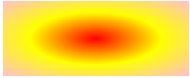
2,径向渐变 https://www.w3school.com.cn/css/css3_gradients_radial.asp
1 background-image: radial-gradient(red, yellow, pink);
3,过渡 https://www.w3school.com.cn/css/css3_transitions.asp
1 #app {
2          200px;
3         height: 200px;
4         background: rgb(235, 136, 136);
5         transition: width 2s, height 3s;
6       }
7       #app:hover {
8          500px;
9       }

| 属性 | 描述 |
|---|---|
| transition | 简写属性,用于将四个过渡属性设置为单一属性。 |
| transition-delay | 规定过渡效果的延迟(以秒计)。 |
| transition-duration | 规定过渡效果要持续多少秒或毫秒。 |
| transition-property | 规定过渡效果所针对的 CSS 属性的名称。 |
| transition-timing-function | 规定过渡效果的速度曲线。 |
transition-property: width;
transition-duration: 2s;
transition-timing-function: linear;
transition-delay: 1s;
4,动画
缩小-放大效果
  // animation: scalc 1s linear infinite;
  // @keyframes scalc {
  //   0% {
  //     transform: scale(1);
  //   }
  //   50% {
  //     transform: scale(1.2);
  //   }
  //   100% {
  //     transform: scale(1);
  //   }
  // }
从左到右跑动效果
  // position: absolute;
  // top: 0;
  // left: 0;
  // animation: light 1s linear infinite;
  // @keyframes light {
  //   0% {
  //     left: -1rem;
  //   }
  //   100% {
  //     left: 3.28rem;
  //   }
  // }