NumPy的主要对象是同种元素的多维数组。这是一个所有的元素都是一种类型、通过一个正整数元组索引的元素表格(通常是元素是数字)。在NumPy中维度(dimensions)叫做轴(axes),轴的个数叫做秩(rank)。
例如,在3D空间一个点的坐标 [1, 2, 3] 是一个秩为1的数组,因为它只有一个轴。那个轴长度为3.又例如,在以下例子中,数组的秩为2(它有两个维度).第一个维度长度为2,第二个维度长度为3.
[[ 1., 0., 0.],
 [ 0., 1., 2.]]
NumPy的数组类被称作 ndarray 。通常被称作数组。注意numpy.array和标准Python库类array.array并不相同,后者只处理一维数组和提供少量功能。更多重要ndarray对象属性有:
-
ndarray.ndim
数组轴的个数,在python的世界中,轴的个数被称作秩
-
ndarray.shape
数组的维度。这是一个指示数组在每个维度上大小的整数元组。例如一个n排m列的矩阵,它的shape属性将是(2,3),这个元组的长度显然是秩,即维度或者ndim属性
-
ndarray.size
数组元素的总个数,等于shape属性中元组元素的乘积。
-
ndarray.dtype
一个用来描述数组中元素类型的对象,可以通过创造或指定dtype使用标准Python类型。另外NumPy提供它自己的数据类型。
-
ndarray.itemsize
数组中每个元素的字节大小。例如,一个元素类型为float64的数组itemsiz属性值为8(=64/8),又如,一个元素类型为complex32的数组item属性为4(=32/8).
-
ndarray.data
包含实际数组元素的缓冲区,通常我们不需要使用这个属性,因为我们总是通过索引来使用数组中的元素。
>>> from numpy  import *
>>> a = arange(15).reshape(3, 5)
>>> a
array([[ 0,  1,  2,  3,  4],
       [ 5,  6,  7,  8,  9],
       [10, 11, 12, 13, 14]])
>>> a.shape
(3, 5)
>>> a.ndim
2
>>> a.dtype.name
‘int32‘
>>> a.itemsize
4
>>> a.size
15
>>> type(a)
numpy.ndarray
>>> b = array([6, 7, 8])
>>> b
array([6, 7, 8])
>>> type(b)
numpy.ndarray
一、numpy.apply_along_axis
官方文档给的:
numpy.apply_along_axis(func1d, axis, arr, *args, **kwargs)
Apply a function to 1-D slices along the given axis.
Execute func1d(a, *args) where func1d operates on 1-D arrays and a is a 1-D slice of arr along axis.
| Parameters: |
func1d : function
axis : integer
arr : ndarray
args : any
kwargs : any
|
|---|---|
| Returns: |
apply_along_axis : ndarray
|
举例:
>>> def my_func(a):#定义了一个my_func()函数,接受一个array的参数
...     """Average first and last element of a 1-D array"""
...     return (a[0] + a[-1]) * 0.5 #返回array的第一个元素和最后一个元素的平均值
>>> b = np.array([[1,2,3], [4,5,6], [7,8,9]])
>>> np.apply_along_axis(my_func, 0, b)
array([ 4.,  5.,  6.])
>>> np.apply_along_axis(my_func, 1, b)
array([ 2.,  5.,  8.])
定义了一个my_func()函数,接受一个array的参数,然后返回array的第一个元素和最后一个元素的平均值,生成一个array:
1 2 3
4 5 6
7 8 9
np.apply_along_axis(my_func, 0, b)意思是说把b按列,传给my_func,即求出的是矩阵列元素中第一个和最后一个的平均值,结果为;
4. 5. 6.
np.apply_along_axis(my_func, 1, b)意思是说把b按行,传给my_func,即求出的是矩阵行元素中第一个和最后一个的平均值,结果为;
2. 5. 8.
二、numpy.linalg.norm
- (1)np.linalg.inv():矩阵求逆
- (2)np.linalg.det():矩阵求行列式(标量)
np.linalg.norm
顾名思义,linalg=linear+algebra,norm则表示范数,首先需要注意的是范数是对向量(或者矩阵)的度量,是一个标量(scalar):
首先help(np.linalg.norm)查看其文档:
norm(x, ord=None, axis=None, keepdims=False)这里我们只对常用设置进行说明,x表示要度量的向量,ord表示范数的种类,

>>> x = np.array([3, 4])
>>> np.linalg.norm(x)
5.
>>> np.linalg.norm(x, ord=2)
5.
>>> np.linalg.norm(x, ord=1)
7.
>>> np.linalg.norm(x, ord=np.inf)
4
范数理论的一个小推论告诉我们:?1≥?2≥?∞
三、numpy.expand_dims
主要是把array的维度扩大
numpy.expand_dims(a, axis)
举例:
>>> x = np.array([1,2])
>>> x.shape
(2,)
shape是求矩阵形状的。
>>> y = np.expand_dims(x, axis=0)
>>> y
array([[1, 2]])
>>> y.shape
(1, 2)
维度扩大,axis=0
>>> y = np.expand_dims(x, axis=1)  # Equivalent to x[:,newaxis]
>>> y
array([[1],
       [2]])
>>> y.shape
(2, 1)
维度扩大,axis=1
pyplot 有两个重要概念: current figure, current axes,所有的plot命令都会应用到current axes
一般pyplot画图具有这样一个流程
- 创建一个当前画板 plt.figure(1), 1为画板的编号,可以不填,这一步骤也可以省略, 直接执行第2步后台会自动执行这一步
- plt.subplot(221) 将当前画板分为4个绘画区域(axes),221表示将画板分为2行2列,并在第一个画板绘图
- plt.plot(x,y,...) 绘图,并制定 line 的属性和图例
- plt.xlabel('x') 等 配置坐标轴
- plt.show() 显示图片
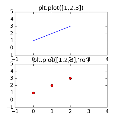
import matplotlib.pyplot as plt
import numpy as np
plt.figure(1, figsize=(4,4))
# 只传入一个参数的话, 默认为y轴, x轴默认为range(n)
# axis()指定坐标轴的取值范围 [xmin, xmax, ymin, ymax], 注意传入的是一个列表即:axis([])
plt.subplot(211)
plt.axis([-1, 4, -1, 5])
plt.plot([1,2,3])
plt.title("plt.plot([1,2,3])")
# ro 表示点的颜色和形状, 默认为 'b-'
plt.subplot(212)
plt.axis([-1, 4, -1, 5])
plt.plot([1,2,3], 'ro')
plt.title("plt.plot([1,2,3],'ro')")
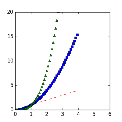
plt.figure(2, figsize=(4,4))
# plot可以一步画出多条线,不过没法设置其他的line properties
plt.axis([0, 6, 0, 20])
x = np.arange(0, 4, 0.08)
plt.plot(x, x, 'r--', x, np.power(x,2), 'bs',x, np.power(x,3), 'g^')
plt.show()


2. 设置 曲线属性
绘图中的line有很多属性 ,这里有很多方式设置line properties
-
关键字 如:
linewidthplt.plot(x, y, 'linewidth'=2.0) -
使用 matplotlib.line.Line2D 的set方法, plt.plot() 会返回 matplotlib.line.Line2D对象元组 如
line1, line2 = plot(x1, y1, x2 ,y2) -
使用pyplot.setp()方法(set properties), 该方法透明处理单个对象和一组对象(见例子)
import matplotlib.pyplot as plt
import numpy as np

#2
x = np.arange(0, 4, 0.2)
# 返回的是一个元组, 通过 line, 取得元组的第一个元素
line, = plt.plot(x, y, 'g-')
#关闭抗锯齿, 可以看到输出的图像与之前比起来不是那么平滑
line.set_antialiased(False)

#3
line1, line2 = plot(x1, y1, x2 ,y2)
plt.setp(lines, color='r', 'linewidth'=2.0)
lines = plt.plot([1, 2, 3])
# 为了得到可设置的 line properties,
plt.setp(lines)
# 如果你只想知道某一个属性的有用取值, 如下(属性要用''括起来)
plt.setp(lines, 'linestyle')
3.同时在多个figure和axes上绘图
pyplot 有两个重要概念: current figure, current axes
所有的plot命令都会应用到 current axes
plt.gca(): 返回当前axes(matplotlib.axes.Axes)
plt.gcf(): 返回当前figure(matplotlib.figure.Figure)
plt.clf(): 清理当前figure
plt.cla(): 清理当前axes
plt.close(): 一副figure知道显示的调用close()时才会释放她所占用的资源;
如果你在画很多图,就要注意了,防止内存占用过高
#coding=utf-8
import numpy as np
import matplotlib.pyplot as plt

plt.figure(1)
# 频谱线
def f(t):
    return np.exp(-t) * np.cos(2*np.pi*t)
t0 = np.arange(0.0, 5.0, 0.04)
t1 = np.arange(0.0, 5.0, 0.2)
plt.subplot(211)
plt.plot(t1, f(t1), 'bo', t0, f(t0), 'k-')

# 心形线参数方程:x=a*(2*cos(t)-cos(2*t)), y=a*(2*sin(t)-sin(2*t))
t2 = np.arange(0.0, 2*np.pi, np.pi/20)
x = 2*np.cos(t2)-np.cos(2*t2)
y = 2*np.sin(t2) - np.sin(2*t2)

plt.subplot(212)
plt.axis([-4, 3, -5, 5])
plt.plot(x/2, y, 'r--', label="cardioid")
plt.legend(loc="upper left", );
plt.show()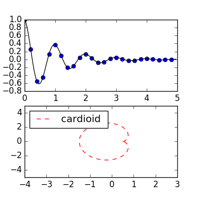 

_
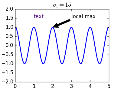
4. 给axes添加文本说明
- plt.text()可以在任意位置添加文本, 而plt.xlabel(), plt.ylabel, plt.title()是将文本放在指定位置
plt.text(x, y, s[, fontsize, color]): 在坐标(x,y)显示文本s,fontsize指定字体大小- matplotlib.text.Text 的属性, 如同上面通过 plt.setp(line) 得到 line properties, 同样的可以通过plt.setp(text)得到 text properties以及某个属性的有效取值; 见 #3
- text对象中可以支持任意 TeX表达式(由2个$括起来); 见 #4
- annotating(标注) text, 用来显示在图形的一些特点,如极点, 最大值等,自然也是可以通过plt.setp(annoteate)获取annotating的特性
import numpy as np
import matplotlib.pyplot as plt

#3
ax = plt.subplot(111)
t = ax.text(1, 1.5, 'text')
plt.setp(t)
plt.setp(t, 'color') # 输出为:color: any matplotlib color
plt.setp(t, color='indigo')
#4
plt.title(r'$sigma_i=15$') # 即σi
#5
x = np.arange(0, 5, 0.02)
y = np.cos(2*np.pi*x)
plt.plot(x, y, lw=2.0)
plt.ylim(-2,2)

# xy : 图上需要标注的点, xytext: 对标记点进行说明的文本
# arrowsprops: 标记方式 其中shrink为箭头的长度(shrink越小越长)
a = plt.annotate('local max', xy=(2,1), xytext=(3,1.5),
arrowprops=dict(facecolor='k', shrink=0.02),
)

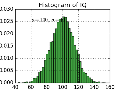
import numpy as np
import matplotlib.pyplot as plt

# Fixing random state for reproducibility
# np.random.randn 这个函数的作用就是从标准正态分布中返回一个或多个样本值
np.random.seed(20170617)

mu, sigma = 100, 15
x = mu + sigma * np.random.randn(10000)
p, bins, patches = plt.hist(x, 50, normed=True, facecolor='g', alpha=0.75)

plt.xlabel('Smarts', color='cyan')
plt.ylabel('Probability')
plt.title('Histogram of IQ')
plt.text(60, .025, r'$mu=100, sigma=15$')
plt.axis([40, 160, 0, 0.03])
plt.grid(True) # 显示网格
plt.show()

5.对数以及其他非线性坐标
matplotlib.pyplot 不仅支持线性坐标, 也支持log scale, symlog scale, logit scale,改变一个坐标的刻度很简单, 如:(scale n, 尺度,刻度)
关于这段代码有看不懂的,可以直接翻倒下面, 有详细的解释
import numpy as np
import matplotlib.pyplot as plt

from matplotlib.ticker import NullFormatter  # useful for `logit` scale

# Fixing random state for reproducibility
np.random.seed(19680801)

# make up some data in the interval ]0, 1[
y = np.random.normal(loc=0.5, scale=0.4, size=1000)
y = y[(y > 0) & (y < 1)] # 选取 0<y<1 的y值
y.sort()
x = np.arange(len(y))

# plot with various axes scales
plt.figure(1)

# linear
plt.subplot(221)
plt.plot(x, y)
plt.yscale('linear')
plt.title('linear')
plt.grid(True)


# log
plt.subplot(222)
plt.plot(x, y)
plt.yscale('log')
plt.title('log')
plt.grid(True)


# symmetric log
plt.subplot(223)
plt.plot(x, y - y.mean())
plt.yscale('symlog', linthreshy=0.01)
plt.title('symlog')
plt.grid(True)

# logit
plt.subplot(224)
plt.plot(x, y)
plt.yscale('logit')
plt.title('logit')
plt.grid(True)
#使用 `NullFormatter`格式化y轴 次刻度注释(minor tick label) 为空字符串,避免y-轴有太多tick label 而看不清
plt.gca().yaxis.set_minor_formatter(NullFormatter())

# 调整子图布局, 应为logit可能会比普通坐标占据更多的空间(如小图y轴tick label如"1-10^{-3}"
plt.subplots_adjust(top=0.92, bottom=0.08, left=0.10, right=0.95, hspace=0.25,
                    wspace=0.35)

plt.show()

5.1 numpy.random.normal(loc, scale, size=None),
该函数返回 高斯分布N(loc, scale)的抽样值
loc:float
    此概率分布的均值(对应着整个分布的中心centre)
scale:float
    此概率分布的标准差(对应于分布的宽度,scale越大越矮胖,scale越小,越瘦高)
size:int or tuple of ints
    输出的shape,默认为None,只输出一个值

特例: numpy.random.normal(loc=0.0, scale=1.0, size=None),
对应于numpy.random.randn(size),标准正态分布随机抽样
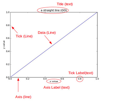
5.2 图像figure内部各个组件内容:
title 图像标题
Axis 坐标轴,
Label 坐标轴标注,
Tick 刻度线,
Tick Label 刻度注释.

5.3 pyplot.subplots_adjust() 解析
plt.subplots_adjust(bottom=0.08, top=0.92, left=0.10, right=0.95, hspace=0.25, wspace=0.35)

一幅图称为figure, 其绘画区域称为axes:
bottom, top: 即 axes距离画板底部的距离 (画板的高度取1)
left, right: 即 axes距离画板左边的距离 (画板的宽度取1)
hspace: hight space 上下axes的距离
wspace: width space 左右axse的距离

注: bottom, top, left, right 不管figure实际长度和宽度为多少,都会归一化为1,这里填的数值,更确切的说是`占的比例`
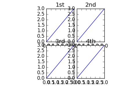
import numpy as np
import matplotlib.pyplot as plt

# Fixing random state for reproducibility

t = np.arange(4)
plt.figure(figsize=(4,))

plt.subplot(221)
plt.plot(t)
plt.title("1st")

plt.subplot(222)
plt.plot(t)
plt.title("2nd")

plt.subplot(223)
plt.plot(t)
plt.title("3rd")

plt.subplot(224)
plt.plot(t)
plt.title("4th")

plt.subplots_adjust(bottom=0.1, top=0.9,
                    left=0.4, right=0.9,
                    hspace=0.1, wspace=0.1)
从下图可以看到axes从占据figure 宽度0.4的位置开始
axes上下左右之间由于距离太近, 一些label都重叠了

# 与上图对比, 各个参数的含义一目了然
plt.subplots_adjust(bottom=0.1, top=0.9,
                    left=0.1, right=0.9,
hspace=0.4, wspace=0.4)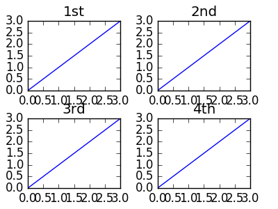 

4.4 matplotlib: log scale vs symlog scale
- log : 只允许正值
- symlog: 即 对称log, 允许正值和赋值, 而且允许图像在0附近取一段线性区域
import numpy
from matplotlib import pyplot

pyplot.grid(True)
xdomain = numpy.arange(-50,50, 0.1)
pyplot.plot(xdomain, xdomain)
# Plots 'sin(x)'
pyplot.plot(xdomain, numpy.sin(xdomain))
# 'linear' is the default mode, so this next line is redundant:
pyplot.xscale('linear')
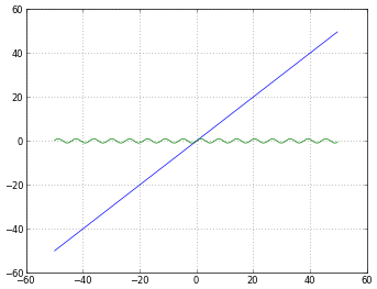 

# How to treat negative values?
# 1. 'mask' will treat negative values as invalid
# 2. 'mask' is the default, so the next two lines are equivalent

pyplot.xscale('log')
pyplot.xscale('log', nonposx='mask')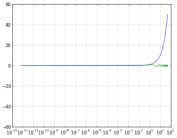 

# How to treat negative values?
# 'mask' will treat negative values as invalid
# 'mask' is the default, so the next two lines are equivalent
pyplot.xscale('log')
pyplot.xscale('log', nonposx='mask')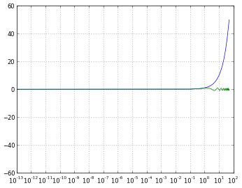 

# 'symlog' scaling, however, handles negative values nicely
pyplot.xscale('symlog')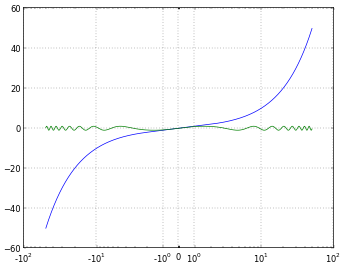 

# And you can even set a linear range around zero
pyplot.xscale('symlog', linthreshx=20)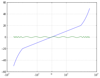 

# 保存figure, 默认dpi为80
pyplot.savefig('matplotlib_xscale_linear.png', dpi=50, bbox_inches='tight')

fig = pyplot.gcf()
fig.set_size_inches([4., 3.])
# figure的默认大小: [8., 6.]