一、
#ID{
宽度px;
height:高度px;
background-color:red; 背景颜色的两种加法
background:rgba(x,x,x,x) rgba颜色 最后一个值为透明度 1为不透明,0为全透明。
background:url(图片.jpg) np-rereat; 背景图添加 repeat是平铺
background-image:url(图片.jpg); 背景图添加
background-size;100%; 背景图拉伸100% 几乎不会用到 因为会失真。
}
#ID{
font-family:字体名字; 改字体
font-size:10px; 改字体大小,单位像素
color:颜色; 改字体颜色
font-styel:italic; 字体样式 italic斜体(就是I那个倾斜) normal正常 默认正常
text-decoration:underline;文本修饰属性 underline下划线 overline上划线 line-through 删除线 none无,可以用于去掉下划线比如<a>标签的。
overflow:hidden; 元素溢出内容属性 visible不修剪 会呈现在元素框之外 默认 hidden修剪并隐藏溢出内容 scroll加滚动条 auto自动 如果溢出就加滚动条
text-align:center; 水平对齐 center 居中 left左对齐 默认 right右对齐
vertical-align 垂直对齐
line-height: 行高 垂直居中可以用行高进行
text-indent 缩进单位像素
}
.btn{
border:black solid 10px; 边框 黑色 solid实线 dotted虚线 线宽、
}
.btn:hover{ 当鼠标移到这个class为btn的div上的时候
background-color:red; 背景色变红
color:green; 字体变绿
cursor:pointer 鼠标变小手
transiti:1s; 变化在1秒内完成
transfor:rotate(45deg); 旋转45°
box-shadow:4px 5px 6px 阴影效果 向下5px 向右5px 虚化5px 阴影色为黑色
二、课上联系
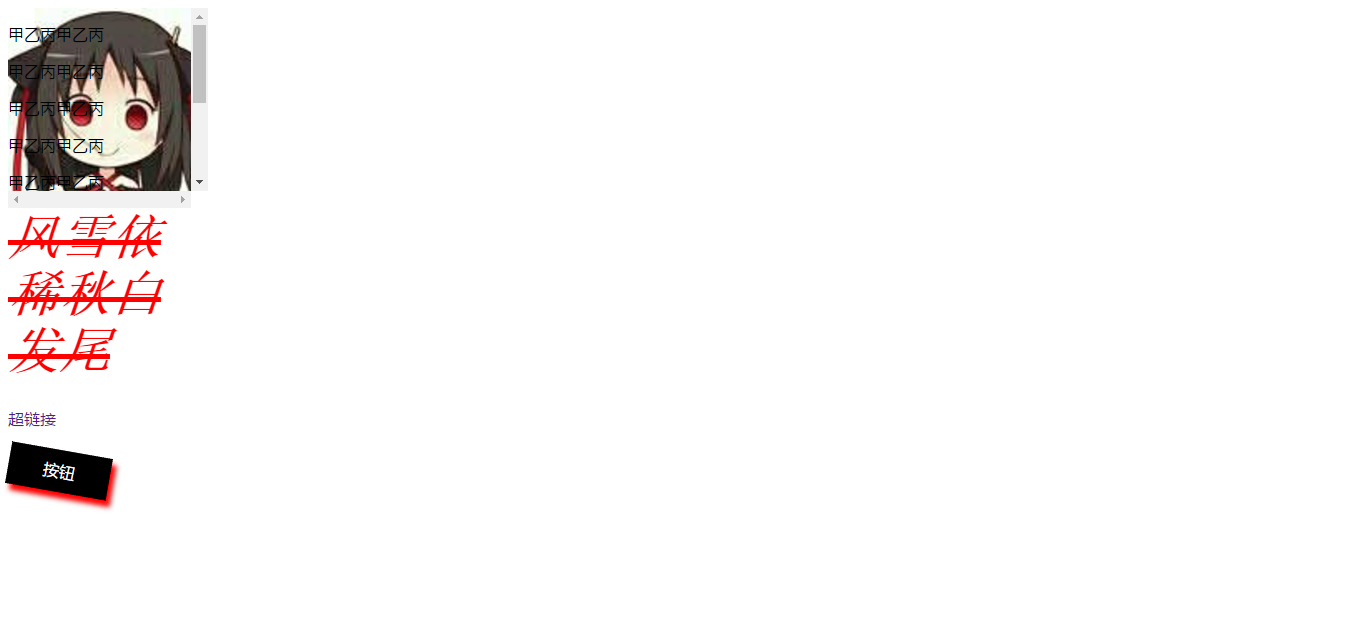
<style>
        #d1 {
            200px;
            height:200px;
            /*background-color:red;*/
            background:rgba(255, 0, 0,0.5);
            background:url(img/tu.jpg) no-repeat;  /*默认平铺,no-repeat不平铺。*/
            /*background-image:url(img/tu.jpg);*/
            background-size:100%;   /*图片尺寸拉伸不常用,容易失真。*/
            /*background-attachment:scroll;*/
            overflow:scroll;
        }
        #d2 {
            200px;
            height:200px;
            font-family:宋体;
            font-size:50px;
            color:red;
            font-style:italic;   /*斜体*/
            font-weight:900;    /*加粗100-900*/
            text-decoration:line-through;   /*删除线。underline下划线 overline上划线 none,无,去超链接下划线*/
        }
        a {
            text-decoration:none;
        }
        .btn {
            100px;
            height:40px;
            border:1px dotted black;
            text-align:center;    /*水平居中*/
            line-height:40px;     /*垂直居中*/
        }
            .btn:hover {
                background-color:black;
                color:white;
                cursor:pointer;
                transition:1s;
                transform:rotate(10deg);    /*转动*/
                box-shadow:5px 6px 7px red;     /*虚化*/
            }
    </style>
<body>

    <div id="d1">
        <p>甲乙丙甲乙丙</p><p>甲乙丙甲乙丙</p><p>甲乙丙甲乙丙</p>
        <p>甲乙丙甲乙丙</p><p>甲乙丙甲乙丙</p><p>甲乙丙甲乙丙</p>
        <p>甲乙丙甲乙丙</p><p>甲乙丙甲乙丙</p><p>甲乙丙甲乙丙</p>
    </div>
    <div id="d2">风雪依稀秋白发尾</div>
    <a href="CSS课上练习3.html">超链接</a><br /><br />
    <div class="btn">按钮</div>
</body>
三、网页效果