Flex是Flexible Box的缩写,意为"弹性布局"。任何一个容器都可以指定为Flex布局,块级元素为display:block,行内元素为display:inline-flex。
注意,设为Flex布局以后,子元素的float、clear和vertical-align属性将失效。
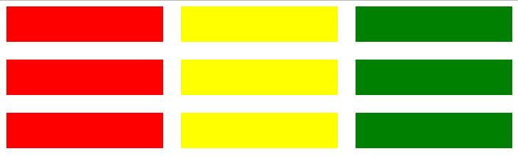
以下是一个实现Flex基本布局的代码:
<style>
    .container{
        width: 100%;
        height: 200px;
        background-color: white;
        display: flex;
    }
    .box_1{  flex: 1;  background-color: red;  }
    .box_2{  flex: 2;  background-color: yellow;  }
    .box_3{  flex: 3;  background-color: green;  }
</style>
<body>
    <div class="container">
        <div class="box_1"></div>
        <div class="box_2"></div>
        <div class="box_3"></div>
    </div>
</body>
子容器的flex属性值代表所占据的权重,显示如下:

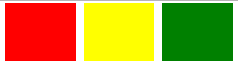
flex-direction: row | row-reverse | column | column-reverse;属性决定主轴的方向,默认为flex-direction: row;
当我们添加:
.container{flex-direction:column}
显示如下:

flex-wrap: nowrap | wrap | wrap-reverse; flex-wrap属性可以决定当子元素在主轴上无法排下时,是否换行
添加:
.container{ flex-wrap:wrap;}
.box_1{  flex: 0 0 50%;}
.box_2{  flex: 0 0 50%;}
.box_3{  flex: 0 0 50%;}
显示如下

flex属性是flex-grow, flex-shrink 和 flex-basis的简写,默认值为0 1 auto。后两个属性可选。
none:none关键字的计算值为: 0 0 auto
<' flex-grow '>:用来指定扩展比率,即剩余空间是正值时此「flex子项」相对于「flex容器」里其他「flex子项」能分配到空间比例。
在「flex」属性中该值如果被省略则默认为「1」(当此值为0时子元素之间才会出现空隙)
<' flex-shrink '>:用来指定收缩比率,即剩余空间是负值时此「flex子项」相对于「flex容器」里其他「flex子项」能收缩的空间比例。在收缩的时候收缩比率会以伸缩基准值加权
在「flex」属性中该值如果被省略则默认为「1」
<' flex-basis '>:用来指定伸缩基准值,即在根据伸缩比率计算出剩余空间的分布之前,「flex子项」长度的起始数值。
在「flex」属性中该值如果被省略则默认为「0%」
在「flex」属性中该值如果被指定为「auto」,则伸缩基准值的计算值是自身的 <' width '> 设置,如果自身的宽度没有定义,则长度取决于内容。
justify-content: flex-start | flex-end | center | space-between | space-around;属性定义了项目在主轴上的对齐方式。
添加:
.container{ justify-content:space-around; }
.box_1{  flex: 0 0 30%;}
.box_2{  flex: 0 0 30%;}
.box_3{  flex: 0 0 30%;}
显示如下:
align-items: flex-start | flex-end | center | baseline | stretch;属性定义项目在交叉轴上如何对齐。
baseline: 项目的第一行文字的基线对齐。
stretch(默认值):如果项目未设置高度或设为auto,将占满整个容器的高度。
添加:
.container{ align-items:center; }
.box_1{  height: 100px;}
.box_2{  height: 120px;}
.box_3{  height: 140px;}
显示:

order属性定义项目的排列顺序。数值越小,排列越靠前,默认为0。
添加:
.box_1{  order: 3;}
.box_2{  order: 2;}
.box_3{  order: 1;}
显示:

align-self: auto | flex-start | flex-end | center | baseline | stretch;align-self属性允许单个项目有与其他项目不一样的对齐方式,可覆盖align-items属性。默认值为auto,表示继承父元素的align-items属性,如果没有父元素,则等同于stretch。
添加:
.box_1{align-self: flex-start}
显示:

align-content: flex-start | flex-end | center | space-between | space-around | stretch;属性定义了多根轴线的对齐方式。如果项目只有一根轴线,该属性不起作用。
例如:
<style>
    .container{
        width: 100%;
        height: 200px;
        background-color: white;
        display: flex;
        flex-wrap:wrap;
        justify-content:space-around;
        align-items: center;
        align-content: space-between;
    }
    .box_1{  flex: 0 0 30%;  background-color: red; height: 50px}
    .box_2{  flex: 0 0 30%;  background-color: yellow; height: 50px}
    .box_3{  flex: 0 0 30%;  background-color: green; height: 50px}
</style>
<script src="jquery-1.8.3.min.js"></script>
<body>
    <div class="container">
        <div class="box_1"></div>
        <div class="box_2"></div>
        <div class="box_3"></div>
        <div class="box_1"></div>
        <div class="box_2"></div>
        <div class="box_3"></div>
        <div class="box_1"></div>
        <div class="box_2"></div>
        <div class="box_3"></div>
    </div>
</body>
显示: