*以下技巧均源自于Lea Verou所著《CSS Secrets》
平行四边形
平行四边形的构造可以基于矩形通过skew()的变形属性进行斜向拉升得到(skew所用的坐标系,纵向是X轴,横向是Y轴,与常见的坐标系相反)。
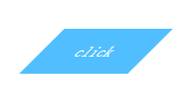
<!DOCTYPE html>
<html lang="en">
<head>
    <meta charset="UTF-8">
    <title>Title</title>
    <style>
        .location{
            position: relative;
            top: 150px;
            left: 150px;
        }
         .button{
             color: white;
             background-color: #51bfff;
             width: 120px;
             height: 50px;
             line-height: 50px;
             text-align: center;
             transform: skewX(-45deg);
         }
    </style>
</head>
<body>
    <div class="location button">click</div>
</body>
</html>
但是内容倾斜可能不是我们所需要的效果,一种常规的解决方案就是在内层嵌套一个div,然后加上一个反方向的拉升transform: skewX(45deg);但是有代码洁癖的人表示接受不能。
另一种思路是将所有样式应用到伪元素上。然后再对伪元素进行变形。
<!DOCTYPE html>
<html lang="en">
<head>
    <meta charset="UTF-8">
    <title>Title</title>
    <style>
        .location{
            position: relative;
            top: 150px;
            left: 150px;
        }
         .button{
             width: 120px;
             height: 50px;
             line-height: 50px;
             text-align: center;
             color: white;
         }
        .button:before{
            content: '';
            position: absolute;
            top: 0; right: 0; bottom: 0; left: 0;
            background-color: #51bfff;
            transform: skewX(-45deg);
            z-index: -1;
        }
    </style>
</head>
<body>
    <div class="location button">click</div>
</body>
</html>
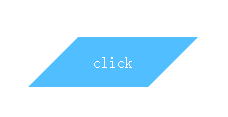
这样不但解决了内容倾斜的问题,而且html结构还是和之前一样干净。不过要注意伪元素生成的图案是重叠在内容之上的,一旦给它设置背景,就会遮住内容,所以要加上z-index: -1。
菱形图片
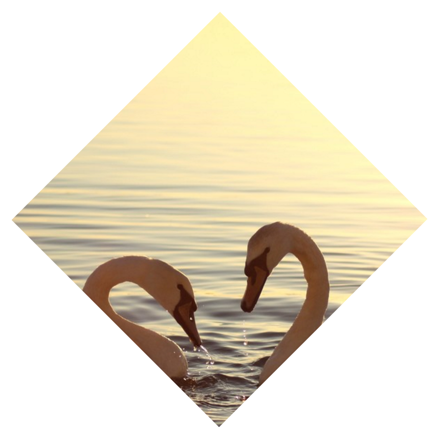
如果是在正方形的基础之上,菱形就是正方形图案旋转45度的图形。我们很容易想到将外层div旋转45度再将内层img反向旋转45度。得到如下的图案。
<!DOCTYPE html>
<html lang="en">
<head>
    <meta charset="UTF-8">
    <title>Title</title>
    <style>
        .location{
            position: relative;
            top: 150px;
            left: 150px;
        }
         .picture{
             width: 600px;
             transform: rotate(45deg);
             overflow: hidden;
         }
        .picture>img{
            max-width: 100%;
            transform: rotate(-45deg);
        }
    </style>
</head>
<body>
    <div class="location picture"><img src="1.jpeg"></div>
</body>
</html>

是个挺漂亮的正八边形呢,如果你能说服产品经理,那工作也算完成啦。好吧,我猜你不能说服。。。
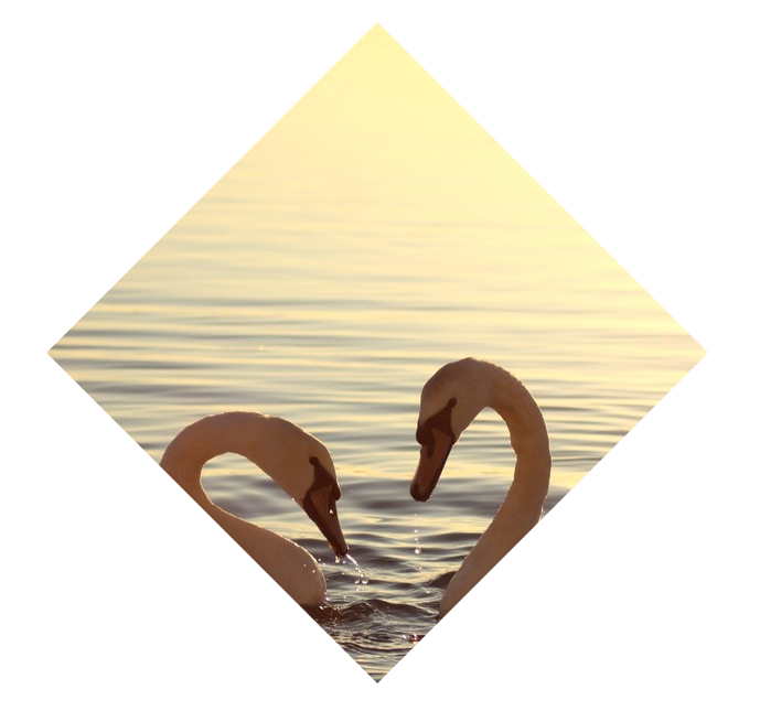
这里由于旋转方向不一致,外层div截取了超出的部分(注意overflow:hidden),然后一部分又空出来了。只要填充完空出的部分就是菱形啦,这里你可以画个草图用勾股定理算一算。
算出的结果是放大1.42倍填充完全。我们在img的transform属性改为transform: rotate(45deg) scale(1.42);得到下图:
这个构造菱形的方案有一个缺陷,就是当原图不是正方形就需要使用更大的放大系数,截取的图片内容就更有限了。
而且方案本身也不算简洁优雅。这里向大家介绍一个属性clip-path(遗憾的是支持性似乎并不好),它可以通过传入固定的位置点将图片裁剪成任意的多边形。
<!DOCTYPE html>
<html lang="en">
<head>
    <meta charset="UTF-8">
    <title>Title</title>
    <style>
        .location{
            position: relative;
            top: 150px;
            left: 150px;
        }
        .picture{
            -webkit-clip-path: polygon(50% 0, 100% 50%, 50% 100%, 0 50%);
            -moz-clip-path: polygon(50% 0, 100% 50%, 50% 100%, 0 50%);
            clip-path: polygon(50% 0, 100% 50%, 50% 100%, 0 50%);
            transition: 1s clip-path;
        }

    </style>
</head>
<body>
<img class="location picture" src="1.jpeg">
</body>
</html>
希望在不远的将来clip-path这个属性在各游览器得到更好的支持。