- 原文链接: The Art of Minimalism in Mobile App UI Design
- 原文作者 : Nick Babich
- 译文出自 : 掘金翻译计划
- 译者 : edvardhua
- 校对者 : owenlyn, jiaowoyongqi, Graning
文章结尾有英文原文
设计是一件用户驱动很强的工作。随着用户越来越偏好更简洁的交互界面,如何剔除多余的元素,保留最基础最重要的元素是极简设计的关键。极简设计形式和功能完美结合。它最大的优点是极简的表现形式,简洁的线条,大方的留白,简约的图形化元素,就算是很复杂的内容,在这样的设计下也会显得很简洁和干练。当然,如果能有效的利用这些元素。
极简设计必须要 简洁明了和一致的可用性 。你的交互系统应该通过 清晰的视觉传达(clear visual communication) 来解决用户的问题。这也是为什么具备简洁设计和高可用性的应用如此让人深刻。即便只是一个通过极简设计的导航,都能够提供很强的交互方式。要做到这一点,你需要注意以下几个方面。
简单的配色方案
简单的配色方案能够提高用户体验,相应的 太多的色彩则会给用户负面的影响。针对于初学者,有一些预先定义的标准颜色方案能够让你轻松创建新的颜色方案。
- 单配色方案。 单配色方案由特定色彩的不同的色调,阴影或颜色深浅所构成。他们的原理是通过修改特定颜色的饱和度和亮度,可以生成多种协调的颜色,这种颜色方案比较简洁和优雅,不会给眼睛产生太大负担。
蓝色的单配色方案。素材来源: Smashing Magazine
素材来源: Dribbble
- 近似色彩配色方案 近似色彩配色方案 的思路是从色轮上取三个相邻的颜色来做为配色。全手势操作的应用 Clear 使用了近似色彩配色方案,它使用不同颜色来区分任务的优先级或者高亮关键的任务。(顶端的任务使用最鲜艳的颜色,而底部的任务则使用明亮精致的颜色)
渐变的黄色和橙色也是近似色彩配色方案的一个例子。素材来源: tuts+
IOS 平台的 Clear 应用
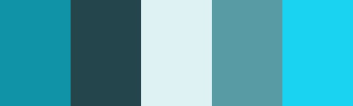
模糊效果
模糊效果出现在极简UI设计中是一件非常符合逻辑的事情,它能够增加 UI 的层次感。如果你的 UI 拥有多个层级,使用模糊效果能够让用户清晰的了解到 UI 的前后层级的关系。这也给了设计师一个完美的机会来设计多样化的菜单和层级效果。
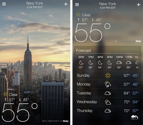
雅虎天气显示了一张当前位置的风景图片,如果需要查看天气的详细信息,你只需要向上滑动便会马上显示出来。与在原先的页面上叠加一层相比,这种方式在增加了详细信息的易于获取的情况下还保存了上一张图片作为模糊背景后,帮助用户在操作之后有更为直观的反馈。而且交互方式极为自然,你可以很方便的就返回到上一层。
IOS 上的雅虎天气
一个应用中只使用一种字体
在一个应用中使用多种字体会看起来很散乱和马虎。减少屏幕上字体的类型数量可以增强排版的效果。当你在设计应用的时候你可以通过更改字体的字重,样式,尺寸和大小来优化布局效果,而不是更换字体。
通常来说,一个应用中只使用一种字体 素材来源: Apple
当你在为APP选择字体的时候,选择平台的默认字体可能是最安全稳妥的选择:
- 苹果使用 San Francisco family 字体来提供全平台一致的阅读体验。(在 IOS 9 中简称为 SF-UI)
-
Roboto 和 Noto 分别是 Android 和 Chrome 的默认字体
减少屏幕上使用的字体类型能够获得较好的排版效果。素材来源: Dribbble
数据的视觉焦点
你应该使用大号字体和醒目的颜色来让特定的数据成为视觉的焦点。使用中性的颜色(黑白灰)来展示普通的内容,而一些具备操作的部分则使用强对比的颜色来吸引用户注意,从而给给予用户正确的指导和操作。
素材来源: Smashing Magazine
明亮的色调+中性的色调是最容易搭配的方案,同时也是视觉上最引人注意的方案之一。素材来源: Smashing Magazine
被放大的字体和显眼的色彩能够很好的吸引用户的注意力,而不需要多余的文字提示。与此同时还提供了简洁易用的信息收集体验。
在屏幕特定的区域使用放大的字体和弹出的颜色能有效吸引用户注意力。 素材来源: Dribbble
使用留白代替线条来区分元素
设计师通常使用线条和分割线来给屏幕划分区域和功能类别,但是增加太多这些元素会 UI 界面过于臃肿。
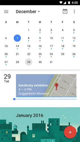
更少的线条和分割线能够让我们的页面看起来更加的干净,现代化和功能突出。我们可以使用间距,留白和色块来区分不同的元素。谷歌日历就是一个很好的例子,它使用投影将两个内容不同的区块清晰地拉开层次,而不是用线段来简单地分割。
间隔不仅提供了清晰的视觉也增加了日历应用的易用性。
图标:线条和填充
我们使用图标用来表达某种功能或者内容,图标作为一种视觉语言,它应该是简约易于识别和理解的。IOS 7 后许多极简设计的 UI 都使用线条或者填充的图标。来看看同一个图标分别使用线条和填充的效果。
时钟图标 素材来源: icons8
我们来看看底部菜单栏的图标。该图标在应用中通常是作为导航的存在,所以指示当前用户所在区域是很重要的,我们通常使用高亮图标来表示当前用户所选中的区域。这个时候,灰色的线性图标表示为未选中的状态。这样一来我们的底部菜单栏就很直观了。
苹果商店的底部导航 素材来源: viget
总结
简约的 UI 和设计技术是完成优秀设计的关键,但是极简设计的本身不是设计的目的。我们最终的目标是要简约 UI 的同时需要保证功能的完整性和高可用性。简单的流程,清晰的视觉传达和与设计的结合来打造无缝的交互体验才是最重要的。
The Art of Minimalism in Mobile App UI Design
22 JULY 2016 on Mobile App Development, UI, UX
Design is one of the most important drivers of user engagement. As users’ preferences shift toward a simpler interface, stripping the UI to its very basic, necessary elements is the key to success. Minimalism is a perfect marriage ofform and function. It’s greatest strength is clarity of form — clean lines, generous whitespace, and minimal graphical elements brings simplicity to even the most confounding subject matter. That is, of course, if it’s usedeffectively.
Minimalist design has to be concise, clear, and consistent to be usable. Your interaction system should aim to address problems for your users through clear visual communication. This is why a beautiful minimalist app combined with great usability is so impressive: an easily navigated, simple app can be a very powerful form of communication. But in order to achieve this goal, you need to focus on following moments:
Simple Color Scheme
Simplifying the color scheme improves the user experience while having too many colors can have a negative impact upon it. There are a number of predefined color scheme standards that make creating new schemes easier, especially for beginners:
-
Monochromatic scheme. Monochromatic color schemes are made up of different tones, shades and tints within a specific hue. By modifying the saturation and brightness of a single hue, you can generate multiple colors, and color scheme it’s not overwhelming on the eye.

Single-hue blue color scheme. Image credit: Smashing Magazine
Image credit: Dribbble -
Analogous color scheme. Analogous schemes are created by using three colors that are next to each other on the color wheel. A minimalist gesture-driven task manager app Clear use analogous colors to visually prioritize important tasks and highlight the most critical ones (the topmost items will be the boldest in color, while items lower on the list will be lighter and more subtle).
-
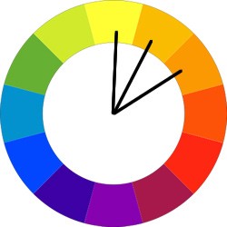
Shades yellow and orange is an example of an analogous color scheme. Image credit: tuts+ 
Clear app for iOS
Blur Effects
Blur effect arise as a logical solution to a minimal user interface, allowing a certain amount of play with the layers and hierarchy of the interface. It’s a very efficient solution when working with layered UI since it gives the user a clear understanding of mobile’s solution flow. This also gives designers a perfect opportunity to explore different menu and overlay solutions.
Yahoo! weather app displays a nice photo of each weather location, and the most important data you need is immediately visible while it’s just a single tap to drill down into more detailed data. Rather than cover the photo with another UI layer, the app keeps you in context after you tap — the detailed information is easily revealed and the photo remains in the background. The interaction is so intuitive that it takes nothing more than a second to return to your previous location.
One App, One Typeface
Mixing several different fonts can make your app seem fragmented and sloppy. Reducing the number of fonts on a screen can reveal the power of typography. When designing an app think about how can you make the typography powerful by playing with weight, style and size, not different typefaces.

When you choosing a typeface for your app keep in mind that a safe bet is to rely on the platform’s default font:
- Apple uses the San Francisco family of typefaces to provide consistent reading experience across all platforms (the San Francisco font for iOS 9 is called SF-UI).
- Roboto and Noto are the standard typefaces on Google Android and Chrome.
Reducing the number of fonts on a screen can reveal the power of typography. Image credit: Dribbble
Data Spotlight
You should use big font size and striking color to make a certain data the center of focus. Using neutral colors for the general scheme and adding contrasting colors for calls to action, helps the user focus on the action we want them to take. 
Increased font size and an accent color draws the users’ attention to a particular area of the screen without additional visual hints. This provides easier information-gathering experience.
Divide by Elements and Spacing, Not Lines
Lines and dividers often used to clearly delineate specific sections or categories within a screen. But adding too many of these elements can result in crowded interfaces.
Less lines and dividers will give your interface a cleaner, modern and more functional feel. There are other ways to separate content with a methods such as using blocks, spacing or colors. Calendar App from Google is a good example of how leveraging space and using shadows instead of drawing lines helps to define different sections in a non-obtrusive manner.
Icons: Stroke and Fill
Iconography is a visual language used to represent functionality or content. Icons are meant to be simple, visual elements that are recognized and understood immediately. Since iOS 7 many minimalist UI has stroke and filled icons. In this article we won’t criticize the concept itself, instead we’ll focus on the practical aspect — stroked and filled type of the same icon:
Let’s take a look on tab bar icons. Because bar icons serve as navigation to other sections of the app, it’s important to indicate which section is currently active by highlighting its icon in some way: a solid version to show an active/selected state and a hollow version to show an inactive/unselected state. This makes recognition of active tabs and controls more straightforward.

Conclusion
Minimalist interfaces and other design techniques are certainly a way to achieve good design, but they are not the goal. The ultimate goal is to simplify our interfaces and make them more functional and usable. Simple user flows, clear visuals, and forgiving design help create a seamless interaction.
Thank you!