In this tutorial you will learn how to create modals with Bootstrap.
Creating Modals with Bootstrap
Modals are basically a dialog box that is used to provide important information to the user or prompt user to take necessary actions before moving on. Modal windows are widely used to warn users for situations like session time out or to receive their final confirmation before going to perform any critical actions such as saving or deleting important data.
You can easily create very smart and flexible dialog boxes with the Bootstrap modal plugin. The following example will show you how to create a simple modal with a header, message body and the footer containing action buttons for the user.
Example
Try this code »-
<div id="myModal" class="modal fade"> -
<div class="modal-dialog"> -
<div class="modal-content"> -
<div class="modal-header"> -
<button type="button" class="close" data-dismiss="modal" aria-hidden="true">×</button> -
<h4 class="modal-title">Confirmation</h4> -
</div> -
<div class="modal-body"> -
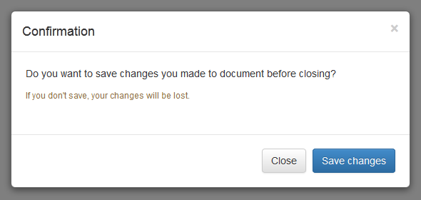
<p>Do you want to save changes you made to document before closing?</p> -
<p class="text-warning"><small>If you don't save, your changes will be lost.</small></p> -
</div> -
<div class="modal-footer"> -
<button type="button" class="btn btn-default" data-dismiss="modal">Close</button> -
<button type="button" class="btn btn-primary">Save changes</button> -
</div> -
</div> -
</div> -
</div>
— The above example launches the modal window when the DOM is fully loaded via JavaScript. The output will look something like this:
Activate Modals via Data Attributes
You can activate a Bootstrap modal by clicking on the button or link via data attributes without writing any JavaScript code. See the following example:
Example
Try this code »-
<!-- Button HTML (to Trigger Modal) --> -
<a href="#myModal" role="button" class="btn btn-large btn-primary" data-toggle="modal">Launch Demo Modal</a> -
-
<!-- Modal HTML --> -
<div id="myModal" class="modal fade"> -
<div class="modal-dialog"> -
<div class="modal-content"> -
<div class="modal-header"> -
<button type="button" class="close" data-dismiss="modal" aria-hidden="true">×</button> -
<h4 class="modal-title">Confirmation</h4> -
</div> -
<div class="modal-body"> -
<p>Do you want to save changes you made to document before closing?</p> -
<p class="text-warning"><small>If you don't save, your changes will be lost.</small></p> -
</div> -
<div class="modal-footer"> -
<button type="button" class="btn btn-default" data-dismiss="modal">Close</button> -
<button type="button" class="btn btn-primary">Save changes</button> -
</div> -
</div> -
</div> -
</div>
The above example launches the modal window on click of the "Launch Demo Modal" button. Let's go through each part of this modal code one by one for a better understanding.
Explanation of Code
To activate a Bootstrap modal via data attributes we basically need two components — the controller element like a button or link, and the modal element itself.
- The outermost container of every modal in a document must have a unique id (in this case
id="myModal"), so that it can be targeted viadata-target(for buttons) orhref(for hyperlinks) attribute of the controller element. - The attribute
data-toggle="modal"is required to add on the controller element, like a button or an anchor, along with a attributedata-target="#myModal"orhref="#myModal"to target a specific modal to toggle. - The
.modal-dialogclass sets the width as well as horizontal and vertical alignment of the modal box. Whereas the class.modal-contentsets the styles like text and background color, borders, rounded corners etc.
Rest of the thing is self explanatory, such as the .modal-header element defines a header for the modal that usually contains a modal title and a close button, whereas the .modal-bodyelement contains the actual content like text, images, forms etc. and the .modal-footerelement defines the footer that typically contains action buttons for the user.
Note:The .fade class on the .modal element adds a fading and sliding animation effect while showing and hiding the modal window. If you want the modal that simply appear without any effect you can just remove this class.
Activate Modals via JavaScript
You may also activate a Bootstrap modal window via JavaScript — just call the modal()Bootstrap method with the modal "id" or "class" selector in your JavaScript code.
Example
Try this code »-
<script type="text/javascript"> -
$(document).ready(function(){ -
$(".btn").click(function(){ -
$("#myModal").modal('show'); -
});
-
});
-
</script>
Changing the Sizes of Modals
Bootstrap gives you option further to scaling a modal up or down. You can make modals larger or smaller by adding an extra class .modal-lg or .modal-sm on .modal-dialog.
Example
Try this code »-
<!-- Large modal --> -
<button class="btn btn-primary" data-toggle="modal" data-target="#largeModal">Large modal</button> -
-
<div id="largeModal" class="modal fade bs-example-modal-lg" tabindex="-1" role="dialog"> -
<div class="modal-dialog modal-lg"> -
<div class="modal-content"> -
<div class="modal-header"> -
<button type="button" class="close" data-dismiss="modal" aria-hidden="true">×</button> -
<h4 class="modal-title">Large Modal</h4> -
</div> -
<div class="modal-body"> -
<p>Add the <code>.modal-lg</code> class on <code>.modal-dialog</code> to create this large modal.</p> -
</div> -
<div class="modal-footer"> -
<button type="button" class="btn btn-default" data-dismiss="modal">Cancel</button> -
<button type="button" class="btn btn-primary">OK</button> -
</div> -
</div> -
</div> -
</div> -
-
<!-- Small modal --> -
<button class="btn btn-primary" data-toggle="modal" data-target="#smallModal">Small modal</button> -
-
<div id="smallModal" class="modal fade" tabindex="-1" role="dialog"> -
<div class="modal-dialog modal-sm"> -
<div class="modal-content"> -
<div class="modal-header"> -
<button type="button" class="close" data-dismiss="modal" aria-hidden="true">×</button> -
<h4 class="modal-title">Small Modal</h4> -
</div> -
<div class="modal-body"> -
<p>Add the <code>.modal-sm</code> class on <code>.modal-dialog</code> to create this small modal.</p> -
</div> -
<div class="modal-footer"> -
<button type="button" class="btn btn-default" data-dismiss="modal">Cancel</button> -
<button type="button" class="btn btn-primary">OK</button> -
</div> -
</div> -
</div> -
</div>
Changing Modal Content Based on Trigger Button
Often several modal on a web page has almost same content with minor differences.
You can use the modal events to create slightly different modal windows based on the same modal HTML. The following example will change the title of the modal window according to the trigger button's data-title attribute value.
Example
Try this code »-
<script type="text/javascript"> -
$(document).ready(function(){ -
$("#myModal").on('show.bs.modal', function(event){ -
// Get button that triggered the modal -
var button = $(event.relatedTarget); -
// Extract value from data-* attributes -
var titleData = button.data('title'); -
$(this).find('.modal-title').text(titleData + ' Form'); -
});
-
});
-
</script>
Options
There are certain options which may be passed to modal() Bootstrap method to customize the functionality of a modal window.
| Name | Type | Default Value | Description |
|---|---|---|---|
| backdrop | boolean or the string 'static' |
true | Includes a modal-backdrop (black overlay area) element. Alternatively, you may specify static for a backdrop which doesn't close the modal on click. |
| keyboard | boolean | true | Closes the modal window on press of escape key. |
| show | boolean | true | Shows the modal when initialized or activate. |
| remote | URL | false | Deprecated If a remote url is provided, content will be loaded one time via jQuery's load method and injected into the '.modal-content' div. |
You may set these options either through the use of data attributes or JavaScript. For setting the modals options via data attributes, just append the option name to data-, like data-backdrop="static", data-keyboard="false" etc.
However, JavaScript is the more preferable way for setting these options as it prevents you from repetitive work. See the modal's method .modal(options) in the section below to know how to set the options for modals using the JavaScript.
If you're using the data api for setting the options for modal window, you may alternatively use the "href" attribute to provide the URL of remote source, like this:
Example
Try this code »-
<!-- Button HTML (to Trigger Modal) --> -
<a href="remote.html" role="button" class="btn btn-large btn-primary" data-toggle="modal" data-target="#myModal">Launch Demo Modal</a> -
-
<!-- Modal HTML --> -
<div id="myModal" class="modal fade"> -
<div class="modal-dialog"> -
<div class="modal-content"> -
<!-- Content will be loaded here from "remote.php" file --> -
</div> -
</div> -
</div>
Note:The remote option for the Bootstrap modals is deprecated since v3.3.0 and will be removed in v4. Use the client-side templating or a data binding framework instead, or call the jQuery.load method yourself.
Methods
These are the standard bootstrap's modals methods:
.modal(options)
This method activates the content as a modal. It also allows you to set options for them.
The jQuery code in the following example will prevent the modal from closing when a user clicks on the backdrop i.e. black overlay area behind the modal.
Example
Try this code »-
<script type="text/javascript"> -
$(document).ready(function(){ -
$(".launch-modal").click(function(){ -
$("#myModal").modal({ -
backdrop: 'static' -
});
-
});
-
});
-
</script>
The following jQuery code will prevent the modal from closing on press of the escape key.
Example
Try this code »-
<script type="text/javascript"> -
$(document).ready(function(){ -
$(".launch-modal").click(function(){ -
$("#myModal").modal({ -
keyboard: false -
});
-
});
-
});
-
</script>
The jQuery code in the following example will create a modal in which content of the modal will be inserted from a remote file upon activation.
Example
Try this code »-
<script type="text/javascript"> -
$(document).ready(function(){ -
$(".launch-modal").click(function(){ -
$("#myModal").modal({ -
remote: '../remote.php' -
});
-
});
-
});
-
</script>
.modal('toggle')
This method toggles a modal window manually.
Example
Try this code »-
<script type="text/javascript"> -
$(document).ready(function(){ -
$(".toggle-modal").click(function(){ -
$("#myModal").modal('toggle'); -
});
-
});
-
</script>
.modal('show')
This method can be used to open a modal window manually.
Example
Try this code »-
<script type="text/javascript"> -
$(document).ready(function(){ -
$(".open-modal").click(function(){ -
$("#myModal").modal('show'); -
});
-
});
-
</script>
.modal('hide')
This method can be used to hide a modal window manually.
Example
Try this code »-
<script type="text/javascript"> -
$(document).ready(function(){ -
$(".hide-modal").click(function(){ -
$("#myModal").modal('hide'); -
});
-
});
-
</script>
.modal('handleUpdate')
This method readjusts the modal's position to counter the jerk that is occurring due to the appearance of the viewport scrollbar in case if the modal height changes in such a way that it becomes higher than the viewport height while it is open.
A common example of this scenario is showing the hidden elements inside the modal via JavaScript or loading content inside the modal using Ajax after activation.
Example
Try this code »-
<script type="text/javascript"> -
$(document).ready(function(){ -
$(".show-text").click(function(){ -
$('#myModal').find(".lots-of-text").toggle(); -
$('#myModal').modal('handleUpdate') -
});
-
});
-
</script>
Events
Bootstrap's modal class includes few events for hooking into modal functionality.
| Event | Description |
|---|---|
| show.bs.modal | This event fires immediately when the show instance method is called. |
| shown.bs.modal | This event is fired when the modal has been made visible to the user. It will wait until the CSS transition process has been fully completed before getting fired. |
| hide.bs.modal | This event is fired immediately when the hide instance method has been called. |
| hidden.bs.modal | This event is fired when the modal has finished being hidden from the user. It will wait until the CSS transition process has been fully completed before getting fired. |
| loaded.bs.modal | This event is fired when the modal has loaded content using the remoteoption. |
The following example displays an alert message to the user when fade out transition of the modal window has been fully completed.
Example
Try this code »-
<script type="text/javascript"> -
$(document).ready(function(){ -
$("#myModal").on('hidden.bs.modal', function(){ -
alert("Modal window has been completely closed."); -
});
-
});
-
</script>
Tip:See also the Bootstrap FAQ section for more examples on modals, like setting vertical alignment, changing default width, embedding video, etc.