<!DOCTYPE html>
<html>
<head>
<meta charset="utf-8">
<title>Layout</title>
<style media="screen">
html *{
padding: 0;
margin: 0;
}
.layout article div{
min-height: 100px;
}
</style>
</head>
<body>
<!--浮动布局 -->
<section class="layout float">
<style media="screen">
.layout.float .left{
float:left;
300px;
background: red;
}
.layout.float .center{
background: yellow;
}
.layout.float .right{
float:right;
300px;
background: blue;
}
</style>
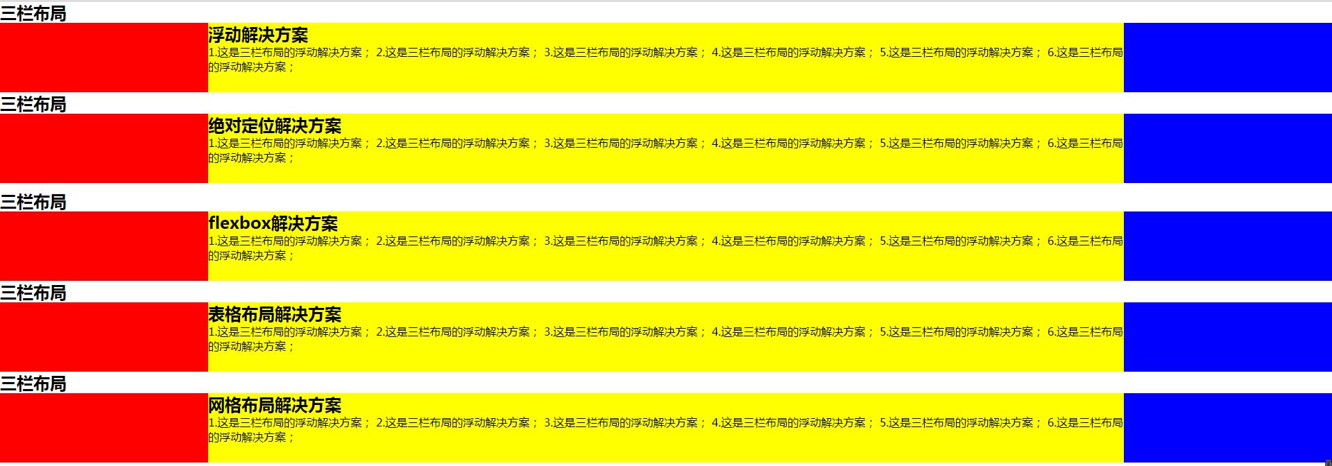
<h1>三栏布局</h1>
<article class="left-right-center">
<div class="left"></div>
<div class="right"></div>
<div class="center">
<h2>浮动解决方案</h2>
1.这是三栏布局的浮动解决方案;
2.这是三栏布局的浮动解决方案;
3.这是三栏布局的浮动解决方案;
4.这是三栏布局的浮动解决方案;
5.这是三栏布局的浮动解决方案;
6.这是三栏布局的浮动解决方案;
</div>
</article>
</section>
<!-- 绝对布局 -->
<section class="layout absolute">
<style>
.layout.absolute .left-center-right>div{
position: absolute;
}
.layout.absolute .left{
left:0;
300px;
background: red;
}
.layout.absolute .center{
left: 300px;
right: 300px;
background: yellow;
}
.layout.absolute .right{
right:0;
300px;
background: blue;
}
</style>
<h1>三栏布局</h1>
<article class="left-center-right">
<div class="left"></div>
<div class="center">
<h2>绝对定位解决方案</h2>
1.这是三栏布局的浮动解决方案;
2.这是三栏布局的浮动解决方案;
3.这是三栏布局的浮动解决方案;
4.这是三栏布局的浮动解决方案;
5.这是三栏布局的浮动解决方案;
6.这是三栏布局的浮动解决方案;
</div>
<div class="right"></div>
</article>
</section>
<!-- flexbox布局 -->
<section class="layout flexbox">
<style>
.layout.flexbox{
margin-top: 110px;
}
.layout.flexbox .left-center-right{
display: flex;
}
.layout.flexbox .left{
300px;
background: red;
}
.layout.flexbox .center{
flex:1;
background: yellow;
}
.layout.flexbox .right{
300px;
background: blue;
}
</style>
<h1>三栏布局</h1>
<article class="left-center-right">
<div class="left"></div>
<div class="center">
<h2>flexbox解决方案</h2>
1.这是三栏布局的浮动解决方案;
2.这是三栏布局的浮动解决方案;
3.这是三栏布局的浮动解决方案;
4.这是三栏布局的浮动解决方案;
5.这是三栏布局的浮动解决方案;
6.这是三栏布局的浮动解决方案;
</div>
<div class="right"></div>
</article>
</section>
<!-- 表格布局 -->
<section class="layout table">
<style>
.layout.table .left-center-right{
100%;
height: 100px;
display: table;
}
.layout.table .left-center-right>div{
display: table-cell;
}
.layout.table .left{
300px;
background: red;
}
.layout.table .center{
background: yellow;
}
.layout.table .right{
300px;
background: blue;
}
</style>
<h1>三栏布局</h1>
<article class="left-center-right">
<div class="left"></div>
<div class="center">
<h2>表格布局解决方案</h2>
1.这是三栏布局的浮动解决方案;
2.这是三栏布局的浮动解决方案;
3.这是三栏布局的浮动解决方案;
4.这是三栏布局的浮动解决方案;
5.这是三栏布局的浮动解决方案;
6.这是三栏布局的浮动解决方案;
</div>
<div class="right"></div>
</article>
</section>
<!-- 网格布局 -->
<section class="layout grid">
<style>
.layout.grid .left-center-right{
100%;
display: grid;
grid-template-rows: 100px;
grid-template-columns: 300px auto 300px;
}
.layout.grid .left-center-right>div{
}
.layout.grid .left{
300px;
background: red;
}
.layout.grid .center{
background: yellow;
}
.layout.grid .right{
background: blue;
}
</style>
<h1>三栏布局</h1>
<article class="left-center-right">
<div class="left"></div>
<div class="center">
<h2>网格布局解决方案</h2>
1.这是三栏布局的浮动解决方案;
2.这是三栏布局的浮动解决方案;
3.这是三栏布局的浮动解决方案;
4.这是三栏布局的浮动解决方案;
5.这是三栏布局的浮动解决方案;
6.这是三栏布局的浮动解决方案;
</div>
<div class="right"></div>
</article>
</section>
</body>
</html>