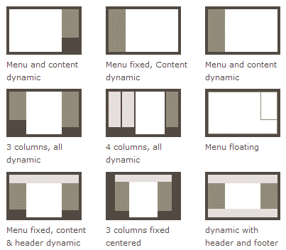
开发过程中,很多布局,用antd的栅格还是不灵活,flex弹性布局会更好用
Flex 是 Flexible Box 的缩写,意为"弹性布局",用来为盒状模型提供最大的灵活性。
注意,设为 Flex 布局以后,子元素的float、clear和vertical-align属性将失效。
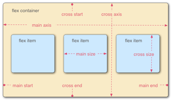
容器属性
- flex-direction 排列方向
- flex-wrap 排不下,如何换行
- flex-flow 1和2的简写
- justify-content 主轴对齐
- align-item 交叉轴对齐
- align-content 多轴线对齐
项目属性
- order 数值越小,越靠前
- flex-grow 项目放大
- flex-shrink 项目缩小
- flex-basis 定宽或定高(同事说他面试都会问一个问题,两列,一列定宽,但是不能用width定义,另一列自适应,怎么写,就用这个属性)
- flex 2/3/4的简写
- align-self 单个项目与其他项目不一样的排列方式,下次写代码可以试试这个
以下为拿来即用公用flex类
  1 .flex_top {
  2     display: -webkit-flex;
  3     display: -ms-flexbox;
  4     display: flex;
  5     -webkit-align-items: flex-start;
  6     -ms-align-items: flex-start;
  7     align-items: flex-start;
  8   }
  9   .center {
 10     display: -webkit-flex;
 11     display: -ms-flexbox;
 12     display: flex;
 13     -webkit-justify-content: center;
 14     -ms-justify-content: center;
 15     justify-content: center;
 16   }
 17   .col_middle {
 18     display: -webkit-flex;
 19     display: -ms-flexbox;
 20     display: flex;
 21     flex-direction: column;
 22     align-items: center;
 23   }
 24
 25   .col_center_middle {
 26     display: -webkit-flex;
 27     display: -ms-flexbox;
 28     display: flex;
 29     flex-direction: column;
 30     -webkit-justify-content: center;
 31     -ms-justify-content: center;
 32     justify-content: center;
 33     align-items: center;
 34   }
 35
 36   .center_middle {
 37     display: -webkit-flex;
 38     display: -ms-flexbox;
 39     display: flex !important;
 40     -webkit-align-items: center;
 41     -ms-align-items: center;
 42     align-items: center;
 43     -webkit-justify-content: center;
 44     -ms-justify-content: center;
 45     justify-content: center;
 46   }
 47
 48   .space_between {
 49     display: -webkit-flex;
 50     display: -ms-flexbox;
 51     display: flex;
 52     -webkit-justify-content: space-between;
 53     -ms-justify-content: space-between;
 54     justify-content: space-between;
 55   }
 56
 57   .space_around {
 58     display: -webkit-flex;
 59     display: -ms-flexbox;
 60     display: flex;
 61     -webkit-justify-content: space-around;
 62     -ms-justify-content: space-around;
 63     justify-content: space-around;
 64   }
 65
 66   .right {
 67     display: -webkit-flex;
 68     display: -ms-flexbox;
 69     display: flex;
 70     -webkit-justify-content: flex-end !important;
 71     -ms-justify-content: flex-end !important;
 72     justify-content: flex-end !important;
 73   }
 74
 75   .cursor_pointer {
 76     cursor: pointer;
 77   }
 78
 79   .common_shadow {
 80     box-shadow: 0 2px 4px 0 rgba(0, 0, 0, 0.07);
 81   }
 82
 83   .str_ellipsis{
 84     white-space: nowrap;
 85     overflow: hidden;
 86     text-overflow: ellipsis;
 87   }
 88
 89   .str_ellpsis_2, .str_ellpsis_3 {
 90     display: -webkit-box;
 91     -webkit-box-orient: vertical!important;
 92     white-space: pre-wrap;
 93     word-wrap: break-word;
 94     overflow: hidden;
 95     text-overflow: ellipsis;
 96   }
 97
 98   .str_ellpsis_2 {
 99     -webkit-line-clamp: 2; /*显示行数*/
100   }
101
102   .str_ellpsis_3 {
103     -webkit-line-clamp: 3; /*显示行数*/
104   }
105
106   .middle {
107     display: -webkit-flex;
108     display: -ms-flexbox;
109     display: flex!important;
110     -webkit-align-items: center;
111     -ms-align-items: center;
112     align-items: center;
113   }
阮一峰 Flex 布局教程:语法篇
http://www.ruanyifeng.com/blog/2015/07/flex-grammar.html?utm_source=tuicool