
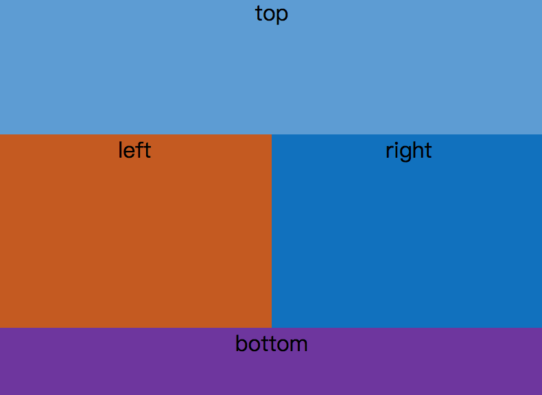
<!-- 利用绝对定位实现 -->
<style media="screen">
    html,body,.parent{height: 100%;overflow: hidden;}
    .top,.left,.right,.bottom{text-align: center;}
    .top{position: absolute;top:0;left: 0;right: 0;height: 100px;background: #5a9bd5;}
    .left{position: absolute;top:100px;left:0;bottom: 50px;width: 200px;background: #c65a11}
    .right{position: absolute;overflow: auto;left:200px;right:0;top:100px;bottom:50px;background: #0170c0}
    .bottom{position: absolute;left:0;right:0;bottom:0;height: 50px;background: #6f31a0}
</style>
<body>
    <div class="parent">
        <div class="top">top</div>
        <div class="left">left</div>
        <div class="right">right</div>
        <div class="bottom">bottom</div>
    </div>
</body>
<!-- 利用flex实现 -->
<style media="screen">
    html,body,.parent{height: 100%;}
    .parent{display: flex; flex-direction:column;}
    .top{height: 100px;background: #5a9bd5;}
    .bottom{height: 50px;background: #c65a11}
    .middle{flex: 1; display: flex;}
    .left{ width: 200px;background: #0170c0}
    .right{ flex: 1; overflow: auto;background: #6f31a0}
</style>
<body>
    <div class="parent">
        <div class="top">top</div>
        <div class="middle">
            <div class="left">left</div>
            <div class="right">right</div>
        </div>
        <div class="bottom">bottom</div>
    </div>
</body>