1、window的各种宽高 outerWidth、innerWidth、outerHeight、innerHeight
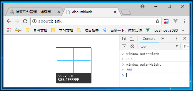
outerHeight 获取浏览器窗口外部的高度(单位:像素)。表示整个浏览器窗口的高度,包括侧边栏(如果存在)、窗口镶边(window chrome)和调整窗口大小的边框(window resizing borders/handles)
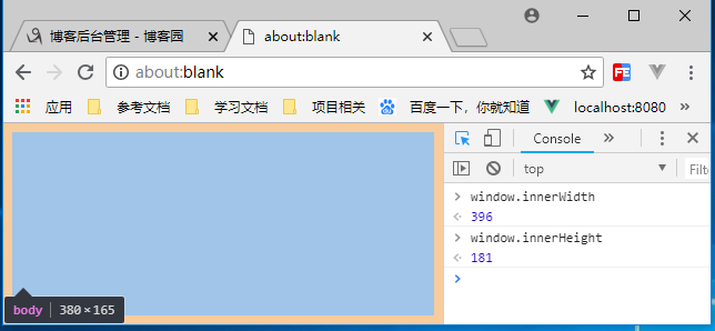
innerHeight 浏览器视口的高度(单位:像素),如果存在水平滚动条则包括它
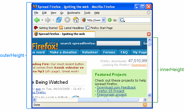
outerWidth 获取浏览器窗口外部的宽度(单位:像素)。表示整个浏览器窗口的宽度,包括侧边栏(如果存在)、窗口镶边(window chrome)和调整窗口大小的边框(window resizing borders/handles)
innerWidth 浏览器视口的宽度(单位:像素),如果存在垂直滚动条则包括它
下图中可以看到,outerWidth 和 outerHeight 不仅包含浏览器窗口的宽高,还包括窗口镶边
下图中可以看到,innerWidth和innerHeight,所谓的视口宽高不仅包含内容还包括padding
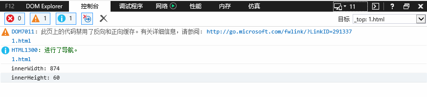
以上四个属性仅适用于 IE9+,对于老IE 则需注意两点:
(1)、IE8及以下不支持 outerWidth 和 outerHeight,且没有提供替代的属性
(2)、针对 innerWidth 和 innerHeight,可以用过 document.documentElement.clientWidth/Height (标准模式) 和 document.body.clientWidth/Height (混杂模式) 替代
下图中可以看到IE8 不支持以上四个属性:

IE8及以下针对 innerWidth 和 innerHeight 的兼容性写法:
var innerWidth = window.innerWidth,
     innerHeight = window.innerHeight;

if(typeof innerWidth !== 'number') {
      if (document.compatMode == "CSS1Compat") { // 当前文档渲染模式是 “标准模式”
        innerWidth = document.documentElement.clientWidth
        innerHeight = document.documentElement.clientHeight
      } else{ // 当前文档渲染模式是 “混杂模式”
        innerWidth = document.body.clientWidth
        innerHeight = document.body.clientHeight
      }
}
console.log('innerWidth: ' + innerWidth)
console.log('innerHeight: ' + innerHeight)
以下两组属性,声明了窗口的左上角在屏幕上的 x 坐标 和 y 坐标,都不存在兼容性问题
screenLeft / screenTop 适用于 IE、Safari 和 Opera
screenX / screenY 适用于 Firefox 和 Safari

下图分别测试在IE9,IE8,IE7 下的输出结果

2、window.screen 对象表示一个屏幕,包含用户屏幕的信息
通过控制台输出可以看到,screen对象共包含6个宽高属性 width、height、availWidth、availHeight

width 返回显示器屏幕的宽度(单位:像素)
height 返回显示器屏幕的高度(单位:像素)
availWidth 返回显示屏幕的可用宽度,除 windows 任务栏之外(单位:像素)
availHeight 返回显示屏幕的可用高度,除 windows 任务栏之外(单位:像素)
3、document 相关的宽高
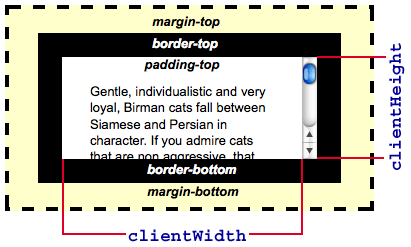
(1)、clientWidth 和 clientHeight ( 均被四舍五入为一个整数,如果需要小数,可以使用 element.getBoundingClientRect() )
clientWidth 属性表示元素的内部宽度(单位:像素)。包括内边距,但不包括垂直滚动条(如果有),边框和外边距
可以通过 css width + css padding - 垂直滚动条宽度(如果有)来计算
clientHeight 属性是只读的,对于没有定义css或者内联布局盒子的元素为0,否则,它是元素内部的高度(单位:像素)。包括内边距,但不包括水平滚动条(如果有),边框和外边距
可以通过 css height + css padding - 水平滚动条高度(如果有)来计算
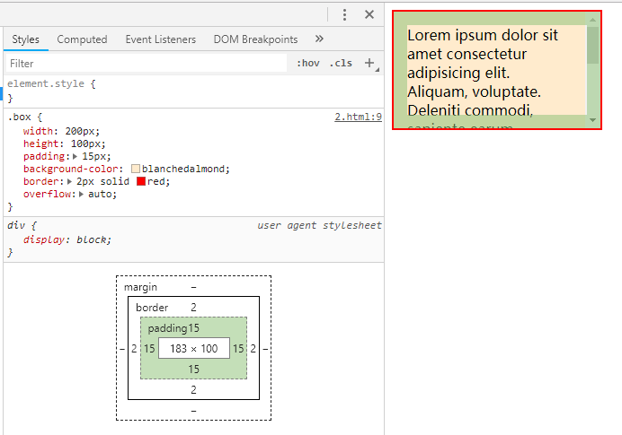
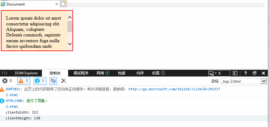
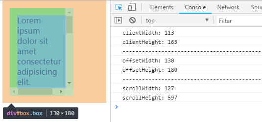
<!DOCTYPE html>
<html lang="en">
<head>
  <meta charset="UTF-8">
  <meta name="viewport" content="width=device-width, initial-scale=1.0">
  <meta http-equiv="X-UA-Compatible" content="ie=edge">
  <title>Document</title>
  <style>
    .box{width: 200px; height: 100px; padding: 15px; background-color:blanchedalmond; border: 2px solid red; overflow: auto;}
  </style>
</head>
<body>
  <div class="box" id="box">Lorem ipsum dolor sit amet consectetur adipisicing elit. Aliquam, voluptate. Deleniti commodi, sapiente earum inventore fuga nulla facere quibusdam unde reiciendis perspiciatis voluptate, sint fugiat aspernatur quidem voluptatem voluptatibus rem?</div>


  <script>
    var box = document.getElementById('box')
    console.log('clientWidth: ' + box.clientWidth)    // clientWidth: 213
    console.log('clientHeight: ' + box.clientHeight)  // clientHeight: 130
  </script>
</body>
</html>
通过控制台可以看到 clientWidth 213 = 元素宽度183 + padding 15 * 2,clientHeight 130 = 元素高度100 + padding 15 *2
该属性在 IE8 以下的浏览器中,取值会有些异常
(2)、clientTop 和 clientLeft (可以理解为 border 的宽高)
clientTop 一个元素顶部边框的宽度(单位:像素),不包括顶部外边距或内边距
clinetLeft 一个元素左边框的宽度(单位:像素),不包括左内边距和左外边距
如果元素的文本方向是从右向左,并且由于内容溢出导致左边出现了一个垂直滚动条,则该属性包括滚动条的宽度

在上例的基础上,IE7/IE8 都输出同样的值
console.log('clientLeft: ' + box.clientLeft)    // clientLeft: 2
console.log('clientTop: ' + box.clientTop)      // clientTop: 2
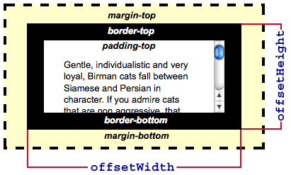
(3)、offsetWidth 和 offsetHeight ( 均被四舍五入为一个整数,如果需要小数,可以使用 element.getBoundingClientRect() )
offsetWidth 返回一个元素的布局宽度。包括 元素的边框(border)+ 水平线上的内边距(padding)+ 垂直方向滚动条宽度(scrollbar)+ css 设置的宽度(width)
offsetHeight 返回一个元素的像素高度。包括 元素的边框(border)+ 垂直线上的内边距(padding)+ 水平方向滚动条高度(scrollbar)+ css 设置的高度(height),不包括 :before, :after 等伪元素的宽高
在上例的基础上,IE7/IE8 都输出同样的值
console.log('offsetWidth: ' + box.offsetWidth)     // offsetWidth: 234
console.log('offsetHeight: ' + box.offsetHeight)   // offsetHeight: 134

(4)、offsetParent、offsetLeft 和 offsetTop
offsetParent 返回一个指向最近的、包含该元素的、定位元素,这里分两种情况
- 当前元素的祖先元素没有定位,offsetParent 最终是body
- 当前元素的祖先元素定位了,offsetParent 取最近的那个祖先元素
<!DOCTYPE html>
<html lang="en">
<head>
  <meta charset="UTF-8">
  <meta name="viewport" content="width=device-width, initial-scale=1.0">
  <meta http-equiv="X-UA-Compatible" content="ie=edge">
  <title>Document</title>
  <style>
    *{box-sizing: border-box;}
    .box1{width: 350px; height: 350px; padding: 75px; background-color:bisque;}
    .box2{width: 200px; height: 200px; padding: 50px; background-color:aquamarine;}
    .box3{width: 100px; height: 100px; background-color:aliceblue; position: fixed;}
  </style>
</head>
<body>
  <div class="box1">
    <div class="box2">
      <div class="box3" id = "box3"></div>
    </div>
  </div>

  <script>
    var box = document.getElementById('box3')

    // 父元素 box2 定位
    console.log(box.offsetParent)   // <div class="box2"></div>

    // 父元素 box2 的父元素 box1 定位(box2 没有定位)
    console.log(box.offsetParent)     // <div class="box1"></div>

    // 所有父元素都没有定位
    console.log(box.offsetParent)     // <body></body>

    // 该元素或祖先元素 设为 display: none
    console.log(box.offsetParent)        // webkit, IE11: null, IE10-IE9: <body></body>

    // 该元素的定位方式为fixed(不管祖先元素是否定位)
    console.log(box.offsetParent)        // 所有IE 均返回 null
  </script>
</body>
</html>
offsetTop 返回当前元素相对于其 offsetParent 元素的顶部的距离
offsetLeft 返回当前元素左上角相对于其 offsetParent 元素的左边界偏移的距离
// box1 定位
console.log('offsetLeft: ' + box.offsetLeft)     // offsetLeft: 125
console.log('offsetTop: ' + box.offsetTop)       // offsetTop: 125
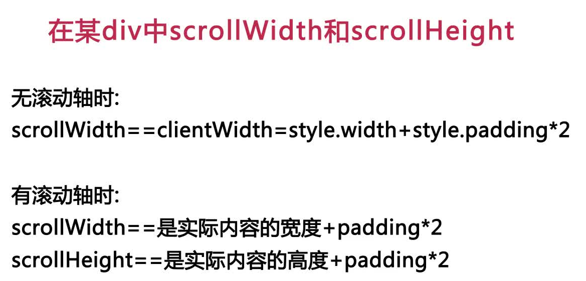
(5)、scrollWidth 和 scrollHeight
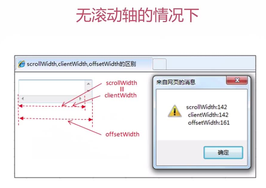
scrollWidth 返回元素的内容区域宽度 或 元素的本身的宽度中 更大的那个值。若元素的宽度大于其内容区域(如:存在滚动条时),scrollWidth 要大于 clientWidth
scrollHeight 等于该元素在不使用滚动条的情况下为了适应视口中所用内容所需的最小高度;若没有垂直滚动条,scrollHeight 与 clientHeight 相同
<!DOCTYPE html>
<html lang="en">
<head>
  <meta charset="UTF-8">
  <meta name="viewport" content="width=device-width, initial-scale=1.0">
  <meta http-equiv="X-UA-Compatible" content="ie=edge">
  <title>Document</title>
  <style>
    .box{width: 100px; height: 150px; margin: 15px; padding: 15px; background-color: lightgreen; overflow: scroll;}
  </style>
</head>
<body>
  <div class="box" id="box">Lorem ipsum dolor sit amet consectetur adipisicing elit. Quaerat odit molestias hic, fuga cumque repudiandae labore dignissimos itaque sunt, sint incidunt, minima laborum earum non maiores laudantium? Reiciendis, unde fugiat.</div>

  <script>
    var box = document.getElementById('box')
    console.log('clientWidth: ' + box.clientWidth)
    console.log('clientHeight: ' + box.clientHeight)
    console.log('-------------------------------------------')
    console.log('offsetWidth: ' + box.offsetWidth)
    console.log('offsetHeight: ' + box.offsetHeight)
    console.log('-------------------------------------------')
    console.log('scrollWidth: ' + box.scrollWidth)
    console.log('scrollHeight: ' + box.scrollHeight)
  </script>
</body>
</html>
(6)、scrollLeft 和 scrollTop (可读写,可被设置为任何整数值)
scrollLeft 可以读取或设置元素滚动条到元素左边的距离
- 如果元素不能滚动(如:没有溢出),那么 scrollLeft 的值是0
- 如果给 scrollLeft 设置的值小于 0,那么 scrollLeft 的值将变为0
- 如果给 scrollLeft 设置的值小于元素内容最大的宽度,那么 scrollLeft 的值将被设为元素的最大宽度
scrollTop 可以获取或设置一个元素的内容垂直滚动的像素数
- 如果元素没有垂直方向的滚动条,那么 scrollTop 的值是0
- 如果 scrollTop 设置的值小于0, 那么 scrollTop的值将变为0
- 如果设置超出了这个容器可滚动的值,scrollTop 会被设置为最大值
<!DOCTYPE html>
<html>
<head>
  <meta charset="utf-8">
  <style>
      #container {
          border: 1px solid #ccc; height: 100px; overflow: scroll; width: 100px;
      }
      #content {
          background-color: #ccc; width: 250px;
      }
  </style>
  <script>
      document.addEventListener('DOMContentLoaded', function () {
          var button = document.getElementById('slide');
          button.onclick = function () {
              document.getElementById('container').scrollLeft += 20;
          };
      }, false);
  </script>
</head>
<body>
  <div id="container">
      <div id="content">Lorem ipsum dolor sit amet.</div>
  </div>
  <button id="slide" type="button">Slide</button>
</body>
</html>

4、Event 事件对象的坐标
clientX和clientY ----> 相对于浏览器(可视区左上角0,0)的坐标
screenX和screenY ----> 相对于设备屏幕左上角的(0,0)的坐标
offsetX和offsetY ----> 相对于事件源左上角(0,0)的坐标
pageX和pageY 相对于整个网页左上角(0,0)的坐标
X和Y 本是IE属性,相对于用CSS动态定位的最内容包裹元素