水平居中:
1、针对文字:text-align
2、针对已知宽高块级容器:margin-left、margin-right
3、不知道宽高:position+translate
4、终极解决方案(文字和容器均可):flex布局
垂直居中:
1、固定高度的单行文本:line-height
2、不知道宽高:position+margin-top(知道高度的px)/translate
3、flex(推荐)
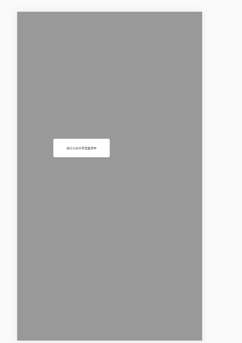
<!DOCTYPE html>
<html>
    <head>
        <meta charset="utf-8">
        <title>2.5 水平居中和垂直居中</title>
        <style>
            *{
                padding: 0;
                margin: 0;
                box-sizing: border-box;
            }
            .modal-wrapper{
                position: fixed;
                top: 0;
                right: 0;
                bottom: 0;
                left: 0;
                z-index: 1000;
                width: 100%;
                height: 100%;
                background-color: rgba(0,0,0,0.4);

                /* display: flex;
                justify-content: center;
                align-items: center; */
            }
            .modal{
                overflow: hidden;
                background-color: #fff;
                border-radius: 10px;
                font-size: 16px;


            /* 情况1:容器宽高自适应 没有指定宽高 内容撑开 */
                /* 1-1 内联元素 不能设置宽高 内容撑开 */
                    /* 1-1-1 文字水平垂直居中 多行文字 */
                    /* display:inline; */
                    /* padding:0 20px; */  /* 这种情况可以不考虑垂直水平居中 */

                    /* 1-1-2 容器水平垂直居中 内联元素 */
                    /* position: absolute; */
                    /* left: 50%; */
                    /* top: 50%; */
                    /* transform: translate(-50%,-50%); */

                /* 1-2 内联块元素 不能设置宽高 内容撑开 */
                    /* 1-2-1 文字水平垂直居中 多行文字 */
                    /* display: inline-block;
                    padding: 30px 20px; */

                    /* 1-2-2 容器水平垂直居中 内联块元素 */
                    /* position: absolute;
                    left: 50%;
                    top: 50%;
                    transform: translate(-50%,-50%); */

                /* 1-3 块元素 不能设置宽高 */
                    /* 1-3-1 文字水平垂直居中 多行文字 */
                    /* display: block;
                    text-align: center;
                    padding: 30px 0; */

                    /* 1-3-2 容器水平垂直居中 块元素 */
                    /* position: absolute;
                    display: inline-block;
                    left: 50%;
                    top: 50%;
                    transform: translate(-50%,-50%); */

            /* 情况2:指定容器宽高 */
                /* 2-1 内联元素 不能设置宽高 内容撑开 */


                /* 2-2 内联块元素 设置宽高 */
                    /* 2-2-1 文字水平垂直居中 多行文字 */
                    /* 也可以写flex布局使文字垂直水平居中 */
                    /* display: inline-block;
                     300px;
                    height: 100px; */
                    /* 单行文字 */
                    /* text-align: center;
                    line-height: 100px; */
                    /* 多行文字 */
                    /* display: flex;
                    justify-content: center;
                    align-items: center; */


                    /* 2-2-2 容器本身 水平垂直居中 内联块元素 */
                    /* position: absolute; */
                    /* left: 50%; */
                    /* top: 50%; */
                    /* 不知道宽高 */
                    /* transform: translate(-50%,-50%); */
                    /* 知道宽高 */
                    /* margin-left: -150px;
                    margin-top: -50px; */

                /* 2-3 块元素 设置宽高 */
                    /* 2-3-1 文字水平垂直居中 多行文字 */
                    display: block;
                    width: 300px;
                    height: 100px;
                    /* 单行文字 */
                    text-align: center;
                    line-height: 100px;
                    /* 多行文字 */
                    /* display: flex;
                    align-items: center;
                    justify-content: center;
                     */
                    /* 2-3-2 容器水平垂直居中 块元素 */
                    /* margin: 0 auto; */
                    position: absolute;
                    left: 50%;
                    top: 50%;
                    transform: translate(-50%,-50%);
                    margin-left: -150px;
                    margin-top: -150px;
            }
        </style>
    </head>
    <body>
        <div class="modal-wrapper">
            <span class="modal">单行文字水平垂直居中</span>
        </div>

    </body>
</html>