圣杯布局指的是一个网页由页眉,3等高列(2个固定侧栏和中心内容主体)和贴在页面底部的页脚组成。
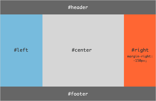
主要思路是对整个容器使用地上diaplay:table 的css规则,然后分别对页眉页脚使用display:table-row的css规则。
对中间的mian容器使用中的左中右使用display:table-cell的css规则.
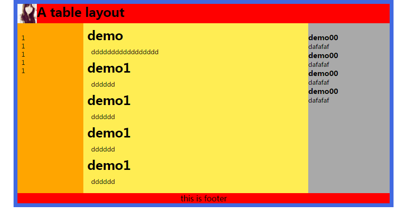
<div id="wrapper">

    <header>
        <img src="../../img/img/d.jpg" width="50px"/>
        <h1>A table layout</h1>

    </header>
    <div id="dd">
    <nav>
        <ul>
            <li>1</li>
            <li>1</li>
            <li>1</li>
            <li>1</li>
            <li>1</li>


        </ul>

    </nav>

    <div id="article">
        <h1>demo</h1>
    <p> ddddddddddddddddd
    </p>

    <h1>demo1</h1>
    <p> dddddd</p>
    <h1>demo1</h1>
    <p> dddddd</p>
    <h1>demo1</h1>
    <p> dddddd</p>
    <h1>demo1</h1>
    <p> dddddd</p>


    </div>

    <aside>

        <h3>demo00</h3>
        <p>dafafaf</p>
        <h3>demo00</h3>
        <p>dafafaf</p>
        <h3>demo00</h3>
        <p>dafafaf</p>
        <h3>demo00</h3>
        <p>dafafaf</p>


    </aside>
    </div>
    <footer>this  is footer</footer>
</div>
<style>
    header{background: #f00;display: table-row}

    header img{float:left}
    header h1::after{content: "";clear: both;display: block;}

    footer{background: #FF0000;font-size: 20px;text-align: center;
    display: table-row;}
    *{margin: 0;padding: 0;}
    nav li{list-style: none;}
    #wrapper{display:table;960px;border: 10px solid  royalblue;margin:  0 auto;}


    nav{display:table-cell; 150px;background: orange;padding: 10px;}

    div#dd{ 100%;display: table;}

    #article{background: #ffed53;padding: 10px;display: table-cell;}
    #article p{word-wrap: break-word;padding:10px ;}
    aside{ 210px;display:table-cell;background: darkgray;}

</style>
运用上面的思路,效果图如下: